


A woven colorful rug has an almost magical ability to reshape a neutral room, introducing warmth, vibrancy, and personality without overwhelming the space. For homeowners who gravitate toward calm palettes yet crave a hint of artistry, a thoughtfully chosen rug becomes the anchor that ties everything together. Styling it well requires more than simply rolling it out on the floor.
The interplay between undertones, textures, furniture shapes, and accent colors guides the room’s mood and cohesion. Understanding how these elements communicate with one another ensures that the rug enhances the existing design rather than competes with it. When approached with intention, a colorful rug turns a subdued space into something memorable, comfortable, lived-in, and effortlessly elevated.

Selecting the Perfect Rug to Anchor Your Space
Choosing the right colorful rug begins with understanding how its tones, patterns, and textures interact with the neutral backdrop of your room. This initial selection lays the foundation for every design decision that follows, ensuring the rug feels intentional rather than merely decorative. By starting with a rug that harmonizes with your space, you set the stage for effortless styling throughout the room.
Matching Rug Undertones to Your Neutral Base
The foundation of styling a colorful rug in a neutral room begins with a close examination of undertones. Neutrals are rarely pure; beige often leans warm with traces of yellow or red, while grays shift cool with blue or green notes. Identifying these subtle temperatures ensures that the rug’s color story enhances harmony rather than tension. When the rug shares a complementary undertone, even bold shades become surprisingly easy to integrate. A warm room with taupe walls and creamy upholstery thrives when joined by a rug featuring terracotta, muted gold, or warm teal because the shared undertones create a sense of continuity. A cooler interior accented with charcoal, greige, or icy white invites rugs with indigo, emerald, or berry tones that echo its crispness.
This alignment does more than create visual ease; it prevents the common issue of a rug feeling out of place. Homeowners often assume a neutral room can support any color, but when undertones clash, the rug becomes a distraction rather than an intentional centerpiece. Through careful selection, the space feels unified, with every element operating in conversation rather than competition. The rug becomes not only a decorative layer but a strategic design choice that strengthens the room’s identity.
Deciding Between Geometric and Organic Patterns
Pattern selection sets the tone for how the rug contributes to the emotional feel of the room. Geometric motifs such as diamonds, latticework, or stripes introduce a rhythmic structure that works beautifully in modern, transitional, or minimalist spaces. Their clean lines bring an orderly energy, giving the eye predictable paths to follow. When placed in a room defined by simple silhouettes and neutral tones, these patterns inject sophistication while preserving the architectural clarity.
Organic patterns, often floral, abstract, or globally inspired, carry a softer, more fluid quality. They complement rooms that lean bohemian, coastal, or eclectic by introducing movement that breaks up the rigidity of solid surfaces. A neutral space filled with rounded furniture or soft-textured textiles benefits from the free-flowing nature of organic motifs, which emphasize warmth and comfort. The choice between structure and fluidity ultimately depends on how you want your room to feel. A geometric rug can sharpen a soft interior, while an organic rug can gently loosen a structured one, offering either balance or emphasis based on your goals.
The Importance of Weave Density and Texture
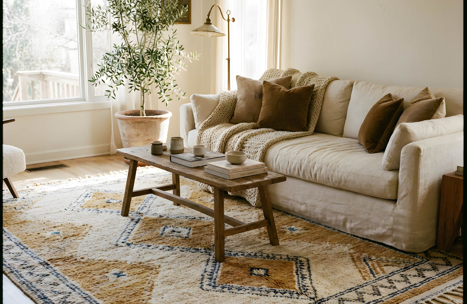
Beyond color and pattern, weave density and texture make a meaningful difference in the rug’s overall impact. A densely woven rug carries a refined, almost polished appearance, ideal for living rooms or dining areas where you want the space to feel intentional and tailored. Its tight weave often showcases detailed patterns with clarity, giving the rug a more formal or contemporary presence, much like the balanced, low-profile construction of Edward Martin’s Marcela Cotton Blend Rug in Natural / Opal, seen in the image above.
Looser, chunkier weaves introduce a tactile quality that brings the room to life. These textures soften minimal interiors and add a sense of comfort, making them excellent choices for casual living rooms or bedrooms where warmth is essential. The texture interacts with light in subtle ways, creating depth that enhances even the most neutral surroundings. The right weave density is not just a matter of feel but of visual influence. A smoother rug reads quiet and sleek, while a more textured surface provides dimension and balance, especially when the rug is rich in color.

Creating Balance by Repeating Colors Elsewhere
Once the rug is firmly established as your visual anchor, the next step is extending its influence beyond the floor. Repeating select colors from the rug in subtle ways around the room creates cohesion and prevents the design from feeling bottom-heavy. This thoughtful distribution of color helps the space feel unified and naturally layered.
Implementing the 60 30 10 Rule
The 60-30-10 rule remains one of the most effective frameworks for ensuring a colorful rug integrates seamlessly into a neutral space. By allowing the room’s primary neutral palette to occupy sixty percent of the visual field and reserving thirty percent for secondary hues, you create the perfect canvas for the remaining ten percent, the accent color that expands directly from the rug. This measured approach prevents strong colors from overwhelming the room. Instead, the rug becomes the source of a cohesive palette, guiding the strategic distribution of supporting tones.
When your rug includes multiple colors, identifying which shade should fill that ten-percent role becomes a matter of choosing the one that either contrasts beautifully with the room or subtly enhances an existing undertone. The neutrality of the surroundings allows the rug’s palette to shine without feeling chaotic, and the accent color becomes the thread that ties the room’s personality together. This approach gives homeowners the freedom to embrace bold choices while maintaining a visually calm environment.
Using Throw Pillows and Blankets as Bridges
Soft furnishings like pillows and blankets serve as essential connectors between the rug and the rest of the space. When chosen thoughtfully, they echo the rug’s palette and subtly distribute its colors at eye level, where they are most influential. A rug with saturated hues gains balance when a pillow in a corresponding shade appears on a sofa, or when a throw draped over an armchair reflects one of its accent tones. These bridges help the rug feel intentional, almost as if it dictated the room’s color story from the beginning.
The key is subtle repetition rather than exact duplication. Selecting fabrics with variations in shade or texture ensures that the space feels layered rather than overly coordinated. A navy thread woven into a pillow can reference a navy stripe in the rug without appearing matchy. A warm coral throw can nod to a similar hue in the rug’s pattern while introducing a different texture that deepens the room’s overall richness. These smaller elements act as harmonizing notes, creating rhythm and continuity.
Curating Art That Speaks to the Floor
Artwork provides one of the most powerful opportunities to reinforce the rug’s influence and elevate the entire room. When art shares tonal or thematic qualities with the rug, the eye naturally moves upward, strengthening vertical cohesion. This harmony transforms the room into a unified visual story, with the rug at its foundation and the artwork serving as its echo. This connection becomes especially seamless when the rug features subtle tonal shifts similar to Edward Martin’s Marcela Cotton Blend Rug in Natural / Ocean, shown in the image above, which naturally invites complementary wall art.
Art does not need to match the rug perfectly; in fact, a direct match can feel staged. Instead, seek pieces that communicate through shape, movement, or a shared accent color. An abstract painting might subtly incorporate the rug’s dominant shade or mimic its dynamic flow. Vintage prints can reflect complementary tones, tying the room together with quiet sophistication. When such connections appear, the room feels intentional and curated, with every detail in conversation rather than competing for attention.

Managing Visual Weight through Furniture and Layout
After establishing color balance, refining the layout and furniture choices ensures that the room feels visually grounded. The placement, material, and silhouette of furniture determine how the eye moves around the space and how prominently the rug’s pattern reads. Managing visual weight at this stage helps maintain harmony as the design becomes more dimensional.
Grounding the Design with Solid Neutral Furniture
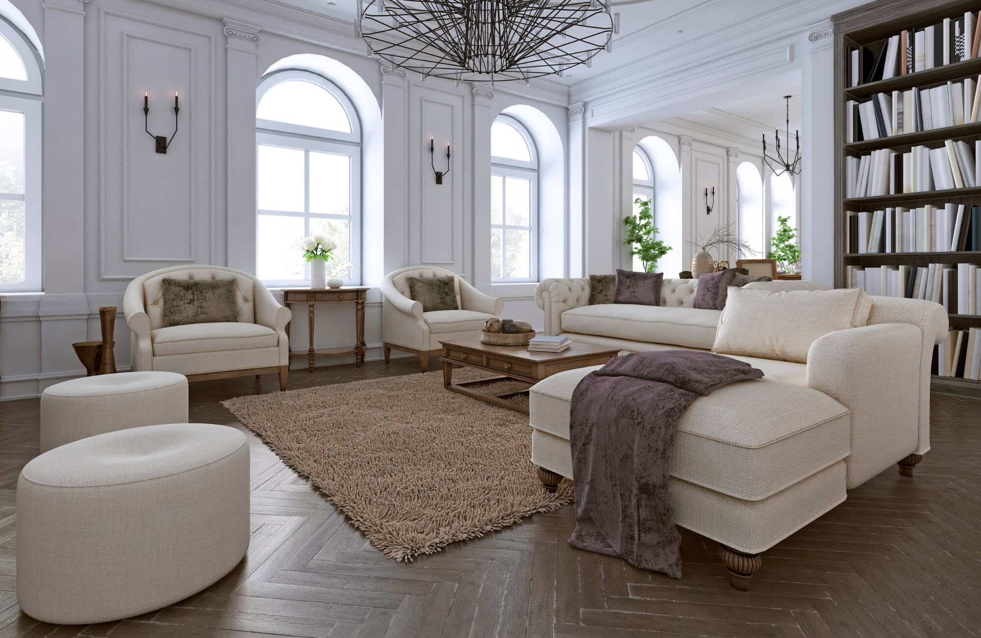
Furniture selection is one of the most effective tools for balancing a colorful rug. Solid neutral pieces establish steadiness that allows the rug’s vibrancy to shine without overwhelming the eye. Sofas in soft beige, ivory, oatmeal, or charcoal act as grounding elements, anchoring the palette and preventing the space from feeling overly busy. Their quiet presence creates contrast against the rug, highlighting its color story while maintaining equilibrium. If you’re drawn to the warm, balanced look in the image above, a similar grounding effect can be achieved with Edward Martin’s Marcela Cotton Blend Rug in Lake / Spice, which blends seamlessly with neutral upholstery.
The key lies in proportion and silhouette. Clean lines and well-balanced forms ensure that furniture supports the rug rather than competes with it. The neutrality of the pieces also allows you to introduce accents elsewhere without fear of clashing. By keeping the furniture dependable and understated, the rug becomes the star, and the room remains welcoming, calm, and cohesive.
Exposing Enough Floor to Frame the Color
How the rug is positioned within the layout significantly affects how it reads in the room. Exposing the surrounding floor acts as a natural frame, easing the transition between the boldness of the rug and the neutrality of the space. Allowing a portion of the wood or tile to show gives the rug breathing room, allowing its colors to settle into the environment rather than dominate it.
This framing effect is especially important in open floor plans, where the rug defines specific zones without interrupting flow. When the rug is too large, it can feel heavy; when too small, it appears disconnected. The right balance helps the rug serve both functional and aesthetic purposes. By ensuring that enough floor remains visible, the space feels grounded, spacious, and thoughtfully composed.
Utilizing Glass and Acrylic to Reveal the Pattern
Transparent furniture materials such as glass and acrylic carry a unique advantage in rooms where the rug’s pattern is a central feature. These materials allow the design to remain visible from multiple angles, ensuring the rug’s artistry is not obscured by heavy furniture. A glass coffee table, for example, provides structure while keeping the rug on full display, turning the floor into a focal point rather than burying it beneath visual weight.
Acrylic pieces also contribute to a sense of modern openness. Their barely-there presence helps maintain airiness, especially in smaller rooms where too much opaque furniture might shrink the space. By incorporating transparent materials, the room achieves a lightness that complements the expressive nature of a colorful rug, allowing pattern and palette to shine without obstruction.

Adding Depth with Layers and Textural Contrast
With the foundational elements in place, the final layer of design comes from texture and material interplay. Introducing depth through layering and contrasting finishes enhances the rug’s vibrancy and enriches the neutral surroundings. These finishing touches bring warmth, personality, and a sense of completeness to the space.
Layering Color Over Natural Fiber Jute
Layering a colorful rug atop a natural jute base creates immediate depth and dimension. The jute’s earthy texture forms a neutral canvas that both grounds and elevates the vibrant rug placed above it. This technique softens the rug’s impact while giving the room a layered, designer-curated appearance. The contrast between the jute’s organic weave and the colorful rug’s intricate texture enhances the tactile experience of the space, making it feel warm, inviting, and intentionally styled.
This approach is particularly effective in large rooms, where additional layering can help fill visual gaps. Jute’s neutrality ensures the colorful rug remains the main attraction, while its texture enriches the environment with subtle complexity. The combination brings out the best qualities of each layer, resulting in a cohesive and luxurious final look.
Mixing Wood Tones and Metal Finishes
A neutral room enriched by a colorful rug benefits greatly from thoughtful interplay among wood tones and metal finishes. Lighter woods introduce freshness, pairing beautifully with rugs that favor cool or coastal palettes, while richer walnut or chestnut tones provide depth that complements rugs with warm, saturated hues. Mixing these tones prevents the space from feeling flat, allowing natural materials to echo the richness of the rug’s palette without overwhelming the senses. For those who prefer a soft, traditional foundation like the image above, a rug with similar versatility, such as Edward Martin’s Marcela Cotton Blend Rug in Brick / Lake, creates an easy starting point for blending finishes.
Metal finishes offer another layer of sophistication. Brass brings warmth that resonates with desert-inspired colors, while blackened steel introduces modern contrast that highlights cooler tones. The goal is to create subtle relationships between materials that enhance the rug’s vibrancy. When wood and metal are layered thoughtfully, they expand the rug’s influence into the broader architecture of the room, forming connections that make the design feel intentional and complete.
Incorporating Greenery for Organic Balance
Plants are one of the most effective tools for balancing the boldness of a colorful rug. Their organic shapes and natural hues provide a restorative influence that softens the room’s palette while enhancing its sense of life and movement. The green tones naturally harmonize with almost any color combination found in a woven rug, bridging transitions between vibrant elements and neutral surroundings, and if you’re unsure which tones pair best, Edward Martin’s design consultation service can help guide those decisions with personalized recommendations.
Whether displayed as tall floor plants or smaller tabletop arrangements, greenery punctuates the design with a sense of calm. Its presence introduces a living layer that complements the tactile richness of the rug and the stillness of neutral furniture. And for those who want help selecting the right rug, greenery accents, or coordinating furnishings, you can always contact Edward Martin for support with product questions or project-specific guidance. The result is a space that feels dynamic yet soothing, with nature acting as the integrator of all elements.
Confidence Is Your Best Accessory
Styling a woven colorful rug in a neutral room is a celebration of both restraint and expression. It is the interplay between softness and boldness, between the calm stability of neutrals and the joyful dynamism of color. The rug serves as the anchor that carries personality into the space, while the surrounding elements come together to shape a cohesive environment.
As with any artistic endeavor, the most compelling designs emerge from thoughtful choices guided by confidence. When you trust your instincts, respect balance, and embrace color with intention, the result is a room that transcends trends and becomes a true reflection of you.