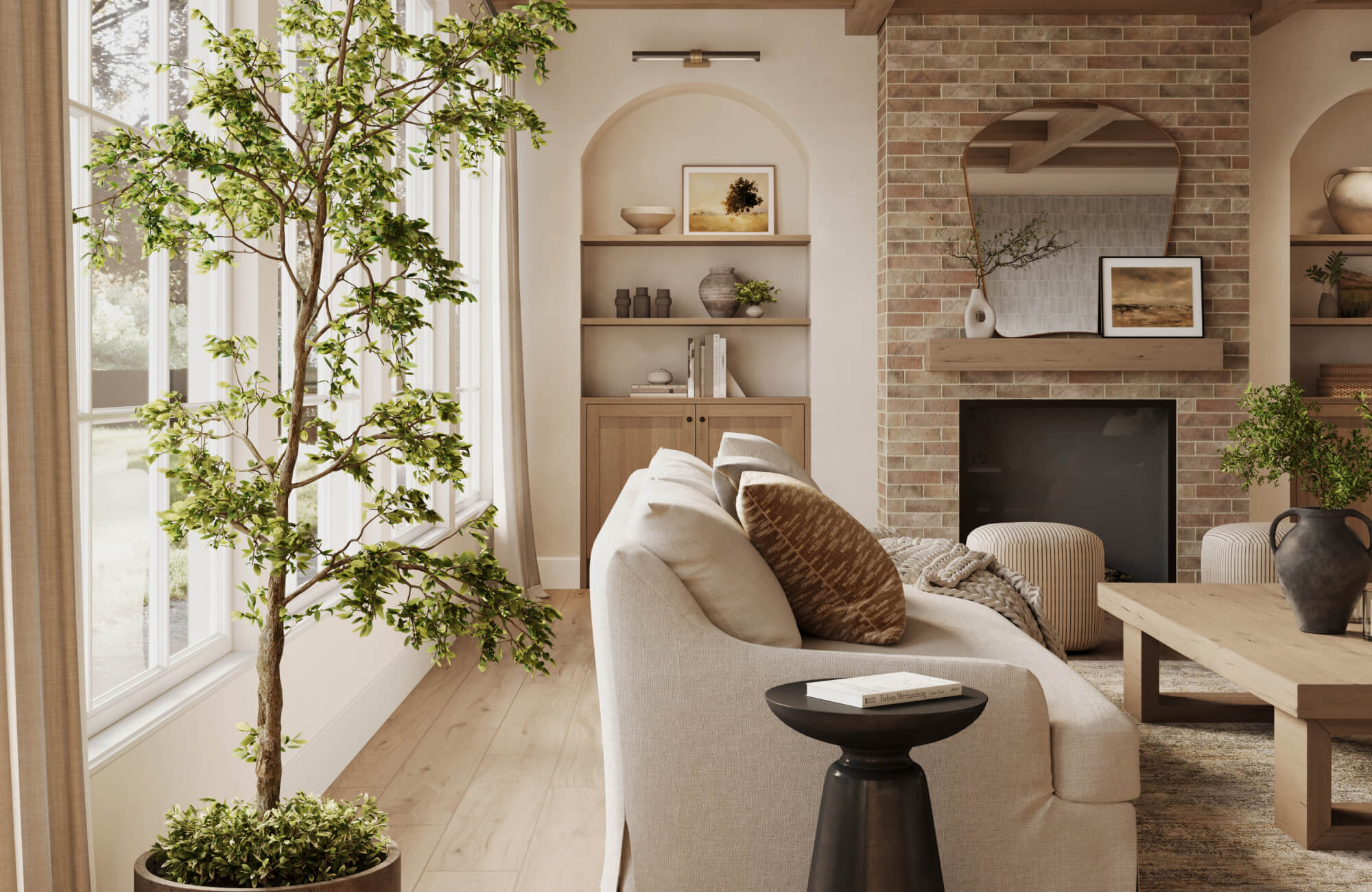
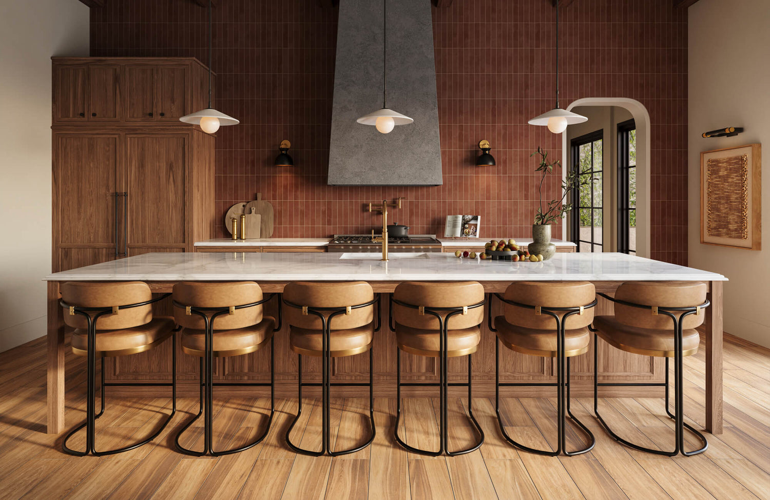
Wall art can make an open-concept space feel connected or unintentionally fragmented depending on how it’s placed, scaled, and carried across different zones. Without clear room boundaries, choosing artwork becomes less about filling empty walls and more about guiding how the eye moves from one area to the next. In this blog, we’ll show you how to choose wall art that brings stronger structure, balance, and cohesion to your open-concept space with more confidence.

Reading the Layout Before Deciding What Goes on the Walls
Open-concept spaces don’t have clear boundaries, which means wall art needs to respond to how the entire layout is seen at once. Instead of focusing on individual walls, it helps to look at how sightlines connect across living, dining, and transitional areas. This makes it easier to place artwork where it actually supports the flow rather than competing with it.
Identifying the First Wall You Notice From Each Entry Point
Every open-concept space has one or two walls that immediately draw attention the moment you step in. These are often visible from entryways, hallways, or main walk paths, which makes them natural focal points for wall art. Because they’re seen first, they tend to set the tone for the rest of the space. Choosing what goes here has more impact than filling smaller or less visible walls. This is where larger pieces or more defined compositions tend to work best. Placing weaker or undersized artwork in these spots can make the entire layout feel less intentional.
A useful way to identify these walls is to walk through the space from different entry points and pause where your eye naturally lands. What you notice first is usually where the visual weight should go. It also helps to consider how often that view is seen throughout the day, not just when entering the room. Once these key walls are established, the rest of the artwork can support rather than compete with them. This approach prevents the layout from feeling scattered. It gives the space a clearer starting point.
Tracking How the Eye Moves Across Connected Areas
In an open layout, the eye doesn’t stop at one wall but moves continuously from one zone to another. Wall art needs to support that movement rather than interrupt it with unrelated pieces. If each area feels visually disconnected, the space can start to feel fragmented even without physical barriers. Repeating certain elements, such as tone, framing, or scale, helps guide the eye more smoothly across the room. This creates a sense of continuity without making everything look the same. The goal is to make transitions between spaces feel natural rather than abrupt.
To understand this better, it helps to stand in one area and look across into the next, noticing how artwork in one zone relates to another. If something feels out of place, it usually means the visual connection is missing. Adjusting placement or selecting pieces that echo nearby elements can help restore that flow. Even subtle alignment in spacing or height can make a difference in how cohesive the space feels. Over time, this creates a layout where each wall contributes to a larger visual path. The room feels more connected without losing its openness.
Deciding Which Walls Should Stay Quiet vs Stand Out
Not every wall needs to carry the same level of visual impact, especially in a large open space. Trying to make every wall a focal point often leads to visual clutter and makes it harder for any one area to stand out. Some walls should hold attention, while others support the overall balance by staying more understated. This contrast helps define where the eye should focus without overwhelming the space. It also allows stronger pieces to have more presence instead of competing with everything else. A mix of active and quiet walls creates a more controlled and intentional layout.
A practical way to approach this is to assign priority to walls based on visibility and function. Walls near main seating areas or directly across from entry points usually benefit from stronger artwork. In contrast, transitional spaces or secondary walls can remain simpler or even be left empty. This creates breathing room that helps the entire layout feel more balanced. It also prevents over-decorating, which can reduce the impact of key pieces. Knowing where to hold back is just as important as knowing where to add.

Keeping the Space Connected Without Making It Repetitive
Open-concept spaces benefit from a sense of continuity, but that doesn’t mean every piece of wall art should look the same. The goal is to create a visual thread that ties different zones together while still allowing each area to feel distinct. When repetition is used with variation, the space feels cohesive without becoming predictable or flat.
Repeating Colors or Finishes to Tie Different Areas Together
Using consistent colors or finishes across wall art helps create a connection between separate zones in an open layout. This doesn’t require exact matching, but rather a shared element that appears in different parts of the space. For example, a tone from a living room artwork can reappear subtly in the dining area to create continuity. This repetition allows the eye to move naturally from one area to another without feeling disconnected. It also helps different sections of the room feel like part of a single design rather than separate setups. Even small color echoes can make a noticeable difference in how unified the space feels.
To make this approach more effective, it helps to identify one or two key tones already present in the room and use them intentionally across different pieces. These could come from furniture, rugs, or existing decor rather than the artwork alone. Keeping the repetition subtle prevents the space from feeling overly coordinated or forced. At the same time, varying how those colors appear, whether through pattern, scale, or placement, keeps the look more dynamic. This balance between consistency and variation creates a stronger visual rhythm. It allows the space to feel connected without becoming repetitive.
Mixing Artwork Styles While Maintaining a Clear Direction
Mixing different art styles can add character to an open-concept space, but without a clear direction, it can quickly feel scattered. The key is to introduce variation while maintaining a common thread that ties everything together. This could be a shared color palette, a similar level of detail, or a consistent tone across the pieces. When these elements align, different styles can coexist without clashing. This approach allows the space to feel more personal and layered rather than overly uniform. It also creates visual interest without disrupting the overall flow.
To keep the mix controlled, it helps to limit how many contrasting styles are used within the same visual range. For example, pairing abstract and minimal pieces can work well if they share similar tones or framing. On the other hand, combining too many distinct styles without overlap can break the sense of cohesion. Spacing also matters, since grouping certain styles together can make transitions feel more intentional. This way, variation becomes part of the design rather than a distraction. A clear direction keeps the space feeling unified, even with different influences.
Bringing in a different type of wall art can add dimension to an open-concept space, as long as it still connects with the overall direction of the room. As seen above, our Golden Drift Wall Art introduces tactile variation through its hand-formed wool and jute knots, while its earthy tonal transitions help it feel aligned with surrounding natural materials instead of visually interrupting the flow. The vertically stacked pattern also gives the piece structure, which keeps the more organic texture from feeling too casual or disconnected beside cleaner-lined furnishings. This kind of contrast helps a space feel more layered without making the artwork mix feel random.
Using Framing Consistency to Keep the Look Grounded
Frames play a significant role in tying different pieces of artwork together, especially in open layouts where everything is visible at once. Even when the artwork itself varies, consistent framing can create a sense of order across the space. This might mean using the same material, color, or general style of frame in multiple areas. The result is a more structured look that helps balance variation within the artwork. Without that consistency, the arrangement can start to feel disjointed or overly busy. Frames act as a visual anchor that keeps everything grounded.
A practical way to approach this is to choose a framing style that works well with the overall tone of the space and repeat it where needed. It doesn’t have to be identical in every case, but keeping it within a similar range helps maintain cohesion. Mixing too many frame styles can draw attention away from the artwork itself and create unnecessary visual noise. Consistency in framing allows the art to vary while still feeling connected. It also makes it easier to expand or adjust the arrangement over time. This approach keeps the layout flexible without losing structure.
Avoiding Random Pairings That Break the Flow Between Zones
Randomly placing artwork without considering how it relates to nearby pieces can disrupt the flow of an open space. When styles, colors, or scales change too abruptly, the eye struggles to move smoothly from one area to another. This can make the layout feel fragmented, even if each piece works well on its own. Avoiding this comes down to thinking about transitions rather than isolated placements. Each piece should connect in some way to what’s around it, whether through color, scale, or style. This creates a more continuous visual experience across the room.
To prevent this issue, it helps to review how each wall interacts with the next before finalizing placement. Standing in one zone and looking toward another can reveal where the connection feels weak or inconsistent. Adjusting spacing, swapping pieces, or introducing a linking element can help smooth that transition. The goal isn’t to eliminate variation but to make it feel intentional. When artwork flows naturally from one area to another, the entire space feels more cohesive. This approach keeps the layout balanced without making it repetitive.

Scaling Artwork So It Holds Its Own in an Open Layout
In open-concept spaces, artwork has to compete with more visual space, longer sightlines, and multiple viewing angles at once. Pieces that feel balanced in a smaller room can quickly lose presence when placed on larger, continuous walls. That’s why scale isn’t just about fitting the wall, but about how the artwork reads from across the entire layout. Getting this right helps the space feel intentional instead of underfilled or uneven.
Choosing Larger Pieces for Wide, Continuous Walls
Wide, uninterrupted walls need artwork that can hold visual weight without feeling lost across the span. Smaller pieces tend to break the flow and make the wall feel fragmented, especially when viewed from different parts of the room. A larger piece helps anchor the wall and gives the eye a clear place to land, which is important in open layouts where everything is visible at once. It also reduces the need to fill the space with multiple smaller elements that may not connect visually. When the scale matches the width of the wall, the entire area feels more grounded. This creates a stronger focal point that supports the rest of the space rather than competing with it.
At the same time, larger doesn’t mean overwhelming if the proportions are handled correctly. The artwork should still leave enough breathing room around it so it doesn’t feel cramped or forced into the space. Placement height and alignment with nearby furniture also affect how balanced it feels. A well-scaled piece should feel integrated rather than oversized. Taking the time to adjust the size relative to both the wall and the layout helps avoid a setup that feels either too empty or too heavy. This balance is what allows the artwork to stand out without dominating the room.
When a Gallery Arrangement Works Better Than One Large Piece
A gallery arrangement becomes more effective when a single large piece feels too rigid or doesn’t match the character of the space. Grouping smaller artworks allows you to introduce variation while still covering enough wall area to maintain presence. This works particularly well in open layouts where flexibility and layering can make the space feel more dynamic. Instead of one fixed focal point, a gallery setup creates multiple points of interest that still read as one composition. It also allows for easier updates over time without needing to replace everything. When arranged properly, it can feel just as intentional as a large statement piece.
However, the key is making sure the grouping reads as a single unit rather than scattered pieces. Consistent spacing, alignment, or framing helps bring everything together visually. Without that structure, the arrangement can feel disconnected and lose its impact. It’s also important to consider how the grouping relates to the surrounding walls so it doesn’t feel isolated. A well-planned gallery setup can fill space while adding depth and personality. This makes it a strong alternative when one large piece doesn’t fully solve the layout.
Matching Artwork Scale to Nearby Furniture Proportions
Artwork should always relate to the furniture around it to create a sense of balance within the space. When a piece is too small compared to a large sofa or dining table, it can feel disconnected and visually weak. On the other hand, something too large can overpower the furniture and throw off the proportions. The goal is to create a relationship where the artwork feels anchored to the furniture without competing with it. This helps the entire setup feel more cohesive and stable. In open layouts, this connection becomes even more important because everything is seen together.
Looking at width, height, and placement in relation to furniture helps guide the right scale. Artwork that spans a significant portion of the furniture's width tends to feel more balanced than something centered but too narrow. It’s also important to consider how high the piece is placed, since incorrect height can disrupt the proportion, even if the size is right. Small adjustments in scale or placement can make a noticeable difference in how the space reads. When artwork and furniture align properly, the entire area feels more intentional. This connection strengthens the overall composition of the room.
When artwork is scaled in proportion to the furniture and architectural features around it, the entire arrangement tends to feel more intentional rather than visually disconnected. Our Quiet Study Wall Art above works well for this approach because its framed structure and layered warm neutral patterning give it enough visual weight to anchor a focal area without overwhelming nearby furnishings. When placed in an open-concept layout, a piece like this can help define a living or dining zone while still reading clearly from connected areas, thanks to its balanced scale and structured presence.
Avoiding Pieces That Feel Too Small From a Distance
In open-concept spaces, artwork isn’t just viewed up close but from across the room, often from multiple angles. This makes distance a key factor in how scale is perceived. A piece that looks appropriate when standing nearby can feel much smaller when seen from the opposite side of the space. This creates a disconnect where the wall feels underfilled even though something is technically there. Larger or more visually impactful pieces tend to hold their presence better across longer sightlines. Without that presence, the artwork can fade into the background.
To avoid this, it helps to step back and view the wall from different parts of the room before finalizing placement. If the artwork doesn’t stand out from a distance, it likely needs more scale or stronger visual weight. This doesn’t always mean going bigger, but sometimes choosing pieces with more contrast or detail can help. The goal is to ensure the artwork remains visible and relevant from every angle. Considering distance early helps prevent a layout that feels incomplete later on. It’s a simple step that makes a significant difference in open spaces.
Using Vertical Space on Taller Walls to Add Presence
Taller walls introduce a different challenge, where artwork can feel compressed if it only occupies the lower portion of the space. Using vertical arrangements or taller pieces helps extend the composition upward, making better use of the wall height. This is especially important in open layouts with higher ceilings, where empty vertical space can make the room feel unbalanced. Drawing the eye upward creates a stronger sense of proportion between the wall and the artwork. It also helps the space feel more complete rather than bottom-heavy. Vertical use of space adds presence without needing to widen the arrangement.
This can be achieved through stacked artwork, elongated pieces, or layered groupings that guide the eye upward. The key is to maintain alignment so the vertical expansion feels intentional rather than scattered. It’s also important to consider how this height interacts with nearby elements like lighting or architectural features. When done correctly, it enhances the scale of the room without overwhelming it. Using vertical space effectively allows artwork to match the full dimension of the wall. This creates a more balanced and visually satisfying result.

Using Wall Art to Define Zones Without Closing Off the Space
In open-concept layouts, wall art can help separate areas without adding physical barriers that interrupt the flow. Instead of dividing the space completely, the goal is to create subtle visual cues that signal how each area is used. When done right, artwork can reinforce function while still keeping the overall layout open and connected.
Anchoring the Living Area With a Clear Focal Wall
The living area usually benefits from having a strong focal wall that visually anchors the seating arrangement. This is often the wall behind the sofa or the one directly across from it, where artwork can help define the space without enclosing it. A well-placed piece gives the eye a clear point of focus, making the area feel more structured within the larger layout. Without that anchor, the seating zone can feel like it’s floating without clear boundaries. The scale, placement, and visual weight of the artwork all contribute to how grounded the space feels. Choosing something that holds attention without overwhelming nearby areas helps maintain balance across the room.
Using Artwork to Give the Dining Area Its Own Identity
The dining area can feel disconnected in an open layout if it doesn’t have its own visual identity. Wall art can help define this zone by reinforcing its function without needing physical separation. Placing artwork near the dining table or along a nearby wall helps establish it as a distinct part of the space. This makes the area feel more intentional rather than just an extension of the living room or kitchen. The style, tone, or subject of the artwork can also reflect the atmosphere you want for dining, whether more relaxed or more structured. Giving the dining space its own visual presence helps it stand out while still fitting into the overall design.
Guiding Transitions Between Spaces Without Abrupt Changes
Transitions between zones are where open-concept layouts can either feel smooth or disjointed. Wall art plays a role in softening these transitions by bridging the visual gap between areas. Instead of placing completely unrelated pieces next to each other, it helps to introduce artwork that shares elements from both sides. This could be through color, scale, or style that gradually shifts rather than changes suddenly. When the transition is handled well, the eye moves naturally from one area to the next without interruption. This makes the space feel more cohesive without removing the sense of separation between zones.
Transitions between connected spaces tend to feel more natural when the artwork itself carries a sense of visual movement rather than abrupt contrast. As shown above, our Greyward Vale Wall Art works well for this kind of approach because its softly woven gradient shifts from pale neutrals into deeper earthy tones, creating a gentle visual transition instead of a hard stop. When used in an open-concept layout, a piece like this can help bridge adjacent zones by introducing tonal movement that feels connected to both areas rather than visually separating them too sharply.
Keeping Visual Continuity While Defining Each Zone
Defining zones doesn’t mean each area should feel completely different from the others. Visual continuity is what keeps the entire layout connected, even when each section has its own purpose. Wall art can support this by repeating certain elements across zones while still allowing variation in placement or scale. This creates a consistent thread that ties the space together without making it feel repetitive. The challenge is balancing distinction with connection so that each area feels intentional but not isolated. When artwork is used this way, the space remains open while still feeling organized and well-defined.

Choosing Pieces That Still Work as the Layout Changes Over Time
Open-concept spaces tend to evolve as furniture is moved, layouts shift, or new elements are introduced, which means wall art should be able to adapt rather than stay fixed to one setup. Choosing pieces with flexibility in mind helps prevent situations where artwork feels out of place after even small changes. The goal is to build a setup that can adjust over time without needing to be replaced or completely reworked.
Selecting Artwork That Can Shift With Furniture Rearrangement
Artwork that works in multiple positions gives you more freedom to adjust your layout without starting over. Pieces that are too dependent on one exact placement can quickly feel disconnected when furniture moves, especially in open spaces where layouts change more often. Choosing artwork with balanced proportions and adaptable scale makes it easier to reposition without disrupting the overall look. This becomes especially useful when shifting between layouts for hosting, daily use, or seasonal changes. When the piece still feels grounded in a new position, it proves its flexibility within the space. Over time, this approach keeps the room feeling consistent even as the setup evolves.
A practical way to ensure this flexibility is to test placement options before committing to a final position. Try visualizing how the piece would look above different furniture or on adjacent walls to see if it still holds its presence. Artwork that maintains its impact across multiple spots tends to be more reliable long-term. It also helps to avoid pieces that rely heavily on surrounding elements to make sense visually. Keeping this in mind makes future layout changes much easier to manage. It turns your artwork into something that works with the space rather than being tied to one version of it.
Building a Collection That Grows Without Losing Cohesion
A growing collection of wall art can add depth and personality, but without a clear direction, it can start to feel disconnected over time. Adding new pieces gradually works best when there’s an underlying thread that ties everything together, whether through tone, framing, or overall style. This allows each new addition to feel intentional rather than random. In open layouts, where multiple pieces are visible at once, this consistency becomes even more important. Without it, the space can start to feel visually scattered instead of layered. A cohesive collection helps maintain structure even as it expands.
To keep this growth controlled, it helps to define a loose framework before adding new pieces. This doesn’t mean limiting creativity, but rather having a reference point for what fits within the space. For example, staying within a certain color range or frame style can help maintain consistency without making everything look the same. It also makes it easier to spot when a piece doesn’t belong before adding it in. Over time, this approach creates a collection that feels intentional rather than accumulated. It allows the space to evolve while still feeling connected.
Avoiding Pieces That Only Fit One Exact Wall or Setup
Some artworks work perfectly in one specific spot but lose their impact anywhere else, which can become limiting in open-concept spaces. Pieces that rely heavily on a particular wall size, color background, or furniture arrangement can feel out of place once anything shifts. This creates a situation where the layout has to adjust around the artwork instead of the other way around. In spaces that are meant to stay flexible, this can quickly become restrictive. Choosing pieces that feel balanced in different settings avoids this issue and keeps the layout adaptable. It allows the room to change without forcing everything else to stay fixed.
A useful way to avoid this is to consider how dependent the artwork is on its surroundings before placing it. If it only looks right in one exact position, it may not be the best fit for a flexible layout. Pieces with more neutral backgrounds, adaptable scale, or less rigid alignment tend to perform better over time. It also helps to think about how the artwork would work in a different room entirely. This mindset encourages more versatile choices that won’t limit future changes. In the long run, it keeps your space easier to adjust without sacrificing visual consistency.
Artwork tends to stay more useful long-term when it is not overly dependent on one exact wall color, furniture arrangement, or surrounding style to feel relevant. As shown above, our Meadowline Wall Art works well for this kind of flexibility because its neutral wool texture, warm beige accents, and structured framed format allow it to sit comfortably across a range of interiors without feeling overly specific to one setup. In an open-concept layout, a piece like this can transition more easily between living, dining, or transitional zones as your arrangement changes, while still maintaining a grounded presence.
Creating Wall Art Choices That Still Feel Right As Your Space Evolves
Choosing wall art for an open-concept space comes down to more than filling empty walls. As a homeowner, you’re working with longer sightlines, connected zones, and layouts that need to feel cohesive from multiple angles at once. The right pieces help guide movement, define areas, and create visual continuity without making the space feel crowded or overly coordinated. When scale, placement, and overall direction are handled intentionally, wall art becomes part of how the entire layout functions rather than just surface decoration.
If you’re still unsure which pieces will actually work with your layout, our personalized design consultation can help you make more confident decisions before committing to artwork that feels out of place later. Whether you’re defining a living area, balancing connected zones, or choosing pieces that can adapt as your home changes, we can help you create a wall art plan that feels cohesive, practical, and tailored to how you actually use your space.