


Wallpaper can transform the atmosphere of a room, but styling it successfully involves more than choosing a pattern you like. The most effective interiors consider how wallpaper interacts with lighting, furniture, color, texture, and architectural details so the entire space feels visually connected and thoughtfully arranged.
If you are new to decorating with wallpaper, the process may seem difficult at first. However, once you understand how wallpaper fits within the overall room design, styling decisions become much easier to approach. Whether you prefer subtle textures, bold prints, or timeless patterns, the right choices can help wallpaper feel naturally integrated into the space rather than visually separate from it.

Choosing the Right Wallpaper for Your Room
Choosing the right wallpaper starts with understanding the room itself. Factors such as size, lighting, and function all influence how the wallpaper will look and feel once installed.
Assess Room Size
The size of a room significantly affects how wallpaper appears once it is installed. Large-scale patterns can feel overpowering in compact spaces because they fill the walls too aggressively, while very small prints may look visually lost in larger rooms and lack enough presence to anchor the space. In smaller rooms, wallpaper with lighter spacing and softer pattern movement often helps the space feel more open. Vertical motifs are especially effective because they draw the eye upward, making lower ceilings appear taller. Larger rooms, by comparison, can accommodate broader patterns more comfortably because the additional wall space allows the design to develop naturally without feeling crowded.
It is also important to consider how much uninterrupted wall space the room has. Windows, doorways, and built-in shelving naturally interrupt the wallpaper layout, which can cause highly intricate patterns to lose their visual clarity. In rooms with many architectural interruptions, cleaner and more structured designs usually create a more unified appearance.
Match the Room Purpose
Wallpaper should reflect how the room is used daily. In bedrooms, softer tones and gentle patterns often create a calmer atmosphere that supports rest. Dining rooms and entertaining spaces, however, can usually accommodate richer colors or more expressive prints because these areas are meant to feel energetic and welcoming.
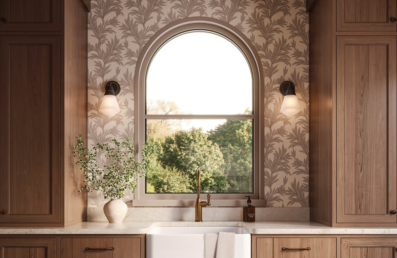
Home offices benefit from a more controlled approach. Wallpaper with subtle texture or structured patterns can add depth and character without becoming visually distracting during long work sessions. Meanwhile, smaller spaces such as powder rooms or entryways often allow for more experimentation with bold designs because the limited wall area keeps the wallpaper feeling deliberate rather than overwhelming. Edward Martin’s Botanique Wallpaper in Winter, 52" x 132", as featured in the photo above, demonstrates this balance especially well. Its botanical pattern adds character and visual movement to the compact powder room, while the soft neutral palette keeps the space feeling refined and inviting rather than overly busy.
Instead of choosing wallpaper based only on current trends, focus on the atmosphere and experience you want the room to create. When wallpaper aligns with the room’s purpose, the overall design tends to feel more practical, comfortable, and enduring over time.
Evaluate Natural Light
Lighting plays a major role in how wallpaper looks throughout the day. Colors can appear warmer in morning light, cooler in the evening, or slightly muted in shadowed areas. Because of this, wallpaper samples should always be viewed under the room’s actual lighting conditions before making a final decision.
Rooms with abundant natural light can usually support darker wallpaper more comfortably since sunlight prevents the walls from feeling too enclosed. By comparison, spaces with limited daylight often benefit from lighter backgrounds or finishes that help reflect light and maintain a brighter atmosphere.
Artificial lighting also changes how wallpaper is perceived. Warm lighting softens colors and creates a more relaxed mood, while cooler lighting highlights stronger contrast and sharper pattern details. Paying attention to these shifts helps prevent unexpected changes once the wallpaper is installed across the room.
Explore Material Options
Wallpaper material influences more than durability because it also shapes the room’s texture and atmosphere. Vinyl wallpaper is often a practical choice for kitchens, bathrooms, and hallways since it handles moisture and routine cleaning more effectively. Grasscloth wallpaper, by contrast, introduces natural variation and texture that give the room a warmer and more organic appearance.
Embossed wallpaper adds dimension through raised surfaces rather than relying on bold patterns, making it well-suited for interiors that prefer a quieter and more understated look. Matte finishes absorb light and create a softer visual effect, while wallpapers with a subtle sheen can brighten darker rooms by reflecting light gently across the walls.
When selecting wallpaper, surface texture deserves as much attention as the pattern itself. In many interiors, texture creates depth and character more effectively than heavily detailed prints.

Creating a Cohesive Color Story
Once your wallpaper is selected, the next step is building a color palette that ties the room together. Repeating tones carefully through furniture, textiles, and finishes helps the wallpaper feel naturally connected to the rest of the space.
Pull Colors From the Pattern
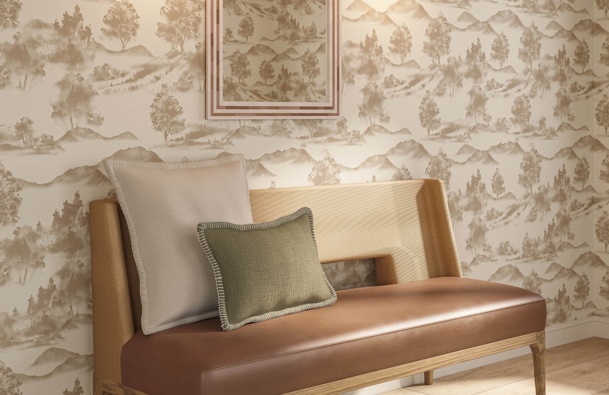
Most wallpaper designs include several tones beyond the primary background color, and those secondary shades can help guide the rest of the room. Bringing colors from the wallpaper into rugs, curtains, upholstery, or decorative accents helps create a stronger visual connection throughout the interior. For example, wallpaper with muted blue detailing and soft beige accents can pair naturally with cushions, fabrics, or area rugs in similar tones. Edward Martin’s Porter Wallpaper in Olive Night I, 52" x 132", as shown in the photo above, demonstrates this approach. Its deep olive tones carry through the painted walls, wood finishes, textured rug, and upholstered seating, creating a layered dining space that feels visually connected without appearing overly coordinated.
It is also important to avoid matching everything too precisely. Slight variations in tone usually create a more natural, layered appearance while still keeping the room visually connected.
Balance Strong Colors
Bold wallpaper naturally becomes the focal point of a room, so the surrounding elements should help soften its intensity. If the walls feature dramatic colors or dense patterns, calmer furnishings can prevent the space from feeling visually exhausting. Neutral seating, understated wood finishes, and restrained decorative accents often work best alongside statement wallpaper. These quieter elements help balance the room while still allowing the wallpaper to remain the central visual feature. This approach works especially well in living rooms and bedrooms, where comfort is just as important as appearance.
Rather than introducing strong color or pattern throughout the room, it is usually better to let the wallpaper carry most of the decorative emphasis. This creates a space that feels more comfortable, polished, and visually composed over time.
Introduce Contrast Carefully
Contrast helps wallpaper stand out while giving the room more depth and definition. Dark wallpaper paired with light upholstery can create clear visual separation, while softer wallpaper patterns often feel more grounded alongside darker wood finishes or structured furniture shapes. That said, contrast works best when used selectively. Too many competing differences in color, texture, or material can make the room feel fragmented rather than visually connected. In many interiors, a few carefully placed contrasts create a cleaner and more sophisticated result.
Temperature contrast also matters. Warm wood finishes can pair beautifully with cooler wallpaper tones when both elements carry a similar visual weight within the room.
Coordinate Paint and Trim
Trim, ceiling paint, and molding all influence how wallpaper is framed within a room. Crisp white trim creates sharper definition against darker wallpaper, while trim painted in a similar tone produces a softer and more continuous appearance.
Undertones should also be considered carefully. Wallpaper with warm undertones may feel slightly disconnected next to cooler paint colors, even when the contrast initially appears subtle. Keeping undertones consistent throughout the room helps the design feel smoother and more visually comfortable.
Ceiling color further contributes to the overall effect. Pulling a shade from the wallpaper palette can create a gentler transition between the walls and ceiling, particularly in rooms with tall ceilings or decorative architectural features.

Positioning Furniture Around Wallpaper
Once the wallpaper and color palette are established, furniture arrangement becomes an important part of the design. The right placement helps the wallpaper stand out naturally while keeping the room comfortable, functional, and visually balanced.
Simplify Large Furniture
Large furniture pieces naturally draw attention because of their size, so they should complement the wallpaper rather than compete with it. When intricate wallpaper is paired with oversized or heavily decorative furniture, the room can quickly feel crowded and visually heavy.
For this reason, sofas, beds, and cabinets with cleaner lines often work better against patterned walls. Simpler silhouettes create breathing room, allowing the wallpaper to remain noticeable without overwhelming the space. Edward Martin’s Windsor Wallpaper in Olive I, 52" x 132", as shown in the photo featured above, pairs naturally with the Selena 55" Outdoor Dining Table in Cream. The wallpaper’s structured vertical pattern adds depth, while the table’s sculptural shape and understated finish keep the dining area feeling open and visually balanced.
Simple furniture does not have to feel plain, however. Streamlined shapes and refined details can still add character while creating contrast against more detailed wallpaper, helping the room feel cleaner, more open, and visually balanced.
Define Visual Separation
Wallpaper often appears more refined when there is a clear sense of structure between the walls and major furniture pieces. Elements such as headboards, shelving, consoles, and wall molding can create visual separation while still allowing the wallpaper to remain visible. For example, an upholstered headboard against patterned wallpaper helps anchor the bed while making the wall design feel more balanced and controlled. Floating shelves can create a similar effect by breaking up large wallpapered surfaces without fully covering the pattern. These subtle divisions help the room feel more organized and deliberate, allowing the wallpaper to contribute to the design without dominating the entire space.
Layer Textiles With Restraint
Curtains, bedding, and upholstery should complement the wallpaper through texture and tone rather than repeat the same pattern. When identical motifs appear across multiple surfaces, the room can begin to feel overly coordinated and repetitive. Instead, fabrics such as linen, cotton, velvet, or woven materials add depth without competing with the wallpaper. This layered approach introduces variation through texture, helping the room feel softer and more visually comfortable. Keeping textiles restrained also allows the wallpaper to remain the main decorative feature, helping the overall design feel more polished and easier to enjoy over time.
Showcase Statement Pieces
Wallpaper can help draw attention to standout furniture by creating a strong visual backdrop. A sculptural chair, vintage cabinet, or distinctive dining table often feels more intentional when placed against wallpaper that complements its shape, material, or color. In this context, wallpaper functions much like a gallery backdrop, helping the furniture stand out without competing for attention. The contrast between the piece and the surrounding wall adds depth while giving the room a more curated appearance.
To maintain balance, avoid surrounding statement furniture with too many decorative objects. Leaving enough visual space around the piece allows it to stand out naturally while keeping the room feeling refined and uncluttered.

Using Wallpaper to Shape Visual Focus
Wallpaper does not need to cover every wall to make a strong visual impact. In many interiors, strategic placement creates a more refined result by guiding attention toward specific areas within the room. Used selectively, wallpaper can also help the space feel more modern, layered, and visually balanced.
Design a Feature Wall
A feature wall helps establish a clear focal point within a room by drawing attention to a specific area. The most effective locations are usually walls that naturally attract the eye, such as behind a bed, around a fireplace, or within a dining area.
By concentrating wallpaper on a single wall, the pattern becomes more noticeable without overwhelming the room. This approach also allows greater flexibility to use bolder prints or deeper colors that may feel excessive if applied throughout the entire space. Edward Martin’s Petaline Wallpaper in Taupe I, 52" x 132", as featured in the photo above, demonstrates this especially well behind the bed area. Its soft botanical pattern adds warmth and visual depth while allowing the surrounding textures and furnishings to maintain a calm and understated atmosphere.
To keep the composition balanced, the surrounding walls should remain more understated. A quieter backdrop allows the wallpapered wall to retain its impact while helping the room’s overall feel more composed.
Enhance Small Spaces
Compact spaces often respond especially well to wallpaper because the smaller wall area allows stronger designs to feel concentrated rather than overwhelming. Powder rooms, entryways, closets, and reading nooks are ideal places to experiment with darker tones, bold prints, or more detailed patterns that may feel too dominant in larger rooms. Wallpaper can also give transitional spaces a stronger sense of identity. A narrow hallway or small alcove feels more intentional and visually engaging when treated as part of the overall design rather than simply serving as a pass-through space.
Since these areas are used differently from main living spaces, they also provide more freedom for creative expression. This makes it easier to introduce more distinctive wallpaper choices without disrupting the visual rhythm of the rest of the home.
Highlight Architectural Features
Architectural details often become more noticeable when wallpaper is applied strategically around them. Recessed walls, built-in shelving, alcoves, and decorative panels gain more definition when contrasted against wallpapered surfaces. Using wallpaper within these sections also adds depth and creates separation between architectural features and surrounding walls. This approach works particularly well in homes with custom millwork, molding, or older structural details that deserve greater visual emphasis.
Rather than treating wallpaper as only a decorative background, you can use it to reinforce the room’s structural character and create a more layered interior.
Add Interest Overhead
Wallpapered ceilings can introduce depth and character without requiring every wall to carry a pattern. This technique works especially well in dining rooms, bedrooms, and powder rooms where you want to add visual interest while keeping the walls relatively restrained. Lighter ceiling wallpaper can soften the feel of taller spaces, while darker tones create a more intimate atmosphere. In most cases, subtle patterns work best overhead because they add texture without making the room feel visually heavy. Ceiling wallpaper also naturally draws the eye upward, giving the room a greater sense of depth and a more thoughtfully layered appearance.

Styling Décor to Complement Wallpaper
Once the wallpaper and furniture are in place, décor helps complete the room. Carefully selected accessories should reinforce the wallpaper’s style while maintaining a sense of openness and visual clarity throughout the space.
Select Artwork Thoughtfully
Artwork should complement the wallpaper rather than compete with it for attention. In many cases, large-scale artwork or a few carefully placed framed pieces work best because they create structure against patterned walls without adding unnecessary visual clutter. Crowded gallery arrangements can sometimes make wallpaper feel overly busy, especially when both the wallpaper and artwork contain detailed imagery. A more restrained approach to artwork placement often creates a cleaner and more sophisticated overall appearance.
Frame selection also influences the room’s balance. Thin metal frames often feel lighter and more contemporary against busy wallpaper, while wood frames tend to pair well with textured, traditional, or organic wallpaper styles.
Incorporate Organic Texture
Natural materials soften the appearance of wallpaper and help rooms feel more relaxed and inviting. Elements such as wood furniture, woven baskets, linen fabrics, and indoor plants introduce texture that complements patterned walls without competing with them.
This approach is particularly effective when wallpaper features geometric designs or darker tones. Organic textures add warmth and help soften the sharper visual edges that stronger patterns can sometimes create. Even smaller additions, such as ceramic vases or stone accessories, can make the room feel more grounded. When layered carefully, natural materials and wallpaper work together to create interiors that feel textured and lived-in rather than overly styled.
Use Lighting to Enhance Detail
Lighting plays a major role in how wallpaper texture and pattern are experienced within a room. Wall sconces can highlight embossed surfaces and subtle textures, while pendant lighting often enhances metallic finishes or reflective details within the wallpaper design.
Different types of lighting also shape the room’s atmosphere. Soft ambient lighting creates a calmer mood, whereas directional lighting can draw attention to specific wallpaper details and create greater visual depth. Thoughtful placement helps wallpaper appear more dimensional throughout the day.
Even smaller elements, such as lampshade materials, influence the final effect. Fabric shades diffuse light gently across the walls, while exposed bulbs create a sharper contrast that emphasizes texture and pattern definition.
Edit Decorative Accessories
Too many decorative objects can distract from the wallpaper and make the room feel visually crowded. Instead of filling every shelf or surface, focus on a smaller selection of accessories that support the room’s overall style and palette. Decorative pieces should relate to the wallpaper through tone, texture, or material rather than repeating the same pattern. This creates stronger visual continuity while still allowing each element to maintain its own identity within the room.
Carefully editing accessories also helps the wallpaper feel more refined and intentional. With fewer competing elements in the room, the overall space feels calmer, more open, and visually comfortable.

Avoiding Wallpaper Styling Errors
Even beautifully designed wallpaper can feel overwhelming if the surrounding elements are not balanced thoughtfully. Understanding a few common styling mistakes can help create rooms that feel comfortable, polished, and visually controlled.
Ignore Scale Problems
Pattern scale should always relate to the size of the room. Oversized prints can quickly overpower compact spaces, while very small patterns may feel visually lost in larger rooms and fail to create enough impact. Achieving the right balance in scale helps wallpaper feel proportionate within the space. Before making a final decision, try viewing larger wallpaper samples from a distance to get a clearer sense of how the pattern will appear across the room.
Mix Too Many Finishes
Using too many glossy surfaces, metallic accents, or competing textures can distract from the wallpaper and make the room feel visually unsettled. When too many materials compete for attention at once, the space can quickly feel cluttered and disjointed. Instead, choose a smaller range of finishes that work naturally with the wallpaper and support the overall design direction. Consistency across materials and textures generally creates a calmer and more polished interior.
Forget Lighting Conditions
Wallpaper should always be evaluated under the room’s actual lighting conditions before making a final decision. Colors and patterns can appear noticeably different in daylight compared to artificial lighting, particularly in rooms with limited natural light. For this reason, it is important to test wallpaper samples at different times throughout the day. Observing how the design responds to changing light helps prevent unexpected shifts in color, contrast, or texture once the wallpaper is installed across the room.
Create Abrupt Room Transitions
Wallpapered rooms should connect naturally with surrounding spaces rather than feel visually isolated from the rest of the home. When transitions between rooms feel too abrupt, the overall interior can appear fragmented. To create stronger continuity, repeat certain colors, finishes, or materials across adjacent spaces. Even when wallpaper styles vary between rooms, a few shared design elements help the home feel more visually connected.
Bringing Balance to the Entire Room
Styling wallpaper starts with understanding how it interacts with the rest of the room. The most effective interiors treat wallpaper as part of a complete design, where color, lighting, furniture, texture, and décor work together to create a cohesive and balanced space.
If you’re new to decorating with wallpaper, the process can feel overwhelming at first. However, once you learn how to coordinate wallpaper with the room’s proportions, materials, and overall atmosphere, styling decisions become much easier and more intentional. If you need guidance selecting the right wallpaper or creating a cohesive look for your space, you can also contact our team or explore our design service for more tailored support.