


Selecting wall art often feels deceptively simple, yet it can quickly become overwhelming when faced with endless styles, sizes, and compositions. Although it may be tempting to choose pieces based solely on personal taste, the most successful interiors rely on a more intentional approach. Wall art has the power to define a room’s atmosphere, guide visual flow, and reinforce the overall design narrative, which means every choice should respond to the space as much as to individual preference.
At the same time, choosing the right piece is not about following rigid rules but about understanding how key elements such as scale, color, placement, and material work together. When these factors are carefully considered, artwork transitions from a decorative afterthought into a cohesive design feature. As you move through this article, you will gain practical insights that help you make confident decisions, ensuring that each piece you select feels purposeful, balanced, and aligned with your space.

Understanding Your Space and Its Purpose
Before selecting wall art, it is essential to assess the room as a complete visual and functional environment. The most effective choices are not based on the artwork alone, but on how the piece interacts with the room’s purpose, circulation, furnishing layout, and overall atmosphere.
Defining the Room Function
The intended function of a room should be one of the first criteria guiding wall art selection. Art does more than decorate a surface. It influences mood, reinforces spatial identity, and shapes how a room is experienced on a daily basis.
Bedroom
In a bedroom, artwork typically benefits from a restrained visual language, such as soft abstraction, tonal landscapes, or compositions with low contrast, such as the Earthbound Trace Wall Art, because these support a more restorative environment.
Dining and Living Rooms
Social spaces such as dining rooms or living rooms can accommodate art with greater chromatic intensity, stronger linework, or more pronounced subject matter, since these rooms often benefit from visual energy and conversation-starting elements.
Bathroom
In bathrooms, wall art should balance visual appeal with environmental considerations. Due to humidity and moisture exposure, it is best to select pieces with protective framing, such as glass-covered prints or moisture-resistant materials like metal or acrylic. Stylistically, lighter compositions, botanical themes, or minimal designs like the Golden Drift Wall Art shown above work well to enhance a sense of cleanliness and relaxation without overwhelming the typically smaller scale of the space.
Home Office
A home office may call for artwork that promotes focus and mental clarity rather than distraction, which means overly dense or chaotic compositions may be less appropriate than structured graphic pieces or calm contemporary works.
Entryways and Hallways
In transitional areas such as hallways or entryways, wall art often serves an introductory role, setting the tone for the rest of the interior while helping establish continuity from one space to another. Therefore, selecting art for these locations requires consideration of both first impression and visual flow.
Private and Public Zones
It is important to distinguish between private and public zones within the space. More intimate spaces allow for deeply personal or sentimental artwork, while shared rooms may call for pieces with broader aesthetic appeal that support the design language of the entire household. By aligning wall art with the room’s functional intent, you can create interiors in which artwork feels integrated, purposeful, and emotionally appropriate rather than simply decorative.
Identifying Architectural Features
Architectural conditions directly affect how wall art should be sized, positioned, and visually weighted within a space. Before choosing a piece, it is important to study the wall plane itself, including ceiling height, openings, millwork, built-ins, and adjacent furnishings. These fixed elements establish the framework within which art must operate. A large uninterrupted wall may support an oversized canvas or multi-panel installation, whereas a segmented wall broken by windows, doors, or casework may require narrower vertical pieces or a more modular arrangement.
Proportion is especially influenced by ceiling height and wall geometry. In rooms with taller ceilings, vertically oriented art can help emphasize height and maintain visual balance. Conversely, in rooms with lower ceilings or horizontally expansive walls, landscape-oriented pieces may better echo the architecture and prevent the composition from feeling top-heavy. The negative space surrounding the artwork is equally significant, as adequate breathing room allows the piece to register clearly and prevents visual crowding.
Architectural detailing should also inform placement strategy. Wainscoting, chair rails, fireplaces, and shelving introduce datum lines that can either anchor artwork or compete with it if ignored. In many cases, the centerline of the art should relate to nearby architectural alignments or furniture groupings rather than float arbitrarily on the wall. Lighting conditions are another critical factor. Natural light can enhance color and texture, but excessive direct sunlight may cause UV degradation, particularly in original works, photographs, or textiles. In such cases, glazing type, wall orientation, and placement relative to windows must be evaluated carefully.

Choosing the Right Scale and Proportion
Scale is one of the most critical factors in wall art selection. Proper proportion ensures that artwork feels visually anchored within a space rather than appearing disconnected or disproportionate. When scale is thoughtfully considered, it reinforces spatial harmony and allows the artwork to integrate seamlessly with surrounding elements.
Matching Art Size to Furniture
Artwork should always be evaluated in relation to the furniture it accompanies, as this relationship establishes visual balance within the composition. A widely accepted guideline is that wall art should span approximately two-thirds to three-quarters of the width of the furniture below it, such as a sofa, console, or bed. This proportional alignment prevents the artwork from feeling either too dominant or too insignificant within the arrangement.
Equally important is the vertical relationship between the artwork and the furniture. The spacing between the bottom of the frame and the top of the furniture should typically range from six to ten inches, creating a cohesive visual connection without crowding the piece. This gap acts as a transitional zone, allowing the eye to move comfortably between elements. In the image above, Shaded Distance Wall Art illustrates this principle by aligning proportionally with the dining table beneath it, creating a balanced focal point within the arched alcove while maintaining clear visual breathing room.
In addition to width and placement, the visual weight of the artwork must be considered. Heavily saturated colors, dense compositions, or ornate frames can make a piece feel larger than its actual dimensions. In such cases, slightly reducing the size or simplifying the frame can help maintain balance. Conversely, lighter or more minimal works may require a larger scale or grouping to achieve the same visual presence. By calibrating both physical size and perceived weight, artwork can effectively anchor furniture while enhancing the overall design composition.
Working With Large and Small Walls
Wall size and configuration play a defining role in determining the appropriate scale of artwork. Large, uninterrupted walls provide an opportunity to introduce oversized pieces or expansive gallery arrangements that create a strong focal point. In these scenarios, undersized artwork can appear lost, failing to engage the full spatial potential of the wall. Oversized canvases, diptychs, or triptychs can establish visual impact while maintaining a clean and cohesive look.
For smaller walls or more confined areas, restraint becomes essential. Selecting a single, well-proportioned piece allows the artwork to stand out without overwhelming the surrounding space. Alternatively, a compact grouping of smaller works can be used, provided that consistent spacing and alignment are maintained to avoid visual clutter. The goal is to preserve negative space, which plays a crucial role in allowing both the artwork and the wall to breathe.
Irregular wall conditions, such as those interrupted by architectural features or located in transitional spaces, require a more tailored approach. Vertical arrangements can maximize height in narrow corridors, while horizontal compositions can visually widen compact areas. In each case, the scale of the artwork should respond directly to the dimensions and constraints of the wall, ensuring that the final composition feels intentional, balanced, and proportionally appropriate.

Selecting Colors That Complement Your Interior
Color selection is a critical component in integrating wall art into a cohesive interior scheme. Beyond aesthetics, color influences perception, mood, and spatial continuity, making it essential to approach art selection with a clear understanding of the room’s existing palette and tonal relationships.
Reinforcing Existing Color Palettes
One of the most effective ways to achieve visual cohesion is by selecting artwork that reflects and reinforces colors already present within the space. This does not require an exact match but rather a thoughtful repetition of key hues found in upholstery, area rugs, window treatments, or architectural finishes. By echoing these tones, the artwork becomes an extension of the overall design rather than an isolated feature.
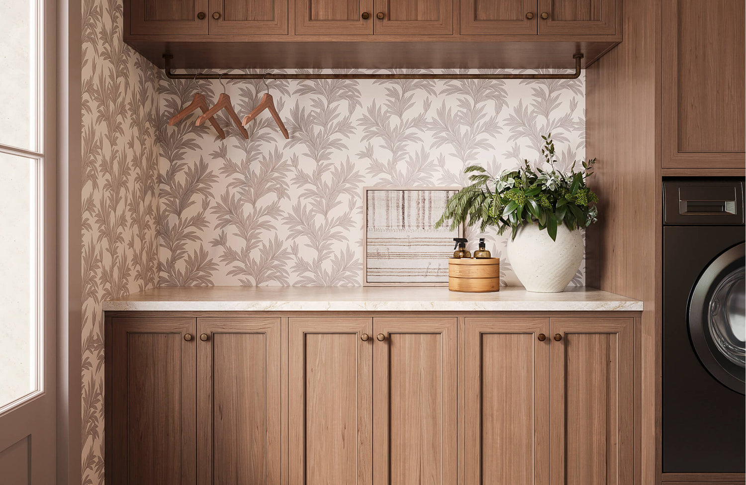
A layered approach to color integration often yields the most refined results. For example, if a room features a neutral base with subtle variations in beige, taupe, and warm gray, artwork that incorporates similar undertones can enhance depth without introducing visual disruption. Edward Martin’s Northland Memory Wall Art, as featured in the image above, exemplifies this approach by reflecting the warm wood tones, terracotta backsplash, and earthy finishes throughout the kitchen, allowing the piece to feel seamlessly integrated within the overall palette. Additionally, tonal gradation within the artwork, such as soft transitions between light and dark values, can mirror the material variations in the room, creating a more sophisticated and unified composition.
It is also important to consider color temperature. Warm-toned interiors benefit from artwork that leans toward reds, ochres, or warm neutrals, while cooler environments are better complemented by blues, greens, and cooler grays. Aligning these temperature profiles ensures that the artwork feels naturally integrated rather than visually discordant.
Introducing Contrast and Accent Colors
Although cohesion is important, contrast plays an equally vital role in preventing a space from feeling monotonous. Wall art offers an opportunity to introduce accent colors that may not be heavily present elsewhere in the room, creating focal points that draw the eye and add visual energy. This approach is particularly effective in neutral interiors, where a single piece of art can serve as a defining element that elevates the overall design.
The key to successful contrast lies in control and proportion. Accent colors introduced through artwork should relate back to at least one existing element within the space, even if only subtly, to maintain a sense of continuity. For instance, a bold color in the artwork can be echoed in a small decorative object or textile, establishing a visual link that feels intentional rather than arbitrary.
Additionally, the intensity and saturation of the accent color should be carefully calibrated. Highly saturated hues can create a strong visual impact but may overwhelm the space if overused. In contrast, muted or desaturated tones can provide a more understated form of contrast that adds depth without dominating the composition. By thoughtfully introducing contrast through wall art, you can create interiors that feel both dynamic and balanced.

Exploring Different Art Styles and Mediums
The style and medium of wall art play a defining role in shaping the overall character and atmosphere of a space. Beyond subject matter, these choices influence how a room is perceived, whether it feels formal, relaxed, modern, or layered with historical depth. Selecting the appropriate combination ensures that the artwork aligns with the broader design intent while enhancing the sensory and visual experience.
Traditional Versus Contemporary Styles
Art style should be carefully aligned with the architectural language and interior design direction of the space. Traditional interiors, often characterized by detailed millwork, classic furniture profiles, and symmetrical layouts, benefit from artwork that reflects a similar level of formality and structure. This may include representational paintings, botanical studies, still lifes, or portraiture, typically presented in ornate or classic frames that reinforce a sense of heritage and craftsmanship.
In contrast, contemporary interiors favor a more streamlined and expressive approach. Abstract compositions, minimal line drawings, or large-scale photographic works often complement modern spaces by introducing visual interest without relying on literal representation. This approach is exemplified by Greyward Vale Wall Art, which features a restrained palette and subtle tonal composition that harmonize effortlessly with the clean lines, rich materials, and moody color scheme of the dining area seen above.
Transitional spaces, which blend traditional and modern elements, offer greater flexibility. In these settings, mixing styles can be particularly effective when done with intention. For example, pairing a contemporary abstract piece with classic furnishings can create a dynamic contrast that feels curated rather than conflicting. The key is to maintain a unifying element, such as a consistent color palette or framing approach, to ensure cohesion across stylistic differences.
Material and Texture Considerations
The medium of the artwork contributes significantly to its visual weight, durability, and tactile presence within a space. Canvas pieces, for instance, offer a softer, more organic appearance, often with visible brushstrokes or surface texture that add depth. Framed prints, on the other hand, provide a more structured and refined presentation, with matting and glazing options that can enhance clarity and protect the artwork over time.
Alternative materials such as metal, acrylic, or mixed-media compositions introduce a different level of dimensionality. Metal prints can reflect light and create a subtle sheen, making them well-suited for contemporary or industrial interiors. Textile-based art, including woven pieces or fiber installations, adds a tactile layer that softens hard surfaces and contributes to acoustic absorption, which can be particularly beneficial in larger or more open spaces.
Layering different materials within a single room can also enrich the overall sensory experience. For example, combining a framed print with a textile wall hanging or a sculptural piece creates contrast not only in appearance but also in texture and depth. However, balance is essential; too many competing materials can create visual noise. By thoughtfully selecting and combining mediums, wall art can contribute to a more nuanced and engaging interior environment.

Placement Techniques That Enhance Impact
Proper placement determines how artwork is perceived and experienced within a space. Even the most well-chosen piece can lose its impact if it is positioned incorrectly, while thoughtful placement can elevate both the artwork and the surrounding environment by reinforcing visual order and spatial harmony.
Optimal Hanging Height and Alignment
One of the most important principles in art placement is establishing the correct hanging height. In most residential settings, the center of the artwork should be positioned approximately 57 to 60 inches from the floor, which corresponds to average eye level. This standard creates a comfortable viewing experience and ensures that the artwork feels naturally integrated into the space rather than floating too high or sitting too low.
However, this guideline should be adjusted based on context. When artwork is placed above furniture such as a sofa, console, or bed, alignment should relate more closely to the furniture than to the wall alone. Maintaining a distance of roughly six to ten inches between the bottom of the artwork and the top of the furniture helps create a cohesive visual connection. Additionally, aligning the edges or centerlines of artwork with architectural features such as windows, door frames, or built-ins reinforces a sense of order and intentionality within the design.
Lighting also plays a critical role in placement. Positioning artwork where it can benefit from indirect natural light or dedicated picture lighting enhances visibility and reveals texture, color variation, and detail. At the same time, care should be taken to avoid excessive glare or prolonged exposure to direct sunlight, which can affect the longevity of certain materials.
Creating Gallery Walls and Groupings
Gallery walls and grouped arrangements offer a flexible way to display multiple pieces while creating a unified visual statement. The success of these compositions depends on maintaining consistency in spacing, alignment, and overall structure. A common approach is to keep the spacing between frames uniform, typically ranging from two to four inches, which helps establish rhythm and prevents the arrangement from appearing fragmented.
Planning is also essential before installation. Laying out the arrangement on the floor or using paper templates on the wall allows for adjustments, making it easier to refine spacing, proportion, and overall composition. Establishing a central anchor piece can also help guide the arrangement, with additional works radiating outward in a balanced configuration. From this foundation, you can then determine the overall layout style, whether opting for a grid arrangement for a more formal and structured appearance or a salon-style display for a relaxed and eclectic feel.
Unifying elements are key to achieving cohesion within a grouping. This may include consistent frame finishes, a shared color palette, or a common thematic direction. As shown in the photo above, Edward Martin’s Quiet Study Wall Art serves as a grounding piece within the arrangement, reinforcing tonal consistency while subtly anchoring the surrounding artworks. Subtle variation in size, orientation, or subject matter can also introduce visual interest without disrupting harmony.

Budget and Personalization Considerations
Wall art selection should strike a thoughtful balance between financial planning and personal expression, as both factors directly influence the long-term value and relevance of each piece within a space. Rather than approaching art as a purely decorative expense, it is more effective to view it as a strategic investment in the overall design. Prioritizing one or two statement pieces allows for a stronger visual foundation, as these works can anchor the room and establish its aesthetic direction. In turn, focusing on quality over quantity often results in a more refined and cohesive environment, where each element feels intentional rather than incidental.
Incorporating personal and custom artwork also introduces a deeper level of meaning that extends beyond visual appeal. Although professionally sourced pieces contribute polish and structure, personal selections such as photography, commissioned works, or curated prints add narrative and individuality. When these elements are thoughtfully integrated, they create a layered composition that reflects both design sensibility and lived experience. Ultimately, by aligning budget considerations with personal storytelling, wall art becomes not only a design feature but also a lasting expression of identity within the space.
Choosing Wall Art That Complements and Enhances Your Space
Choosing the right wall art ultimately involves a thoughtful balance between design principles and personal expression. When scale aligns with furniture and architecture, color reinforces or enhances the existing palette, and placement supports visual flow, artwork becomes fully integrated into the space rather than appearing separate from it. In addition, selecting styles and materials that reflect the room’s character ensures consistency while still allowing for individuality. Equally important, incorporating pieces that resonate on a personal level adds depth and meaning, transforming a room into something that feels curated rather than staged. By approaching wall art selection with both intention and flexibility, you can create interiors that are visually cohesive, engaging, and reflective of your unique perspective.
If you are unsure how to translate these principles into your own space, seeking expert guidance can help refine your decisions. Our team can assist in selecting wall art that aligns with your layout, palette, and overall design vision. By reaching out through our contact page, you can receive tailored recommendations that ensure your artwork feels both intentional and seamlessly integrated into your space.