


As the heart of the home, the kitchen is where both form and function must perfectly align. The visual dialogue between your countertops and your backsplash tiles is the single most important design element in the space, acting as the primary focal point that sets the entire room's aesthetic tone. Choosing the wrong combination can lead to a jarring, visually busy, or disjointed look, while a cohesive pairing instantly elevates your home's appeal and value.
At Edward Martin, we understand that selecting the right kitchen backsplash tile to complement existing countertops requires a systematic approach that balances material texture, color theory, and pattern scale. This comprehensive guide breaks down the process into five actionable steps, ensuring your final selection is as durable and functional as it is beautiful, helping you design a stunning, timeless kitchen you will love for years to come.

How to Harmonize Backsplash and Countertop Materials
The relationship between your countertops and backsplash sets the tone for the entire kitchen. By carefully pairing finishes and materials, you can create balance that feels both intentional and timeless.
The Contrast of High Versus Low Polish
Finish is a key factor in how surfaces complement one another. A high-polish quartz or marble countertop reflects light and creates a sleek, luminous look. To balance this, a matte or honed backsplash tile can add depth and prevent overwhelming glare. The soft texture of Edward Martin’s Juliet 2.5x10 Matte Porcelain Tile in Pearl, shown above, is a perfect example, offering a subtle surface that harmonizes with reflective countertops. Conversely, a low-sheen concrete or soapstone counter benefits from a backsplash with a glazed or glossy surface, ensuring dimension and visual interest without competing textures.
Pairing Natural Stone with Manufactured Surfaces
Material composition also shapes design outcomes. Natural stone counters, such as granite or quartzite, often have organic veining and tonal variation. Pairing them with engineered materials like porcelain or ceramic tiles provides consistency and reduces visual busyness, letting the stone remain the focal point. On the other hand, solid-surface or quartz countertops with uniform coloration can be elevated by a backsplash that introduces natural variation, adding warmth and authenticity to the overall palette.
Durability and Maintenance Must Align
Practicality is as essential as style. Both backsplash and countertop should share similar thresholds for durability and care. For instance, porous marble counters require sealed or low-maintenance backsplash materials to offset potential staining. Similarly, highly durable quartz countertops pair well with stain-resistant glass or porcelain tiles, minimizing upkeep in high-use kitchens. Aligning maintenance profiles ensures that neither surface becomes the weak link in long-term performance.

Choosing Tile Colors Based on Countertop Undertones
Once materials are aligned, color becomes the next key factor. Reading the undertones of your countertops helps guide tile selection, ensuring harmony instead of unplanned contrast.
Identifying Warm Neutral Versus Cool Neutral Bases
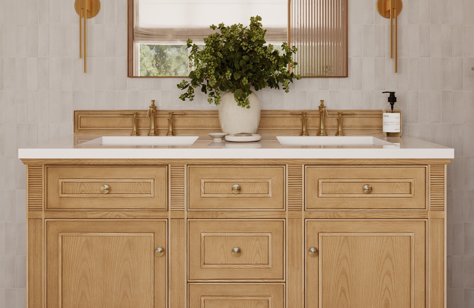
Countertops in beige, taupe, or creamy granite typically carry warm undertones, while surfaces in gray, white, or blue-veined marble lean cool. Matching backsplash tiles to these undertones avoids visual discord, ivory or sand-hued tiles enhance warmth, while crisp whites or soft greys reinforce cooler palettes. The gentle tonal variation of Edward Martin’s Natasha 2x6 Glossy Porcelain Tile in Bone, pictured above, is an excellent example of how a warm neutral backsplash can echo creamy stone countertops, ensuring balance that remains consistent under both natural and artificial lighting.
Using Contrast to Define Focal Points
Strategic contrast can highlight either the countertop or the backsplash as the design’s centerpiece. A dark quartz countertop with cool undertones gains emphasis when paired with lighter subway tiles in the same tonal family. Conversely, a pale marble counter can be grounded with slate or charcoal tiles that maintain tonal harmony while adding depth. This contrast provides balance and helps delineate focal planes without clashing.
The Value of Monochromatic Color Schemes
For a more unified look, monochromatic schemes leverage variations in shade rather than undertone. Pairing a grey-veined quartz countertop with backsplash tiles in graduated shades of grey creates continuity while preventing monotony. Subtle shifts in texture, such as a polished counter against a matte tile, add dimension within a single color family. This approach is especially effective in contemporary or minimalist designs where cohesion is prioritized over bold contrast.

Navigating Busy Patterns The Scale and Focus Test
With color established, pattern comes into play. Balancing bold surfaces through careful scaling and focal points keeps the design dynamic without overwhelming the space.
Determining Visual Dominance of the Countertop
Countertops often serve as the largest uninterrupted surface in a kitchen, making them the natural focal point. If the slab features bold veining, strong speckling, or directional movement, the backsplash should act as a supporting element with restrained color and minimal pattern. Conversely, a subtle, solid-surface countertop allows for a more decorative backsplash, ensuring visual balance rather than competition between the two planes.
Introducing Pattern Through Tile Geometry
Pattern need not always come from surface decoration; geometry can provide visual rhythm without overwhelming the space. Subway, herringbone, or hexagonal tile layouts introduce interest while remaining secondary to a dominant countertop. The compact format of Edward Martin’s Dani 1.6x5 Matte Ceramic Tile in Cream, pictured above, illustrates how smaller-scale tiles can create a subtle yet refined grid effect, pairing beautifully with expansive, solid countertops. Scaling also matters: small-format tiles highlight proportion in larger spaces, while bigger formats or linear layouts suit counters with heavier veining or texture, maintaining overall balance.
The Role of Grout in Pattern Definition
Grout color and joint thickness significantly affect how a backsplash pattern reads. A high-contrast grout emphasizes individual tile shapes, intensifying visual complexity, best paired with understated counters. Low-contrast grout, on the other hand, softens transitions, allowing intricate countertops to remain the focus. Technical choices such as epoxy versus cementitious grout also influence maintenance and appearance over time, reinforcing both function and design intent.

Why Tile Size and Layout Matter for Seamless Design
Beyond color and pattern, the size and arrangement of tiles shape the flow of your kitchen. Thoughtful layout choices help align edges, sightlines, and overall proportions.
Using Scale to Influence Visual Flow
Tile scale governs rhythm and proportion in a space. Large-format tiles minimize grout lines, creating cleaner planes that suit contemporary kitchens or spaces with open sightlines. Smaller tiles, such as mosaics, introduce texture and movement but can feel busy if paired with countertops that already have prominent veining or speckling. Matching tile scale to room size and countertop detailing ensures balance rather than distraction.
Layout Options That Complement Countertop Edges
Tile orientation interacts directly with countertop edges and cabinetry lines. A horizontal subway layout elongates walls and echoes straight countertop runs, while vertical stacking can draw the eye upward to highlight upper cabinetry. Diagonal or chevron layouts introduce dynamic energy but should be considered carefully in relation to countertop patterns, as competing angles may disrupt visual cohesion. Alignment with countertop seams and edge profiles further strengthens the sense of precision in the overall design.
The Seamless Look of Slab Backsplashes
For homeowners seeking minimal interruptions, slab backsplashes extend countertop material vertically for a continuous surface. This eliminates grout lines altogether, emphasizing the natural veining or coloration of stone, quartz, or porcelain panels. While slabs deliver a sleek, uninterrupted effect, options like Edward Martin’s Cleo 2x6 Glossy Ceramic Tile in Bone, shown above, can replicate this look on a smaller scale. Its reflective surface and soft tonal movement create the illusion of seamless flow, offering a polished alternative where full slab installation may not be practical. Beyond aesthetics, both approaches enhance durability and ease of maintenance in high-use zones.

The Essential Final Checks Before Installation
After planning materials, colors, patterns, and layout, the last step is reviewing details before installation. Testing samples, timelines, and visual impact ensures your design comes together seamlessly.
Testing Tile Samples Under Kitchen Lighting
Lighting dramatically alters how colors and textures appear. Tile samples should be tested under both natural daylight and artificial task or ambient lighting to confirm undertones and finishes align with the countertop. Glossy tiles may create unwanted glare beneath under-cabinet lighting, while matte finishes can absorb light and appear darker than anticipated. Edward Martin’s Augmented Reality (AR) Visualization Tool allows homeowners and designers to preview tiles virtually in their own kitchens, making it easier to narrow down options. Once a favorite look is identified, ordering Edward Martin tile samples provides a tangible check, ensuring the digital preview matches real-world lighting conditions before full installation.
The Importance of Budget and Lead Time Alignment
Project timing and cost considerations must be verified before ordering materials. Specialty tiles or large-format slabs often require extended lead times that can impact scheduling. Confirming unit pricing, waste allowances (typically 10–15% extra), and shipping timelines helps avoid delays or budget overruns. Aligning procurement with contractor availability ensures a smooth workflow without costly downtime.
Visualizing the Full Height Installation
Backsplashes are highly visible vertical planes, and their scale impacts the entire kitchen composition. Before committing, mockups or digital renderings should be reviewed to visualize the tile at full height, from countertop to upper cabinetry or range hood. The layered tone of Edward Martin’s Natasha 2x6 Glossy Porcelain Tile in Fog, shown above, demonstrates how a backsplash can transform when applied floor-to-ceiling, creating depth while maintaining cohesion. This process also reveals whether grout lines align properly and ensures focal areas, such as cooktop backdrops, achieve the intended effect.
Creating Your Ultimate Countertop and Backsplash Combination
The countertop and backsplash are two halves of the kitchen’s visual equation, and achieving the perfect match is about ensuring both pieces tell the same story without shouting over each other. The core principles of success involve respecting material textures, aligning color undertones, and controlling pattern scale.
By meticulously applying the five steps in this guide, harmonizing materials, analyzing color bases, balancing pattern weight, controlling size and layout, and conducting final visual tests, you move beyond guesswork and into confident, professional-level design. We at Edward Martin encourage you to embrace the challenge and use these surfaces to express the unique personality of your home.