


Wall art is often treated as the final layer of a room, yet its impact can reshape the entire design narrative. Although many assume that artwork must strictly match the surrounding decor, the reality is far more flexible. In well-composed interiors, wall art can either reinforce an existing style or introduce contrast that adds depth, character, and visual intrigue.

Understanding Design Harmony Versus Contrast
Design cohesion does not always depend on exact stylistic matching. Instead, it is often achieved through a careful balance between harmony and contrast, where elements either align to create unity or diverge to introduce visual interest. Understanding how these two principles interact allows you to make more intentional decisions, ensuring that wall art enhances the space rather than feeling disconnected or arbitrary.
Creating Cohesion Through Visual Alignment
Aligning wall art with the existing decor style is one of the most straightforward ways to establish a cohesive interior. When artwork reflects the same design language as the surrounding furnishings, it reinforces a sense of continuity that makes the space feel well-composed. This alignment can be achieved through similarities in form, subject matter, or stylistic approach. For example, abstract compositions with clean lines and minimal color variation integrate seamlessly into contemporary interiors, while more traditional artworks, such as landscapes or portraiture, complement classic settings with detailed millwork and ornate furnishings.
Beyond subject matter, cohesion is also influenced by framing and presentation. Frame materials, finishes, and proportions should relate to other elements in the room, such as furniture hardware or architectural details. A consistent framing approach can unify a collection of artworks, even if the individual pieces vary slightly in style. Additionally, maintaining a controlled color palette within the artwork helps reinforce visual alignment, ensuring that the art feels like an extension of the overall design rather than an isolated feature. Through these strategies, wall art contributes to a polished and harmonious environment.
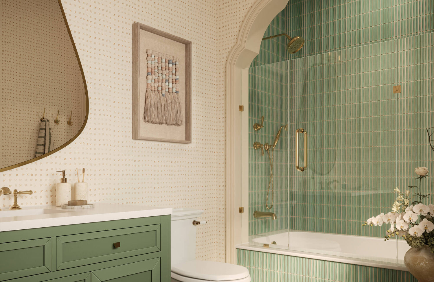
A piece like the Shaded Distance Wall Art demonstrates how subtle tonal variation and understated composition can enhance cohesion without overwhelming the space. Its soft, layered design complements neutral palettes and architectural elements, making it especially effective in interiors that prioritize warmth, texture, and quiet sophistication like the one shown above.
Using Contrast to Add Depth and Interest
Although cohesion creates stability, contrast introduces energy and complexity, preventing a space from feeling overly uniform. Incorporating wall art that differs from the prevailing decor style can create a dynamic interplay that draws attention and adds character. This approach is particularly effective in interiors that risk appearing too predictable or restrained, as contrast can serve as a focal point that elevates the overall composition.
Successful contrast also requires careful calibration to avoid visual discord. Rather than introducing completely unrelated elements, you can establish a subtle connection through color, scale, or thematic undertones. For instance, a contemporary abstract piece placed within a traditional setting may still share a complementary color palette or similar proportions, allowing it to stand out without appearing out of place. This technique creates what is often referred to as “intentional tension,” where differences are perceived as deliberate and refined rather than accidental.
Additionally, contrast can be used to highlight specific areas within a room. Placing a bold or unconventional artwork in a central location, such as above a fireplace or sofa, can anchor the space and guide visual focus. When applied thoughtfully, contrast enhances depth, introduces individuality, and transforms wall art into a defining feature rather than a secondary element.

The Role of Color in Connecting Art and Decor
Color serves as one of the most powerful unifying elements in interior design, often bridging the gap between wall art and surrounding decor. Even when stylistic differences exist, a well-considered color strategy can create visual continuity that allows diverse elements to coexist harmoniously. By focusing on hue, saturation, and tonal relationships, wall art can be integrated into a space in a way that feels intentional rather than incidental.
Repeating Key Colors Across the Space
One of the most effective methods for connecting wall art to a room is through the repetition of key colors already present in the environment. These colors may originate from major design elements such as upholstery, area rugs, drapery, or even architectural finishes. By selecting artwork that incorporates these hues, you create a visual thread that links different components of the space, reinforcing cohesion without requiring stylistic uniformity. Edward Martin’s Northland Memory Wall Art, seen in the image above, exemplify this approach, drawing from warm wood tones and earthy neutrals to echo the surrounding materials while subtly enhancing the overall palette.
This approach benefits from subtlety rather than exact duplication. Instead of matching colors precisely, varying tones within the same color family can introduce depth while maintaining harmony. For example, if a room features warm neutrals and soft earth tones, artwork that includes layered variations of those hues can enhance the overall palette without appearing redundant. Additionally, repeating secondary or accent colors found in smaller accessories can strengthen connections across the space, ensuring that no single element feels isolated. Through this method, wall art becomes an integrated part of the design rather than a separate visual statement.
Leveraging Accent Colors for Visual Balance
In addition to reinforcing existing tones, wall art can be used to introduce or amplify accent colors that bring energy and balance to a room. Accent colors are typically used sparingly throughout a space to create contrast and visual interest, and artwork provides an ideal platform for incorporating these hues in a controlled and impactful way.
Strategic placement of accent-colored artwork can also help distribute visual weight evenly across the room. For instance, if a bold color appears in one area, incorporating that same hue within a piece of art elsewhere can create a sense of balance and prevent the composition from feeling lopsided. This technique is particularly useful in larger or open-plan spaces, where visual continuity must be maintained across multiple zones.
Furthermore, the intensity of accent colors should be carefully calibrated. Highly saturated tones can act as focal points, drawing the eye and energizing the space, while more muted accents provide a softer, more understated effect. By thoughtfully integrating accent colors through wall art, you can achieve a balanced composition that supports both cohesion and visual dynamism.

Considering Scale and Placement for Integration
Scale and placement are fundamental to how wall art is perceived within a space, often determining whether it feels integrated or disconnected. Regardless of style, properly proportioned and well-positioned artwork can unify a room by aligning with its architectural framework and furniture layout. When these factors are carefully considered, even contrasting pieces can appear intentional and cohesive within the overall design.
Matching Art Size to Furniture and Walls
Selecting the appropriate size of wall art begins with evaluating its relationship to nearby furniture and the dimensions of the wall. Artwork should visually correspond to the width and mass of the piece it accompanies, such as a sofa, console, or bed. A commonly accepted guideline is that wall art should span approximately two-thirds to three-quarters of the furniture’s width, ensuring that it feels anchored rather than isolated. With its balanced proportions and refined composition, the Borrowed Dawn Wall Art, displayed above, offers a clear example of how artwork can anchor a wall while complementing surrounding elements without overpowering them.
Equally important is the proportion of the artwork to the wall itself. Large, open walls can accommodate oversized pieces or grouped arrangements that create a strong focal point, while smaller or more confined areas benefit from a single, well-scaled piece that maintains visual clarity. In addition to physical dimensions, perceived scale should also be considered. Elements such as bold color, dense composition, or heavy framing can increase visual weight, making a piece feel larger than its actual size.
Positioning for Visual Flow and Continuity
Placement plays a critical role in establishing visual flow and ensuring that wall art contributes to a cohesive environment. One of the most effective strategies is to position artwork at eye level, typically with the center of the piece approximately 57 to 60 inches from the floor. This standard creates a comfortable viewing experience and maintains consistency across different areas of the space.
In addition to height, the relationship between the artwork and surrounding elements must be carefully managed. Maintaining a consistent distance, often between six to ten inches, between the bottom of the artwork and the top of adjacent furniture helps create a clear visual connection. This spacing acts as a transitional zone, allowing the eye to move smoothly between elements.
For multiple pieces or gallery arrangements, alignment and spacing become even more critical. Consistent gaps between frames and a clear organizational structure, whether grid-based or asymmetrical, help unify the composition. By thoughtfully considering placement and alignment, wall art can guide the viewer’s eye, enhance spatial continuity, and integrate seamlessly with a variety of decor styles.

Blending Multiple Styles Intentionally
Combining different wall art styles within a single space can result in a more layered and personalized interior, provided the approach is deliberate and well-structured. Rather than aiming for strict uniformity, successful design often relies on curated contrast, where varied elements coexist under a cohesive framework. By understanding how to guide these combinations, you can create interiors that feel dynamic, expressive, and thoughtfully composed.
Establishing a Unifying Element
When mixing multiple art styles, establishing a unifying element is essential to maintain visual cohesion. This element acts as a connective thread that ties diverse pieces together, preventing the arrangement from appearing fragmented. Common unifying factors include a consistent color palette, similar framing materials, or a shared thematic direction such as nature, abstraction, or geometry. Artwork like the Quiet Study Wall Art, featured above, demonstrates how a subdued palette and refined composition can act as a visual anchor, helping bridge varied pieces within a gallery-style arrangement.
Color is often the most effective tool in this process. Even when artworks differ significantly in style, repeating key hues across each piece can create a sense of continuity. Similarly, using uniform frames or finishes can visually align a collection, giving it a cohesive structure regardless of the artwork itself. Scale and spacing can also function as unifying principles, ensuring that each piece relates proportionally to the others within the composition.
Balancing Dominant and Secondary Styles
In addition to establishing cohesion, it is important to create a clear hierarchy when mixing styles. Allowing one design style to dominate while others serve as secondary accents helps maintain visual clarity and prevents the space from feeling disjointed. The dominant style typically aligns with the overall interior design direction, setting the tone for the room, while secondary styles introduce variation and interest.
This balance can be achieved through proportion and placement. For example, larger or more centrally positioned artworks can reflect the primary style, anchoring the space, while smaller or more subtly placed pieces introduce complementary or contrasting influences. This approach ensures that the eye is guided naturally through the composition, rather than being overwhelmed by competing elements.
Additionally, restraint plays a key role in maintaining balance. Limiting the number of contrasting styles and ensuring that each has a defined role within the design prevents visual clutter. When thoughtfully managed, this hierarchy allows for creative expression while preserving a sense of order, resulting in an interior that feels both cohesive and richly layered.

Reflecting Personal Expression Over Strict Rules
Wall art holds a uniquely personal role in interior design, often serving as a direct reflection of individual taste, experiences, and identity. Although design principles provide valuable guidance, prioritizing personal expression can result in spaces that feel more authentic and meaningful. By allowing art to transcend rigid stylistic rules, interiors gain character and depth that cannot be achieved through uniformity alone.
Choosing Art That Resonates Emotionally
Selecting artwork based on emotional connection is one of the most impactful ways to shape a space. Pieces that evoke memories, inspire creativity, or reflect personal interests contribute to an environment that feels genuinely lived in rather than purely styled. This approach shifts the focus from matching decor to creating a narrative, where each piece of art carries significance beyond its visual qualities.
Emotional resonance can also stem from a variety of sources, including travel experiences, cultural influences, or personal milestones. For example, a painting acquired during a meaningful trip or a print that reflects a favorite subject matter can introduce a sense of individuality that elevates the overall design. Although these pieces may not always align perfectly with the existing decor style, their presence adds authenticity and depth, making the space more engaging and personal.
Curating a Collected Rather Than Styled Look
A collected approach to wall art emphasizes gradual curation rather than immediate coordination. Instead of selecting pieces all at once to match a predefined style, this method encourages incorporating artwork over time, allowing the collection to evolve naturally. The result is a layered aesthetic that reflects personal growth and changing preferences, creating a more dynamic and lived-in environment.
This approach also allows for greater diversity in style, medium, and subject matter. By thoughtfully integrating new pieces alongside existing ones, a cohesive look can still be achieved through subtle connections such as color, scale, or framing. Unlike perfectly matched arrangements, which can sometimes feel staged, a collected display introduces variation that feels organic and visually engaging.

Practical Guidelines for Decision Making
Selecting wall art can feel complex, particularly when balancing style, scale, and personal preference. However, applying a structured approach helps streamline the process and ensures that each choice contributes meaningfully to the overall design. By considering both functional and aesthetic factors, wall art can be integrated in a way that feels intentional, cohesive, and well-suited to the space.
Evaluating the Room’s Purpose and Atmosphere
The function of a room plays a significant role in determining the most appropriate style and composition of wall art. Spaces designed for relaxation, such as bedrooms or reading areas, often benefit from artwork with softer tones, minimal contrast, and calming subject matter. These choices help reinforce a restorative environment without introducing visual overstimulation.
In contrast, social or busy areas, such as living rooms, dining spaces, or entryways, can support more dynamic and expressive artwork. In these settings, bolder compositions, higher contrast, or more complex subject matter can enhance energy and encourage interaction. The goal is to align the visual character of the artwork with the intended mood of the space, ensuring that it supports rather than conflicts with how the room is used.
Testing Combinations Before Finalizing
Before committing to a final arrangement, it is essential to evaluate how different pieces interact within the space. Testing combinations allows for adjustments in scale, placement, and visual balance, reducing the likelihood of misalignment once the artwork is installed. One effective method is to arrange pieces on the floor or use paper templates on the wall to simulate their placement, providing a clearer sense of proportion and spacing.
Digital tools can also assist in this process by allowing users to visualize artwork within a photographed interior. These previews help assess how colors, styles, and compositions will interact with existing elements such as furniture and lighting. Additionally, temporarily leaning artwork against walls rather than immediately mounting it offers flexibility to refine positioning over time.
Wall art does not need to match the decor style to be effective. Instead, it should complement the space through a balance of cohesion and contrast, allowing it to either blend seamlessly or stand out with purpose. When guided by consistent elements such as color relationships, proportion, and thoughtful placement, even contrasting styles can feel integrated and refined. Ultimately, the most impactful interiors embrace flexibility, using wall art to enhance the overall design while reflecting personal taste and creating a space that feels both curated and authentic. Achieving this balance often becomes easier with the right guidance and a clear design direction. Whether you're selecting a single statement piece or curating a full gallery wall, expert insight can help ensure each element works harmoniously within your space. If you need assistance refining your vision or choosing the perfect pieces, our team is here to help. Feel free to reach out—we’re dedicated to supporting you in creating a space that feels thoughtfully designed and uniquely yours!Finding the Right Balance Between Matching and Mixing


