


In the ever-evolving world of home decor, certain design elements possess a timeless versatility that allows them to adapt to new trends. White tiles, with their clean lines and reflective surface, are a classic choice for kitchens and bathrooms, but can they truly harmonize with the layered, textured, and often earthy aesthetics of rustic or bohemian style?
This blog explores how to bridge these seemingly opposite worlds and create a space that is both visually cohesive and deeply personal. We'll show you how to blend the clean simplicity of white tile with the warmth and character of these popular decor styles.

The Foundation of White Tile
Before diving into specific styles, it’s important to understand why white tile has long been considered a design essential. Its neutrality, adaptability, and clean surface make it the perfect foundation for layering other materials and details.
Why White Tiles Are an Ideal Base
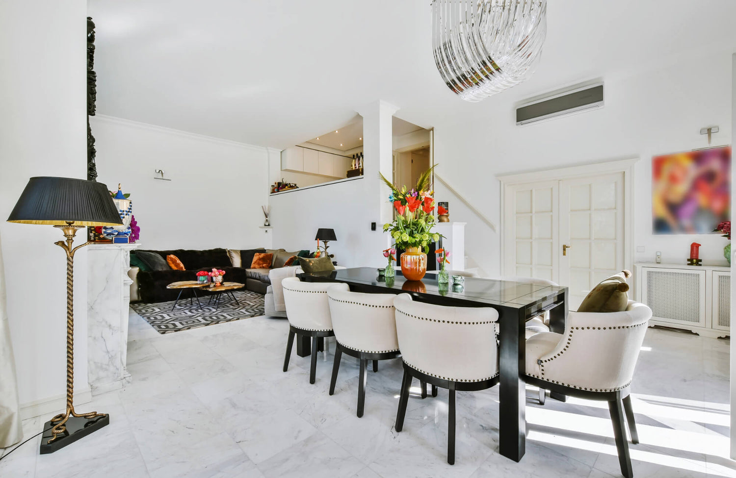
White tiles act as a visual stabilizer in both contemporary and traditional spaces. Their reflective surface enhances natural and artificial light, making rooms appear larger and more open. Within the design pictured above, Edward Martin’s Teagan 3x12 Glossy Ceramic Tile in Pearl introduces a luminous finish that adds depth while maintaining a neutral foundation. This adaptability allows white tiles to integrate seamlessly with diverse palettes, from earthy rustic tones to vibrant bohemian hues, while ensuring longevity in style. Designers often rely on white as a grounding element, offering flexibility for future updates without requiring a full renovation.
Exploring Texture and Shape Beyond Plain White
The versatility of white tile extends beyond its color. Variations in finish, such as glossy, matte, or crackle glaze, dramatically alter the atmosphere of a room. Three-dimensional designs, like beveled subway tiles or handmade zellige-inspired pieces, add tactile depth and artisanal character. Shape is equally influential, with hexagons, chevrons, and elongated rectangles introducing geometry that enriches otherwise simple surfaces. These technical variations elevate white tile from a blank surface to a curated design element.
The Power of Grout and Installation Pattern
Grout color and layout strategies significantly influence the overall effect of white tile. Dark grout lines emphasize structure and rhythm, creating graphic impact in herringbone or basketweave patterns, while light grout fosters a seamless, continuous surface. Advanced installation methods, such as stacked bonds for a modern aesthetic or diagonal layouts for visual movement, further expand design possibilities. By carefully considering grout tone and tile orientation, professionals can transform the same white tile into dramatically different outcomes, from understated backdrops to striking focal walls.

Grounding Your Design with Natural and Rustic Materials
Once that foundation is in place, adding natural elements like wood, metal, and clay helps anchor the space with warmth and authenticity. These rustic touches bring texture and balance, ensuring the design feels both inviting and grounded.
The Warmth of Wood and Wicker
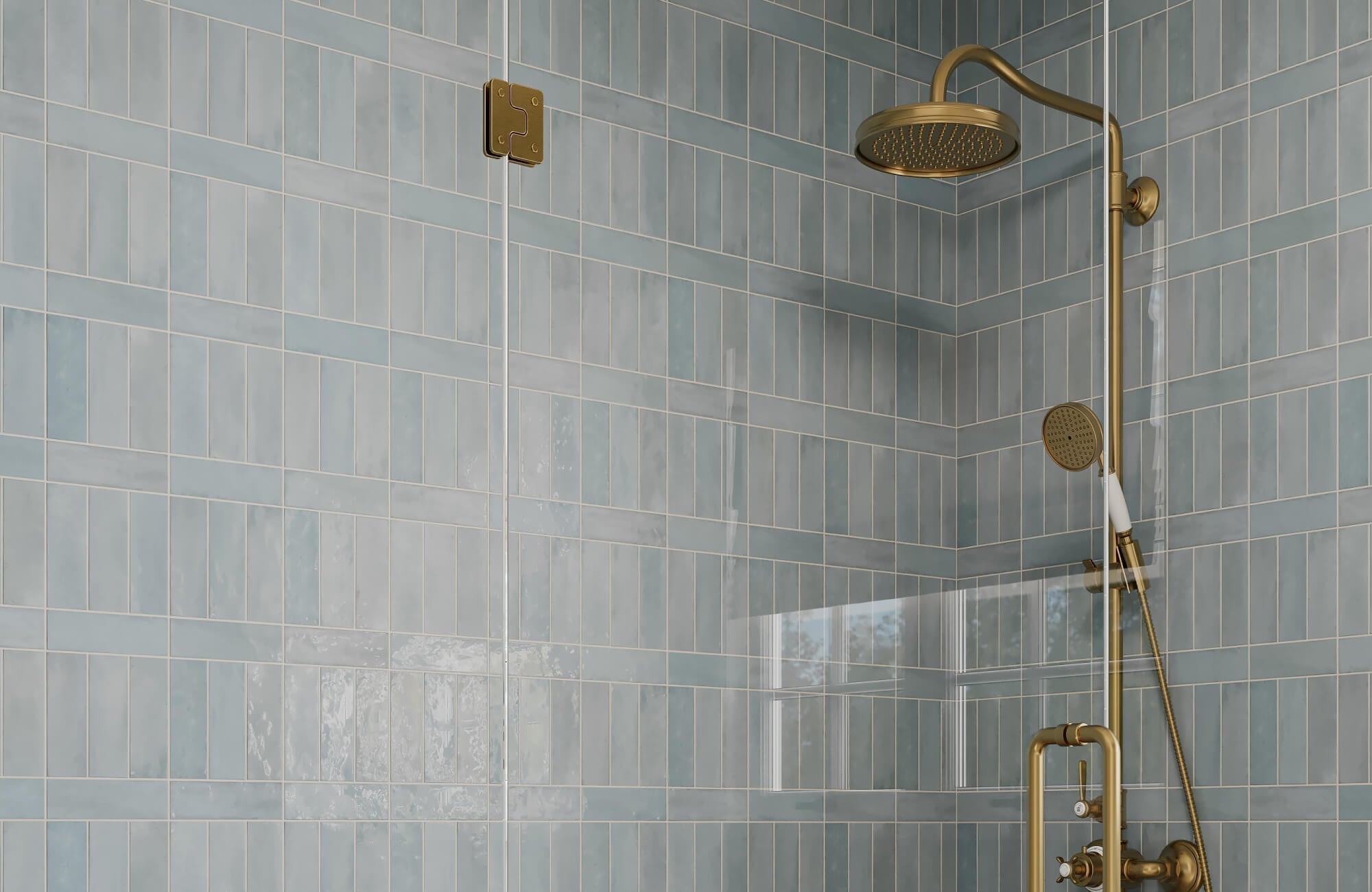
Wood and wicker are cornerstones of rustic design, valued for their organic textures and natural variation. Reclaimed wood flooring or exposed beams add patina and a sense of history, while lighter oak or pine surfaces brighten interiors without losing character. Wicker, whether used in accent chairs, pendant lighting, or woven baskets, introduces an artisanal, hand-crafted quality. Seen in the bathroom above, Edward Martin’s Sarina 3x12 Glossy Ceramic Fishscale Tile in Cloud pairs effortlessly with wood tones, its soft curves easing rigid lines and contributing to a lived-in, welcoming atmosphere.
Finding Harmony with Raw Metals
Raw metals such as iron, copper, and brass introduce structural strength while maintaining a rustic edge. Left untreated, these materials develop a natural patina over time, copper may acquire a greenish verdigris, while iron darkens with oxidation, adding layers of character to the design. Exposed hardware, hand-forged light fixtures, and industrial-inspired furniture pieces create contrast against softer natural finishes like wood or linen. Designers often balance metal’s cool undertones with warmer, organic materials to prevent spaces from feeling overly stark, achieving harmony through contrast.
Embracing the Imperfection of Clay and Terracotta
Clay and terracotta embody rustic authenticity through their earthy tones and irregular textures. Hand-molded terracotta tiles, with subtle variations in shape and glaze, highlight craftsmanship while offering excellent thermal properties, absorbing and slowly releasing heat for natural climate control. Unglazed clay pottery and vessels further emphasize imperfection, contributing a tactile richness that machine-made products lack. These materials connect interiors to centuries-old traditions, particularly Mediterranean and Southwestern design, where terracotta is prized for its durability and organic beauty. By embracing their imperfections, designers foster spaces that feel grounded, warm, and genuinely human.

Infusing Color and Pattern for a Bohemian Vibe
With a grounded base established, introducing color and pattern opens the door to a more eclectic, free-spirited aesthetic. Layering textiles, saturated hues, and intentional objects transforms the neutral backdrop into a bohemian-inspired space full of personality.
The Art of Layering Textiles
Layering is central to the bohemian aesthetic, with textiles providing the foundation for depth and visual intrigue. Kilim rugs, suzani throws, and embroidered cushions introduce global influences while creating tactile variety. Mixing materials, such as linen with velvet or cotton with wool, enhances the sensory experience and prevents monotony. Overlapping rugs or draping fabrics over furniture also softens architectural edges, fostering a relaxed, inviting atmosphere. In the laundry space above, Edward Martin’s Aniston 2x2 Matte Porcelain Hexagon Mosaic Tile in Carrara Bianco echoes the layered quality of bohemian styling, its geometric pattern adding rhythm without overwhelming surrounding details.
Bringing in Earth Tones and Saturated Hues
Color is essential to bohemian design, where earth tones serve as grounding elements and saturated hues provide vibrancy. Warm neutrals like ochre, sand, and terracotta establish a natural base, while jewel tones, emerald, sapphire, and deep magenta, add richness and drama. Designers often rely on analogous color schemes to maintain harmony or strategically use complementary contrasts for focal points. Layering colors in textiles, ceramics, and wall treatments allows spaces to feel dynamic yet cohesive, reflecting the free-spirited energy of the style without overwhelming the eye.
Decorating with Intentional Objects
While bohemian spaces often appear eclectic, the best examples are carefully curated with intention. Handcrafted ceramics, vintage lanterns, and artisan-made baskets introduce cultural narratives and authenticity. Objects with visible patina, such as weathered wood or aged brass, add character and a sense of history. The strategic placement of these items, whether clustered on open shelving or arranged as focal vignettes, ensures the room feels personal rather than cluttered. This intentional layering of objects and materials transforms a bohemian interior into a lived-in, storied space.

Creating a Rustic Look with Dark and Weathered Finishes
Finally, for those drawn to a more rugged aesthetic, darker tones and aged surfaces add depth and character. These weathered finishes build on the earlier layers, reinforcing rustic charm while complementing the clean versatility of white tile.
Accentuating with Dark and Distressed Accents
Dark, distressed finishes immediately establish rustic character by emphasizing grain, texture, and wear. Weathered oak cabinetry, hand-scraped hardwood flooring, or distressed leather upholstery introduce a lived-in quality that modern finishes often lack. These surfaces showcase irregularities, such as knots, saw marks, and subtle color variation, that tell a visual story. Featured in the bathroom above, Edward Martin’s Ollie 3/4x3/4 Matte Porcelain Mosaic Penny Round Tile in White acts as a refined counterbalance, its crisp detailing tempering the heaviness of darker finishes and helping maintain a grounded yet approachable aesthetic.
The Charm of Open and Exposed Elements
Exposed finishes highlight the honesty of materials, a hallmark of rustic design. Dark-stained ceiling beams, weathered brick walls, and visible steel brackets add structural integrity while reinforcing a raw, unrefined aesthetic. These open elements create contrast when paired with softer surfaces like linen upholstery or natural fiber rugs, balancing strength with comfort. The tactile interplay of rough-hewn wood against smooth plaster or metal enhances visual interest, while maintaining a cohesive, grounded design language.
Blending Rustic with Traditional Farmhouse Elements
Rustic interiors gain added richness when blended with farmhouse influences. Shaker-style cabinetry finished in deep stains, apron-front sinks paired with dark iron hardware, and wide-plank barn doors offer functionality rooted in tradition while complementing rustic aesthetics. Farmhouse elements provide structure and utility, while weathered finishes reinforce age and authenticity. This combination allows designers to maintain practicality without losing character, striking a balance between refined comfort and rugged charm that resonates in both rural and contemporary homes.
White Tiles as a Design Bridge
White tiles demonstrate remarkable adaptability, serving as a unifying thread between rustic and bohemian aesthetics. In rustic settings, their clean surfaces balance the weight of reclaimed wood or hand-forged metal, creating harmony without diluting character. In bohemian spaces, they provide a calm backdrop that allows layered textiles, saturated hues, and artisanal accents to shine without competition.
To make the design process effortless, Edward Martin’s Augmented Reality (AR) Visualization Tool lets you preview white tiles directly in your space, while the tile sample ordering feature ensures you can confirm texture and finish in person, bridging the gap between inspiration and confident choice.
