


Should pendant lights match the other fixtures in a room? It’s a common design dilemma, and the answer is more nuanced than a simple yes or no. While a uniform look can create visual consistency, today’s most compelling interiors often rely on contrast, complementary materials, and thoughtful variation.
Achieving cohesion without exact matching calls for a deliberate approach grounded in key design principles: scale, balance, layering, and lighting performance. From mixing finishes to coordinating color temperature and lumen output, every detail contributes to the overall harmony of a space. In this blog, we’ll break down when it makes sense to match, and when to mix, with expert guidance to help you design with clarity and confidence.

The Traditional Viewpoint of Matching Fixtures
For years, matching every light fixture in a space was considered the gold standard in home design, a rule rooted in tradition and visual symmetry. However, as styles evolve and interiors become more personalized, it's worth revisiting why this approach held such appeal, and when it still holds value today.
The "Matchy-Matchy" Aesthetic
Traditionally, the "matchy-matchy" aesthetic, where fixtures align in material, finish, and form, historically offered a sense of order and predictability that appealed to traditional sensibilities. A kitchen, for instance, might feature brushed nickel pendants, cabinet hardware, and faucets from the same product line, resulting in a clean, unified look.
Moreover, matching helps reduce visual clutter, particularly in smaller or more formal spaces where symmetry and repetition are key to spatial clarity. Manufacturers have long catered to this design preference by offering coordinated collections, pendants, chandeliers, and sconces, making it easier to achieve a consistent and polished finish.
When Strict Matching Still Makes Sense
That said, even as design preferences shift toward mixed styles and finishes, there are still cases where strict matching is not only appropriate but advisable. For instance, in homes with classical, colonial, or craftsman architecture, matching fixtures support architectural authenticity and maintain stylistic continuity.
Furthermore, in open-concept layouts where multiple functional zones are visible at once, matching fixtures can serve as visual anchors. This continuity is especially helpful in minimal or neutral-toned environments. As shown above, our Santos Pendant in Vintage Gold Leaf by Edward Martin showcases how sculptural form and woven texture deliver both purposeful illumination and visual cohesion when used in repetition.
Finally, in commercial settings like boutique bakeries or hospitality environments, matching fixtures serve a purposeful function. They help establish rhythm, communicate brand identity, and create a polished, curated experience that leaves a lasting impression.

Embracing Intentional Contrast and Complementary Design
As lighting design moves beyond rigid uniformity, many are discovering the creative freedom that comes with contrast. By shifting the focus from matching to intentional coordination, spaces gain depth, personality, and a more curated feel.
Complementary Elements
At its core, complementary design isn’t about clashing styles; it’s about purposefully combining varied elements that share a common visual language. Contrasts in finish, shape, or scale can create layered interiors that feel collected and deliberate. For example, pairing matte black pendants with warm brass sconces introduces both dimension and cohesion when unified by consistent features like clean lines or geometric forms.
In addition, material contrast can significantly enhance a room’s texture and richness. Mixing oil-rubbed bronze with antique gold, or glass pendants with wood or rattan accents, adds tactile interest, so long as the undertones align and bulb temperatures remain consistent. By grounding these choices within a broader design narrative, such as coastal, transitional, or modern-industrial, the result feels intentional, not improvised.
A well-executed example of this approach is Edward Martin’s Phineas Pendant in Historic Bronze. As seen above, its classical silhouette and substantial presence make it a natural bridge between traditional millwork and contemporary cabinetry, offering tonal harmony without aesthetic rigidity.
The Power of the Statement Piece
Building on the concept of contrast, statement lighting takes this principle even further. In today’s interiors, fixtures often serve as focal points, intentionally bold in scale, shape, or finish. Whether it’s a dramatic chandelier or a sculptural pendant, these pieces are meant to stand apart and define the space.
For instance, placing a sleek globe pendant over a rustic farmhouse table creates a tension that feels fresh and unexpected. Similarly, in bathrooms, asymmetrical sconces or oversized pendants can evoke a boutique-hotel atmosphere through purposeful contrast and unconventional placement.
That said, striking the right balance is essential. To keep the overall composition harmonious, supporting fixtures should remain visually quiet, allowing the statement piece to lead. A layered lighting plan, blending ambient, task, and accent sources, ensures both functional performance and aesthetic clarity. Finally, thoughtful specs like dimmable controls and high CRI (Color Rendering Index) ratings help your showpiece shine not only in design but also in usability.

Key Elements to Consider Beyond Exact Matching
Once you move past the idea of perfectly matched fixtures, the real work lies in balancing the details that make a space feel intentional. Elements like finish, scale, and light quality are essential for tying different fixtures together, both visually and functionally.
Finish and Material Harmony
One foundational strategy involves finish compatibility, choosing different materials and finishes that complement one another without looking identical. This approach is particularly effective in eclectic interiors, where a curated mix of styles and periods creates a layered, intentional look. For example, satin brass paired with aged bronze can feel unified when both share a warm undertone. Similarly, matte black pendants and pewter hardware can work together through their muted finishes and visual weight.
In addition, material interplay adds a layer of sophistication. A hand-blown glass pendant might echo the lines of a nearby mirror or the texture of a marble surface. When repeated thoughtfully, through elements like rattan, frosted glass, or ceramic, these materials create rhythm and continuity, tying the space together without relying on identical pieces.
Scale and Proportion
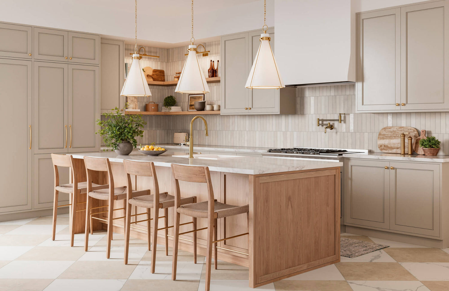
Equally important is scale. Lighting fixtures must align with both the room’s dimensions and their functional zone. For instance, a pendant above a kitchen island should be appropriately scaled, typically about 12 inches narrower than the surface below, with spacing between fixtures equal to their diameter.
Beyond individual sizing, maintaining visual hierarchy helps mixed fixtures work as a cohesive whole. Large pendants can act as focal points, while recessed or flush-mount fixtures provide subtle support. Aligning fixture scale with architectural details like ceiling height and room width avoids imbalance and visual competition.
A strong example of this principle is Edward Martin’s Sable Pendant in Distressed Bronze/Ceramic Ivory Crackle. As displayed above, its refined scale enhances the kitchen island without overwhelming it, and the warm contrast between glazed ceramic and metal introduces interest while staying visually grounded.
Light Temperature and Output
Lastly, light quality itself is vital to achieving cohesive, functional lighting. Consistency in color temperature, typically within the 2700K to 4000K range, is essential for creating a unified lighting atmosphere. Mixing drastically different temperatures can lead to a jarring or disjointed experience, particularly in open-concept layouts.
Likewise, lumen output must be balanced according to function. Bright, focused lighting is crucial in task areas like kitchen counters, while ambient zones benefit from softer, more diffused illumination. Integrating dimmers adds even more control, allowing lighting to adapt throughout the day or to suit specific moods and activities.
Taken together, these foundational elements, finish, proportion, and performance, offer a framework for mixing fixtures with confidence. When thoughtfully applied, they ensure your lighting plan feels intentional, cohesive, and perfectly suited to your space.

Designing by Room Type and Function
Lighting isn’t just about style; it’s about supporting how each room is used and experienced day to day. From task-heavy kitchens to relaxed living spaces and transitional hallways, every area benefits from a tailored approach to fixture choice and placement.
Kitchens and Bathrooms
In functional spaces like kitchens and bathrooms, lighting must strike a balance between utility and design. These task-driven environments require focused illumination as well as layered sources that contribute to the overall visual appeal. For instance, pendant lights above islands or vanities do more than brighten a surface; they provide structure and serve as visual focal points, particularly in open-concept or spa-inspired layouts.
In kitchen settings specifically, it’s common to pair metal-finish pendants with under-cabinet LED strips, recessed ceiling lights, and accent lighting within glass-front cabinetry. These elements should work in unison, and maintaining a consistent color temperature (typically 2700K–3000K) along with a cohesive finish or material palette helps unify the space.
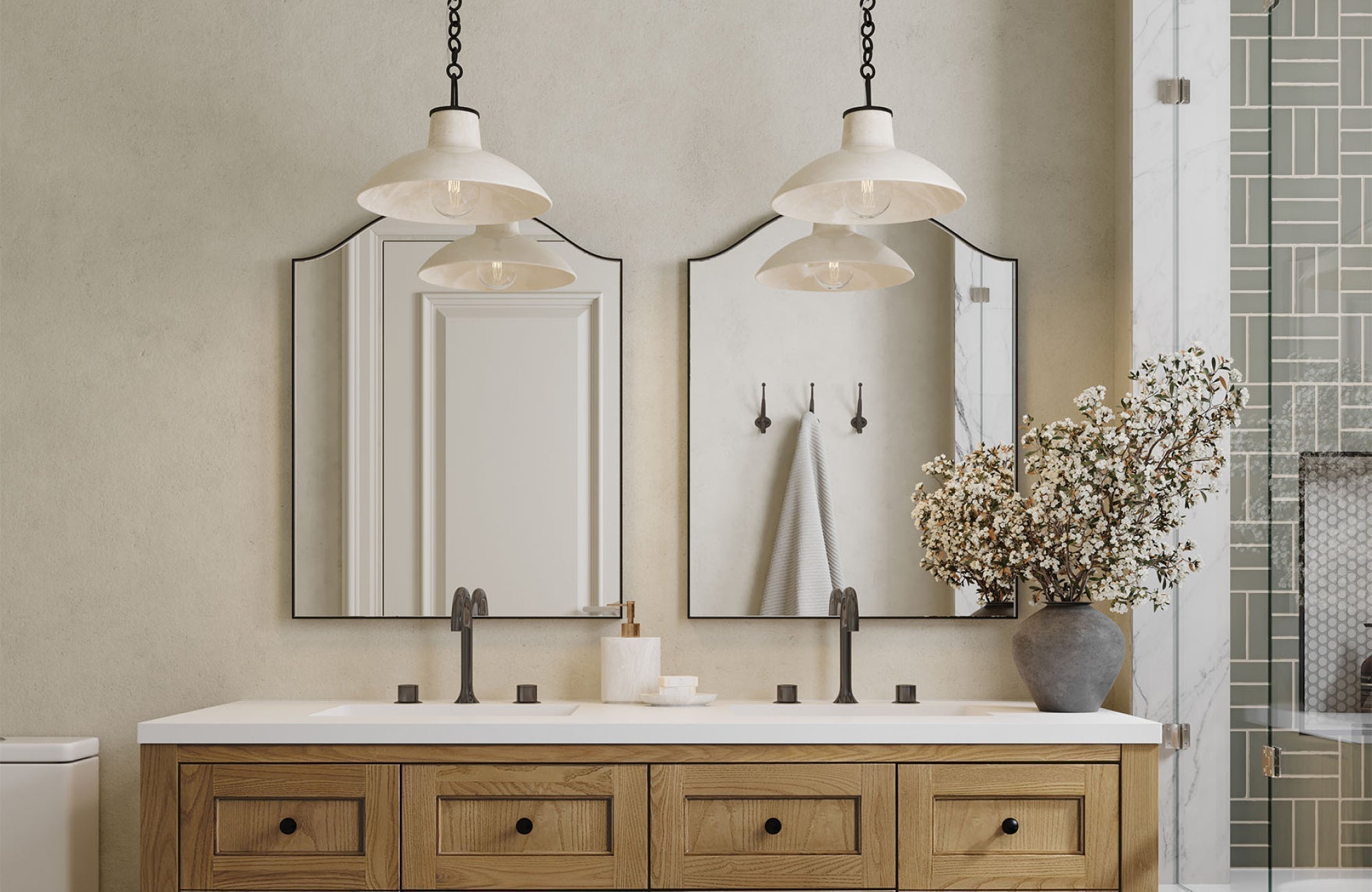
Moving into the bathroom, lighting continues to serve both functional and aesthetic purposes. Overhead pendants or sconces flanking a mirror should offer ample task light while enhancing the room’s aesthetic. While exact matches between kitchen and bathroom fixtures aren’t required, echoing certain elements, such as tone, silhouette, or diffuser material, can help maintain a sense of flow throughout the home. For example, frosted globe pendants above a vanity may visually connect with matte black kitchen pendants when their form or warmth aligns. Dimmers in both spaces allow lighting to adapt to different tasks and moods.
As a prime example, Edward Martin’s Kaley 11" Pendant in Aged Brass, featured above, illustrates this delicate balance. Its opal glass shade delivers soft, diffused light while complementing surrounding brass and wood accents, demonstrating how cohesion can be achieved without strict uniformity.
Living Rooms and Bedrooms
Transitioning to more relaxed spaces, living rooms and bedrooms focus on ambient and accent lighting to support comfort, flexibility, and mood. These areas typically rely on a mix of floor and table lamps, ceiling fixtures, and the occasional wall sconce. Instead of exact matches, these pieces are often linked by shared materials, finishes, or stylistic details such as mid-century curves or rustic wood accents.
In bedrooms, for example, bedside sconces or pendants are an increasingly popular alternative to traditional table lamps. These may contrast with a central semi-flush mount or chandelier, yet still feel cohesive when tied together through consistent metallic tones or similar shade materials. Moreover, using high CRI (Color Rendering Index) lighting, ideally 90 or above, ensures that colors appear accurate, an important consideration for daily routines like dressing or reading.
Meanwhile, living rooms benefit from their own kind of flexibility. They often accommodate varied activities, from reading to entertaining, so a layered lighting plan is essential. A statement chandelier can work alongside understated floor or table lamps made of wood, metal, or ceramic, provided the overall composition maintains balance. As in other rooms, dimmers are invaluable here, helping to shift the mood and function of the space throughout the day.
Entryways and Hallways
Although often overlooked, entryways and hallways help establish the overall tone of the home. In a foyer, a pendant or flush mount can act as both a practical source of light and a stylistic introduction. Whether you opt to match adjacent room fixtures or introduce subtle contrast, it's important that a consistent design language is present, such as a shared shape, finish, or material.
In hallways, the goal is to ensure both safety and stylistic continuity. Repetitive elements, like evenly spaced sconces or flush-mount lights, create architectural rhythm while visually linking longer corridors to surrounding rooms. Not every fixture needs to match exactly, but shared tones or forms can provide subtle cohesion. Additionally, indirect lighting, like cove or recessed options, offers opportunities to highlight artwork, paneling, or architectural features without overwhelming the space.
To help navigate these layered decisions, Edward Martin offers a design consultation service, which includes one-on-one sessions with a designer and dedicated follow-ups. This process ensures lighting choices align well with tile, rug, and furniture selections, creating unified interiors that feel both beautiful and functional.
For additional guidance, you can always contact the Edward Martin team. Whether you're refining a lighting scheme, selecting complementary finishes, or curating a complete fixture plan, our experts are ready to support your vision from concept to completion.

Exploring Different Design Styles and Their Lighting Approaches
Every design style brings its own language, and lighting is essential to expressing it. Whether your space leans modern, rustic, or classic, the way you choose and coordinate fixtures should reflect the character and rhythm of that aesthetic.
Modern and Minimalist Styles
At the forefront of contemporary design, modern and minimalist interiors emphasize clean lines, openness, and functional elegance. Lighting in these settings often features streamlined forms and refined finishes like matte black, brushed nickel, or powder-coated white. Instead of ornate detailing, the emphasis is placed on proportion and geometry; linear suspensions, globe pendants, and recessed lights are typical choices.
In keeping with the minimalist ethos, fewer lighting elements are used, each selected with intent. Fixtures are spaced precisely to establish rhythm and avoid visual clutter. Rather than relying on matching finishes, these spaces maintain consistency through tonal harmony and material restraint. Additionally, concealed lighting options, such as cove lighting or under-shelf LEDs, introduce subtle illumination without interrupting the clean, uncluttered aesthetic.
Farmhouse and Industrial Styles
Shifting to a different sensibility, farmhouse and industrial styles both celebrate texture and authenticity, though they do so in distinctive ways. Farmhouse lighting leans warm and rustic, often incorporating materials like weathered wood, aged metal, and seeded glass. Lantern-style pendants, open-cage fixtures, and candle-style sconces contribute to the style’s casual charm and lived-in appeal.
By contrast, industrial interiors draw inspiration from utilitarian roots. Dome pendants, exposed hardware, and Edison bulbs suspended from dark cords are hallmarks of this approach. Finishes such as raw steel, gunmetal, and matte black dominate, with fixtures that highlight visible mechanics and functional form. Despite these stylistic contrasts, both farmhouse and industrial aesthetics benefit from the thoughtful mixing of metals and textures. Using shared surfaces, such as matte finishes or reclaimed elements, creates a sense of unity and visual balance.
Traditional and Transitional Styles
Next, traditional design places emphasis on symmetry, detailing, and timeless finishes. Lighting in this style is often elegant and ornate; chandeliers with curved arms, crystal embellishments, and polished brass or antique bronze are common. Meanwhile, wall sconces and flush mounts may include fabric shades or decorative metalwork to echo the craftsmanship of surrounding architectural elements.
In contrast, transitional style offers a middle ground between classic richness and modern restraint. Here, lighting tends to feature simplified silhouettes, like drum shades or tapered glass pendants, that nod to tradition without the excess of ornamentation. Finishes such as brushed nickel, soft gold, or muted bronze maintain a sense of sophistication while offering greater stylistic flexibility. This makes transitional lighting especially well-suited for spaces that blend traditional and modern design elements.
To illustrate this balance, consider Edward Martin’s Barnes 14" Pendant in Aged Antique Distressed Bronze. As featured in the image above, its bold globe silhouette and two-tone finish create a statement without overwhelming the space. The deep bronze dome paired with a soft opal diffuser strikes a refined contrast, bridging traditional warmth and modern formality. This pendant’s scale and character make it a perfect fit for transitional kitchens that aim for timeless appeal while still embracing clean, contemporary details.
Curated Contrast Over Carbon Copies
Hence, pendant lights don’t need to mirror every other fixture; they simply need to make sense within the broader visual and functional context. When finishes, materials, proportions, and light temperatures are thoughtfully aligned, contrasting elements can enhance rather than disrupt the cohesion of a space.
As design philosophy continues to move away from rigid matching and toward curated, layered environments, mixing fixtures becomes less about breaking the rules and more about applying them with intention. At Edward Martin, we’re here to support that creative process, pairing your vision with expert guidance to help you achieve harmony through contrast.