


Designers today are no longer treating flooring as a passive backdrop. Instead, it has become an active design tool—one that can anchor a space, connect disparate elements, and express a highly intentional color story. As interior palettes grow more nuanced and curated, from layered neutrals to expressive jewel tones, one question comes up frequently among architects, designers, and discerning homeowners alike: can terrazzo flooring truly be tailored to match a specific designer color palette?
The answer is not only yes, but increasingly so. Terrazzo’s evolution from a utilitarian surface into a sophisticated design medium has unlocked extraordinary flexibility in color, scale, and expression. Whether through traditional poured terrazzo or advanced porcelain interpretations, terrazzo now offers an unparalleled ability to echo, enhance, and unify a designer’s vision. Understanding how its components interact with color is key to unlocking its full potential as a palette-driven material.

Understanding The Chameleon Nature Of Terrazzo Aggregates
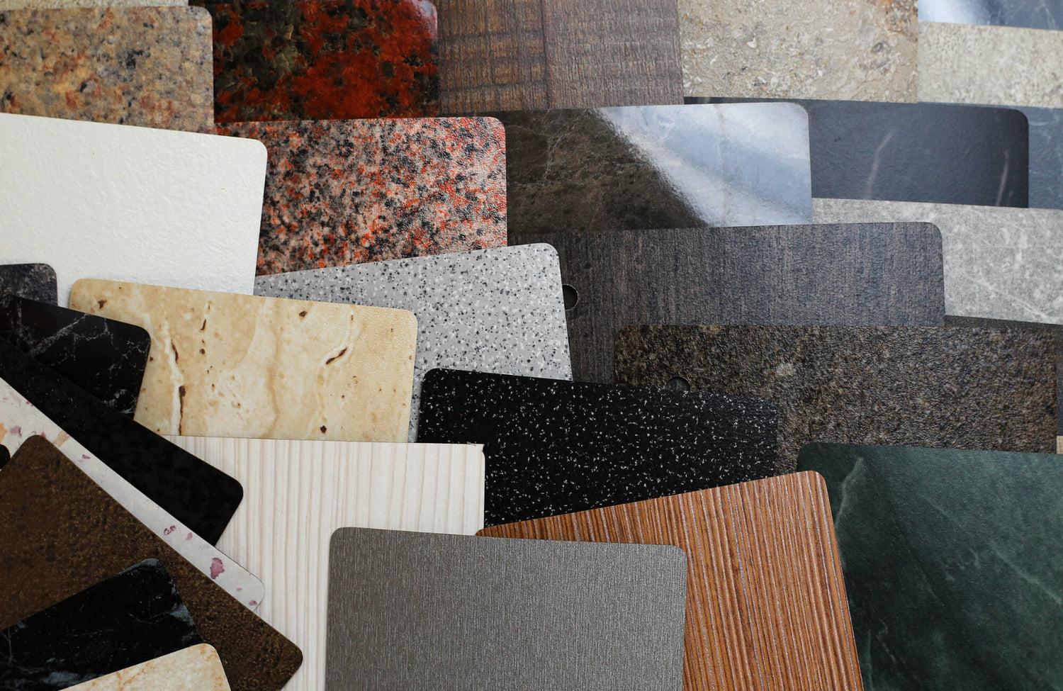
At its core, terrazzo is a composite material, which gives it a visual complexity unlike most other flooring options. Rather than presenting a single flat color, it relies on the interplay between a base matrix and embedded aggregates. This layered construction is what allows terrazzo to behave like a chameleon, adapting seamlessly to different color narratives depending on how it is specified and viewed.
The Role Of The Base Color As The Foundation
The base color of terrazzo acts as the visual field upon which everything else is built. In both poured terrazzo and porcelain tile collections, this background tone carries the most visual weight, particularly when viewed from standing height. Designers often use the base to align with dominant surfaces such as walls, cabinetry, or large furniture pieces, ensuring the floor feels integrated rather than decorative, as seen with Edward Martin’s Sloane 12x24 Matte Porcelain Tile in Charcoal, which provides a grounded, architectural foundation in the image above.
A warm off-white or limestone-inspired base can soften modern interiors and complement natural materials like oak, travertine, or linen upholstery. Deeper bases in charcoal, clay, or muted green can ground a space and introduce richness without relying on solid color flooring, which can feel flat by comparison. Because the base color occupies the negative space between aggregates, even subtle tonal shifts can dramatically alter the mood of a room.
Using Aggregate Chips To Pick Up Accent Colors
While the base establishes cohesion, the aggregate chips are where terrazzo becomes a powerful color-matching instrument. Chips can be selected in a wide spectrum of hues, allowing designers to echo accent colors found in upholstery, art, lighting finishes, or decorative accessories. This is particularly valuable in spaces with layered palettes, where no single accent dominates but several tones coexist.
Rather than matching colors literally, successful terrazzo design often relies on resonance. A muted terracotta chip can quietly reference leather pulls or clay ceramics. Flecks of brass-toned aggregate can reinforce warm metallic lighting without overwhelming the surface. When done well, these accents register subconsciously, creating a sense of completeness that feels intentional rather than themed.
The Concept Of Visual Blending From A Distance
One of terrazzo’s most underappreciated qualities is how it visually blends at scale. Up close, the floor reveals a mosaic of individual components, but from a distance, these elements optically mix into a cohesive tone. This phenomenon allows terrazzo to carry multiple colors without feeling busy, making it ideal for designers working with complex palettes.
This visual blending is especially important in open-plan interiors. As the eye moves across the space, terrazzo reads as a unified surface that subtly shifts depending on lighting and perspective. This dynamic quality makes it easier to incorporate bold or unconventional colors, knowing they will soften into harmony when viewed as a whole.

Using The Floor As A Bridge To Unify Decor Elements
In premium interiors, the most successful designs are those where every element feels connected. Terrazzo excels in this role, acting as a visual bridge that ties together materials, finishes, and colors across a space. Rather than competing with furnishings or architectural features, it supports them through thoughtful color alignment.
Connecting Cabinetry Colors To The Floor
Cabinetry often represents one of the largest color commitments in a kitchen or bathroom. Terrazzo can be specified to subtly reference cabinet tones, creating continuity without repetition. A soft grey terrazzo base paired with warm beige and stone-colored aggregates can complement taupe cabinetry while keeping the floor visually lighter, much like Edward Martin’s Sloane 12x24 Matte Porcelain Tile in Pearl, shown in the image above, which bridges wood cabinetry and light wall finishes seamlessly.
In more expressive designs, terrazzo can also temper bold cabinetry choices. Deep navy, forest green, or oxblood cabinets gain balance when paired with a terrazzo floor that incorporates lighter chips and a neutral base, preventing the space from feeling overly saturated. The result is a layered composition where the floor feels purpose-built for the cabinetry rather than chosen after the fact.
Harmonizing Mixed Metal Finishes
Modern interiors increasingly embrace mixed metals, combining brushed brass, matte black, aged bronze, and polished chrome within the same space. While visually rich, this approach can feel disjointed without a unifying element. Terrazzo provides that anchor by subtly reflecting multiple metallic tones through aggregate color selection.
Warm-toned chips can echo brass and bronze, while cooler stone or graphite fragments relate to blackened steel or chrome. Because these references are abstract rather than literal, terrazzo allows metals to coexist naturally. The floor becomes a mediator, ensuring the mix feels curated and deliberate rather than accidental.
Anchoring Bold Wallpaper And Patterns
Patterned wallpaper and statement textiles introduce energy and personality, but they also raise the risk of visual overload. Terrazzo’s organic randomness offers a counterbalance, grounding bold vertical surfaces with a horizontal plane that feels structured yet lively.
By pulling one or two colors from a wallpaper pattern into the terrazzo aggregate mix, designers can create a subtle dialogue between floor and wall. This approach allows expressive patterns to shine while maintaining a sense of order. The space feels layered and confident, with each element reinforcing the others rather than competing for attention.

Choosing Between Bold Contrast And Monochromatic Harmony
One of terrazzo’s greatest strengths is its ability to support vastly different design philosophies. Whether a project calls for dramatic contrast or quiet tonal cohesion, terrazzo can be tuned accordingly. The key lies in understanding how scale, color intensity, and distribution affect perception.
The Drama Of High Contrast Venetian Styles
Traditional Venetian terrazzo, characterized by larger chips and pronounced color variation, lends itself beautifully to high-contrast interiors. When paired with minimalist architecture or restrained furnishings, this style becomes a focal point, injecting personality and movement into the space. Edward Martin’s Sloane 24x24 Matte Porcelain Tile in Charcoal, featured in the image above, captures this bold interplay with a dark base punctuated by expressive aggregate detailing.
High-contrast terrazzo works particularly well in entryways, hospitality environments, or creative commercial spaces where impact is desired. Dark bases with light aggregates, or vice versa, create visual rhythm and depth. Even when bold, these floors feel timeless due to their artisanal roots and material authenticity.
The Subtlety Of Tone On Tone Micro Patterns
At the opposite end of the spectrum, micro-terrazzo with closely related tones offers an elegant solution for designers seeking calm and continuity. Here, the distinction between base and aggregate is intentionally minimized, resulting in a surface that reads almost like a textured solid.
This approach is ideal for spa-inspired bathrooms, contemporary residences, and luxury retail spaces where serenity and refinement are paramount. Tone-on-tone terrazzo supports architectural lines and premium finishes without drawing attention away from them, proving that restraint can be just as expressive as contrast.
Balancing Saturation Levels
Matching a designer color palette is not only about hue but also about saturation. Overly vivid aggregates can dominate a floor, while desaturated tones may fade into the background. The most successful terrazzo designs strike a balance, using softened versions of palette colors that complement rather than compete.
This balance ensures longevity. Floors specified with slightly muted colors age more gracefully, adapting to future decor changes while maintaining relevance. For quality-conscious clients, this adaptability is a significant advantage, aligning aesthetic ambition with long-term value.

Navigating The Shift From Custom Poured To Porcelain Tile
While traditional poured terrazzo remains a gold standard for customization, advancements in porcelain tile manufacturing have made terrazzo aesthetics more accessible than ever. Understanding the strengths of each approach helps designers make informed decisions without compromising their color vision.
The Predictability Of Porcelain Collections
Porcelain terrazzo tiles offer remarkable consistency, making them ideal for projects where predictability and control are essential. Unlike poured terrazzo, which can exhibit natural variation during installation, porcelain tiles deliver uniform color and pattern repetition, simplifying coordination with other finishes.
This predictability is especially valuable in large-scale residential or commercial projects where multiple rooms or phases must align seamlessly. Designers can confidently match tiles to specified palettes, knowing the finished result will closely mirror samples and renderings.
Durability For Busy Designer Spaces
Performance is a critical consideration in premium environments, particularly those with heavy foot movement. Porcelain terrazzo tiles excel in this regard, offering exceptional resistance to wear, staining, and moisture. This durability allows designers to use sophisticated color palettes in spaces like kitchens, retail floors, and hospitality settings without fear of premature aging, as demonstrated by Edward Martin’s Leighton 35x35 Matte Porcelain Tile in Multicolor in the image above.
The ability to maintain visual integrity over time reinforces terrazzo’s role as a long-term design investment. Color remains stable, surfaces stay refined, and the original palette continues to read clearly years after installation.
Cost Effective Access To Exotic Colors
Custom poured terrazzo can be cost-prohibitive, particularly when rare aggregates or bespoke colors are involved. Porcelain alternatives democratize access to these aesthetics, offering designs inspired by exotic stones, marbles, and pigments at a more approachable price point.
For clients seeking premium results within defined budgets, this shift opens new possibilities. Designers can specify terrazzo looks that align with sophisticated palettes without sacrificing quality, durability, or visual impact.
The Ultimate Tool For Cohesive Design
Terrazzo flooring has evolved into one of the most versatile surfaces available to designers today. Its ability to interpret, enhance, and unify complex color palettes makes it uniquely suited to contemporary interiors where every detail matters. Rather than forcing a space to adapt to the floor, terrazzo adapts to the space, responding to its colors, materials, and intent—a process made more intuitive with Edward Martin’s Augmented Reality (AR) Visualization Tool, which allows users to preview terrazzo tiles within their own rooms before making a decision.
Whether expressed through custom poured installations or refined porcelain tile collections, terrazzo offers a rare combination of artistic freedom and practical performance. By pairing digital visualization with the option to order tile samples, you can confidently translate what you see on screen into real-world materials, confirming color, texture, and scale firsthand. For those committed to cohesive, premium environments, terrazzo becomes not just a flooring choice but a foundational design strategy—one that transforms color from a challenge into an opportunity.