The checkerboard tile pattern is a timeless design element most often associated with the classic black and white look found in many traditional interiors. While this combination remains popular, checkerboard tiles can also be designed with a variety of color pairings, giving the pattern a fresh, more personalized look. By exploring different hues, homeowners and designers can adapt the checkerboard layout to suit both modern and traditional spaces.
In this article, we’ll explore alternative color combinations for checkerboard tiles, how different palettes can influence the look and feel of a space, and design ideas for incorporating colorful checkerboard patterns throughout the home. From subtle neutrals to bold contrasts, these options show how the classic checkerboard pattern can evolve while maintaining its recognizable style.

Alternatives to Black and White Checkerboard Tiles
Many color combinations can create the same striking checkerboard pattern while introducing a different visual character. Exploring alternative palettes allows the design to adapt to a variety of interior styles, from soft and subtle to bold and dramatic.
Warm Neutral Combinations
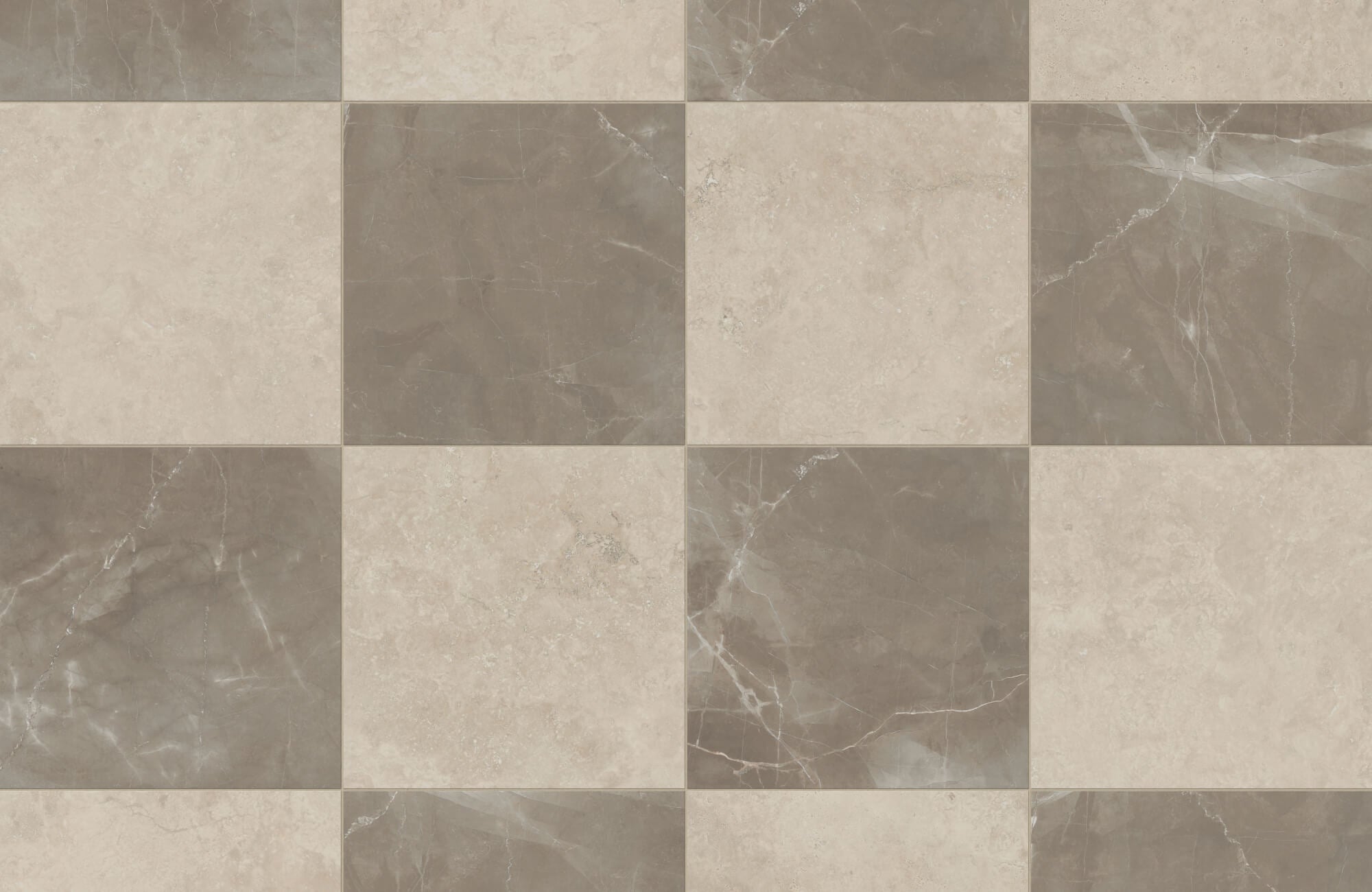
Neutral color pairings offer a softer interpretation of the checkerboard pattern while still maintaining visual contrast. Combinations such as beige and white, brown and cream, or tan and light brown create a warm and balanced color palette. These tones can create a softer contrast while still keeping the checkerboard pattern clearly defined. The result is a refined look that feels classic yet more subtle than traditional high-contrast combinations.
A beautiful example of this approach is Edward Martin’s Brody 24x24 Checkerboard Matte Porcelain Tile in Sand and Sienna, as featured in the photo above. Its warm, off-white, and grayish-beige tones create a gentle contrast that highlights the checkerboard layout while maintaining a soft, cohesive appearance within the space.
Soft Pastel Pairings
Pastel color combinations offer a softer and more delicate take on the checkerboard pattern. Pairings such as light green and white, light blue and light gray, or light pink and cream create a gentle and balanced color palette. These lighter shades soften the contrast while still keeping the checkerboard pattern clearly visible. The result is a calm and refined look that feels fresh and subtly colorful.
Bold Color Contrasts
Bold color combinations create a more dramatic interpretation of the checkerboard pattern. Pairings such as dark blue and white, dark green and cream, or deep red and beige introduce richness and depth while emphasizing the geometric layout. The stronger contrast between these colors highlights the checkerboard design and makes the pattern more visually striking. These combinations offer a vibrant alternative to traditional black and white pairings.
If you want to see how these color combinations will look in your own space, you can explore different checkerboard layouts and palettes using our Augmented Reality (AR) tool. This lets you preview different tile colors directly in your space before making a final design decision.

How Color Choices Affect the Look of Checkerboard Tiles
Color selection plays an equally important role in defining the visual impact of checkerboard tiles. Different color combinations can change how bold, subtle, or balanced the checkerboard pattern appears.
High-Contrast Pairings
High-contrast color pairings make the checkerboard pattern more visually defined and prominent. Combinations such as dark blue and white or dark gray and cream clearly separate each tile, allowing the geometric layout to stand out. This strong contrast highlights the checkerboard design, making it appear more defined and visually striking. As a result, the pattern becomes more noticeable and visually impactful within the overall color scheme.
Low-Contrast Pairings
Low-contrast color pairings can create a softer, more subtle checkerboard effect. Combinations such as light gray and light beige or off-white and light brown can keep the tiles visually connected while still allowing the pattern to be recognized. Because the colors are close in tone, the checkerboard layout appears smoother and less visually sharp. This approach creates a more understated look while still preserving the classic checkerboard structure.
Light and Dark Balance
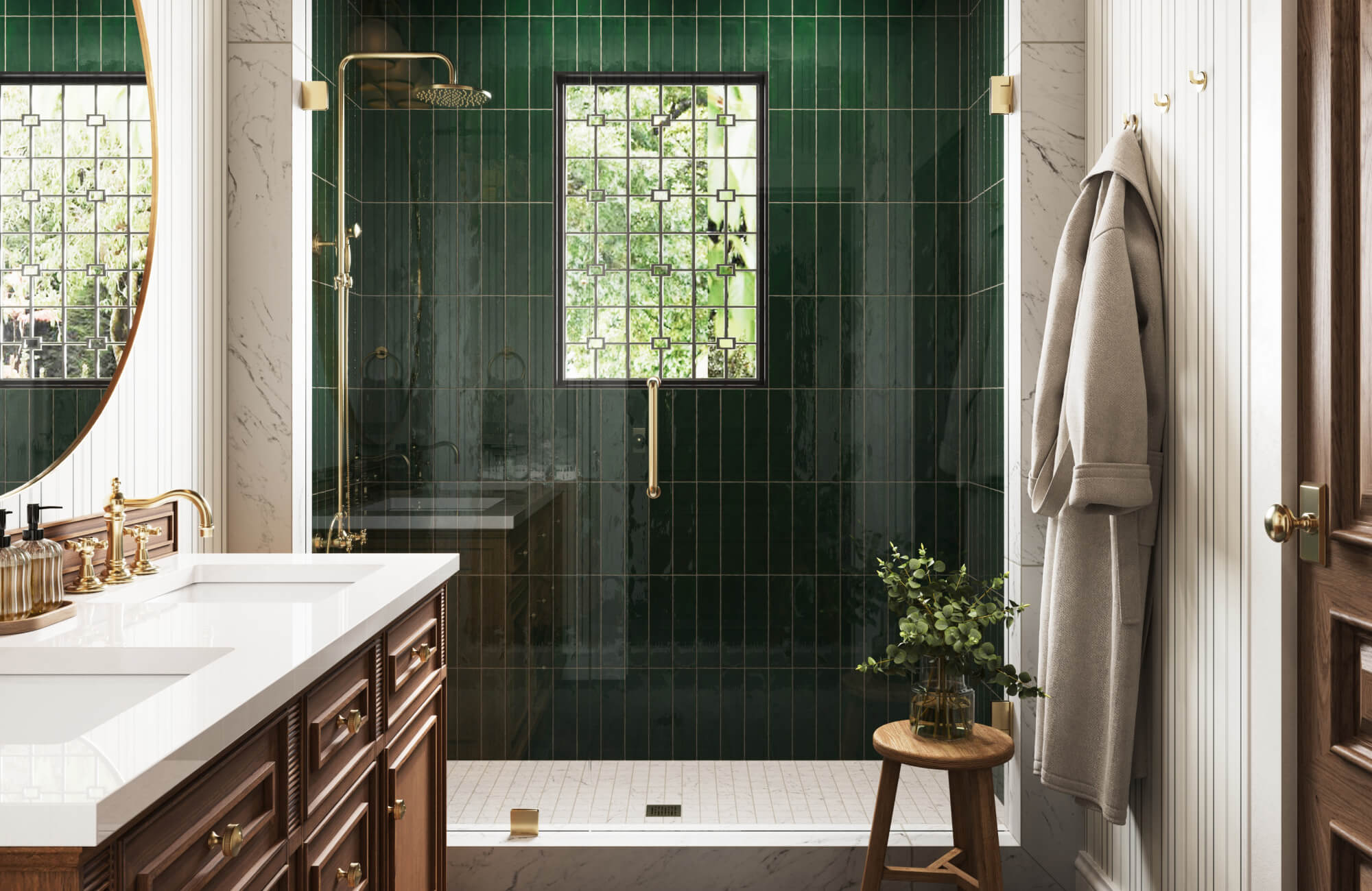
Combining a lighter color with a darker shade helps create a balanced checkerboard pattern. Pairings such as beige and dark gray or light green and dark green can add depth while maintaining a clear visual structure. The difference between the light and dark tones keeps the pattern easy to recognize without appearing too harsh. This balance allows the colors to complement each other while preserving the checkerboard’s geometric rhythm.
A similar effect is achieved with Edward Martin’s Harper 5x5 Glossy Ceramic Tile in Eggshell and Harper 5x5 Glossy Ceramic Tile in Basil, as featured in the photo above. The soft cream and muted green tones create a gentle contrast that defines the checkerboard pattern while maintaining a harmonious, balanced look within the bathroom.

Design Tips for Using Different Colored Checkerboard Tiles
Using alternative colors for checkerboard tiles opens up a wide range of design possibilities. Keeping a few key considerations in mind can help ensure the pattern looks balanced and complements the overall color scheme.
Coordinate with the Room’s Color Palette
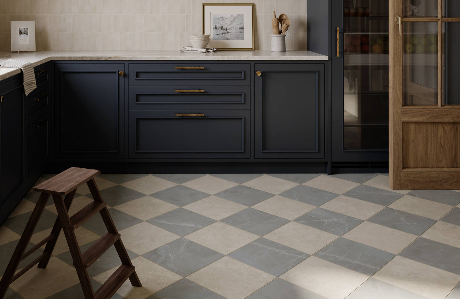
When choosing colors for checkerboard tiles, consider how they relate to the existing color palette in the space. Selecting a neutral tone paired with a stronger accent color helps create a balanced and cohesive look. This combination allows the checkerboard pattern to stand out without overwhelming the overall design. It also helps ensure the tile colors blend naturally with surrounding elements for a more unified appearance.
A cohesive example of this approach is illustrated with Edward Martin’s Leona 24x24 Checkerboard Matte Porcelain Tile in Calacatta and Marfil, featured in the photo above. Its soft white and warm beige tones mirror the surrounding cabinetry, countertops, and natural wood finishes, allowing the checkerboard pattern to integrate seamlessly with the kitchen’s overall color palette.
Consider Tile Size and Layout
Tile size and layout can significantly influence how colorful checkerboard patterns appear. Larger tiles can give bold color pairings a more modern and visually striking appearance. Smaller tiles, on the other hand, can create a more detailed and classic interpretation of the checkerboard design. A diagonal layout can also introduce a sense of movement, giving the pattern a more dynamic and engaging appearance.
Balance the Pattern with Simpler Elements
Because checkerboard tiles naturally draw attention, pairing them with simpler design elements helps keep the overall look balanced. Surrounding the pattern with neutral surfaces and clean finishes prevents the space from feeling visually overwhelming. Subtle materials and understated details allow the colorful checkerboard tiles to stand out without competing with other elements. This approach helps maintain a cohesive and well-proportioned design.

Where Different Color Checkerboard Tiles Work Best
Checkerboard tiles in different color combinations can be incorporated into various areas of the home to add visual interest and character. Choosing the right color pairings helps the pattern complement different interior styles while maintaining its distinctive design.
Kitchens and Dining Areas
Different color checkerboard tiles can add visual structure and subtle contrast to kitchens and dining areas. Color pairings such as beige and white or brown and cream create a warm and balanced pattern that feels welcoming. These tones complement common kitchen materials while keeping the checkerboard layout clearly visible. The pattern introduces color variation while maintaining a clean and cohesive look.
A refined example of this approach is shown with Edward Martin’s Leona 12x12 Checkerboard Polished Porcelain Tile in Calacatta and Amani Bronze, featured in the photo above. Its soft white and bronze tones bring warmth and depth to the dining space while keeping the checkerboard pattern elegant and visually balanced.
Bathrooms and Powder Rooms
Bathrooms and powder rooms are ideal spaces for checkerboard tiles in softer color combinations. Pairings such as light blue and white or light green and cream create a gentle contrast while keeping the pattern visually balanced. These lighter shades help maintain a calm, refined atmosphere while still introducing subtle color variation. The checkerboard layout also adds visual texture to the space without overpowering the overall design.
Entryways and Hallways
Entryways and hallways are excellent places to showcase checkerboard tiles in bold color combinations. Pairings such as dark blue and white or deep green and cream create a strong contrast that highlights the pattern. These colors help the checkerboard design stand out while adding depth and visual interest to the space. The result is a distinctive floor that immediately captures attention and sets the tone for the rest of the home.
Outdoor Areas
Outdoor spaces can also benefit from checkerboard tiles in different color combinations. Pairings such as beige and brown or light gray and dark gray can create a balanced pattern that works well in open-air settings. These color contrasts help define patios, walkways, or outdoor seating areas while maintaining a structured design. The checkerboard layout adds visual interest while blending naturally with surrounding outdoor materials.
Using Different Colors for Checkerboard Tiles
Yes, checkerboard tiles can absolutely use colors other than black and white. Many alternative color combinations, such as beige and white, brown and cream, light blue and white, light green and cream, or dark blue and white, can create the same recognizable pattern while offering a different visual effect. These color variations allow the checkerboard design to adapt to a wide range of interior styles, from subtle and understated to bold and dramatic. By choosing the right color pairing, you can personalize this classic pattern while preserving its distinctive geometric appeal.
If you need help selecting the right color combinations or tile styles, you can schedule a free design consultation with our team. Our design specialists can guide you through checkerboard tile options and help you find a color pairing that complements your space.