


Green tile backsplashes are gaining attention for all the right reasons; they’re calming, grounded, and surprisingly versatile. Rooted in nature and available in a range of tones, green brings warmth and character without overwhelming the space. It’s no wonder more designers and homeowners are reaching for it in kitchens, bathrooms, and beyond.
But like any standout design choice, it’s worth asking: will green still hold up years from now? In this blog, we’ll take a closer look at why this color has lasting appeal, where it works best, and how to use it in ways that feel timeless rather than trendy.

Why Green Is Gaining Popularity in Backsplash Design
Designers and homeowners alike are reaching for green tile when they want something fresh but timeless. Rooted in nature and flexible in tone, green has become a go-to for creating interiors that feel grounded and visually interesting.
Earth Tones Meet Modern Spaces
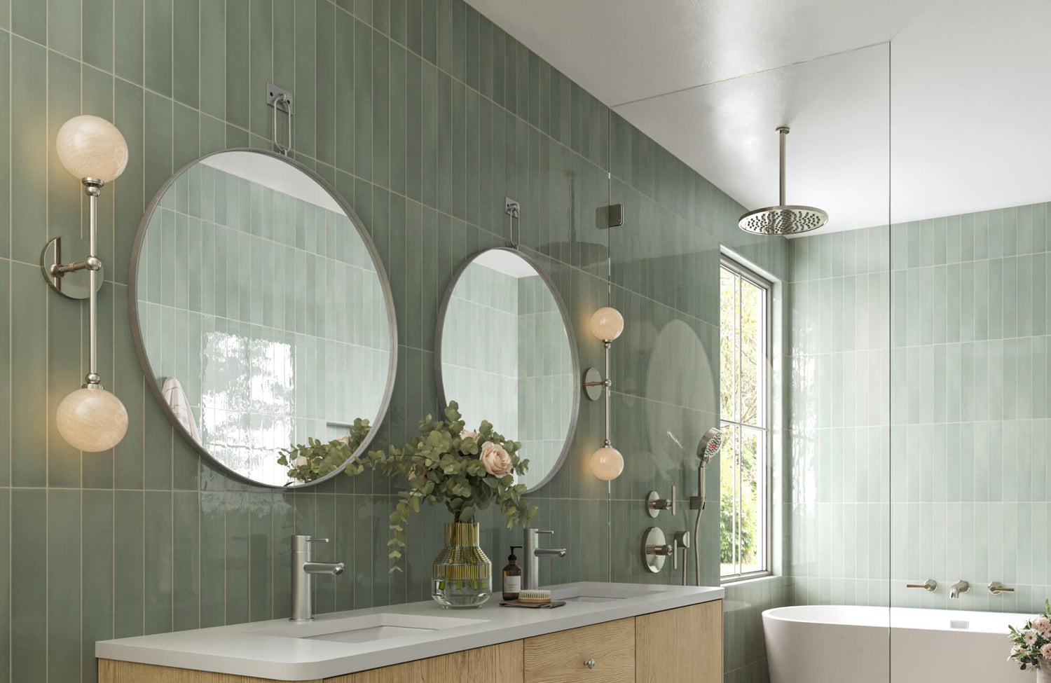
There’s something instantly grounding about green; it connects a room to the outdoors without feeling too rustic or dated. From soft sage to deep forest, these hues work beautifully with modern finishes like brushed brass, black fixtures, or veined marble. They soften sleek lines and add warmth to spaces that might otherwise lean too cold or clinical. Whether you're updating a contemporary kitchen or refreshing a utility room, green tile adds an earthy layer that feels both thoughtful and current.
For example, our Olivia 4x16 Glossy Ceramic Tile in Sage, as seen above, brings this balance to life with its natural variation and subtle sheen. Whether you're updating a contemporary kitchen or refreshing a utility room, this kind of tile adds an earthy layer that feels both thoughtful and current.
Calming Shades That Feel Inviting
Green strikes a rare balance between clean and cozy, which makes it especially appealing in everyday spaces like kitchens, laundry rooms, or bathrooms. Lighter shades like mint or moss can brighten a space without going stark, while darker tones bring mood and richness without feeling overwhelming. These natural tones support the kind of relaxed, lived-in feel that more homeowners are after right now. Instead of dominating the room, they quietly shape the atmosphere in a way that lasts.
Green as a Bridge Between Styles
One of Green’s biggest strengths is its ability to work across styles. It can soften a minimalist space, warm up industrial finishes, or complement vintage details, all without looking out of place. That makes it a great pick when you're blending old and new, or trying to tie together materials like wood, metal, and stone. It doesn’t scream for attention, but it adds just enough color to keep a space from feeling flat. For many, it’s the missing piece that makes a mixed-style space feel cohesive.

Where Green Backsplashes Show Up
Green tile isn’t just making waves in the kitchen; it’s finding a place in nearly every corner of the home. Below, we’ll take a closer look at how homeowners are using green backsplashes to bring warmth and style to spaces that were once purely functional.
Bathroom Accent Walls and Sink Areas
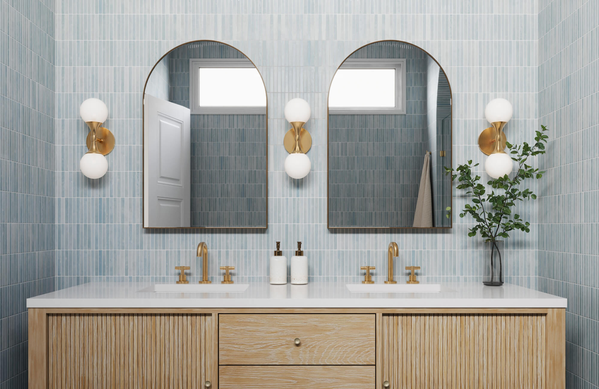
Green tile brings a fresh, spa-like quality to bathrooms, especially when used behind the vanity or in a full accent wall. Lighter shades like eucalyptus or mint can help smaller bathrooms feel open and relaxing, while darker greens add richness in powder rooms or primary ensuites. Paired with white sinks or wood vanities, green provides a natural, balanced contrast that feels clean without being sterile.
As seen above, our Mikayla 5x5 Glossy Ceramic Tile in Olive adds depth and softness to modern bathrooms with its muted tone and subtle gloss. Paired with white fixtures or marble surfaces, it delivers a grounded, balanced contrast that feels clean without being sterile.
Laundry Rooms and Utility Spaces
Once overlooked, laundry rooms are now getting thoughtful design treatment, and green tile is an easy way to add character. A green backsplash behind the sink or folding area brings softness to otherwise hard surfaces like appliances and counters. These spaces benefit from the color’s calming feel, making chores feel a little more pleasant while still being easy to clean and maintain.
Wet Bars and Compact Nooks
Small spaces like wet bars, coffee stations, or hallway nooks are ideal for a splash of green tiles. These areas don’t need much material, so homeowners can choose richer tones or bolder patterns without the commitment of a large wall. A green backsplash adds just enough depth to make the space feel curated, even if it’s just a corner of a larger room.
Entryways and Mudroom Splash Zones
Tile backsplashes in entry or mudroom areas are practical for protecting walls, especially near drop zones or utility sinks. Green works well here because it hides dirt better than lighter colors and adds a welcoming, grounded look to transitional spaces. Paired with built-in storage or open shelving, it helps elevate the function of the room without overwhelming it visually.
Dining Alcoves and Built-In Buffets
Homes with open layouts, dining nooks, and built-in buffet areas often need a subtle backdrop, and green tile can fill that gap beautifully. A simple backsplash in these areas adds texture and separates the space without using full walls or bulky dividers. Whether you’re working with a casual breakfast corner or a more formal sideboard, green tile brings a hint of elegance and helps tie the space into the broader color story of the home.
Want to see how green tile would look in your space before committing? Our AR Visualization Tool lets you preview designs in real-time, helping you make confident, design-smart decisions. Once you find a tile you love, you can order a free 4" x 4" sample to test the color and finish at home. It’s a simple, no-stress way to plan your next backsplash update.

Will Green Still Work in 5–10 Years?
While color trends come and go, some shades have a way of settling in for the long haul. Green is one of those rare hues that can shift with the times while still feeling relevant. Below, we’ll explore what makes certain greens more timeless than others.
Tonal Greens vs. Statement Shades
Not all greens are created equal when it comes to longevity. Soft, tonal shades, like sage, olive, and eucalyptus, tend to blend naturally into a room and support a wide range of styles. These muted greens feel calm, flexible, and timeless, making them easier to live with long-term. They also work well with warm neutrals and natural materials, which are less likely to go out of style.
On the other hand, brighter or saturated greens, while striking, can read as more trend-specific. Emerald, mint, or even neon tones might feel exciting now, but they can become visually overwhelming over time, especially in smaller rooms. That doesn’t mean you shouldn’t use them, but placement matters. In high-impact areas like a bar backsplash or powder room accent, they can shine without overstaying their welcome.
What Makes a Color Timeless?
Timeless colors typically have a connection to nature, neutral undertones, and the ability to complement other evolving design elements. Green checks many of these boxes, especially in its earthier, desaturated forms. It can ground a space, work across styles, and shift easily between modern and traditional looks. That flexibility makes it a smart long-term choice if you’re designing with future updates in mind.
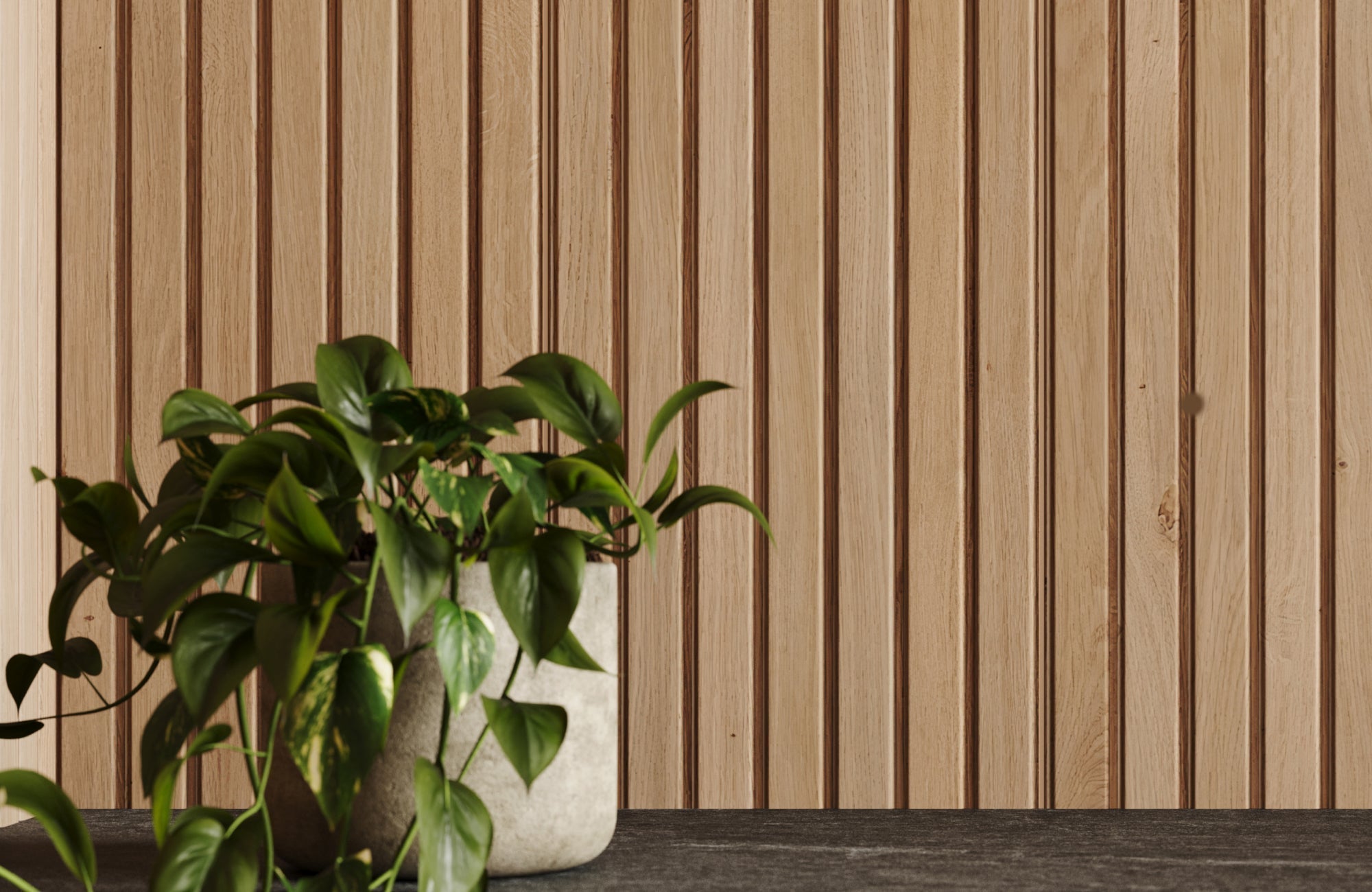
Also, timelessness isn’t just about hue; it’s about how the color is used. A green backsplash with simple lines and quality materials will outlast a flashy pattern or glossy trend. If the tone balances well with surrounding cabinetry, flooring, or fixtures, it’ll continue to feel relevant even as other design choices evolve. As shown above, our Dani 1.6x5 Matte Ceramic Tile in Sage highlights this kind of staying power. Its soft matte finish and vertical layout bring modern structure to the space, while the tone remains grounded enough to outlast fleeting trends.

How to Choose a Green Tile That Won’t Date Quickly
If you're drawn to green but hesitant about long-term appeal, the right tile details can make all the difference. Here, we’ll cover how format, finish, and color tone help a green backsplash stay current without needing constant updates.
Stick With Classic Formats Like Subway or Square
Using traditional tile shapes, like 3x6 subway or clean-lined square formats, helps green feel more versatile and timeless. These shapes are familiar and widely accepted across a range of design styles, from vintage to modern. Even if the shade of green leans bold or earthy, the classic format provides a sense of balance. That makes your space feel intentional, not overly styled to a moment.
Also, common tile shapes are easier to match with future renovations or accents. If you ever update cabinetry or countertops, you're more likely to keep your backsplash if it already leans timeless in shape. Think of it as laying a foundation that works with multiple looks. You can always express personality through accessories or lighting instead.
Choose Muted or Dusty Greens for Flexibility
Green tiles with muted, dusty, or olive undertones tend to wear better over time than high-saturation or neon versions. These earthier greens act more like neutrals and blend easily with both warm and cool materials. They're easier to pair with natural wood, stone, or brass finishes, and they age gracefully as trends shift. Choosing a softer tone doesn’t mean compromising on style; it means giving yourself more room to evolve your space later.
These tones also adapt better across rooms, which is useful if you're using green in more than just the kitchen. A muted sage or eucalyptus green, for instance, looks just as good in a bathroom as it does near a wet bar or utility sink. That flexibility makes it easier to use green confidently without worrying about a short design shelf life. Think of it as color with staying power.
Texture Can Tone Down Brightness
If you're drawn to brighter greens but worried they’ll date too quickly, choosing textured tiles can help. A slightly matte, crackled, or hand-glazed finish takes the edge off intense hues and makes them feel more organic. Texture adds character while softening light reflection, which makes bold shades easier to live with over time. This is especially useful in smaller areas like a powder room or behind a bar, where color intensity can be more noticeable.
Textured tiles also hold up better visually in natural light and don’t highlight smudges or splashes as easily as glossy ones. That’s a bonus in busy areas like kitchens or laundry rooms. Plus, the imperfect surface feels more artisanal and less mass-produced, which gives your design more warmth and depth. When in doubt, texture is a great tool for balance.

What to Pair With a Green Backsplash (for Long-Term Flexibility)
To make green work in the long run, it’s not just about the tile—it’s about the whole palette. Choosing long-wearing, reconfigurable materials gives you more styling freedom, even as your tastes shift.
Warm Neutrals and Natural Wood Cabinets
Pairing green tiles with warm neutrals or natural wood is one of the easiest ways to create a look that lasts. Beige, taupe or off-white tones soften the green and keep things feeling grounded without overwhelming the space. Natural wood, especially oak or walnut, adds warmth and texture while staying outside of trend cycles. These combinations feel earthy and modern at once, perfect for a look that won’t feel dated in a few years.
Natural wood also weathers well and picks up character over time, which helps your space evolve without needing major updates. If you ever swap out lighting or hardware, your cabinetry and backsplash will still feel cohesive. The mix of organic wood and green tile creates a relaxed but elevated atmosphere that suits both traditional and modern interiors. It’s a pairing that never really goes out of style.
Matte Black or Aged Brass Fixtures
When it comes to hardware and fixtures, matte black and aged brass are both strong choices that complement green beautifully. Matte black adds a sleek, modern edge that balances softer greens, while aged brass warms things up with vintage charm. Both finishes are versatile, meaning they can adapt to future changes in decor or accessories. Unlike chrome or bright metals, they’re less likely to feel out of place as trends shift.
They also bring just enough contrast to let your green tile stand out without overpowering it. These finishes work well in kitchens, bathrooms, and even utility areas where style and function need to align. Plus, they tend to hide water spots and fingerprints better than shinier alternatives. Choosing fixtures with character, but not flash helps keep your design fresh without locking you into a specific style era.
Simple Countertops That Ground the Palette
Green backsplashes often look their best when paired with simple, understated countertops. Materials like white quartz, light concrete, or subtle marble keep the focus on the tile without making the space feel busy. These options create balance and let the green act as an accent rather than competing for attention. A quieter counter surface also gives you more room to experiment with décor or open shelving above.
Over time, simpler countertops make it easier to refresh your look with new lighting, rugs, or cabinet paint, without needing a full renovation. That kind of flexibility is key for homeowners who want longevity out of their materials. Neutral, grounded counters also tend to increase resale appeal, making your design choices work both stylistically and practically. When in doubt, less really is more when supporting a standout tile color.

Common Mistakes That Make Green Tile Feel Too Trendy
Not all green tile designs are created equal. In this section, we’ll explore where homeowners often go wrong with green and how a few smart adjustments can keep your space feeling balanced, not trend-bound.
Too Much Saturation in a Small Space
A bold green tile can add drama, but when the color is too saturated and used across an entire small space, it can feel more claustrophobic than stylish. Deep emeralds or vivid jades work best in moderation, especially when they’re paired with lighter finishes that offer contrast. Without balance, the room may feel darker or visually heavy, which shortens its shelf life. Choosing just one wall or section for a strong color helps the design breathe and age more gracefully.
Using Trendy Tile Shapes Without Contrast
Pairing bold greens with overly trendy shapes like scallops or geometric diamonds can push your backsplash into “of the moment” territory. These shapes aren’t bad on their own, but when combined with strong colors, they can feel overwhelming or gimmicky. To keep things balanced, contrast trend-forward tiles with neutral grout, minimalist fixtures, or classic cabinetry. That way, the green still shines, without locking the whole room into a single style.
Lack of Connection With Overall Room Palette
Green tile needs to feel like it belongs, not just on the wall, but in the whole room. When the surrounding elements don’t echo or complement the tile color, it can look like an afterthought. Coordinating with wood tones, metals, or nearby textiles can help the green blend in naturally. Without this visual tie-in, even a timeless tile can start to look mismatched over time.
Bringing Green Into Your Space With Confidence
Green tile backsplashes have proven they’re more than a fleeting trend; they’re a versatile, design-forward choice that bridges color, comfort, and longevity. Whether you’re leaning into subtle sage tones or playing with deeper forest hues, green brings a timeless quality that works across styles, rooms, and eras. It’s all about balance: pairing the right tile with thoughtful materials, proportions, and surrounding finishes.
If you're unsure which green tile will work best in your space or how to style it in a way that feels lasting, our design team is here to help. Book a design consultation for expert advice on color, layout, and product pairing that fits your long-term vision.