


Earth-tone backsplashes, once staples of cozy, rustic spaces, are stepping back into the spotlight with a new sense of sophistication. Soft terracottas, muted greens, and sandy neutrals now offer warmth without overpowering your space. As home design moves away from stark whites and cool grays, these grounded tones are finding fresh relevance in modern homes.
But are they truly making a comeback, or is this just a passing trend? In this blog, we’ll explore why earthy hues are resonating again, where they work best, and how to use them in a way that feels timeless, not dated.

Why Earth Tones Are Trending Again
There’s been a noticeable shift in kitchen design from stark and sterile to warm and grounded. As more people seek comfort and natural texture in their spaces, earth tones are stepping back into the spotlight with a sense of ease and quiet confidence.
Shifting Away From Cool Grays and Stark Whites
For a while, backsplashes were all about crisp whites and cool grays, but that clean, modern look can sometimes feel a little too clinical. Designers are now leaning into warmer tones that bring softness and depth without overwhelming the space. These colors help tone down the sharp edges and create a more welcoming atmosphere. It’s a return to palettes that feel easier on the eyes and easier to live with, too.
Influence of Natural Materials in Modern Design
As natural materials like wood, stone, and woven textures take center stage, it’s no surprise that earth tones are rising alongside them. These colors echo the warm grains of oak, the soft tones in limestone, or the greens from indoor plants, tying the space together in a way that feels calm and connected. Backsplashes are being designed to feel more like an extension of nature, not a stark contrast from it. Earthy backsplashes play right into that mindset, adding color that feels organic instead of ornamental. It’s all about creating balance without forcing it.
Earth Tones as a Versatile Neutral Alternative
Earth tones walk that line between subtle and stylish, as seen above with our Natasha 2x6 Glossy Porcelain Tile in Fog; they don’t scream for attention, but they do quietly support just about any design direction. Whether you’re working with sleek, modern cabinets or a more classic setup, these tones fit right in. They’re the kind of colors that adapt to your space rather than compete with it. That’s part of what makes them so timeless; they work hard in the background, letting other design elements shine.

What Counts as an Earth-Tone Backsplash Today?
Earth tones may sound familiar, but today’s take is far more refined than the bold rusts or ochres of decades past. The modern palette leans into softer, more grounded colors offering warmth without being overpowering, and texture without losing sophistication.
Modern Takes on Terracotta and Clay
Terracotta and clay, like our Catalina 2x16 Matte Porcelain Tile in Clay above, have come a long way from their bright, sunbaked past. Today’s versions lean toward muted, more mineral-based tones, think soft adobe, dusty coral, or faded blush. These shades give you the warmth you expect from terracotta but in a more restrained, usable format. Many of them come in matte finishes with gentle surface variation, giving the impression of a handcrafted tile without the heaviness. That makes them a solid fit for both traditional and contemporary spaces.
You’ll also see these tones in shapes that feel fresh, elongated subway tiles, zellige-style squares, or slim rectangles that create a more modern rhythm on the wall. The texture plays just as much of a role as the color here, with subtle pitting or glaze movement adding dimension. These evolved terracotta are warm without being overly rustic, which helps them complement a broader range of cabinetry and countertop finishes. They strike that rare balance between character and calm, which is what makes them feel so current.
Soft Greens, Muted Ochres, and Sand Tones
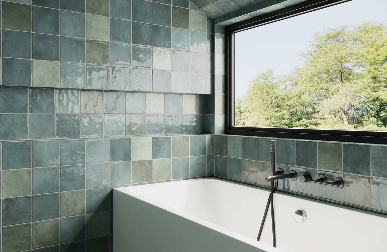
The modern earth-tone palette isn’t just about clay; it’s also about bringing in softer, quieter colors drawn from landscapes and natural materials. Shades like eucalyptus, sage, mushroom beige, and muted ochre all offer warmth in a more understated way. These colors feel relaxed but never flat, often with enough depth to stand out against cabinetry without dominating the space. They’re especially effective in spaces that get good natural light, where their subtle undertones can shift and play throughout the day. The result is a room that feels grounded, serene, and quietly stylish.
These tones are also incredibly adaptable. Mushroom beige pairs well with light oak or cream-colored cabinets, while a muted green can bring balance to darker wood tones. Even ochres, when softened and toned down, feel more like a refined neutral than a statement color. Many of these hues are also available in tactile finishes, which adds a layer of richness without needing a bold pattern or shape. They’re the kind of colors that age gracefully and stay versatile as styles shift.
Matte Finishes and Textured Surfaces
Finish has become just as important as color when it comes to backsplash selection, especially with earth tones. Matte glazes are leading the way because they bring softness and tactility that high-gloss tiles often lack. They also diffuse light more gently, which adds to the calming, organic feel many designers are after. When paired with earthy hues, a matte surface helps the tile feel rooted in the space rather than overly polished. It’s a more natural, low-sheen look that plays nicely with wood, stone, or brushed metal.
Texture is another key element. Subtle irregularities like ripples, hand-pressed edges, or tonal variation add character without overpowering the design. Even a simple tile can feel rich when it carries a bit of visual movement or glaze layering. These textural details elevate the backsplash and give it an artisanal touch, making the space feel layered and considered. Together, matte and texture give earth tones the contemporary finish they need to feel right at home in modern homes.

Where Earth-Tone Backsplashes Work Best
Earth-tone backsplashes don’t just look good; they work best when paired thoughtfully with the surrounding finishes in your space. Whether you’re working with warm wood cabinetry or trying to soften a cooler space palette, the key is compatibility. Below, we’ll explore how these tones naturally complement different layouts and finishes without overpowering the design.
Warm Cabinets With Matching Tones
Pairing earth-tone tiles with warm cabinetry is one of the easiest ways to create a seamless, inviting look. Cabinets in walnut, oak, or creamy off-white shades naturally echo the depth and richness of ochre, taupe, or terracotta tiles. These combinations feel intentional and grounded, especially when both tile and cabinetry share undertones. The effect is layered but never loud, making the entire kitchen feel calm and collected. This pairing works well in both traditional and transitional kitchens where warmth is a central feature. A great example is our Mikayla 2.5x5 Glossy Ceramic Tile in Olive, as seen above—earth-toned hues bring soft depth and tone that pairs beautifully with natural wood cabinetry.
Cool Kitchens That Need Grounding
In spaces dominated by cool colors like stark whites, grays, or blue-toned cabinetry, earth-tone backsplashes act as a subtle grounding element. A soft clay or beige tile can take the edge off an overly clinical feel, adding visual warmth without the need for a full remodel. These hues also help bridge the gap between cooler base tones and warmer accents like brass hardware or wood flooring. The result is a more balanced space that feels both modern and welcoming. Even a narrow backsplash strip can shift the overall mood of the room.
Open-Concept Layouts That Need Cohesion
Open-concept spaces benefit from earth-tone backsplashes because they help tie different functional zones together through consistent warmth. For example, using similar tones in your kitchen backsplash and adjacent living area textiles or decor creates a visual throughline. This approach can make the space feel unified without being overly matchy or forced. Earthy tones also work well with a variety of flooring types, from hardwood to natural stone, which makes them a safe choice in blended layouts. The backsplash becomes a quiet connector that brings harmony to the full open-plan area.
Pairing With Stone or Concrete Countertops
Earth-toned tile offers a rich contrast to cooler materials like concrete or stone countertops. Soft clay or mushroom beige brings out the warmth in veined marble or quartz while adding texture and depth. This contrast can make the backsplash pop without clashing, especially when the tile’s finish is matte or subtly variegated. It’s an easy way to keep things feeling grounded without losing a modern edge. The combination balances visual interest with a natural, unfussy look.
Transitional Homes That Blend Old and New
For homes that lean into both modern and vintage design, earth-tone backsplashes provide a common thread. Whether you’re mixing contemporary appliances with antique fixtures or pairing minimalist layouts with farmhouse tables, these hues bridge the aesthetic gap. Soft terracottas, warm sand tones, and muted greens hold nostalgic charm without feeling outdated. They support layered design choices without overwhelming them. It’s a natural fit for spaces that embrace a bit of both worlds.
Spaces With Limited Natural Light
In spaces where sunlight is scarce, earth-tone backsplashes can add visual warmth that artificial lighting alone might not achieve. Richer tones like rust or tobacco brown reflect ambient light with softness, creating a cozier effect than glossy white tile. These colors also help rooms feel less stark or cold during evening hours. When paired with under-cabinet lighting, they bring out layered textures that add life to the space. It’s a smart move for windowless spaces or shaded apartment layouts.

Choosing the Right Earth-Tone Tile Without Dating Your Kitchen
Earth-tone backsplashes are back, but the trick is making them feel timeless, not like a throwback. With careful attention to color, texture, and complementary fixtures, you can create a warm, grounded look that still feels fresh and current.
Stick to Soft, Dusty Tones Over Saturated Ones
Color choice is where most backsplashes go wrong when trying to use earthy palettes. Saturated hues like pumpkin orange, brick red, or mustard yellow often overwhelm the space and feel stuck in a past era. Today’s approach favors muted, mineral-inspired tones, think warm clay, eucalyptus green, dusty mauve, and sandy taupe. These colors feel more natural and versatile, working easily with both modern and classic design features.
Dusty, softened tones, like our Lilah 6x6 Glossy Ceramic Tile in Mist above, also hold up better as styles change over time. Because they aren’t too bold or trendy, they serve as a subtle backdrop that lets cabinetry, lighting, or countertops shine. They blend into the space rather than demanding attention, which helps the space feel calm and well-balanced. If you're aiming for a backsplash that stays relevant, starting with quiet color is a smart move.
Let Texture Carry the Character
When you keep your tile color understated, texture becomes the element that gives the backsplash its personality. Handmade finishes, uneven glazes, and natural surface variations offer movement and depth without relying on dramatic tones. These small details give even the simplest tile a lived-in, curated feel that adds to the warmth of the space. Matte or slightly weathered textures also help soften reflected light, making your backsplash feel more relaxed.
Texture is especially powerful in earth-toned palettes because it brings the richness of nature indoors. Whether it’s a clay tile with slight ridges or a sand-toned porcelain with subtle speckles, tactile details draw the eye and make the space feel layered. You don’t need bold patterns to make a statement, just well-chosen surface texture that complements the room’s overall rhythm. It’s a quiet design strategy that works across styles and eras.
Pair With Updated Finishes and Fixtures
No matter how beautiful the tile, it won’t feel fresh if everything around it looks outdated. Pairing earth tones with modern finishes like brushed nickel, matte black, or sleek brass helps bridge the gap between traditional color and contemporary design. Consider slim cabinet pulls, minimal faucet lines, and streamlined lighting to keep the space crisp. The contrast between natural tile and refined hardware creates just enough tension to keep things interesting.
This approach also allows the warmth of the backsplash to shine without dragging the whole space into rustic territory. By surrounding earth tones with cleaner elements, the room feels intentional and current, not stuck in the past. It's a balance of soft and structured, familiar and polished. And when done right, it makes the whole kitchen feel cohesive and thoughtfully updated.

How to Pair Earth-Tone Backsplashes With Modern Fixtures
Pairing earth-tone backsplashes with modern fixtures is all about finding balance. The warmth and texture of clay, taupe, or sand-toned tile can feel timeless, but if paired with outdated finishes, the look can lean too traditional. To keep the space feeling fresh, start with clean-lined elements, sleek faucets, minimal lighting, or thin cabinet pulls that provide contrast. This visual tension between organic tile and refined fixtures brings a sense of purpose to the design. It ensures that the backsplash feels grounded, not nostalgic.
Lighting plays a huge role in modernizing the overall effect. Choose fixtures that offer both style and function, like slim sconces, linear pendants, or under-cabinet LEDs with a soft white glow. Brass, matte black, or even muted chrome finishes work beautifully with earthy tones and help reflect the backsplash’s natural warmth. Aim for a cohesive silhouette, nothing too ornate or oversized, which might overpower the tile’s subtlety. The goal is to let the backsplash breathe while still layering in contemporary character.
Appliances can also tip the scale between dated and current. Stainless steel remains a safe, versatile choice, especially when paired with matte or textural earth-toned tile. For a more seamless look, consider panel-ready appliances that allow cabinetry and tile to take center stage. Even small accents like modern knobs, minimalist range hoods, or integrated vent designs can tie the whole space together. With thoughtful pairing, an earth-tone backsplash can look right at home in a space that feels modern, natural, and perfectly in step with today’s design priorities.

Should You Go Bold or Subtle With Earth Tones?
Choosing between bold or subtle earth tones comes down to how you want the space to feel and how much visual weight your space can handle. Rich terracottas, deep browns, and rusty reds add drama and warmth but tend to draw more attention. They're best suited for larger rooms with ample natural light or layouts where the backsplash is meant to be a standout feature. In smaller or dimly lit spaces, these stronger hues can quickly feel heavy if not balanced well. That’s where subtlety becomes your ally.
Softer tones like clay, sage green, or mushroom beige, such as our Teagan 3x12 Glossy Ceramic Tile in Cream above, offer a quieter backdrop that supports the room without dominating it. These muted shades are ideal for compact layouts or open concepts where the backsplash needs to work alongside other materials. They create a calming atmosphere and pair easily with modern finishes like light oak, brushed brass, or creamy quartz. Choosing subtle earth tones doesn’t mean losing personality; it just means expressing it with texture, shape, or variation instead of saturation. It’s a gentle way to introduce color while keeping the space feeling bright and timeless.
If you’re on the fence, try a tonal mix. For example, you could use a lighter field tile and accent it with deeper earth-tone borders or niches. This adds dimension without going fully bold across the board. You can also test how different tones feel in your space by looking at samples during different times of day—earth tones shift beautifully in changing light. Whether you go bold, subtle, or a mix of both, the key is letting the room’s size, light, and overall mood guide your color choices.
Not sure which direction to take? Use our Augmented Reality Tool to preview bold or subtle earth-tone tiles directly in your kitchen. It’s a simple way to see how each option interacts with your space before making a decision.

Are Earth-Tone Backsplashes Right for You?
Earth-tone backsplashes can be a natural fit for some kitchens, but not every space benefits from the same palette. Here we will help you assess whether these tones align with your light, layout, and overall design goals.
You Want a Warm, Relaxed Look That Ages Well
If you’re drawn to kitchens that feel calm, grounded, and welcoming, earth tones offer that soft visual comfort without chasing trends. Shades like taupe, clay, or muted olive carry a quiet elegance that works well in lived-in, long-lasting spaces. They’re forgiving in terms of daily wear and don’t show grime as easily as stark whites. More importantly, they stay relevant through shifting design cycles. If you value longevity over flash, these tones are worth a closer look.
You Have Natural Light That Highlights Subtle Hues
Earth tones thrive in spaces with good daylight because their softness reacts beautifully to changing light throughout the day. A sunlit space will bring out the nuanced undertones of mushroom beige, dusty sage, or terracotta without making the room feel dark. These tones tend to deepen slightly in the evening, creating a cozy glow. That adaptability adds richness and dimension to your design. If your home gets plenty of natural light, earth tones can truly shine.
You Want to Build a Cohesive, Nature-Inspired Space
For homeowners looking to create harmony between their kitchen and the rest of their interiors, earth tones offer a strong foundation. These colors easily pair with organic materials like wood cabinets, honed stone countertops, or matte black hardware. They help bridge the gap between the kitchen and nearby living or dining areas, especially in open layouts. If your goal is a space that feels connected to natural elements without overwhelming them, earth-tone backsplashes support that vision. They’re versatile, grounded, and easy to build a palette around.
Ready to Bring Earth Tones Into Your Space?
Earth-tone backsplashes are no longer just a nostalgic throwback; they’ve evolved into a grounded, versatile design choice that complements modern kitchens beautifully. Whether you're working with warm wood cabinetry, sleek fixtures, or a mix of old and new, these tones offer a quiet confidence that adapts to your space. From soft clay and sage to muted ochre and mushroom beige, they bring warmth and texture without overpowering the room. With the right combination of tile finish, placement, and surrounding elements, earth tones can strike a perfect balance between comfort and style.
If you're unsure which direction to take, a second opinion can help refine your palette and layout. At Edward Martin, our design team is ready to help you find the best tile for your space and tie it into a cohesive look that lasts. Explore our curated backsplash tile collection or book a free design consultation to get expert insight tailored to your space and style.