



Tile samples have a curious way of making multiple options look equally convincing until you try to make the final decision at home. What seems like a straightforward side-by-side comparison can quickly get confusing when lighting shifts, textures behave differently in your space, or a tile that looked perfect in your hand feels completely different once placed where it will actually be installed. That is why comparing samples properly matters just as much as ordering them in the first place. In this guide, we will show you how to compare tile samples at home in a way that helps you choose with far more clarity and far less second-guessing.

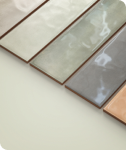
Marble-look and stone-look tile samples are displayed across a warm wood backdrop for a side-by-side comparison.
Set Up Your Tile Samples Like They Will Actually Be Experienced
A tile sample can tell you a lot, but only if you evaluate it in a way that reflects how the finished installation will actually look and feel in your home. Quick comparisons made in your hand or under random conditions often lead to reactions that feel certain in the moment but become much less convincing once the tile is installed.
Viewing Samples Flat Instead Of Holding Them In Your Hand
Holding a tile sample in your hand might seem like the fastest way to compare options, but it rarely reflects how the material will actually be experienced once installed. Tiles are meant to be viewed as surfaces, not handheld objects, which means angle, light interaction, and surrounding context all change dramatically when the sample is upright in your hand instead of laid flat. A polished tile, for instance, may look much more reflective when tilted toward direct light, while textured surfaces can appear far more dramatic than they actually will once spread across a larger area. Even color can shift depending on how you angle the sample while moving it around. Laying the sample flat gives you a much more honest read of how the tile will visually behave in real life.
Testing Samples In The Exact Installation Zone
A tile that looks perfect on your dining table or kitchen counter can feel surprisingly different once moved into the actual space where it will be installed. That is because surrounding shadows, nearby finishes, room proportions, and even how natural light enters that specific area all influence how the tile reads visually. A bathroom floor tile, for example, may feel warmer or darker once placed beside your vanity, while a backsplash sample can react differently once positioned beneath cabinetry. Testing in the exact installation zone removes much of the guesswork because you are evaluating the tile in its true design environment instead of a neutral staging area.
That shift becomes easier to recognize with visually expressive surfaces like our Mariel 1x12 Glossy Porcelain Tile in Opal Blue. Its calmly rippled, glossy glaze and soft grayish pastel blue tones respond noticeably to surrounding materials and changing light, sometimes appearing brighter and more airy, other times taking on a moodier, more dimensional character. What feels balanced in a neutral setting may read entirely differently once introduced to the finishes, shadows, and scale of the room it is actually meant for.
Moving Samples Between Eye-Level And Floor-Level Perspectives
The way a tile looks can change a lot depending on how you will actually experience it in the finished space. A backsplash or shower wall tile is usually seen straight on, which makes pattern, texture, and surface details much easier to notice up close. Floor tile works differently because you usually see it from standing height, where the overall color, movement, and repetition matter more than small surface details. A tile that feels overly busy when you inspect it in your hand may look much more balanced once placed on the floor, while a subtle option can sometimes feel less noticeable than expected from a normal viewing distance. Testing your samples from the same perspective they will actually be seen helps you make a much more realistic comparison.
Leaving Samples Out Long Enough To Stop Reacting To First Impressions
Your first reaction to a tile sample is not always your most reliable one, especially when a dramatic color, bold pattern, or highly polished finish immediately grabs your attention. Strong first impressions can be useful, but they can also create excitement that fades once the novelty wears off and you start imagining living with that surface every day. Leaving samples out for several days gives you the chance to encounter them more naturally as you move through your routine instead of making a rushed decision based on one focused comparison session. You may find yourself consistently drawn back to one option, or realize another becomes less appealing the more familiar it feels. That slower exposure often reveals which tile genuinely fits your space instead of simply making the loudest entrance.

A selection of tile samples is laid out on a board with beige, grey, and earthy tones placed next to each other as texture, edge detail, and light reflectivity are also assessed
Comparing Tile Samples Beyond Just Color
Color tends to get most of the attention when comparing tile samples, but it is rarely the only factor that shapes how the finished installation will feel in your space. Some of the biggest differences between seemingly similar tiles come from details that are much easier to overlook during a quick side-by-side comparison.
How Surface Texture Changes The Feel Of A Space
Surface texture has a surprisingly strong influence on how a room feels, even when the tile color itself looks nearly identical across multiple options. A smoother surface often reads cleaner, sharper, or more contemporary, while a more tactile finish can introduce softness, movement, or a more natural material character, depending on the design. Textured stone-look tiles, for example, tend to feel more grounded and organic, while flatter finishes may create a more streamlined architectural impression. The important thing is not simply whether the texture looks appealing up close, but whether it supports the atmosphere you want the room to create overall. A tile’s surface can quietly shape the emotional feel of the space just as much as its color does.
Why Edge Detail Affects The Finished Installation Look
Tile edges are easy to ignore when you are focused on color or pattern, but they can make a major difference in how polished the final installation feels. A rectified edge, for instance, tends to create cleaner lines and tighter grout spacing that can make the overall layout feel sharper and more modern. Slightly softer or more irregular edges may introduce a more relaxed, handcrafted, or traditional character, depending on the tile style. These details become much more noticeable once multiple tiles are installed together rather than viewed as isolated samples. Paying attention to edge detail early helps you better visualize whether the finished surface will feel crisp and tailored or softer and more informal.
How Light Movement Across The Surface Changes Visual Depth
A tile does not just sit in light; it actively responds to it, which is why surface movement deserves much more attention during comparisons. Some finishes reflect light evenly and create a flatter, cleaner look, while others catch shifting highlights and shadows that make the surface feel more layered and dynamic. A glossy tile may feel brighter and more energetic as daylight changes, while a matte surface often delivers a quieter, steadier visual effect throughout the day. Even subtle texturing can change how light travels across the tile, affecting how much depth you perceive from normal viewing angles. Looking at how the surface interacts with changing light helps you understand how alive or restrained the finished installation may feel.
Our Amelia 2x13 Glossy Crackled Ceramic Tile in Denim makes that interaction especially easy to spot. Its rich, blue flux glaze, softly pronounced crackle effect, and gently imperfect edges create a surface that rarely looks static, as shifting light pulls different details forward throughout the day. In brighter conditions, the finish can feel more luminous and reflective, while lower or angled light tends to draw out its depth and moodier character instead.
How Scale Can Feel Different Once The Tile Sits In Context
A tile sample only shows you a small piece of the full picture, which is why some options can feel very different once you imagine them covering an entire wall or floor. A bold veining pattern that looks elegant on a small sample may start feeling much busier when repeated across a larger surface, while a simpler tile can become much more refined once it creates a calm, consistent backdrop. Tile size also changes the overall effect, since larger formats often feel cleaner and more continuous, while smaller tiles naturally introduce more grout lines and visual repetition. Because of that, a tile that looks perfect as a sample may create a completely different impression once installed at full scale. It helps to think beyond the sample itself and picture how that material will actually fill the space.

Miley 4.5x9.1 Glossy Porcelain Tiles in Water run along the pool walls, where rippling reflections and shifting light give the surface a soft sense of movement.
Testing Tile Samples Against Real Daily Conditions At Home
A tile may look beautiful in a controlled comparison, but that does not always mean it will feel equally successful once real life enters the picture. Testing samples against the actual conditions of your home helps you move beyond surface-level reactions and understand how the material will behave in the spaces where you will actually live with it.
How Wet Areas Can Change Surface Perception
Tiles used in moisture-prone spaces can look and feel noticeably different once water becomes part of the equation, which makes dry-only comparisons somewhat incomplete. A bathroom floor tile, shower wall, mudroom surface, or pool-adjacent material may react differently once moisture changes how the finish reflects light or emphasizes surface texture. Some matte finishes can appear richer when damp, while certain glossy surfaces may feel far more reflective than expected once water is involved. Even subtle texturing can become more visually pronounced depending on how moisture settles across the surface. If the tile will regularly live near water, it deserves to be evaluated in conditions that reflect that reality.
This does not mean fully staging a renovation scenario, but even simple testing can be surprisingly revealing. Lightly dampening a sample can help you notice how the finish shifts visually and whether the texture behaves the way you expected. You may discover that a surface you loved while dry suddenly feels much darker, more active, or visually inconsistent once moisture enters the picture. That kind of discovery is far better made during the sample stage than after installation. Real-world testing often reveals details that polished showroom comparisons never will.
Pool settings make this shift especially noticeable because water, sunlight, and constant surface reflection are all working at once. As shown above, our Miley 4.5x9.1 Glossy Porcelain Tile in Water captures that kind of interaction well, where its glossy finish and subtle relief create far more movement than a dry indoor sample might suggest. A surface that feels visually balanced under controlled lighting can become much brighter, busier, or more reflective once installed in a moisture-heavy environment like this.
Checking How The Tile Looks In Shadowed Corners Versus Open Areas
A tile can behave very differently depending on where it sits within the same room, especially when some areas receive generous natural light while others remain noticeably darker throughout the day. A surface that feels bright, dimensional, and visually balanced near a window may read flatter, heavier, or even duller once moved into a shadowed section of the space. This becomes especially relevant in bathrooms, kitchens, hallways, or larger open layouts where lighting conditions are not evenly distributed. Judging the sample from only one location can give you a misleading sense of how consistently the tile will perform. Moving it through different parts of the room creates a much more complete understanding of its visual behavior.
A useful habit is checking the sample at the times you naturally use the room most, not just during one ideal comparison moment. Morning light may flatter one option beautifully, while evening shadows reveal that the same tile loses much of its appeal once the space dims. A slightly warmer tile may feel more welcoming in darker corners, while cooler finishes can sometimes start feeling harsher or less inviting depending on the environment. The goal is not finding perfection in every lighting condition, but choosing something that remains visually convincing across the ones that matter most. Consistency often becomes more valuable than one standout moment.
Why Household Activity Can Change What Feels Practical
A tile that looks stunning in a quiet comparison setup can feel much less successful once you start imagining how your household actually functions around it. Busy kitchens, active entryways, shared family bathrooms, and homes with children or pets all create practical demands that can shift what feels like the right choice. A surface that looks beautifully refined may suddenly feel less appealing if you realize it will constantly show water spots, visible dust, smudges, or everyday wear more noticeably than expected. Practicality does not mean sacrificing design, but it does mean being honest about how the tile will fit into your real environment. The best sample is not always the one that photographs best, but the one that still makes sense once daily life is factored in.
This is where mentally walking through your routines can be incredibly useful during the comparison process. Think about whether the tile will sit in a zone where shoes, spills, splashes, pets, or regular movement are simply part of everyday life. A dramatic, polished finish may feel perfect for a quieter powder room, but far less practical in a heavily used family entry. Likewise, a heavily textured tile may feel visually compelling until you consider how often that surface will actually need cleaning. A tile that aligns with your lifestyle usually feels like the smarter long-term decision, even if another option makes a stronger first impression.

A checkerboard floor in Karina 5.5x5.5 Matte Porcelain Tiles in Greige and Cotto brings soft neutrals and clay tones together in a way that settles in nicely the longer you look at it.
Practical Comparison Mistakes That Lead To Bad Tile Decisions
Even when you have the right samples in front of you, the way you compare them can easily skew the outcome without you realizing it. Many disappointing tile decisions happen not because the options were poor, but because the comparison process itself made one sample seem stronger or weaker than it actually was.
Judging Samples Too Quickly
It is easy to make a fast decision when one tile immediately stands out, but quick reactions are not always the most reliable ones when you are choosing a surface you will live with for years. A bold finish, dramatic veining, or unusually rich color can create instant excitement that feels convincing in the moment, even if that reaction fades once the novelty wears off. Meanwhile, quieter tiles often need more time to reveal their strengths because their appeal tends to come from long-term balance rather than immediate impact. Making a decision too quickly can cause you to mistake visual excitement for genuine compatibility with your space. Giving yourself more time often leads to a choice that feels much stronger once the installation is complete.
That slower kind of appeal is often what makes understated surfaces more dependable in the long run. Our Karina 5.5x5.5 Matte Porcelain Tile in Greige above captures that well, where the soft matte glaze, gently varied grayish-brown tones, and handmade feel become more compelling the longer they are viewed alongside surrounding materials. Rather than demanding attention right away, it settles into a space in a way that can feel far more natural once the initial comparison excitement wears off.
Comparing Samples In Different Conditions Without Realizing It
One of the easiest ways to misjudge tile samples is by comparing them under conditions that are not actually consistent, even if the differences seem minor at first. Looking at one sample in bright daylight and another later under softer artificial lighting can completely shift how color, texture, and surface movement are perceived. Even comparing one tile while it is flat on a counter and another while you are casually holding it can distort the experience enough to create unfair conclusions. Because these differences often happen unintentionally, it is easy to feel confident in a comparison that was never truly equal to begin with. The more controlled and consistent your setup is, the more trustworthy your final impressions become.
Ignoring Installation Context Entirely
A tile may look perfect as a sample, but create unnecessary headaches if you do not consider how it will actually need to be installed. Smaller formats, intricate patterns, textured surfaces, or tiles with noticeable variation can sometimes require more precise layout planning, additional grout lines, or more labor-intensive installation than simpler alternatives. A tile that feels like the clear winner visually may start making less sense once you think about where it will be installed and what that process realistically involves. For example, a complex mosaic backsplash creates very different installation demands than a straightforward large-format floor tile. Comparing samples without factoring in installation practicality can make a beautiful choice feel far less appealing once the project actually begins.

Aurora 24x24 Matte Porcelain Tile in Grey sets a stone-look base for the bathroom, while Remi 2x17 Glossy Ceramic Tile in Pistachio washes the bathroom and shower walls in a glassy, green finish for a modern organic look.
How To Narrow Your Final Decision Without Second-Guessing Yourself
Once you have spent enough time comparing your tile samples properly, the challenge often shifts from evaluation to simply making the final call with confidence. At this stage, the goal is no longer collecting more impressions, but recognizing which option continues making the most sense once the initial uncertainty starts to settle.
Identifying Which Sample Performs Best Most Consistently
The strongest tile choice is not always the one that delivers the single most impressive moment, but the one that continues performing well across the widest range of real conditions. A sample that looks beautiful only in bright daylight but feels flat by evening, or one that impresses up close but feels too busy from normal viewing distance, may not be the most dependable option long-term. The better choice is often the tile that remains visually convincing, whether you see it in changing light, from different perspectives, or within the actual installation zone. Consistency matters because you will experience the tile in all of those conditions, not just the most flattering one. If one sample keeps holding up no matter how you test it, that reliability is usually worth paying attention to.
Separating Short-Term Excitement From Long-Term Satisfaction
Some tile samples create an immediate emotional reaction that feels incredibly persuasive, especially when the design is dramatic, trend-forward, or visually striking in a way that grabs your attention right away. That excitement is not necessarily a bad thing, but it helps to ask whether the appeal feels genuinely lasting or simply new and stimulating in the moment. A surface you love after repeated exposure often makes a much stronger long-term choice than one that only wins the first comparison round through sheer visual intensity. Since tile is not a short-term decorative accent, your decision should account for how the material may feel months or even years into daily life. Choosing with long-term satisfaction in mind often leads to a result that feels much more stable and rewarding.
Knowing When More Comparing Stops Being Helpful
There comes a point where additional comparison stops improving the decision and starts creating unnecessary doubt instead. If you have already tested your top options in realistic conditions, viewed them over several days, and narrowed the field thoughtfully, constantly revisiting the same comparisons can make even strong choices feel less certain. Decision fatigue has a way of making small differences feel bigger than they actually are, especially when you start searching for perfect certainty that no material decision can fully provide. The goal is not eliminating every possible question, but reaching a point where one option clearly makes the most practical and visual sense overall. When your comparisons stop producing new insight and only create more hesitation, that is usually the moment to trust the process and move forward.
Making The Final Tile Decision Feel A Lot Less Overwhelming
Comparing tile samples at home is really about giving yourself enough real-world context to make a decision you will still feel good about once everything is installed. The right option is often not the one that makes the loudest first impression, but the one that keeps making sense the more you test it in your actual space. When a tile continues looking right in different lighting, from different angles, and within your daily routine, that consistency usually tells you a lot. By that point, the decision tends to feel far less overwhelming and much more grounded.
If you are down to a few strong options and they are all starting to look the same, that is usually when an outside perspective can make the process feel much easier. Our Personalized Design Consultation helps you compare your tile choices within the context of your actual space, existing finishes, and overall design direction. Sometimes a quick expert conversation is all it takes to spot the option that fits most naturally instead of continuing to second-guess every detail. That way, you can move forward feeling confident in your decision rather than wondering what you may have missed.


