


Wall art does more than decorate a room. When placed thoughtfully, it shapes how an area feels, guides the eye through the interior, and highlights the character of your space. However, even the most beautiful artwork can lose its impact if it is hung too high, too low, or disconnected from the surrounding furniture and architecture. Because of this, placement becomes just as important as the art itself.
Understanding where wall art should be placed helps create a space that feels balanced, inviting, and intentional. By considering eye level, furniture alignment, architectural features, and lighting, you can turn blank walls into meaningful focal points. As a result, artwork becomes naturally integrated into the room, enhancing both its visual flow and overall atmosphere.

Eye Level and Human Scale
Where you place wall art greatly affects how comfortable and natural it feels to look at. By aligning artwork with the way your eyes naturally move through a space, you create a display that feels balanced and easy to appreciate.
The 57 Inch Gallery Standard
One of the most widely used guidelines for hanging artwork is the 57-inch gallery standard, which positions the center of a piece about 57 inches from the floor. This measurement closely aligns with the average human eye level, allowing you to view the artwork comfortably without needing to tilt your head upward or downward. Because of this natural alignment, galleries and museums rely on this height to make artwork accessible and visually engaging for most viewers.
When you apply the same principle in your space, the artwork becomes more integrated into the room rather than floating awkwardly on the wall. Even if your space features high ceilings, keeping the center of the piece near eye level helps maintain a sense of connection between the art, the furniture, and the people using the room. As a result, the artwork becomes part of the everyday visual experience instead of something that feels distant or purely decorative.
Adjusting for Seated Environments
Although the standard eye-level rule works well in many spaces, certain rooms require slight adjustments based on how you use them. In areas where you spend most of your time seated, such as dining rooms, lounges, or reading corners, artwork positioned at the standard height may feel a bit too high. When you are sitting, your natural line of sight drops, which means the artwork should shift slightly as well.
Lowering the center of the artwork by a few inches helps bring it into a more comfortable viewing range. This subtle adjustment creates a more intimate visual experience, especially during conversations or quiet moments in the space. Instead of feeling detached from the room, the artwork becomes part of the atmosphere, naturally drawing your attention without requiring effort.
The Two Thirds Rule for Furniture
When you hang artwork above furniture, the relationship between the two elements becomes just as important as the height. A helpful guideline is the two-thirds rule, which suggests that the width of the artwork should span roughly two-thirds of the furniture beneath it. Following this proportion helps the wall arrangement feel balanced and cohesive.
If the artwork is too small, the furniture can dominate the wall and make the piece appear insignificant. On the other hand, artwork that is too large can overwhelm the furniture and disrupt the overall balance of the room. By maintaining the two-thirds proportion and leaving a small gap between the frame and the furniture, you create a clear visual connection that allows both elements to complement each other naturally.

Matching Wall Art Placement with Furniture Layout
Furniture often determines the most natural location for wall art in a room. When artwork aligns with the layout of major furniture pieces, it creates a sense of structure that makes the entire space feel cohesive and thoughtfully arranged.
Anchoring Art Above Sofas and Consoles
Large furniture pieces such as sofas, console tables, and beds naturally act as visual anchors in a room. Placing artwork above these pieces strengthens their presence and helps define the surrounding wall space. When the artwork is centered in relation to the furniture, the entire arrangement begins to feel balanced and intentional rather than randomly assembled. For instance, a refined piece like our Quiet Study Wall Art, as shown in the image above, works beautifully above a sofa or console, where its subtle textures and composed design can echo the calm atmosphere of a thoughtfully arranged living space.
Equally important is the distance between the artwork and the furniture below it. If the piece hangs too high, the visual relationship weakens, and the artwork can appear disconnected from the rest of the room. By positioning the artwork within a comfortable range above the furniture, you create a clear visual link that allows both elements to work together as a unified focal point.
Balancing Large Walls with Multiple Pieces
Large walls can sometimes make a single artwork feel undersized or lost within the space. In these situations, arranging multiple pieces together can help fill the area while adding depth and character to the room. Instead of relying on one oversized piece, grouping several artworks allows you to build a more layered and engaging display.
As you arrange these pieces, it also helps to imagine the entire grouping as one large artwork rather than several separate frames. This mindset encourages consistent spacing and alignment, which keeps the composition visually organized. As a result, the wall feels balanced and dynamic, while the collection of pieces introduces personality and storytelling into the space.

Geometric Logic for Multi-Piece Arrangements
When you display several artworks together, the focus shifts from individual pieces to how they interact as a group. A well-planned arrangement allows multiple frames to function as one cohesive visual composition rather than a scattered collection.
The Anchor Method for Gallery Walls
Creating a gallery wall becomes much easier when you begin with an anchor piece such as our Evenfall Wall Art. This anchor is typically the largest or most visually striking artwork, and it establishes the center of the arrangement. By placing this piece first, you give the composition a clear starting point that naturally guides the placement of the surrounding frames.
From there, additional artworks can be arranged around the anchor in a way that feels balanced and fluid. As you build outward, the arrangement begins to take shape organically while maintaining visual harmony. This method also prevents awkward gaps or uneven clusters, allowing the gallery wall to feel intentional and thoughtfully composed.
Precise Spacing and Visual Weight
Spacing plays a crucial role in making a gallery wall appear polished and cohesive. When the distance between frames remains consistent, the arrangement looks organized and visually connected. Even small variations in spacing can disrupt the flow of the display, so maintaining an even gap helps the collection read as a unified composition.
At the same time, you should consider the visual weight of each piece. Darker artwork or heavier frames naturally attract more attention, which means their placement can influence how balanced the arrangement feels. Positioning these heavier elements toward the center or lower sections of the display helps ground the composition and prevents the gallery wall from appearing top-heavy.
Triptych Symmetry and Peripheral Vision
Triptych arrangements, which feature three related panels, rely heavily on symmetry to maintain their visual impact. The center panel usually acts as the main focal point and should align with the central axis of the wall or the furniture beneath it. This placement anchors the composition and ensures the artwork feels properly positioned within the space.
Once the center panel is in place, the two outer panels should be positioned at equal distances on either side. When the spacing is consistent, your eyes naturally connect the panels and interpret them as one continuous image. This visual continuity allows the artwork to maintain its intended narrative while still benefiting from the dynamic presentation of multiple panels.

Architectural Features and Transitional Spaces
Not every wall offers a simple, uninterrupted surface for displaying artwork. Architectural elements such as staircases, corners, and high ceilings often require a more thoughtful approach so that the artwork complements the structure of the space rather than competing with it.
Ascending Rhythms on Staircases
Staircases naturally introduce movement into a space, which means artwork placed along these walls should reflect that same sense of motion. Instead of hanging frames in a straight horizontal line, you can follow the upward slope of the staircase so the arrangement mirrors the direction of the steps. This alignment also creates a visual rhythm that feels connected to the architecture rather than imposed on it.
As the frames gradually rise along the wall, the eye instinctively follows the path upward. This progression transforms what might otherwise be an overlooked transitional space into an engaging visual journey. With the artwork guiding the viewer’s gaze from one level to the next, the staircase wall becomes an intentional gallery rather than simply a passageway.
Corner Wrapping and Negative Space
Corners are often treated as empty or awkward areas, yet they can become compelling focal points when you use them creatively. By placing related artworks on both walls near the corner, you create a wraparound display that visually softens the sharp angle of the architecture. This arrangement encourages the eye to move naturally across the two walls instead of stopping abruptly at the corner.
As a result, the surrounding space begins to feel more connected and fluid. The negative space around the frames also plays an important role, allowing each piece to breathe while still contributing to the overall composition. Through this thoughtful placement, a previously unused corner transforms into a subtle yet engaging design feature.
Strategic Verticality for High Ceilings
Rooms with high ceilings often leave large sections of wall feeling empty, which can make standard-sized artwork appear undersized. Instead of relying on a single oversized piece, you can create visual impact by stacking multiple frames vertically. This approach helps fill the vertical space while maintaining a comfortable viewing scale closer to eye level.
A refined piece such as our Golden Drift Wall Art featured above works beautifully in rooms with tall walls, where its warm tones and layered textures can complement the vertical openness of the space. Placed as part of a stacked arrangement or positioned slightly above the main sightline, it helps extend the visual composition upward while still maintaining harmony with the furniture and architectural features below.
As the arrangement rises upward, it also draws attention to the height of the room and emphasizes the architectural openness of the space. At the same time, the layered frames guide the viewer’s gaze gradually rather than overwhelming the wall with a single dominant piece. Through this vertical composition, the wall feels intentionally styled and proportionate to the room’s height.

Light Exposure and Preservation Dynamics
Where you place wall art influences not only how it looks but also how well it lasts over time. Because light, heat, and humidity can gradually damage artwork, thoughtful placement helps preserve both its appearance and structural integrity.
Avoiding the Direct Sunlight Trap
Direct sunlight is one of the most common reasons artwork fades or deteriorates over time. Ultraviolet rays slowly break down pigments and materials, which can cause colors to lose their vibrancy and paper or canvas to become brittle. Even pieces that appear durable may experience gradual damage if exposed to strong sunlight for long periods.
For this reason, you should avoid hanging delicate artwork directly across from large windows or in areas where sunlight hits the wall for several hours a day. Instead, placing artwork on walls that receive indirect or diffused light allows you to enjoy the piece without exposing it to excessive UV radiation. This small adjustment can significantly extend the lifespan of your artwork while keeping it clearly visible within the room.
Layering Artificial Light Sources
Lighting plays a major role in how wall art is perceived, and thoughtful illumination can enhance both color and texture. Rather than relying on a single overhead fixture, layering different light sources creates a more balanced and flattering effect. When light is distributed gently across the artwork, it also highlights details without causing distracting glare or harsh shadows.
You can achieve this effect by positioning adjustable lighting so that it falls softly onto the artwork rather than shining directly into your line of sight. Angled lighting works especially well because it illuminates the surface evenly while minimizing reflections. As a result, the artwork becomes a subtle focal point within the room, allowing its colors and textures to stand out naturally.
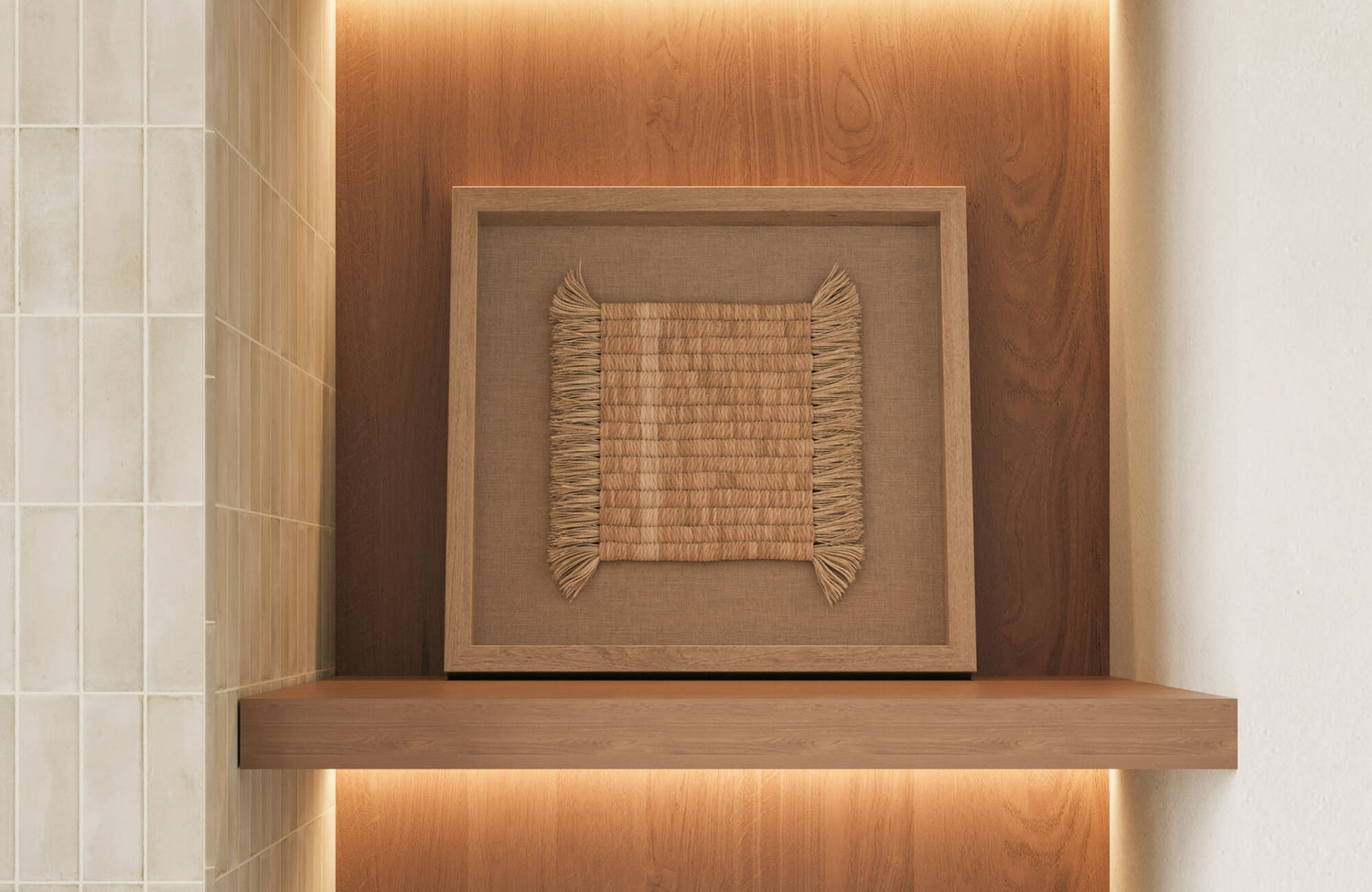
Heat and Humidity Zones
Environmental conditions inside your space can also influence the long-term condition of your wall art. Certain areas naturally generate higher levels of heat or moisture, which may gradually weaken materials such as canvas, paper, and wooden frames. When artwork is exposed to repeated temperature changes or persistent humidity, warping, cracking, and mold growth can eventually occur.
Because of this, it is best to avoid placing delicate pieces in areas directly above fireplaces or in humid spaces such as bathrooms. If you want to incorporate art in these rooms, selecting durable materials or well-sealed frames like our Shadow Orchard Wall Art, displayed above, can help reduce potential damage. By paying attention to these environmental factors, you allow your artwork to remain visually striking while maintaining its condition over time.

Aligning Art Placement with Room Function
The function of a room should influence how and where you place wall art. When artwork reflects the mood and purpose of a space, it naturally enhances the overall atmosphere and makes the room feel more intentional.
Bedrooms
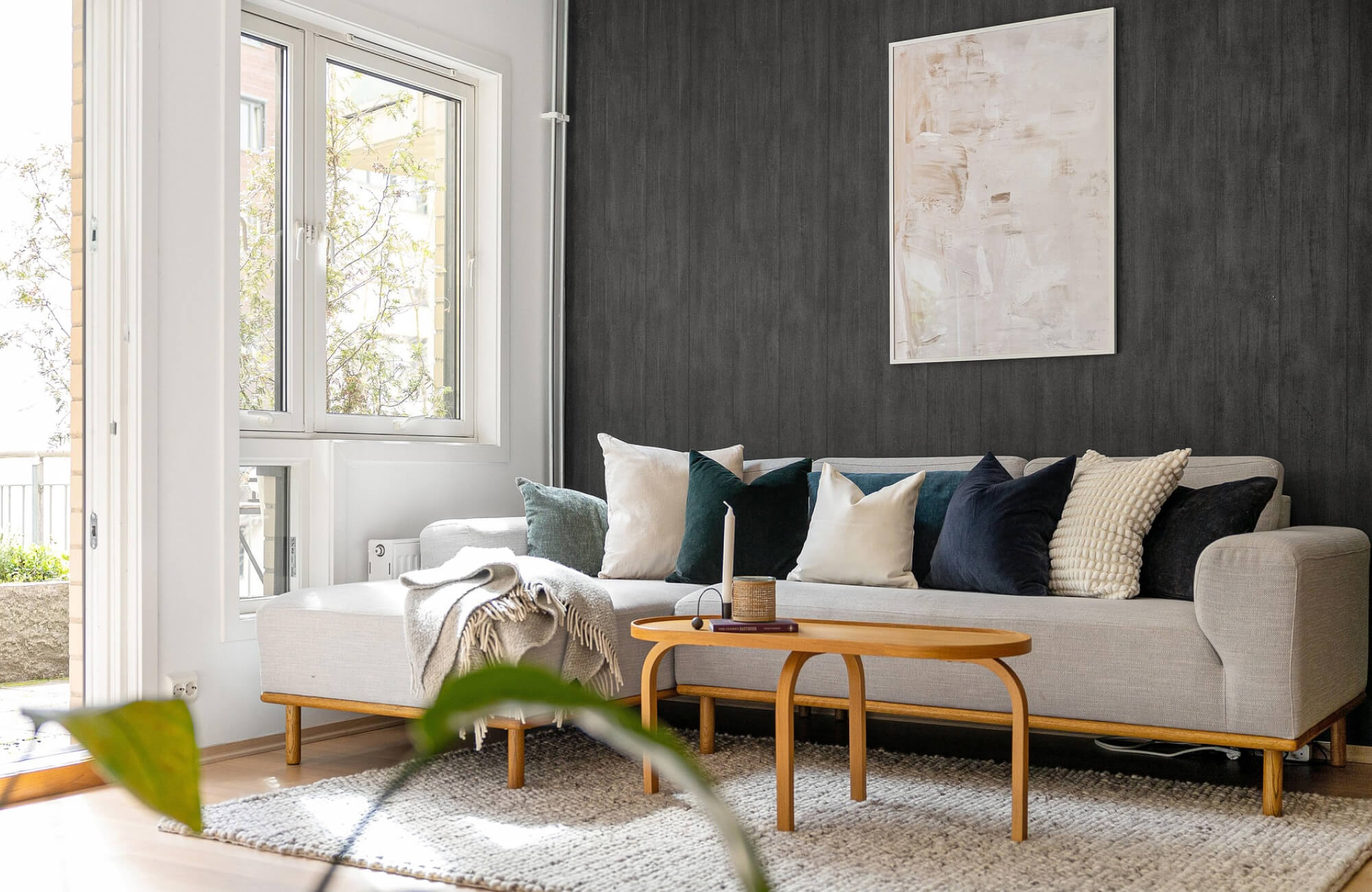
Bedrooms are meant to feel restful and calming, so the artwork you choose and where you place it should support that atmosphere. Instead of hanging heavy or visually intense pieces directly above the bed, placing artwork like our Wintering Light Wall Art on adjacent walls can create a softer and more relaxing visual presence. This approach also prevents the space from feeling overwhelming while still allowing the artwork to contribute to the room’s character.
Additionally, positioning artwork where it can be easily seen from the bed helps integrate it into the daily rhythm of the room. When you wake up or wind down at night, the artwork becomes part of the peaceful environment surrounding you. Choosing pieces with gentle colors or soothing imagery further strengthens the tranquil mood that a bedroom naturally requires.
Entryways
The entryway serves as the first visual introduction to your space, which makes it an excellent place for impactful artwork. When you place a striking piece, such as Hearthline Wall Art, on the most visible wall, it immediately sets the tone for the design style found throughout the rest of the space. This single focal point can establish color themes, artistic preferences, and the overall personality of the space.
Because entryways are typically transitional areas where people move quickly through the space, a bold and simplified display often works best. A single statement piece allows the wall to remain uncluttered while still capturing attention. As guests step inside, the artwork naturally draws their eyes and creates a welcoming first impression.
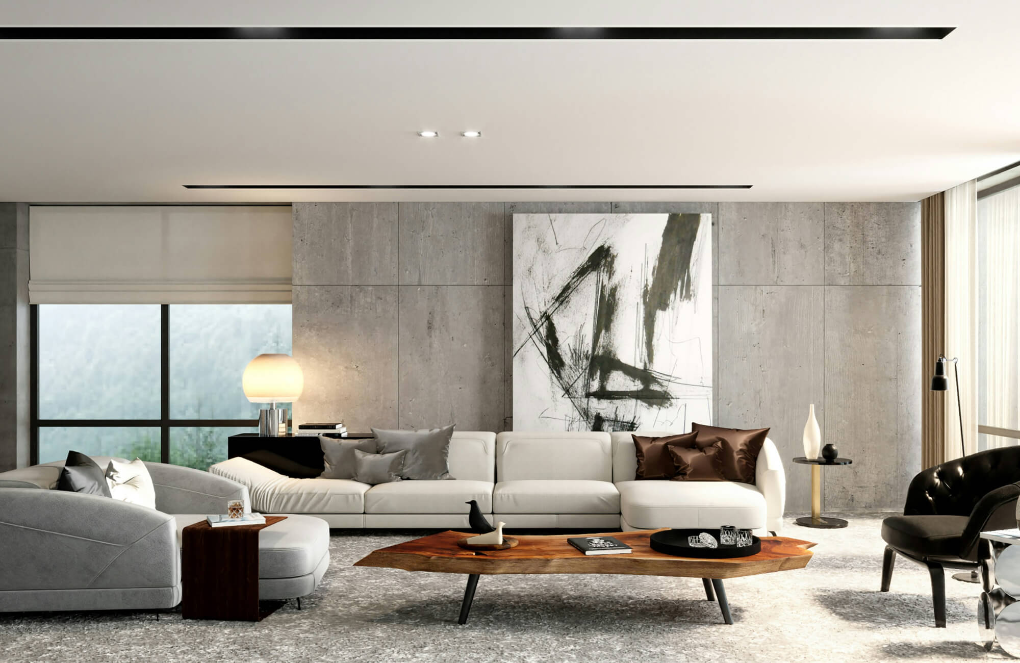
Living Areas
Living areas are often the central gathering spaces, which makes them ideal for showcasing artwork that reflects your personal style. Because these rooms typically include larger walls and prominent furniture pieces like sofas, fireplaces, or console tables, wall art can serve as a defining focal point. Placing artwork above a sofa, centered between built-ins, or positioned above a fireplace also helps anchor the seating area while creating a balanced visual composition. A standout example is our Follow the Wind Wall Art, which can work beautifully above a sofa or mantel, where its flowing design introduces movement and visual interest while complementing the room’s overall aesthetic.
In addition, living areas allow for greater flexibility in scale and arrangement. You can choose a single statement piece to establish a strong focal point or create a gallery wall that introduces variety and storytelling into the space. By aligning artwork with the furniture layout and maintaining comfortable viewing heights, the living area becomes both visually engaging and inviting, allowing art to enhance the atmosphere where people gather, relax, and connect.
Kitchens
Kitchens are primarily designed for function, yet well-placed artwork can introduce warmth and personality into the space. Since countertops, cabinets, and appliances often dominate the room, small wall areas become ideal spots for decorative accents. When you place artwork in these unused areas, it softens the practical nature of the kitchen and makes the space feel more inviting.
At the same time, careful placement ensures the artwork remains protected from the demands of cooking. Keeping pieces away from direct heat, steam, or splatter zones helps preserve their appearance while maintaining cleanliness. With thoughtful positioning, you can add artistic charm to the kitchen without disrupting the efficiency of the space.
For example, a nature-inspired piece like our Silent Orchard Wall Art shown above works beautifully in kitchens that feature warm wood tones or earthy finishes. Its layered textures and organic composition complement natural materials often found in cabinetry, countertops, and tile backsplashes. When placed on an open wall or styled on a floating shelf above a backsplash, it introduces a calming visual element that balances the kitchen’s functional surfaces while enhancing the overall atmosphere of the space.
Bathrooms
Bathrooms may be smaller than other rooms, but they still offer excellent opportunities to incorporate thoughtfully placed artwork. Because these spaces are designed for relaxation and daily routines, choosing art that reflects a calm and refreshing atmosphere, like Hushed Wall Art, can help enhance the overall experience. Placing artwork on open walls near a vanity, beside a mirror, or above a freestanding tub can introduce visual interest while maintaining a clean and uncluttered look.
However, bathrooms require extra consideration when it comes to placement. Since humidity and moisture levels can fluctuate, it is best to avoid areas directly exposed to steam or splashes. Instead, positioning artwork on walls with better ventilation helps preserve its condition while still allowing it to contribute to the room’s design. With the right placement and durable framing, wall art can add warmth, personality, and a spa-like character to the bathroom environment.
Creating a Cohesive Art Display Throughout Your Space
Thoughtful wall art placement brings harmony between artwork, furniture, and architecture, allowing each piece to feel naturally connected to the space. When art is positioned at comfortable viewing heights, aligned with furniture, and adapted to the function of each room, it transforms empty walls into purposeful focal points. As these elements come together, your artwork no longer feels like an afterthought but instead becomes an essential part of the space’s visual story, enriching the atmosphere and strengthening the overall design.
Furthermore, achieving a cohesive art display sometimes benefits from expert guidance, especially when balancing artwork with furniture, lighting, and the overall layout of your area. If you need help refining your wall art placement or planning a more coordinated interior design, our team can provide support and insights tailored to your space. By reaching out, you can gain practical advice that helps align your design vision, ensuring every element works together to create a harmonious and thoughtfully curated environment.