Low-light rooms can make even great wall art feel underwhelming when the piece wasn’t chosen with visibility in mind. You might hang something you love, only to notice it fades at night, loses detail from a distance, or looks completely different depending on the light. That’s not a style issue; it’s a visibility problem. Things like contrast, surface finish, and scale end up mattering more than color alone in these spaces. In this blog, we’ll walk through how to choose wall art that actually holds up in low-light rooms so your walls stay clear, intentional, and easy to read at any time of day.

Start With How the Room Actually Receives Light
Before choosing any wall art, it helps to pay attention to how light actually moves through the room during the day. Some walls stay consistently dim, while others catch brief moments of light that can make a big difference in how the artwork reads. Once you understand that pattern, it becomes easier to place art where it can actually be seen, rather than guessing based on style alone.
Identifying the Dimmest Wall vs the Brightest Spot
Every room usually has a natural contrast between its dimmest areas and the spots that receive the most light, even if the difference feels subtle at first. You might notice that one wall always looks slightly darker, no matter the time of day, while another catches just enough light to make details stand out more clearly. This difference matters more than most people expect, especially when it comes to artwork that relies on visibility to have an impact. Placing the wrong piece on the dimmest wall can make it feel like it disappears, even if it looks great up close. On the other hand, using the brighter spot for the right piece can make it feel more intentional without changing anything else in the room. It’s less about finding the “perfect” wall and more about recognizing which surfaces support visibility and which ones don’t.
A useful way to figure this out is to observe the room at different times instead of relying on a single moment. What looks fine in the afternoon might feel completely different in the evening once the light drops or shifts direction. You can also stand back and see which areas your eyes naturally go to, since brighter spots tend to draw attention without effort. If a wall consistently feels muted or shadowed, it’s usually better suited for simpler or lighter artwork rather than anything detailed. Meanwhile, the slightly brighter areas can handle more visual weight without losing clarity. This small shift in placement thinking can make a big difference in how the artwork is experienced day to day.
Natural vs Artificial Light and How They Affect Visibility
Natural and artificial light don’t behave the same way, and that difference shows up clearly once the artwork is on the wall. Natural light tends to shift throughout the day, changing how colors and details appear depending on the angle and intensity. In the morning, a piece might look softer and more balanced, while later in the day, shadows can make certain areas feel heavier or less defined. Artificial light, on the other hand, is more controlled but often more limited in range. It tends to highlight certain areas while leaving others slightly flat or uneven. Because of this, the same artwork can feel completely different depending on which type of light is doing most of the work.
A helpful approach is to look at how both light sources interact with the wall before committing to a placement. For example, a piece that looks clear under natural light might lose some of its detail under a single overhead fixture. You can test this by turning the lights on and off at different times to see how the artwork holds up in both conditions. It also helps to notice where artificial light is actually hitting, since not all areas are evenly lit. If a piece relies on subtle detail, it may need more consistent lighting to stay visible. Understanding this difference helps you avoid placing artwork in spots where it only works part of the time.

Choose Artwork That Doesn’t Get Lost in Shadow
In low-light rooms, the goal isn’t just to pick something that looks good up close, but something that still reads clearly from across the space. Some pieces naturally hold their visibility even when the lighting is uneven, while others start to fade into the wall once shadows come in. Focusing on how well the artwork holds up in dim conditions helps you avoid pieces that only work under ideal lighting.
Light Backgrounds That Stay Visible Even in Dim Corners
Artwork with lighter backgrounds tends to hold up better in dim areas because it reflects whatever light is available instead of absorbing it. Off-whites, soft beiges, and pale tones give the piece a base that stays visible even when the room isn’t fully lit. This makes a noticeable difference in corners or walls that don’t get much natural light throughout the day. Instead of fading into the background, the artwork remains readable from a distance, which keeps it from feeling like it disappears at certain times. It also helps maintain a sense of balance in the room, especially when other elements are already darker. Choosing lighter-based pieces is one of the simplest ways to keep artwork visible without relying on additional lighting.
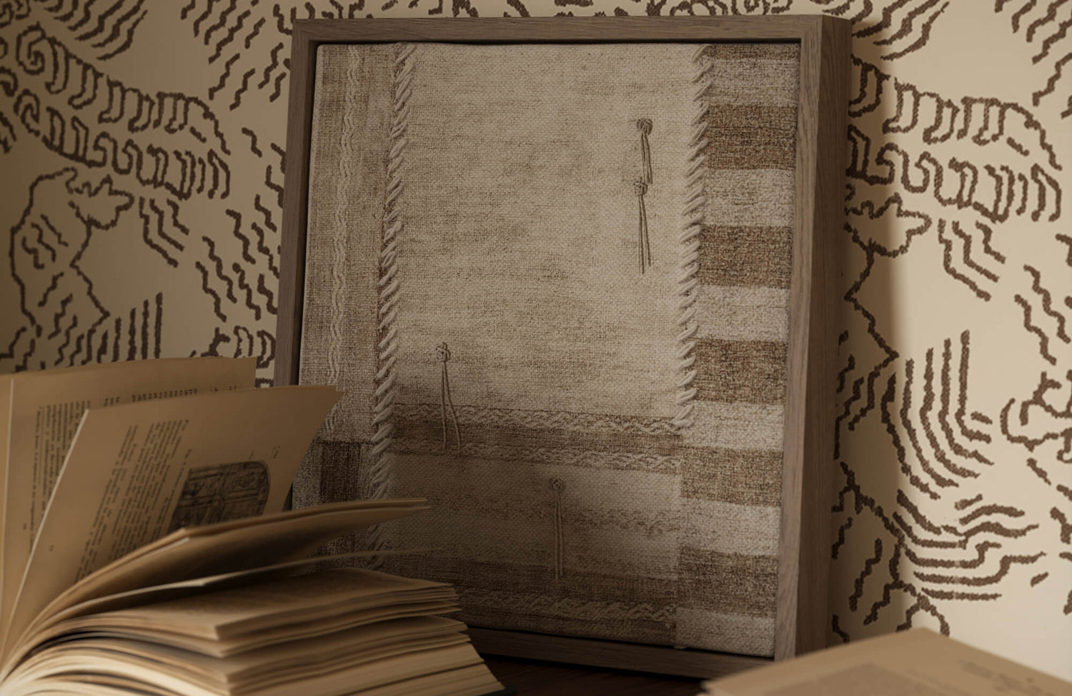
In spaces like this, texture becomes just as important as color when it comes to visibility. Our Distance Wall Art shown above works well in low light because its off-white base catches ambient light, while the stitched detailing creates subtle shadows that help define the composition. Even as the room dims, those raised lines and layered sections keep the piece from flattening out visually. Instead of relying on brightness, it stays readable through depth and surface variation, which makes it more dependable in uneven lighting conditions.
High-Contrast Pieces That Don’t Fade Into the Wall
Another approach that works well in low-light spaces is choosing artwork with clear contrast between its elements. When there’s a big difference between light and dark areas within the piece, it becomes easier for the eye to pick up shapes and details, even when lighting is limited. This is especially useful in rooms where shadows tend to soften everything, making low-contrast pieces harder to read. The contrast helps define the composition so it doesn’t blend into the wall or surrounding decor. It also gives the artwork more presence without needing to increase brightness or add more light sources. In many cases, this kind of clarity is what keeps a piece from feeling lost in the space.
Avoiding Overly Dark or Low-Contrast Artwork
Artwork that leans too dark or stays within a very narrow tonal range can struggle in low-light rooms. When there isn’t enough variation in brightness, the details tend to blend together, especially once shadows start to settle in. From a distance, the piece can end up looking like a single block rather than something with depth or definition. This doesn’t mean dark artwork can’t work, but it needs enough contrast to stay readable under less-than-ideal lighting. Without that, even well-designed pieces can lose their impact simply because they can’t be seen clearly. Being mindful of how much detail holds up in dim conditions helps prevent that issue.

Surface and Finish Matter More Than You Think
In low-light rooms, the surface of the artwork can affect visibility just as much as the design itself. Some finishes reflect light in a way that helps details stand out, while others absorb it and make everything feel more muted. Paying attention to how a piece interacts with light helps you choose something that stays readable instead of fading into the background.
Matte Finishes That Reduce Glare but Can Look Flat
Matte finishes are often seen as a safe option because they don’t reflect glare, especially under artificial lighting. This can be helpful in rooms with lamps or overhead lights that might otherwise bounce off the surface and distract from the artwork. However, in low-light spaces, that same quality can make the piece feel flatter than expected. Since matte surfaces absorb light instead of reflecting it, they can lose a bit of depth, especially if the artwork already has subtle detail. From a distance, the image may appear softer or slightly muted, which can reduce its overall presence. This is why matte works best when the composition is bold or simple enough to hold its shape without relying on light reflection.
Slight Sheen or Textured Surfaces That Catch Light Better
Artwork with a slight sheen or visible texture tends to hold up better in dim conditions because it interacts with light in a more dynamic way. Surfaces like canvas, layered prints, or pieces with visible brushstrokes can catch even small amounts of light and create subtle variation across the image. This helps bring out depth without needing strong lighting, since the surface itself adds movement as light shifts throughout the day. Even under artificial light, these finishes can highlight certain areas just enough to keep the piece readable. The effect isn’t overly reflective, but it’s enough to prevent the artwork from feeling flat. In low-light rooms, that small amount of surface variation can make a noticeable difference.
Avoiding Glossy Finishes That Reflect Instead of Showing the Art
Highly glossy finishes can cause more problems than they solve in low-light spaces, especially when artificial lighting is involved. Instead of helping the artwork stand out, they often reflect surrounding light sources like lamps or windows, which can make parts of the piece hard to see. This reflection can shift depending on where you’re standing, meaning the artwork might look clear from one angle and completely washed out from another. In darker rooms, where lighting is already limited, this becomes even more noticeable. Rather than adding depth, the surface ends up competing with the light itself. Avoiding overly glossy finishes helps keep the focus on the artwork instead of the reflections around it.
Why Texture Can Add Depth in Low-Light Spaces
Texture plays a different role in low-light rooms because it creates depth without relying on brightness. When the surface has variation, even small changes in light can create shadows and highlights that give the artwork more dimension. This is especially useful when the room doesn’t have strong lighting to begin with, since the texture helps define the image on its own. Instead of appearing flat, the piece feels more layered, which makes it easier to read from different angles. This effect becomes more noticeable the longer you spend in the space, especially as light shifts throughout the day. In many cases, texture ends up doing the work that light can’t provide on its own.
That’s exactly where pieces like our Meadowline Wall Art come into play, especially in setups like the one shown above. The tightly wound rows of wool catch light in a controlled way, while the softer fringe edges create slight shadow breaks that keep the piece from blending into darker surroundings. Even against deeper surfaces like green tile or cabinetry, those raised fibers help the artwork hold its shape without needing brightness. The subtle mix of white, beige, and light brown tones also adds enough variation so it doesn’t read as one flat surface.

Scale and Simplicity Become More Important in Low Light
In low-light rooms, how big and how clear a piece is often matters more than how intricate or detailed it looks up close. When lighting is limited, the eye naturally looks for shapes and contrast it can recognize quickly, which means simpler compositions tend to read better. Focusing on scale and clarity helps the artwork stay visible and intentional, even when the room isn’t fully lit.
Why Small, Detailed Art Gets Lost Easily
Small, detailed pieces often rely on close viewing to be fully appreciated, which becomes a problem in dim spaces where visibility is already limited. Fine lines, subtle transitions, and intricate elements can blend together once the light drops, making the artwork harder to read from a distance. What looks rich and layered up close can start to feel indistinct when viewed across the room. This is especially noticeable in areas where shadows soften everything, reducing the contrast that helps define those details. Over time, the piece can feel like it fades into the wall rather than standing out as a feature. In low-light rooms, detail doesn’t always translate the way you expect, which is why scale plays such a big role.
Larger Pieces That Anchor the Wall Even in Dim Light
Larger artwork tends to hold its presence better because it doesn’t rely on fine detail to be seen. Instead, it creates a clear visual block that the eye can recognize even when the lighting is uneven or minimal. This makes it easier for the piece to anchor the wall and give the space a sense of structure. In dim rooms, this kind of presence becomes more important, since smaller pieces can feel scattered or less defined. A larger composition also reduces the need to “search” for the artwork, which helps the room feel more settled. Even with limited light, the scale alone gives it enough weight to remain noticeable. This is why bigger pieces often feel more intentional in these conditions.
In setups like the one shown above, scale does most of the work before detail even comes into play. Our Dusk Fold Wall Art holds the wall through its size and softened tonal shifts, where taupe and dark gray create a broad, readable surface rather than relying on sharp contrast. The blurred motifs don’t compete for attention but instead form a single, cohesive field that’s easy to register from across the room. Even in low light, it doesn’t disappear; it settles in as a clear focal point because the composition reads as one complete shape.
Keeping the Composition Clear and Easy to Read
Beyond size, how simple or complex the composition is also affects how well it holds up in low light. Artwork with clear shapes, defined contrast, and fewer competing elements tends to read more easily, especially from a distance. When too many details are packed into one piece, they can start to blur together once the lighting softens. This doesn’t mean the artwork has to be plain, but it does need a level of clarity that allows the main idea to come through quickly. Strong focal points, clean transitions, and balanced spacing all help maintain that clarity. In dim rooms, this kind of structure keeps the piece from feeling visually lost. It allows the artwork to remain legible without needing perfect lighting.
When a Gallery Wall Still Works and When It Doesn’t
Gallery walls can work in low-light spaces, but they require more control to avoid looking scattered. When multiple pieces are grouped together without clear spacing or alignment, the entire wall can start to feel busy, especially when visibility is already reduced. The eye has a harder time moving between pieces, which makes the arrangement feel less cohesive. However, when the layout is tighter and more intentional, with consistent spacing and a shared visual direction, it can still read as one unified display. Keeping the pieces within a similar scale or palette also helps maintain that cohesion. In these cases, the gallery wall works because it functions as a single visual unit rather than separate parts.

Placement and Lighting Work Together With the Art
Even the right piece can fall flat if it’s placed where light never really reaches it. In low-light rooms, placement isn’t just about where the wall is, but where the light actually lands and how it moves throughout the day. Once you start thinking of light as part of the setup, it becomes easier to position artwork where it can actually be seen and appreciated.
Placing Art Where It Naturally Catches Light
Some spots in a room naturally pick up more light, even if the overall space feels dim. This could be a section of wall near a window, across from a light source, or an area that catches indirect light at certain times of the day. Placing artwork in these zones helps it stay visible without needing extra effort, since even a small amount of light can bring out details and contrast. You’ll notice that pieces placed in these spots feel more defined and easier to read compared to those in shadowed areas. It’s not about making the artwork brighter, but about letting it work with the light that’s already there. This approach keeps the setup feeling more natural and less forced.
A useful way to figure this out is to observe where your eye naturally goes when you walk into the room at different times. The areas that feel slightly brighter or more noticeable are usually the ones that can support artwork best. You can also test this by temporarily placing a piece in different spots and seeing how it looks throughout the day. Even small shifts, like moving it a foot closer to a light source, can change how it reads. Over time, this kind of adjustment helps you find placements that feel effortless rather than overly planned. It’s a simple step that makes a big difference in visibility.
Using Wall Lights or Picture Lights to Support the Artwork
In rooms where natural light is limited, adding a dedicated light source for the artwork can make a noticeable difference. Wall lights or picture lights don’t need to be strong or dramatic to be effective; they just need to provide enough illumination to bring out the details. When done right, this kind of lighting feels like part of the design rather than something added later. It helps define the artwork and gives it a clear presence, especially in the evening when the rest of the room may feel darker. Without it, even well-chosen pieces can start to fade into the background. The goal is to support the artwork, not overpower it.
Avoiding Corners Where Art Completely Disappears
Corners or recessed areas in a room often receive the least amount of light, which makes them difficult spots for artwork. Even during the day, these areas can stay consistently dim, causing pieces placed there to lose clarity and presence. Instead of standing out, the artwork can start to blend into the wall, especially if the tones are already muted. Over time, this makes the space feel underused or visually uneven, since one part of the room holds attention while another fades away. It’s not always obvious at first, but it becomes more noticeable the longer you spend in the space. Avoiding these low-visibility areas helps keep the room feeling more balanced.
If you do need to use a corner or dim section, a simple fix is to support it with a nearby light source rather than leaving it as is. This could be a floor lamp, a wall fixture, or even repositioning an existing light so it reaches that area. You can also choose artwork that has stronger contrast or lighter tones to help it stand out more naturally. Testing the space at night is especially helpful, since that’s when these areas tend to disappear the most. Even a small amount of added light can bring the piece back into view. Being aware of these “dead zones” helps you avoid placements that don’t work long term.

Matching the Mood of Low-Light Spaces
Low-light rooms naturally create a certain atmosphere, whether that’s calm, cozy, or slightly dramatic. Instead of trying to fight that with brighter or louder artwork, it usually works better to follow the direction the room is already leaning. Once the mood feels consistent, the space comes together more naturally without needing to force contrast or brightness.
Leaning Into a Cozy, Moody Feel
In dim spaces, leaning into a deeper and more relaxed mood often feels more intentional than trying to “fix” the lighting. Artwork with richer tones, softened edges, or slightly muted palettes tends to settle into the room instead of standing out in a forced way. This works especially well in living rooms or bedrooms where the lighting already supports a quieter atmosphere. You’ll notice that when the artwork aligns with that mood, it doesn’t demand attention but still feels present and grounded. Instead of competing with the space, it blends into it in a way that feels natural over time. That’s usually what makes the room feel complete rather than overworked.
A more practical way to approach this is to evaluate the room at night, not just during the day when natural light might temporarily brighten things up. Pay attention to how the walls look under your regular lighting setup, since that’s when the artwork will be seen most often. If the space already feels warm and subdued, choosing artwork with softer transitions and less sharp contrast helps maintain that tone. You can also look at how shadows fall across the wall, since artwork that works with those shadows tends to feel more integrated. Even small decisions like avoiding overly crisp or high-energy pieces can keep the mood consistent. Over time, this approach makes the space feel more comfortable and less forced.
When to Brighten the Space With Lighter Artwork
There are also cases where a low-light room starts to feel too heavy, especially when most elements already lean toward dark. In those situations, introducing lighter artwork can help open up the space without completely changing its character. The goal isn’t to brighten everything, but to create just enough contrast so the room doesn’t feel closed in. Artwork with lighter backgrounds or softer tones can reflect available light and make the wall feel more visible. This is especially helpful in areas where the wall tends to fade into shadow. When done right, it lifts the space slightly while still keeping the overall mood intact.
A more useful way to handle this is to place lighter artwork where it can catch even minimal light rather than expecting it to brighten the entire room. For example, positioning it near a lamp or across from a reflective surface allows it to pick up more light naturally. It also helps to choose pieces where the lighter areas are balanced with some depth, so they don’t feel too stark against the rest of the room. You can test this by viewing the piece from across the room at night to see if it still reads clearly. This keeps the effect subtle and controlled instead of overly bright. When done this way, the room feels more open without losing its original atmosphere.
Keeping the Look Consistent Across the Room
Even when individual pieces work well, the room can still feel slightly off if the overall mood isn’t aligned. This often happens when the artwork introduces a completely different energy compared to the rest of the space. For example, a bright or high-energy piece can feel out of place in a room that leans dim and relaxed. At first, it may not seem obvious, but over time, that mismatch becomes more noticeable. Instead of feeling layered, the room starts to feel split between two different directions. This is usually where the sense of cohesion breaks down, even if everything looks good on its own.
A practical way to avoid this is to step back and look at the room as a whole rather than focusing on individual items. Ask yourself whether the artwork supports the existing mood or pulls attention in a different direction. If something feels off, it’s often easier to adjust the artwork slightly than to change everything else around it. You can also look for repeating qualities, like similar intensity levels or visual softness, rather than exact colors. This helps tie everything together without making it feel overly matched. Keeping that consistency in mind makes the space feel more intentional and easier to live with over time.
Making Wall Art Work in Low-Light Spaces
Low-light rooms don’t need to feel limiting, but they do require a more thoughtful approach than simply choosing artwork you like. As you’ve seen, small decisions like scale, finish, contrast, and even where the piece sits can completely change how visible and intentional it feels. When those elements are aligned with how your room actually behaves throughout the day, the artwork stops fading into the background and starts holding its place naturally. It’s rarely about making the room brighter, and more about making sure the artwork works with what’s already there.
If you’re still unsure which pieces will actually hold up in your space, especially with tricky lighting conditions, having a more tailored approach can save a lot of trial and error. At Edward Martin, our personalized design consultation focuses on how artwork interacts with your lighting, layout, and overall room mood, not just how it looks on its own. That way, you’re choosing pieces that stay visible, balanced, and consistent from morning to night. It’s a more practical way to design, especially in spaces where lighting plays such a big role.