


Color defines a bathroom’s personality, grounding both mood and function in every detail. The vanity, often the room’s focal point, offers a moment to express tone, contrast, and texture with quiet sophistication. Whether striking or subtle, its color choice shapes how light dances across surfaces and how materials speak to one another. From time-tested whites to daring midnight blues and warm wood tones, today’s vanities anchor entire interior stories. Their finishes, interplay with tile, and sensitivity to light conditions elevate them from utility to artistry.
In this article, we explore the nuanced spectrum of vanity colors and the design narratives they help bring to life. Through this exploration, discover how the right hue can transform a bathroom into a space of beauty, balance, and enduring character.

White Vanities
White vanities remain a perennial favorite for their timeless versatility and clean, crisp aesthetic. They enhance space, light, and material combinations in both traditional and contemporary interiors.
Enhancing Spatial Perception
White vanities reflect natural and artificial light, making small or dimly lit bathrooms feel more open and expansive. This quality is especially useful in powder rooms or apartment bathrooms where maximizing perceived space is crucial. When paired with glossy porcelain tiles or polished marble, the effect becomes even more luminous. Designers often incorporate under-vanity lighting to accentuate shadow lines and highlight surfaces. These touches contribute to a layered, airy ambiance that strikes a balance between function and elegance. The result is a fresh, breathable environment that feels thoughtfully composed.
Neutral Canvas for Statement Tiles
White vanities provide a perfect neutral backdrop for bold, artistic tile choices. Because of this, mosaic backsplashes and geometric encaustic patterns can shine without competing against cabinetry. Designers can also experiment with grout colors to create high contrast or subtle transitions. This adaptability empowers tile-centric designs with a solid visual anchor. The neutrality of white even allows for greater experimentation in floor and wall applications. It invites creativity while grounding the room in cohesive visual calm.
Seamless Integration with Varied Styles
From coastal to minimalist and farmhouse to transitional, white vanities harmonize with diverse stylistic directions. Matte shaker-style cabinets bring warmth and tradition, especially when paired with beadboard tiles. For modern spaces, lacquered slab-front vanities contribute a sleek, monolithic look. To complete the look, hardware finishes like brushed nickel or matte black introduce a refined edge that offers subtle contrast and visual balance. The color's neutrality also supports a flexible palette of warm and cool tile tones. This adaptability ensures the vanity remains relevant through evolving design trends.

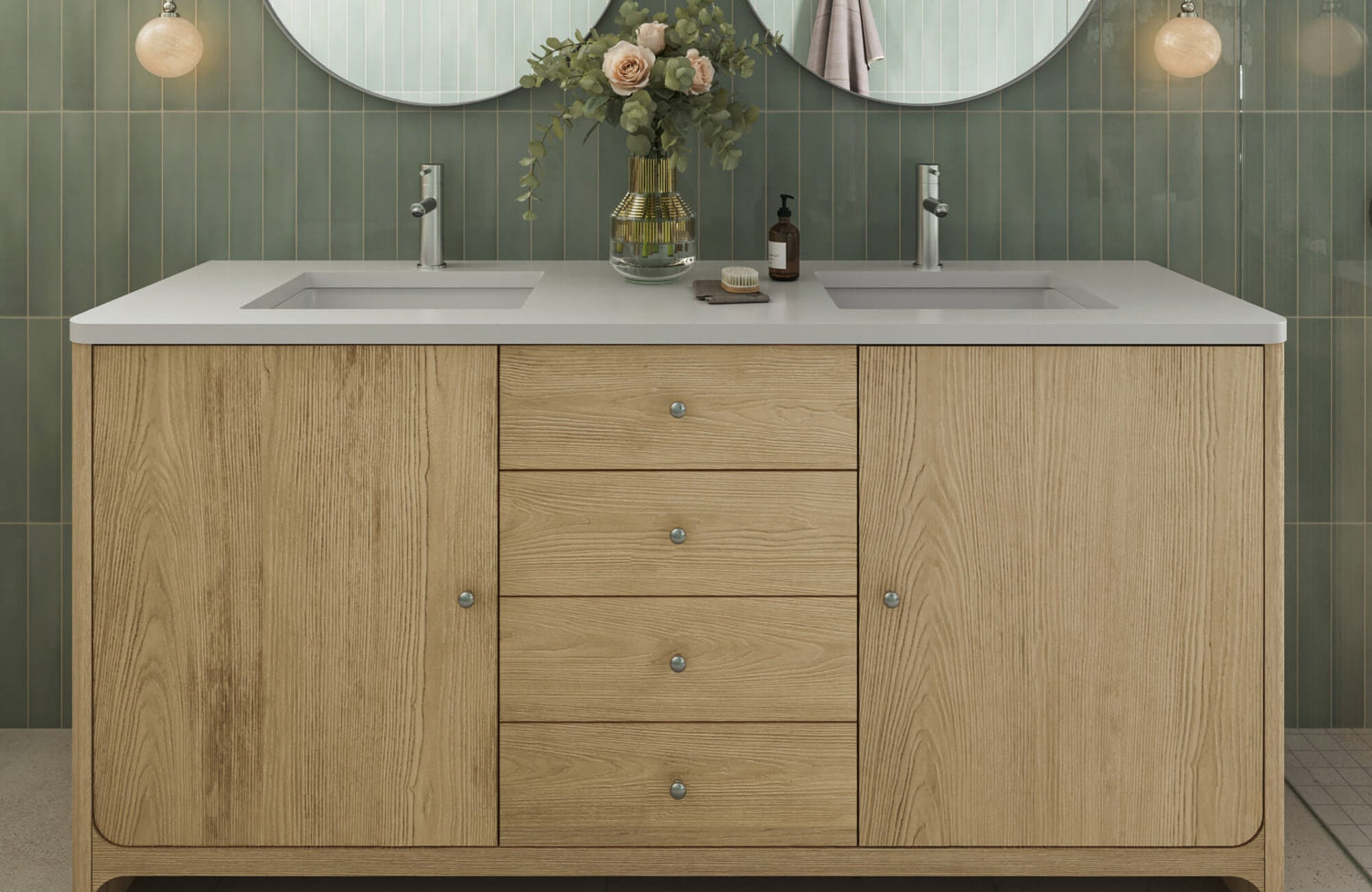
Soft Blue and Midnight Blue Vanities
Soft blue and midnight blue vanities introduce calming sophistication and moody elegance into the bathroom space. Their tonal range offers both gentle serenity and rich depth, making them ideal for a wide variety of design styles.
Striking Contrast with Light Tile Surfaces
Midnight blue vanities make a bold impression when set against bright, light-toned tiles. For example, white subway tiles or marble look porcelain create a striking contrast, drawing the eye directly to the vanity. The interplay between deep color and luminous surfaces amplifies spatial drama and light reflection. Soft blue vanities, by contrast, offer a more tranquil pairing with light gray or pale beige tiles. This softer contrast also brings a breezy, coastal feel to the room without overpowering it.
A perfect example, as displayed in the photo, is Edward Martin’s Bridgette 60" Double Vanity in Serenity Blue with 3 cm White Zeus Quartz Top, which balances delicacy and presence. The serene blue finish brings a soft, inviting tone, while the crisp white quartz-based top introduces a clean, luminous surface. The vanity’s open shelf and classic drawer fronts also enhance its light, coastal appeal, making it ideal for bathrooms where gentle contrast and airiness are key. Even without surrounding tiles, the vanity’s color and finish suggest a versatile pairing with bright, light-toned surfaces for a harmonious and elevated design.
Enhanced Pairing with Brass and Matte Black Accents
Both soft and midnight blues pair effortlessly with brushed brass and matte black hardware. Brass lends warmth and a touch of vintage elegance to soft blue cabinetry, while enriching the sophistication of deeper midnight tones. Matte black also provides structure and contrast, anchoring the palette with a contemporary edge. These finishes guide grout and fixture choices, offering either soft transitions or high-impact detail. As light plays across the metals and cabinetry, subtle reflections introduce depth and enhance the sense of layered materiality. The result is a refined and versatile design language that adapts to varied aesthetics.
Transitional Design Appeal
Soft blue and midnight blue vanities are perfect for transitional spaces that blend traditional charm with modern clarity. Soft blue offers a gentle, airy presence that works well with natural wood and neutral quartz. Midnight blue, on the other hand, adds gravity and richness that feels timeless under both warm and cool lighting. The impact of these hues is further shaped by cabinet styles. Recessed-panel doors introduce a classic touch, while minimal slab fronts lean modern and sleek. To complement these forms, accents like framed mirrors or simple sconces add definition and bring balance to the overall composition. This dual-tone approach ensures flexibility and enduring visual interest in evolving interiors.

Satin Black and Charcoal Vanities
Satin black vanities deliver bold definition with a soft, elegant sheen that balances presence and polish. Their smooth, low-luster finish offers a refined contrast in both modern and transitional interiors.
Harmonizing with Textured Tiles
Satin black vanities complement textured tile surfaces while maintaining a gentle, light-diffusing sheen. They work beautifully with materials like concrete look porcelain, fluted glass, and lightly textured ceramics. The satin finish introduces just enough reflection to enhance depth without overshadowing surrounding textures. When paired with large format or dimensional tiles, the result is grounded and visually compelling. Unlike matte, satin black adds subtle light movement, which enlivens the overall composition. These vanities are often used to bring sleek sophistication to minimalist or industrial designs.
Defining Monochromatic Aesthetics
In monochrome schemes, satin black vanities anchor the palette with soft visual weight and refined contrast. Paired with graphite tiles or charcoal grout, they preserve a sense of depth while allowing tone-on-tone layering. Chrome or brushed steel fixtures complement the soft shine of satin, adding a crisp, contemporary accent. The finish enhances surface interest while maintaining clarity and cohesion. It encourages interplay between form and shadow without overwhelming the design. The overall effect is a sophisticated balance of elegance and restraint.
Applications in Architectural Design
Satin black vanities work beautifully in architecturally focused bathrooms where finish plays a structural role. Floating forms, integrated sinks, and minimalist lines all benefit from satin’s smooth surface quality. The subtle sheen reflects ambient light, highlighting negative space and contour. These vanities pair well with rectilinear tiles and sleek frameless glass enclosures. Often used in upscale residential and boutique hospitality settings, they evoke a sense of curated luxury. The finish also supports an intentional, design-forward look without sacrificing approachability.
A prime example is Edward Martin’s Josephine 48" Single Vanity in Satin Drifted Black Veneer with Carrara Marble Top. As shown in the photo above, the vanity’s minimalist façade and deep black finish offer structural elegance without ornamentation. The Carrara marble top introduces a soft, natural counterpoint, while the brass hardware adds warm definition. Together, these elements showcase how satin black can support a quiet yet refined architectural expression in modern, boutique environments.

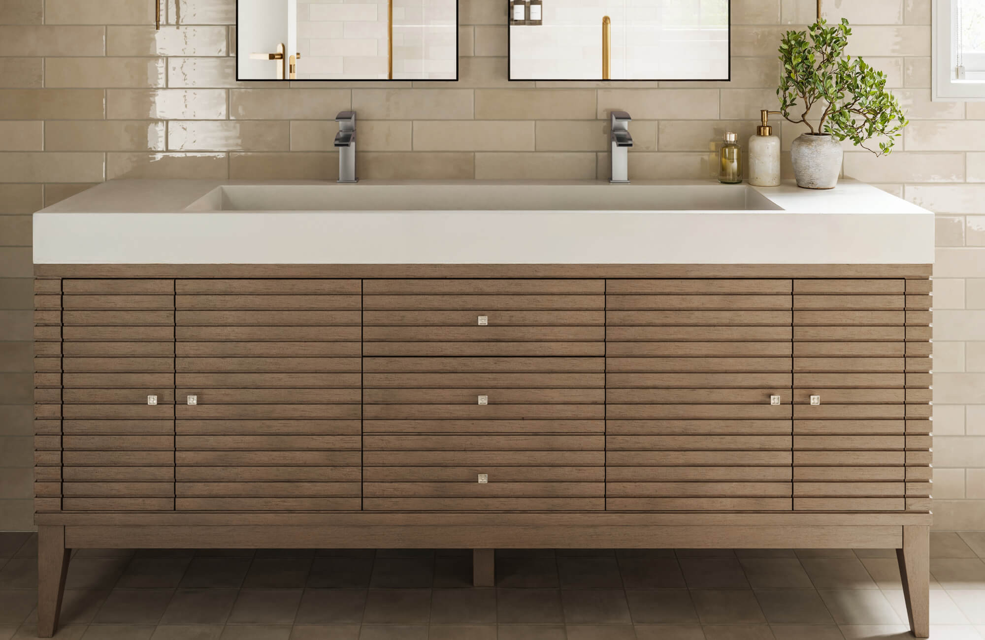
Wood-Tone Vanities
Wood-tone vanities bring depth, authenticity, and a sense of warmth through natural grain and color. They offer a grounding element that resonates with biophilic and nature-inspired design principles.
Complementing Earth-Toned Tile Palettes
Wood-tone vanities, especially in walnut, oak, and teak, pair seamlessly with tiles in terracotta, light beige, or gray-blue tones. These palettes echo the natural world and provide a sense of comfort and rootedness. Used alongside natural stone mosaics or pebble flooring, the design also feels both organic and luxurious. Brushed or honed tile textures further reinforce the rustic character of the space. These combinations are often found in Mediterranean and desert-modern aesthetics. Together, they create a space that feels both grounded and timeless.
Integration in Floating Designs
Floating wood-tone vanities introduce visual lightness while maintaining natural warmth. The clearance below allows floor tiles to flow continuously, emphasizing spatial openness. Integrated under-lighting also adds depth and elegance, especially in dim bathrooms. Clean-lined construction, such as mitered corners or frameless edges, helps keep the look modern. This design approach merges traditional materials with contemporary sensibilities. It’s a thoughtful fusion that enhances both function and form.
While floating configurations often dominate this design style, more compact, grounded options like our Royce 36" Single Vanity in Chestnut with 3 cm White Zeus Quartz Top bring similar warmth and tonal richness in small-space applications. Though freestanding, Royce’s clean silhouette, warm wood grain, and crisp quartz-based top reflect many of the aesthetic benefits found in floating vanities. As displayed in the picture above, the vanity’s warm brown finish introduces earthy depth, making it a versatile choice for modern bathrooms where space is limited but style and texture are prioritized.
Biophilic Design Influence
Wood-tone vanities embody biophilic design principles by drawing the outdoors inward. When paired with botanical tiles or reclaimed materials, they create a calming, nature-based aesthetic. Textured wood surfaces interact beautifully with daylight and shadows, enriching the tactile experience. Designers often complete the look with greenery, organic textiles, and light wood accessories. The result is a holistic environment that supports emotional and physical well-being. It’s not just a design style—it’s a design philosophy.

Green Vanities
Green vanities bring a bold, biophilic undertone that balances visual drama with calming depth. They make memorable statements in boutique-inspired and heritage-driven designs.
Heritage and Boutique Aesthetic Influence
Rich greens like emerald and forest shades lend vintage elegance to bathrooms inspired by Art Deco or classic British styles. Cabinet paneling and wainscoted tile reinforce the historical narrative. Antique gold or brass hardware also enhances the boutique feel, adding warmth and character. These vanities infuse personality while preserving a sense of formality. They are often chosen for bathrooms where narrative and style are equally prioritized. It’s a palette that respects the past while remaining visually compelling.
Pairing with Artisanal and Textured Tiles
Muted greens such as sage and olive pair beautifully with handmade tile options like zellige, terracotta, or encaustic cement. These combinations highlight tactile variety and irregularity, contributing to an artisanal feel. Tiles with glaze variation or hand-cut edges also enhance the handcrafted quality. When paired with green cabinetry, the space feels curated and deeply layered. Designers use these combinations to create one-of-a-kind interiors that feel storied and soulful. It’s a look that celebrates craftsmanship and intentionality.
Effective Use in Powder Rooms and Accent Areas
Because of its intensity, green is often used in small bathrooms where experimentation is welcome. Paired with ample light and reflective tiles, green feels vivid and energizing rather than heavy. Tile wainscoting or chair rails can also help visually contain and highlight the vanity. Glass accents and open shelving further balance the bold color. This makes green a smart choice for adding impact without overwhelming the space. The result is vibrant, memorable, and beautifully proportioned.

Greige and Taupe Vanities
Greige and taupe vanities embody a quiet sophistication that bridges warm and cool palettes effortlessly. Their subtle tone provides both harmony and flexibility within diverse lighting and textural environments.
Creating Spa-Inspired Environments
Greige vanities promote serenity and calm, making them ideal for spa-like bathroom settings. When paired with limestone-look tiles and natural light, the atmosphere becomes restorative and organic. Creamy or ivory flooring also enhances the soothing quality of the palette. To carry that softness upward, wall tiles in gentle textures like linen or wave patterns add depth without clutter. The overall effect is one of tranquility and slow, intentional design. These elements work together to cultivate a space that nurtures well-being.
Pairing with Natural and Faux Textures
Greige and taupe blend beautifully with wood-look tiles, stone mosaics, and woven finishes. These vanities support the textural richness of rustic modern or organic minimalist interiors. Engineered veneers that mimic real wood grain also add an extra layer of authenticity. Their muted tone ensures materials take visual precedence while maintaining chromatic harmony. This creates a cohesive environment where texture drives interest over color. It’s a perfect balance of earthiness and elegance.
Adapting to Fixture and Lighting Variations
Greige is known for its chameleon-like nature, shifting between beige and gray depending on light. Under warm illumination, it leans cozy and earthy, while in cooler lighting, it feels more modern and reserved. This flexibility makes it compatible with both chrome and oil-rubbed bronze fixtures. The tone also complements soft gray or warm white tiles, enhancing its neutral adaptability. Designers value this quality in spaces that may evolve or be renovated over time. Its ability to accommodate change makes it a wise, long-term choice.
Texture, Reflectivity, and Surface Durability
A vanity’s finish, matte, glossy, or satin, affects its aesthetic, durability, and interplay with tile and lighting. Each surface treatment influences how the bathroom feels and functions day to day.
Matte Finishes for Soft Diffusion
Matte finishes absorb light, reducing glare and enhancing surface texture. They are ideal for pairing with equally textured or subdued tiles in organic spaces. These vanities hide smudges and water spots better than glossy ones, making them low maintenance. Their tactile, architectural quality also supports clean, minimalist compositions. Designers favor matte in spaces that prioritize mood over shine. It’s a quietly powerful finish that complements thoughtful design.
Glossy Finishes for Reflectivity and Expansion
Glossy vanities reflect light, brightening darker bathrooms and making small spaces feel larger. This enhanced brightness pairs effortlessly with polished porcelain and marble-look tiles, reinforcing a sleek, luxurious appearance. Wall-mounted versions take it further by visually lifting the vanity, creating the impression of more floor space. Though they require more frequent cleaning, their luminous surfaces reward with crisp, radiant contrast. That interplay of shine and space results in a bathroom that feels open, contemporary, and high-end. For designers aiming to maximize visual impact, glossy is often the finish of choice.
An excellent example of this principle in action is Edward Martin’s Easton 72" Double Vanity in Whitewashed Walnut with Glossy White Composite Stone Top, as depicted in the picture above. The vanity’s expansive white surface bounces light effortlessly, elevating the airy tone of its whitewashed walnut base. This glossy top not only enhances brightness but also adds a clean, spa-like finish ideal for modern luxury bathrooms. This vanity exemplifies how glossy finishes can blend natural warmth with sleek sophistication, perfect for designs that seek both openness and texture.
Satin Finishes for Balanced Elegance
Satin finishes offer a perfect balance between matte and glossy, blending subtle shine with durability. They coordinate well with both flat and reflective surfaces, making them highly versatile. Satin is especially useful in busy bathrooms where easy maintenance is key. It adds depth without visual heaviness, helping to unify diverse material palettes. The finish also feels soft and refined, neither flashy nor flat, making it a practical and stylish middle ground.

Coordinating Vanity Color with Tile and Space Constraints
Choosing the right vanity color means balancing tile tone, lighting conditions, and the room’s proportions. When these elements are thoughtfully aligned, the space feels intentional and visually grounded. A cohesive palette not only improves functionality but also elevates the overall character of the bathroom.
Aligning with Tile Undertones
The undertones of tile and vanity should complement one another to avoid visual dissonance. For example, cool gray tiles can feel disconnected from warm taupe finishes unless a bridging tone like greige is introduced to harmonize them. Elements such as veining or speckling within the tile can serve as visual cues, guiding designers toward complementary vanity finishes. Choosing neutral vanities helps anchor these combinations, offering a subtle backdrop that supports more expressive tile selections.
Addressing Spatial Proportions
Dark-colored vanities can overwhelm tight or narrow bathrooms unless thoughtfully balanced. To counter this, floating vanities and open designs reduce visual weight and help preserve spatial flow. Extending continuous floor tile and using vertical wall tile layouts also guides the eye upward, subtly elongating the room. This sense of height is further amplified by well-placed mirrors and ambient lighting, which introduce brightness and depth. Maintaining proper scale allows rich, dark tones to feel grounded rather than overpowering.
Managing Lighting Temperature and Intensity
Lighting dramatically affects how vanity colors are perceived throughout the day, often shifting their tone and intensity. For example, warm light can add a yellow cast to cooler hues, while cool LEDs may mute the richness of warmer ones. These shifts become even more pronounced when natural light enters the equation, varying with the time of day and the room’s orientation. Tile surfaces further influence perception. Glossy and reflective finishes amplify brightness, whereas matte textures absorb light and soften its effect. Because of these variables, swatching materials under actual lighting conditions is essential for making accurate selections.
To help bring that story to life, Edward Martin offers personalized design services that guide homeowners, designers, and builders through these nuanced decisions. From selecting the perfect vanity finish to harmonizing with tile undertones, spatial needs, and lighting conditions, our experts collaborate with you to shape spaces that are both beautiful and practical.
Embracing Color as a Design Tool
Today’s most celebrated vanity colors reveal how emotion, light, and material come together in thoughtful design. No longer just an aesthetic choice, color now plays a central role in shaping experience and atmosphere. From bold greens to classic whites, each hue becomes a lens through which the bathroom takes on a distinct identity. When these colors are balanced with tile, lighting, and finish, the vanity evolves from a functional element into a form of expression. This harmony of tone and texture allows the space to resonate on a more emotional level. In the hands of a mindful designer, color transforms not just the look of the room, but its narrative.
If you're ready to explore that transformation in your own home, Edward Martin’s team is here to help. Whether you need product guidance, layout advice, or a fully tailored design consultation, we welcome your questions. Let’s bring your bathroom vision to life—with color, character, and expert design!