


Choosing the right tile color for your kitchen goes beyond appearance; it also influences how the space feels, functions, and evolves with daily use. The color you choose can make a kitchen feel brighter, cozier, or more refined, setting the tone for daily living and family gatherings. A thoughtful choice balances style with function, ensuring your kitchen remains both beautiful and easy to maintain. In this article, we explore six key perspectives to help you choose a hue that suits your lifestyle, complements your design goals, and enhances the overall harmony of your kitchen.

How Tile Color Shapes Kitchen Mood and Space
Color plays a vital role in how we experience a kitchen’s size, light, and overall atmosphere. The shades you choose can make a small space feel more open or bring a sense of warmth and intimacy to a larger room. By understanding how color influences perception, you can create a kitchen that feels balanced, welcoming, and visually cohesive.
Light vs Dark Tones
Light-colored tiles naturally brighten a room, creating an open, airy feel that makes the kitchen appear larger and more welcoming. In rooms with limited natural light or smaller layouts, shades like soft white, light gray, or cream can visually expand the space while offering a clean, versatile backdrop that complements any style.
This balanced effect is beautifully illustrated by Edward Martin’s Leona 24x24 Checkerboard Matte Porcelain Tile in Calacatta and Marfil, as seen in the photo above. The soft contrast between light and warm beige tones enhances brightness while adding subtle visual depth. In larger kitchens, darker tiles in shades like brown, gray, or black can also create a more grounded and intimate atmosphere without making the space feel confined.
Warm vs Cool Shades
Warm colors such as tan, cream, or light brown create a welcoming and comfortable atmosphere that makes the kitchen feel inviting and relaxed. When paired with natural materials such as wood or woven accents, they enhance the room’s sense of warmth and familiarity. In contrast, cool colors like gray, green, or blue bring a calm, balanced look that feels refreshing and composed. They’re especially effective in modern or minimalist spaces, where clarity and clean lines help maintain an open, peaceful mood.
Contrast and Balance
Color contrast adds depth and visual interest to a kitchen. Pairing light floors with darker cabinets naturally draws the eye upward, creating the illusion of height and openness. On the other hand, dark floors beneath lighter counters can add a sense of balance and stability. The goal is to use contrast thoughtfully, allowing colors to complement one another rather than compete for attention.

Considering Kitchen Size and Lighting Before Choosing Tile Color
Tile color can look very different under natural and artificial light. Because lighting and room size affect how colors appear, it’s important to assess both before making your final choice.
Natural Light Influence
The amount and direction of sunlight in your kitchen can greatly affect how tile colors appear. South- or west-facing rooms often receive warm, golden light that enhances deeper shades, such as gray or navy. In spaces with limited sunlight, lighter tiles help reflect brightness and create a more open, airy feel. This effect is beautifully demonstrated by Edward Martin’s Giselle 24x24 Polished Porcelain Tile in Shell, as displayed in the photo above, where the soft neutral tone captures natural light to brighten the room and highlight its smooth, refined surface.
Artificial Lighting Effects
Even in kitchens with ample daylight, artificial lighting plays a key role once the sun sets. The type of bulb you use can change how tile colors appear. Cool LED lights may make white tiles look harsh, while warm bulbs bring out the richness of cream, beige, or tan tones. If your lighting is more neutral, mid-tone tiles usually remain consistent, retaining their natural color throughout the day.
Small vs Large Kitchens
The size of your kitchen should play an important role in choosing the right tile color. Light or mid-tone tiles can make smaller kitchens feel more open and spacious by softening shadows and blending visual boundaries. In larger kitchens, darker tiles work beautifully to add contrast and definition, helping to distinguish areas like the island or cooking zone while maintaining a cohesive look.

Coordinating Tile Color with Cabinets, Countertops, and Finishes
Every element in a kitchen contributes to its visual harmony. Tile color ties together the flooring, cabinetry, and other surfaces, creating a cohesive and well-balanced look. Whether you prefer subtle continuity or bold contrast, coordination ensures your kitchen feels intentional and complete.
Matching vs Contrasting Surfaces
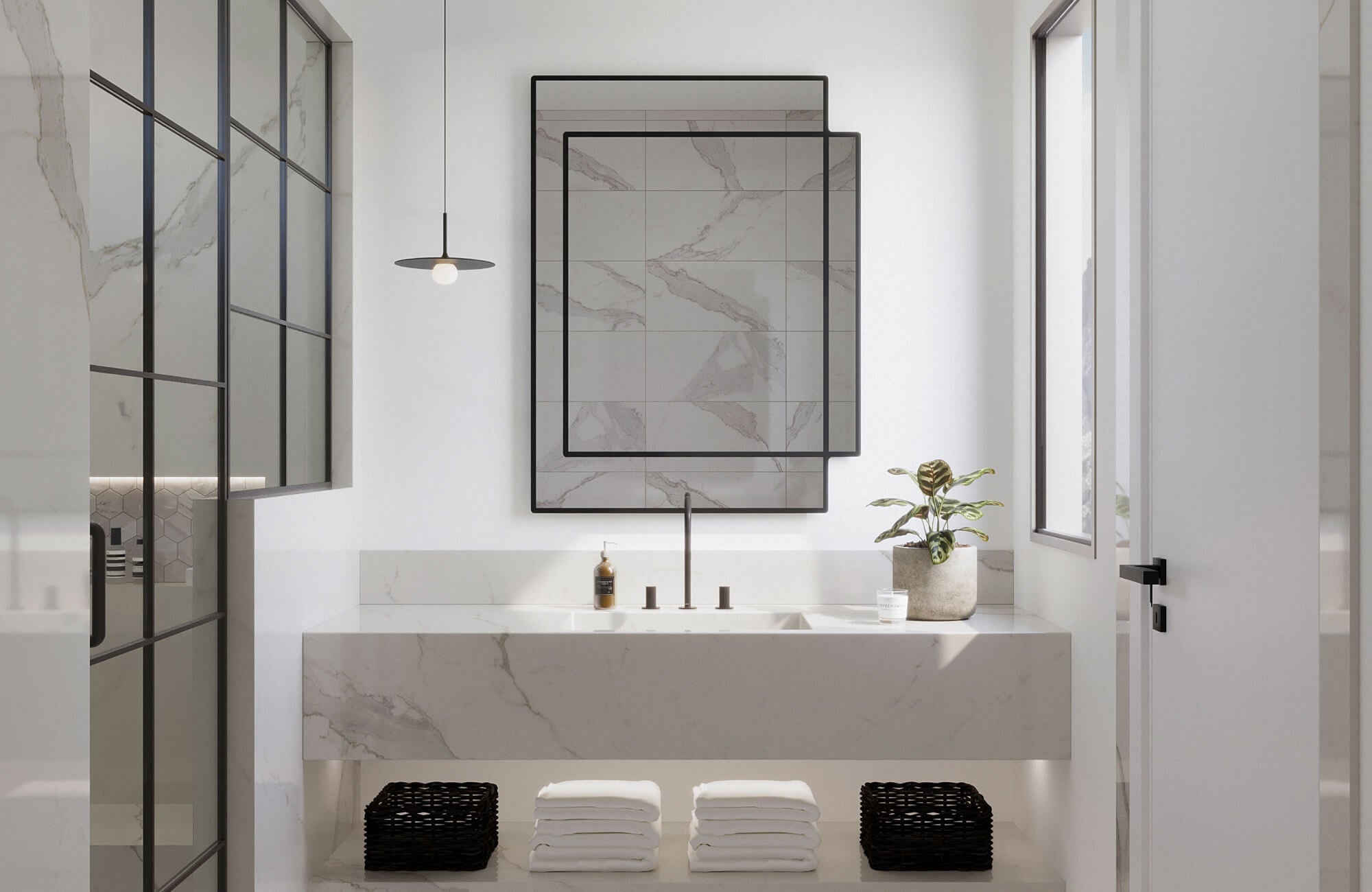
Matching the color of your tiles and cabinets creates a smooth, unified look that feels calm and intentional. For example, pairing soft gray tiles with similar gray cabinetry allows other details, such as lighting or hardware, to take the spotlight. A perfect example of balanced contrast can be seen with Edward Martin’s Brody 12x24 Matte Porcelain Tile in Sienna, as featured in the photo above. Its warm gray tone contrasts gently with light cabinetry, creating depth and visual interest while keeping the overall feel inviting and cohesive. White cabinets with darker tiles can also add personality and dimension, offering clear definition without overwhelming the space.
Neutral Foundations
Neutral tiles are among the most versatile options for any kitchen design. Shades like cream, beige, or light gray pair effortlessly with both warm and cool color schemes, creating a balanced and timeless backdrop. Because they adapt easily to changing décor, they’re ideal for those who enjoy refreshing their space from time to time. These understated tones also allow statement elements, such as patterned backsplashes or textured countertops, to stand out beautifully.
Metal and Wood Pairings
When your kitchen includes metal or wood finishes, let the undertones guide your color choices. Warm wood cabinets pair nicely with beige, tan, or honey tiles, adding a welcoming and comfortable feel to the kitchen. Cooler woods, such as gray-washed oak, work best with soft gray or dark gray tiles for a balanced, contemporary look. Similarly, stainless steel or matte black appliances complement cooler tile tones that highlight their sleek, modern character.

Reflecting Lifestyle and Maintenance Needs in Color Selection
Tile color should suit not only your style but also your everyday routine. The right shade can simplify cleaning, minimize visible wear, and help your kitchen look fresh and well-kept for years to come.
Hiding Dirt and Stains
Tiles in mid-tone colors, such as gray, beige, or those with subtle speckled patterns, like our Leighton 35x35 Matte Porcelain Tile in Multicolor, as featured in the photo above, do an excellent job of concealing small crumbs or spills. In comparison, pure white tiles tend to show marks quickly, while very dark tiles can highlight dust and water spots. A lightly varied or textured finish also adds depth and helps disguise everyday imperfections while keeping the surface clean and refined.
Frequency of Use
Kitchens that see daily activity benefit from tiles that retain their appearance over time. Mid-tone neutrals are a practical choice, as they tend to age gracefully and hide signs of wear better than bright white or deep black tiles. In kitchens used less frequently, lighter or more trend-focused colors can add personality and style without requiring as much maintenance.
Family and Pets
In homes with children or pets, durability and easy maintenance are essential. Tiles with matte or lightly textured finishes help reduce visible scuffs and provide better traction underfoot. Patterns or stone-look designs also add character while subtly concealing everyday marks, keeping your kitchen looking cleaner between deep cleans.

Expressing Style and Personality Through Tile Color
Tile color plays a big role in defining your kitchen’s personality. Whether your style leans toward timeless elegance or modern simplicity, the colors you choose help express your taste and bring character to the space.
Classic and Timeless Looks
Neutral colors stay timeless because they adapt easily to evolving styles and trends. White tiles, light gray ceramics, and soft cream tones pair beautifully with both traditional and contemporary cabinetry. These shades create a versatile foundation, allowing you to refresh your kitchen’s look over time without the need for a full remodel.
Modern and Bold Choices
If you prefer a more striking look, deep colors like dark gray, navy, or green can completely transform your kitchen’s mood. These shades add contrast and sophistication, especially when paired with simple lines or metal accents. The effect is beautifully illustrated by Edward Martin’s Leona 12x12 Checkerboard Matte Porcelain Tile in Marfil and Amani Grey, as featured in the photo above. The soft contrast between warm beige and cool gray complements darker cabinetry, bringing visual depth and a timeless, modern edge. To keep the space balanced, combine darker tiles with lighter walls or countertops that will help reflect light and maintain an open, welcoming feel.
Earthy and Organic Palettes
Colors inspired by nature, such as brown, tan, or green, create a natural connection between the kitchen and the outdoors. Brown, green, and tan tiles pair beautifully with wood cabinets and stone countertops, creating a calm, grounded atmosphere. These tones add warmth and authenticity, making them perfect for homes that value comfort and natural texture over formality.

Testing and Finalizing Your Tile Color Choice
Choosing a color is one thing; confirming it works in your home is another. Before making a final decision, test your options in real lighting conditions to ensure the color fits your kitchen’s environment.
Sampling in Real Lighting
Tile colors can look very different depending on the time of day and type of light. Place sample tiles where they’ll actually be installed, and observe them in the morning, afternoon, and evening. You may notice cooler tones under natural daylight and warmer hues under evening light, helping you make a choice that looks consistent and appealing in every setting.
Visualizing with Design Tools
Online design tools and an augmented reality app make it simple to explore how different tile colors will look with your cabinets and countertops. You can easily test combinations, compare options, and refine your choices with confidence before making a purchase. For the most accurate view, try using our AR tool to preview tiles directly in your kitchen and see how each color interacts with your lighting and décor.
Evaluating Long-Term Appeal
Trends may evolve, but your kitchen should remain welcoming and enjoyable for years to come. Consider whether the color you love today will still suit your style in the future. A shade that complements your lifestyle, décor, and natural light will stay visually appealing and comfortable to live with long after installation.
Making the Final Choice with Confidence
After weighing the mood, lighting, finishes, and everyday needs of your kitchen, the best tile color is one that blends practicality with style. Take time to test samples, observe them in your space, and ensure they complement the surrounding materials. A thoughtfully chosen color not only enhances your kitchen’s look but also creates a space that feels inviting, functional, and distinctly your own.
If you’re ready to explore tile options or need personalized guidance, contact us today—our design team is here to help you find the perfect color for your kitchen.