


A large blank wall can make a room feel unfinished, even when everything else is already in place. It’s not always about adding art, but choosing something that actually fits the scale of the space. Go too small, and it feels lost; go too big, and it can take over the room in the wrong way. The tricky part is finding that middle ground where the artwork feels connected to the wall, the furniture, and the overall layout. In this blog, we’ll walk through how to choose the right wall art size so your space feels balanced, intentional, and complete without overthinking it.

Start With the Wall Size and Overall Room Scale
Before choosing any wall art, it helps to look at the size of your wall and how it relates to the rest of the room. Large blank walls can be a bit misleading, and what looks right in your head doesn’t always feel balanced once it’s up. Starting with scale gives you a clearer direction, so your choices feel intentional instead of trial and error.
Measuring Wall Width and Height Before Choosing Art
The first step is simply understanding how much space you’re actually working with. It’s easy to underestimate or overestimate a wall when you’re just eyeballing it, especially in larger rooms. Taking a few quick measurements gives you a better sense of proportion right away. It also helps you avoid choosing something that ends up looking too small once it’s installed. When you know the width and height, you can start visualizing how much of that space your art should realistically take up. This small step makes the entire process feel more controlled instead of guessing your way through it.
How Ceiling Height Changes the Way Art Is Perceived
Ceiling height plays a bigger role than most people expect when it comes to wall art. Taller ceilings naturally create more vertical space, which can make standard-sized pieces feel smaller than they actually are. On the other hand, lower ceilings can make the same artwork feel more prominent. This shift in perception is important because it affects how balanced the room feels overall. If the art doesn’t match the vertical scale, the wall can end up feeling either empty or slightly off. Paying attention to height helps you choose something that feels proportionate from top to bottom. It’s one of those details that quietly shape how the whole space comes together.
Relating Art Size to Nearby Furniture
Wall art doesn’t exist on its own; it’s always interacting with the furniture around it. A piece that looks large on a blank wall can suddenly feel small once it’s placed above a wide sofa or bed. This is where proportion really starts to matter, because the art needs to visually connect with what’s below it. If it’s too small, it can feel disconnected, almost like it’s floating on the wall. If it’s too large, it can overpower the furniture and throw off the balance. Looking at the relationship between the two helps everything feel more grounded. When they work together, the space feels more cohesive without needing extra adjustments.
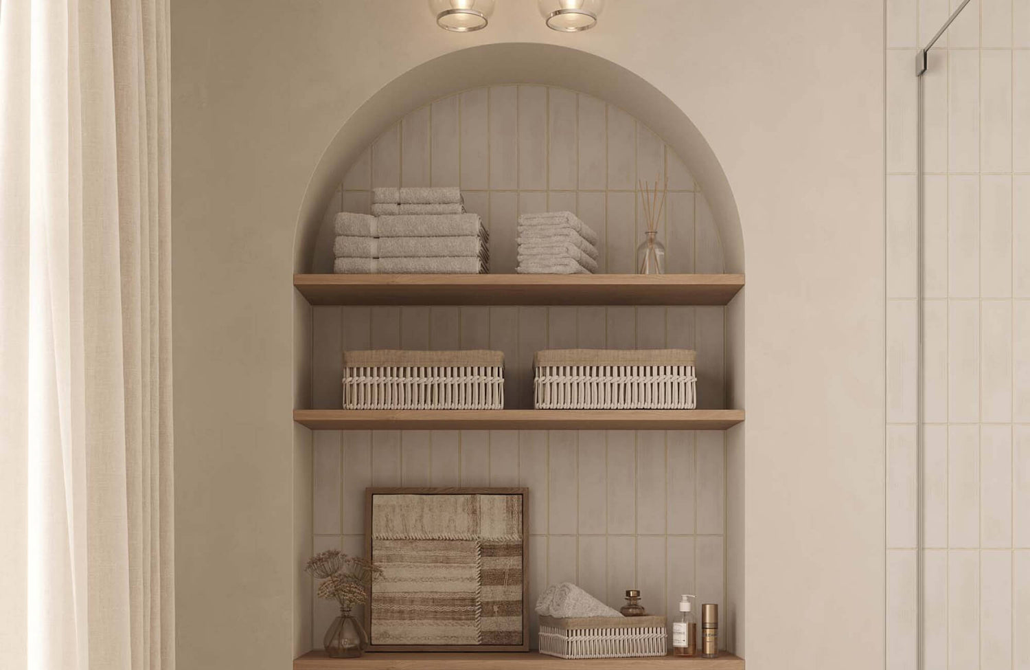
When wall art is placed near furniture, its size needs to feel connected rather than separate from what’s below it. In the space shown above, our Greyward Vale Wall Art is a great example, with its 26 inches width and 26 inches height giving it just enough presence to sit comfortably above the console without overwhelming it. The softly woven gradient that moves from pale neutral tones into deeper, earthier shades adds depth while staying visually calm. At 7.5 lb, it also remains practical to install while still feeling substantial on the wall. It shows how the right proportions help the artwork feel grounded within the setup instead of floating or feeling out of place.
Why Large Walls Need More Than Standard Sizing
Large walls often require a different approach because standard art sizes don’t always fill the space the way you expect. What works in smaller rooms can feel underwhelming once it’s placed on a much wider surface. This is where people usually end up with art that looks “too small for the wall” without knowing exactly why. The scale of the space naturally calls for something with more presence. It doesn’t mean you have to go extreme, but it does mean thinking beyond typical proportions. Larger walls need artwork that can hold its own visually without getting lost. Once you adjust your mindset around scale, the choices start to feel much more natural.

Common Wall Art Sizes and When They Work Best
Once you understand your wall and room scale, the next step is knowing how different art sizes actually perform in that space. Not every size works the same way, especially on larger walls where smaller pieces can easily get lost. Having a clear idea of when to go medium, large, or oversized makes it much easier to choose something that feels right.
Medium Sizes That Only Work When Grouped
Medium-sized artwork can still work on large walls, but it usually needs support to feel complete. On its own, it can look a bit undersized, especially when there’s a lot of open space around it. That’s why grouping multiple pieces together often creates a stronger visual impact. It allows you to build presence without relying on one large piece. When arranged thoughtfully, grouped art can feel just as intentional as a single statement piece. It also gives you more flexibility in how you style the wall over time. The key is making sure the grouping feels connected rather than scattered.
Medium-sized pieces like our Meadowline Wall Art can still work on larger walls, but they tend to feel more complete when paired or grouped with other elements. Looking at the space above, it’s 21 inches wide and 22 inches high, giving it a noticeable presence, but not enough to fully anchor a wide wall on its own. The layered wool texture, with tightly wound rows and soft cascading fringe, adds depth, but scale still plays a big role in how it reads from a distance. At 8 lb, it’s substantial enough to feel grounded, yet flexible enough to be styled alongside other pieces. Grouping similar works allows you to build that visual weight while keeping the overall look cohesive and intentional.
Large Formats That Create a Clear Focal Point
Large-format artwork is often the easiest way to anchor a big wall. It naturally draws attention and gives the space a clear focal point without needing additional pieces. This works well in modern interiors where simplicity plays a big role. Instead of filling the wall with multiple elements, one strong piece can carry the entire look. It also makes the space feel more cohesive because everything else can be styled around it. You don’t have to overthink the arrangement when the scale already feels right. In many cases, this approach creates a cleaner and more confident result.
Oversized Art for Expansive Walls
Oversized art really comes into play when the wall feels too large for standard or even large formats. These pieces are meant to take up space in a way that feels bold but still controlled. On expansive walls, smaller artwork can end up looking disconnected or lost. Going oversized helps fill that gap while still keeping the design simple. It also creates a strong visual statement without needing multiple layers. When done right, it makes the room feel more complete without adding clutter. It’s often the best choice when you want impact without complexity.
Multi-Panel Art for Wide Coverage
Multi-panel artwork is a great option when you want to cover more width without committing to a single large piece. It breaks the image into sections, which adds movement and keeps the wall visually interesting. This works especially well on wide walls where one piece might feel too centered or static. The spacing between panels also creates a natural rhythm that makes the layout feel more dynamic. It gives you a balance between structure and flexibility at the same time. You still get strong coverage, but with a bit more variation in how it’s presented. It’s a practical way to fill space while keeping things visually engaging.
When Vertical vs Horizontal Orientation Matters
Orientation can change how a piece of art feels just as much as its size. Horizontal pieces tend to work well on wide walls, especially when placed above furniture that follows the same direction. Vertical pieces, on the other hand, help draw the eye upward and can make a space feel taller. Choosing the right orientation helps the artwork feel more aligned with the room instead of working against it. It also affects how balanced the wall looks overall. If the orientation feels off, even the right size can look slightly out of place. Paying attention to this detail helps everything feel more connected and intentional.

Choosing Between One Large Piece or Multiple Smaller Pieces
Once you’ve narrowed down the general size that works for your wall, the next decision is whether to go with one large piece or a group of smaller ones. Both approaches can work really well, but they change the feel of the room in different ways. It comes down to how you want the space to look and how much visual structure you want on the wall.
When a Single Oversized Piece Works Best
A single oversized piece works best when you want the wall to feel clean, bold, and easy to read at a glance. It creates an instant focal point without needing anything else to support it, which makes the space feel more settled right away. This approach is especially useful in modern interiors where simplicity often leads to a stronger overall look. You don’t have to think about how multiple pieces relate to each other because everything is already contained in one frame. It also helps reduce visual clutter, since there’s only one element holding attention. When the scale is right, one large piece can make the wall feel complete without any extra effort.
Creating Balance With a Curated Gallery Wall
A gallery wall gives you more flexibility, but it also requires a bit more intention to get right. Instead of relying on one piece, you’re building a composition that needs to feel connected as a whole. Each piece should relate to the others in some way, whether through color, theme, or overall tone. When done well, it can make the space feel more personal and layered without feeling chaotic. It also allows you to adjust or swap pieces over time without reworking the entire wall. The key is making sure it feels curated, not random, so everything works together instead of competing. That sense of connection is what keeps it looking cohesive instead of busy.
Using Diptychs and Triptychs for Structure
Diptychs and triptychs are a great middle ground between one large piece and a full gallery wall. They break up a single image into two or three panels, which adds structure without making things feel too fragmented. This creates a sense of continuity across the wall while still giving you a bit of variation. It also helps guide the eye naturally from one panel to the next, which makes the arrangement feel intentional. Compared to a gallery wall, it’s easier to manage because the pieces are already designed to work together. At the same time, it doesn’t feel as heavy or static as one oversized piece. It’s a balanced option when you want both structure and visual interest.
Mixing Frame Sizes Without Losing Cohesion
Mixing different frame sizes can make a wall feel more dynamic, but it needs to be done carefully to avoid looking disorganized. The goal is to create variation while still keeping a clear sense of order. This usually works best when there’s something tying everything together, like a consistent color palette or similar subject matter. Without that connection, the wall can quickly start to feel scattered. It also helps to maintain a visual rhythm so the sizes don’t feel randomly placed. When done right, the mix adds depth and personality without losing that clean, intentional look. It’s about finding that balance between variety and structure.
Avoiding a Scattered or Random Layout
One of the most common mistakes with multiple pieces is letting the layout feel too loose or unplanned. When spacing, alignment, or sizing feels inconsistent, the whole wall can come across as cluttered. Even if each piece looks good on its own, the overall effect can feel disconnected. This is why having a clear plan before hanging anything makes a big difference. It helps you see how everything will work together instead of adjusting things one by one. Keeping the layout structured doesn’t mean it has to feel rigid; it just needs to feel intentional. When everything is placed with purpose, the wall feels complete rather than chaotic.

Placement and Proportion That Make Wall Art Feel Right
Even the right size can feel off if the placement isn’t working with the space. Where you position the artwork affects how large it looks and how balanced the whole room feels. Getting the proportion right is less about strict rules and more about making everything feel naturally aligned.
Centering Art Based on Wall, Not Just Furniture
A lot of people default to centering art only in relation to furniture, but it helps to step back and consider the wall as a whole. Sometimes, what feels centered above a sofa doesn’t actually feel centered within the full wall space. Because of that, the artwork can end up looking slightly off without it being obvious why. It’s worth looking at both the furniture and the surrounding wall area before deciding where the center should be. This gives you a more balanced result that feels intentional from every angle. You may find that shifting things slightly makes the whole setup feel more grounded. In the end, it’s about finding a position that feels right in the room, not just above one piece.
Proper Width Above Sofas, Beds, and Consoles
The width of your wall art should relate to the furniture below it in a way that feels connected, not separate. If the artwork is too narrow, it can look like it’s floating above the piece instead of belonging to it. On the other hand, if it stretches too far beyond the furniture, it can start to feel overwhelming. A good approach is to aim for a width that visually aligns with the furniture without matching it exactly. This creates a sense of balance that feels natural rather than forced. It also helps anchor the art so it doesn’t feel disconnected from the rest of the setup. When the proportions feel right, the entire area starts to come together more smoothly.
Spacing Between Pieces for a Clean Layout
When you’re working with multiple pieces, spacing becomes just as important as the artwork itself. If the gaps are too tight, everything can feel crowded and harder to read. If they’re too far apart, the pieces can start to feel disconnected from one another. Finding a consistent spacing helps create a sense of order that keeps the layout looking clean. It also allows your eyes to move across the wall without feeling interrupted. You’ll notice that when spacing is handled well, even a complex arrangement can feel calm. It’s a small detail, but it has a big impact on how the wall comes together.
Aligning Art With Architectural Lines
It also helps to pay attention to the lines that already exist in the room. Things like windows, door frames, or built-in features can act as natural guides for placement. When artwork aligns with these elements, the space tends to feel more cohesive without needing extra adjustments. On the other hand, if things are slightly off, it can create a subtle sense of imbalance. You might not immediately notice it, but it affects how the room feels over time. Taking a moment to line things up with these existing features can make everything feel more intentional. It’s one of those quiet details that help the design come together.
Adjusting Placement for Taller Walls
Taller walls can make placement a bit more challenging because there’s more vertical space to consider. If the artwork is placed too low, the upper portion of the wall can feel empty. If it’s placed too high, it can feel disconnected from the rest of the room. Finding the right height means balancing both the furniture below and the wall above. It also helps to think about how the piece will be viewed when you’re standing or sitting in the space. Slight adjustments in height can completely change how the artwork feels. Taking the time to get this right makes the entire wall feel more proportional and complete.

Common Mistakes to Avoid When Sizing Wall Art for Large Walls
Even when you have a good idea of what you want, a few small missteps can throw off the entire look of a large wall. Most of these mistakes come down to scale, proportion, and not stepping back to see how everything works together. Once you know what to watch for, it becomes much easier to make adjustments that actually improve the space.
Choosing Art That’s Too Small for the Wall
One of the most common mistakes is choosing artwork that simply doesn’t have enough presence for the wall it’s on. It might look fine on its own, but once it’s placed on a large surface, it can feel a bit lost. This usually happens when the wall has too much empty space around the piece, making it look disconnected. You might even find yourself trying to “fix” it by adding more pieces later on. Instead, it helps to recognize early on when something feels undersized. A larger or more impactful piece often solves the issue right away. Getting the scale right from the start saves you from constantly adjusting the setup.
Hanging Pieces Too High or Too Low
Placement height can easily make the artwork feel off, even if the size is right. When a piece is hung too high, it can feel detached from the rest of the room, almost like it’s floating above everything. On the other hand, hanging it too low can make the space feel cramped or slightly unbalanced. It’s helpful to think about how the art connects visually with what’s around it, especially furniture. You’ll also want to consider how it looks from a natural viewing height when you’re standing or sitting. Small adjustments here can make a surprisingly big difference. When the height feels right, everything tends to fall into place more naturally.
Overcrowding the Wall With Too Many Pieces
It’s easy to think that filling a large wall means adding more pieces, but that can quickly lead to a cluttered look. When there are too many elements competing for attention, the wall loses its sense of clarity. Even if each piece looks good individually, the overall effect can feel overwhelming. This often makes the space feel busier than it actually is. Giving each piece a bit of room helps it stand out more and keeps the layout easier to read. You don’t need to cover every inch of the wall for it to feel complete. In many cases, doing less creates a stronger result.
Forgetting to Step Back and View the Whole Space
Sometimes, the biggest mistake is focusing too closely on one area without seeing how it fits into the room as a whole. When you’re up close, it’s hard to judge scale, spacing, and alignment accurately. Taking a few steps back gives you a better sense of how everything is working together. You might notice that something feels slightly off that wasn’t obvious before. This simple habit can save you from making decisions that don’t quite land once everything is in place. It also helps you make more confident adjustments instead of guessing. Seeing the full picture makes it much easier to get the balance right.
Making Large Wall Art Feel Proportional, Not Overwhelming
At the end of the day, choosing the right size wall art for a large blank wall comes down to how everything works together in your space. It’s not just about filling the wall, but making sure the scale actually feels right once everything is in place. When proportion, placement, and surrounding elements are aligned, the wall starts to feel complete without looking forced. Those small, intentional adjustments are what make the artwork feel like it truly belongs.
If you’re still unsure about sizing or how to make everything feel balanced, getting a second perspective can really help. A personalized design consultation looks at your wall, your furniture, and your layout as a whole, so the decisions feel more grounded. It takes away the guesswork and helps you avoid common sizing mistakes before they happen. You end up with a setup that feels natural and easier to live with every day. Instead of just covering a large wall, you’re creating a space that actually feels put together.
