


Making a room feel more spacious doesn’t always require a major renovation or expensive furniture swap. Sometimes, the simplest shift, like choosing the right rug color, can dramatically change how large or open a room appears. Your floor plays a major role in shaping your perception of space, and rugs, in particular, offer a clever and creative way to visually expand a room without changing its layout.
By tapping into the psychology of color, the effects of lighting, and the power of visual flow, you can use rugs to transform tight corners into airy retreats and closed-off rooms into seamless, inviting spaces. In this article, you’ll discover how specific rug colors and styles can influence depth, light, and cohesion, giving you all the tools you need to turn even the smallest room into one that feels bright, balanced, and beautifully open.
The Color Psychology in Room Design
Color directly affects how you perceive size, openness, and boundaries within a room. Choosing the right rug color allows you to manipulate space without changing a single wall, simply by altering how the eye interprets the floor.
How Light Colors Create a Sense of Spaciousness
Light-colored rugs such as ivory, pale gray, and soft beige act like mirrors on the floor, reflecting both natural and artificial light. This reflection not only brightens the room but also blurs the boundaries between furniture, floor, and walls, making everything feel more fluid and expansive. Because these shades have a high light reflectance value, they bounce light across the room, lifting ceilings and widening walls in perception.
If you’re working with a tight space, opting for a rug in these tones immediately makes the environment feel less cramped. Light colors also visually dissolve hard edges and shadows, two elements that tend to close in a space. The result is a room that feels more airy and breathable, as if it has more square footage than it actually does. A great example of this effect in action is our Liddy Polyester Pile Rug in Graphite / Pearl, shown in the image above. With its soft blend of off-white and cool gray, this rug subtly reflects light while anchoring the room in elegance, helping the space feel grounded yet visibly open.
The Visual Retreat Effect of Cool Tones
Cool tones such as soft blue, seafoam green, and gentle lavender have a unique way of fooling the eye. They seem to pull away from you, making the walls feel like they’re drifting farther back. This optical illusion creates a sense of openness that’s particularly effective in compact or enclosed spaces like small bedrooms or narrow offices.
These shades also carry an innate calmness, which adds to the perception of an uncluttered environment. As your eye follows the soft hues across the floor, you’ll notice how they lead naturally toward the edges of the room, creating the impression of increased depth. A rug like our Charlise Polypropylene & Polyester Pile Rug in Navy / Khaki brings this visual trick to life with its classic navy blue base. The deep, cool tone gently recedes into the background, making the room feel more spacious, while the soft khaki accents add warmth and balance without interrupting the sense of flow.
Why Bold Colors Can Crowd a Space
Bold rug colors like deep red, navy, forest green, or charcoal tend to dominate visually. Because they absorb more light than they reflect, these shades often act like visual anchors, pulling attention toward the floor and making the space feel more compact. They also create strong focal points that can work against your goal if you’re trying to enlarge the room.
In smaller rooms, such colors can overwhelm the senses, making the space feel busy or even claustrophobic. If you're drawn to bold hues, consider using them in smaller doses or as accents rather than choosing a solid bold rug. Keeping your palette balanced will maintain the openness you’re aiming for while still allowing some visual personality.
The Grounding Influence of Earth Tones
Earth tones such as terracotta, muted olive, and warm browns offer a middle ground between brightness and depth. Although they don’t create the expansive glow of pale hues, they also don’t overpower the space. These colors carry a natural warmth that feels grounded and welcoming, especially in multi-use areas like living rooms or reading nooks.
Because of their subdued nature, earth-toned rugs integrate smoothly with various furniture styles and wall colors without drawing the eye downward too forcefully. Instead of acting as a visual endpoint, they blend into the environment, helping maintain a balanced sense of flow throughout the room. They’re especially useful when you want the room to feel cozy but not confined.
The Dynamic Impact of Warm Colors on Perceived Closeness
Warm colors such as red, orange, and golden yellow advance visually, meaning they seem to move toward you rather than away. In larger rooms, this effect can be incredibly cozy and intimate. But in small or medium spaces, the same warmth can close the walls in and make the area feel more compressed than it actually is.
If you're drawn to the energetic feel of warm tones, the key is moderation. Instead of blanketing the floor with a solid warm rug, choose designs where these colors appear in patterns, borders, or subtle gradients. This way, you still get the vibrancy without sacrificing a sense of space. The warmth also adds personality, but the strategic use keeps your room feeling open.
The Strategic Use of Pattern and Texture for Spatial Illusion
The interplay between pattern, texture, and color can completely reshape how large or small your room feels. Rugs with minimal, large-scale patterns, especially in light or cool tones, help maintain visual clarity. These designs guide the eye smoothly across the floor, minimizing interruptions and allowing the space to feel stretched and breathable.
On the other hand, heavy textures or complex, small-scale patterns tend to absorb light and attention. They can clutter the visual field and create an impression of density, even in an otherwise open space. Choosing flat-weave or low-pile rugs with subtle textures and generous spacing between elements also ensures the design supports your goal of making the room appear larger. This balance of simplicity and detail keeps your space visually lifted rather than weighed down.

Matching Rug Colors to Wall and Floor Tones
How your rug color interacts with surrounding surfaces is essential in space optimization. The goal is visual continuity that reduces boundaries and opens up the room, making the entire layout feel more cohesive and expansive.
Creating Tone-on-Tone Harmony
When your rug mirrors the tones of your walls or flooring, you create an uninterrupted flow that visually stretches the room. A cream-colored rug paired with off-white walls and pale hardwood floors removes visual obstacles, encouraging the eye to glide across the space without stopping at bold transitions. This seamless blending tricks the mind into perceiving the room as larger and more open than it actually is.
Tone-on-tone harmony is especially effective in smaller spaces where every design choice impacts the overall feel. By layering similar shades, you avoid harsh visual contrasts that might otherwise box in the room. Instead, you generate a clean, continuous palette that maximizes openness and keeps the environment feeling calm and unified.
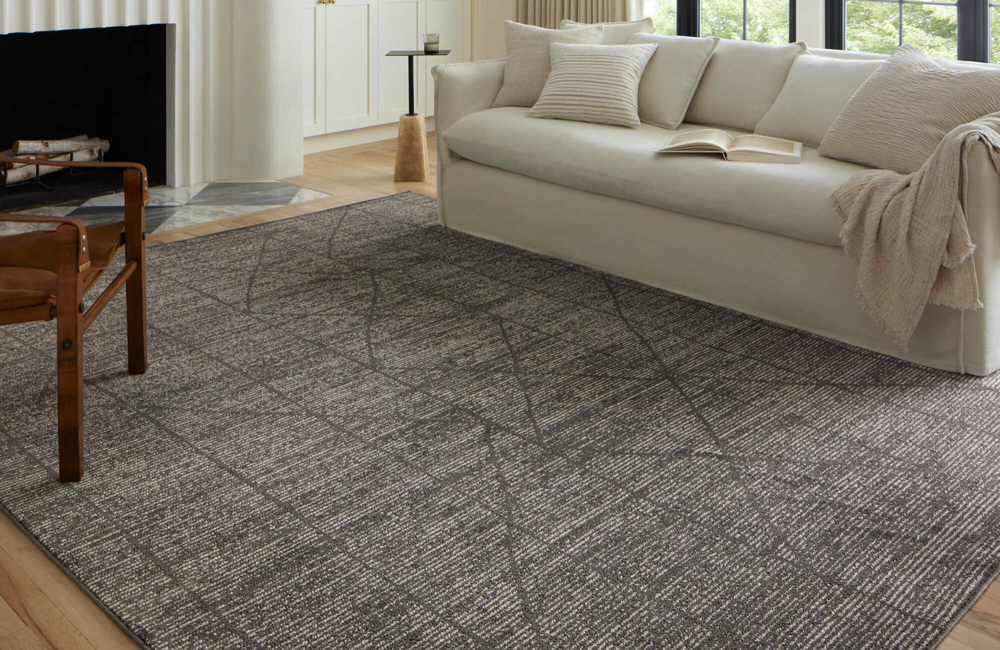
Contrasts That Compress or Expand
High-contrast pairings, such as a dark rug on a pale floor, can fracture the room visually, creating strong dividing lines that disrupt flow. These contrast points act as visual boundaries, making areas feel chopped up and more confined. If you’re trying to open up a space, too much contrast in the lower half of the room can work against you.
However, that doesn’t mean all contrast is bad. Gentle contrasts, like a soft gray rug on light oak flooring, can add dimension without breaking the visual plane. A perfect example is our Hutchinson Polyester Face Rug in Graphite / Olive, shown in the picture above. With its subdued blend of graphite gray and olive green, two versatile, earthy tones, it introduces just enough variation to anchor the room without overwhelming it. The result is a layered, sophisticated look that defines the space while maintaining an open and harmonious flow.
The Trick of Soft Transitional Palettes
When your walls and floors sit on opposite ends of the color spectrum, such as cool-toned gray walls and warm honey-toned wood floors, a rug can act as the peacemaker. Transitional shades like greige, mushroom, or soft taupe help bridge the aesthetic gap between these clashing elements. They blend hints of both warm and cool undertones, smoothing out differences and maintaining cohesion.
By anchoring your space with a rug that leans into both sides of the palette, you prevent the eye from catching on jarring shifts. This technique avoids spatial fragmentation, which can make a room feel unsettled or smaller. The result is a harmonious transition that keeps everything visually connected and spacious.
Leveraging Undertones for Cohesive Integration
Even when two colors appear neutral or similar, mismatched undertones can cause visual tension. For example, placing a cool-toned gray rug against a warm beige wall may create a subtle but persistent sense of disharmony. Your brain picks up on the disjointed pairing, even if it’s not immediately obvious.
To keep your room visually cohesive, match the undertone of your rug with that of your major surfaces. If your walls have a warm cream base, opt for a rug with warm undertones, such as a golden taupe or soft caramel. One option that achieves this beautifully is our Davies Wool & Nylon Rug in Rust / Wheat, which blends earthy rust with warm wheat tones, both rich in golden undertones. This palette creates visual harmony alongside warm flooring or creamy walls, maintaining a seamless flow throughout the space and preventing any jarring contrasts.
The Impact of Sheen and Texture on Visual Continuity
Beyond color, the surface finish of your rug also affects how you perceive space. Rugs with a slight sheen or silky texture reflect light, adding a soft glow that can make a room feel airier and more expansive. This effect works especially well in rooms that already benefit from good lighting, amplifying the sense of spaciousness.
Conversely, rugs with matte finishes or deep, plush textures tend to absorb light, anchoring the room and making the floor feel heavier. Although this can be cozy in large areas, it may compress a smaller space. If you're working with limited square footage or low lighting, opt for rugs that reflect more light and sit lower to the floor, promoting openness through both color and surface quality.

Considering Natural and Artificial Light Sources
Lighting alters how color behaves. Optimizing rug color for your space’s lighting setup is crucial in making a room feel bigger, as it directly impacts how open or confined the area appears.
Sunlight Amplification with Pale Rugs
In sunlit rooms, rugs in pale hues like white, cream, or soft blush become active participants in light distribution. These shades catch and reflect daylight, enhancing the brightness of your space and making every surface appear more vibrant. As sunlight bounces off a pale rug, shadows soften, corners brighten, and the floor feels like it extends beyond its actual borders.
This amplified glow is especially effective in rooms with large windows or glass doors. Instead of absorbing the natural light, your rug helps spread it, which elevates the overall mood and makes the room feel more expansive. If you want to maximize this effect, choose rugs with a slight sheen or subtle patterning in similar tones to add gentle dimension without weighing down the space.
For instance, consider our Hutchinson Polyester Face Rug in Burgundy / Khaki. As displayed in the photo above, its warm taupe palette pairs beautifully with wooden floors and sun-drenched interiors, adding depth without overpowering the natural light flow. The intricate, vintage-inspired pattern also provides texture and visual interest while maintaining the open, airy atmosphere essential to light-maximizing spaces.
Balancing Dim Rooms with Light-Reflective Colors
When natural light is limited, your rug color becomes even more important. Dim rooms tend to feel smaller, but using light-reflective colors like icy blue, pearl gray, or soft cream can counteract that effect. These hues help capture and redistribute what little ambient light exists, whether from a nearby lamp, overhead fixture, or even a hallway.
By using a rug that lifts the available light, you prevent the room from feeling cave-like. Instead of disappearing into shadow, the rug remains visible and dynamic, opening up the space visually. Light-reflective colors also reduce harsh edges between dark flooring and dim surroundings, creating a more fluid environment that feels larger and lighter.
Adjusting Rug Color for Artificial Lighting Hues
Not all light is created equal. The color temperature of your artificial lighting—warm (2700–3000K) or cool (4000–5000K)—will change how your rug’s color is perceived. Warm lights pair best with taupe, beige, or warm off-whites, which echo the soft golden hue of the bulbs. When paired properly, these rugs create a cozy yet open atmosphere without clashing with the light source.
Cool lighting, on the other hand, works more harmoniously with rugs in silvery gray, soft blue, or other cool neutrals. These combinations maintain clarity and cohesion, avoiding the muddiness that occurs when undertones fight the lighting temperature. Aligning your rug’s color with the type of artificial light ensures the room feels well-balanced and spacious at any hour.
The Dynamic Interplay of Sheen and Light Reflection
Rug sheen (how shiny or matte the material appears) significantly affects how it interacts with light. Lustrous rugs made of silk, viscose, or blends with a light-reflective finish catch both sunlight and artificial light, creating a radiant surface that visually expands the floor. This shimmer can lift the entire room, especially in spaces that rely heavily on layered lighting.
In contrast, matte rugs tend to ground the room. Although that can feel cozy, they also absorb light and can make the floor feel heavier and the space more compact if not balanced properly. If you prefer a matte finish for its texture or warmth, consider pairing it with brighter lighting sources or layering reflective decor nearby to maintain visual openness.
Mitigating Shadows and Dark Spots with Strategic Rug Placement
Shadows can create visual dead zones that make a room feel choppy or smaller. One of the simplest ways to combat this is by placing a rug in corners or beneath large pieces of furniture. Light-colored rugs extend the perception of the floor into areas that would otherwise disappear in shadow.
This technique works particularly well in rooms with uneven lighting, such as those with single light sources or awkward layouts. As the pale rug catches ambient light and pushes it into darker corners, the entire room begins to feel more connected. This approach not only enlarges the visible area but also ties together disjointed spaces into a single, cohesive environment.

Using Rug Patterns and Color Together
Patterns enhance or hinder spatial perception depending on their scale, contrast, and layout. Choose wisely to complement your color choices and amplify the openness you're trying to create.
Small, Tight Patterns vs. Large Open Designs
Small, dense patterns tend to chop up the floor into tiny sections, making a room feel cluttered and visually overwhelming. These tightly packed designs demand constant attention and cause the eye to bounce from one detail to the next, creating a sense of visual congestion. In smaller spaces, this can drastically reduce the feeling of openness, making even well-lit areas appear cramped.
On the other hand, large open designs give your space room to breathe. When you choose a rug with generous spacing between motifs like oversized florals, geometric outlines, or minimalist silhouettes, the floor becomes an uninterrupted canvas. This type of pattern also creates the illusion of expansiveness by allowing the eye to travel smoothly, enhancing the sense of airiness in any room.
Directional Stripes and Their Impact
Stripes aren’t just decorative; they’re spatial tools. Horizontal stripes running parallel to the shorter side of a room visually widen the space, stretching the walls outward. Conversely, vertical or lengthwise stripes create a tunnel effect, drawing the eye forward and elongating the room’s appearance. These tricks are particularly useful in oddly shaped rooms or narrow corridors that need visual rebalancing.
Color also plays a crucial role in enhancing the effect of directional stripes. Lighter shades make the pattern less intrusive, ensuring the expansion feels subtle and elegant rather than jarring. Whether you're trying to make a hallway feel broader or a living room appear longer, striped rugs in a light palette offer a practical and stylish solution.
Monochromatic Patterns for Minimal Interruption
When you want texture without sacrificing spatial openness, monochromatic patterns offer the perfect balance. These designs feature different shades of the same color, creating a sense of depth and interest without introducing visual clutter. For example, a rug with ivory, cream, and pale beige in a tonal wave pattern can elevate the room’s design while maintaining a soft, expansive look.
Monochromatic patterns are especially effective in modern or minimalist interiors where clean lines and cohesion are key. They keep the eye engaged without disrupting flow, allowing you to introduce personality and elegance while preserving the illusion of a larger, connected space. The result is a refined aesthetic that supports your overall spatial goals.
The Role of Pattern Scale in Proportional Harmony
The pattern scale must align with your room’s dimensions to maintain visual harmony. In a small space, oversized patterns can feel chaotic and dominant, consuming valuable visual real estate. The eye has no room to rest, and the rug ends up overpowering the room rather than enhancing it. The effect is a compressed and visually top-heavy environment.
In contrast, a very small pattern in a large room can disappear entirely, leaving the floor looking dull or empty. The key is to select a pattern size that matches your room’s proportions. Medium-sized motifs typically strike the right balance, providing enough definition without overwhelming or underwhelming the space. This thoughtful match ensures the rug contributes to your room’s openness, not its confinement.
For those seeking an understated yet structured look, consider a piece like our Micah Wool Blend Rug in Natural / Graphite, depicted in the image above. Its medium-scale diamond lattice pattern adds just enough visual texture without feeling busy. The palette, a blend of charcoal gray and soft ivory, offers a grounded, contemporary feel that complements both minimalist and mid-century interiors. It’s a strong example of how scale and contrast work together to support a room’s proportions and personality.
Incorporating Abstract and Organic Patterns for Fluidity
Abstract and organic patterns like soft swirls, watercolor gradients, or flowing shapes introduce a sense of movement that keeps the eye traveling across the room. Unlike rigid grids or tight symmetry, these free-form designs avoid harsh boundaries, allowing the floor to feel more continuous and alive. This fluidity also helps combat the boxy feeling that often plagues small or angular rooms.
Because these patterns mimic natural movement, they’re especially helpful in softening sharp architectural lines or rigid furniture arrangements. When paired with calming tones or light palettes, abstract rugs contribute to an airy, unconstrained atmosphere that feels both modern and spacious. They invite the eye to wander and explore, which subtly expands your sense of space.
Adapting Rug Color Choices to Room Function
Not all rooms require the same visual tricks. Color choice should reflect each space’s function, emotional tone, and natural dimensions to achieve the right balance between comfort, practicality, and perceived spaciousness.
Living Room
In living rooms where you entertain, relax, or gather frequently, rugs in shades of taupe, beige, or soft gray serve as neutral anchors that visually open up the space without drawing too much attention. These tones create a backdrop that feels calm and expansive, especially when paired with a mix of textures or furniture in varied styles and colors.
By choosing a neutral rug in a mid-to-light tone, you allow the eye to move effortlessly across the room, from floor to walls to furnishings. The floor also doesn't compete for attention, which keeps the area from feeling segmented or cluttered. Instead, it unifies everything while contributing to a sense of spaciousness and flow, even in busy areas.
Bedroom
Your bedroom should feel like a peaceful retreat, and rugs in cool pastel tones help cultivate that restful atmosphere. Shades like soft blue, misty lavender, or pale mint have a naturally calming effect that also supports spatial openness. These colors tend to recede visually, which means they don’t crowd the space or disrupt its serenity.
Whether the room is bathed in natural daylight or relies on warm bedside lighting, pastels adapt beautifully. They brighten the floor without being overly reflective, and they invite relaxation by softening the overall visual landscape. For a perfect blend of subtle color and comfort, consider our Hutchinson Polyester Face Rug in Sage / Graphite, featured in the photo above. Its muted tones echo the calming palette and help define the space without overwhelming it. Placing a pastel rug beneath the bed or extending it just beyond the foot can also gently frame the area without shrinking its perceived size.
Kitchen and Dining
Kitchens and dining areas are often compact and utilitarian, but that doesn’t mean they should feel cold or cramped. Rugs in creamy yellow, soft peach, or light terracotta introduce warmth while still supporting a bright and open feel. These hues reflect light well and pair beautifully with natural wood tones or neutral cabinetry.
Using warm light tones under a dining table or in front of a kitchen sink can make these functional spaces feel more welcoming. At the same time, the lighter palette keeps the floor from feeling heavy, ensuring the room remains cheerful and visually expanded. These shades also help conceal minor stains or spills without absorbing too much visual weight.
Home Office
When you're working in a home office, your surroundings should support clarity and concentration without making the space feel boxy or sterile. Rugs in light green tones such as sage, celadon, or moss strike a soothing balance. They provide enough color to engage the senses while remaining gentle on the eyes during long stretches of work.
These green tones also reflect a bit of nature into the room, which can promote mental alertness and reduce visual fatigue. In smaller offices or multi-use corners, light greens help open up the area while still adding definition beneath a desk or seating area. The result is a workspace that feels calm, focused, and free of spatial limitations.
Entryway and Hallway
Entryways and hallways often suffer from narrow layouts and poor lighting, which can make them feel tight or uninviting. A narrow runner in a bright or light-reflective tone, such as ivory, pale sand, or a soft metallic sheen, guides the eye along the path and adds perceived length. This visual stretch draws you through the space, making it appear longer and more expansive than it really is.
By placing a runner that fits the proportions of the hall or entryway, you reduce visual breaks and make the transition between rooms feel smoother. The brightness of the rug also counters shadows and visually lifts tight corners, creating a sense of welcome the moment you step inside. This simple upgrade sets the tone for the rest of your home while maximizing every square foot.

Layering and Rug Shape as Visual Tools
Layering and shape subtly reshape how the eye moves through a room, affecting space perception without altering layout. These visual tools can enhance openness, encourage flow, and bring balance to rooms that might otherwise feel constrained or overly rigid.
Why Round Rugs Feel More Spacious in Tight Spaces
Round rugs break the predictable lines that dominate most interiors. In rooms where straight walls, square furniture, and sharp corners rule the layout, a circular rug softens the visual environment and shifts focus outward in every direction. This dispersion of attention reduces the sense of confinement that rectangular outlines often reinforce.
Placing a round rug in a small corner, entryway, or nook also creates the illusion of a more open space by eliminating visual boundaries. The eye no longer travels in a closed loop but instead follows a continuous, flowing path. As a result, the room feels lighter and more inviting, even when space is limited.
Strategic Layering with Light-Toned Base Rugs
Layering rugs is an effective way to add depth without losing the sense of spaciousness. Start with a large, pale-toned base rug like ivory, beige, or a soft pastel and then place a smaller, patterned rug on top. The lighter bottom layer reflects light and keeps the space visually open, while the top layer introduces texture and character.
This technique allows you to play with contrast and personality while maintaining clarity in your layout. Because the base rug sets the visual foundation, it also prevents the upper layer from feeling too dense or disruptive. The room gains definition and layering, but the sense of expansiveness remains intact thanks to the luminous, grounded backdrop.
Choosing Rug Size and Color Together
Size and color are inseparable when your goal is to make a room look bigger. A large rug in a light hue visually anchors the space while extending its perceived dimensions. When your rug reaches close to the walls or furniture perimeter, it creates the illusion of a broader floor area and helps unify scattered elements.
In contrast, a small, dark rug tends to shrink the space by fragmenting the floor into sections. It draws the eye inward and cuts off continuity, making the room feel smaller and less connected. For maximum openness, always scale your rug to the room and favor soft, reflective tones that lift rather than compress the layout.
The Deliberate Use of Irregular and Organic Shapes
Organic-shaped rugs, whether resembling pebbles, clouds, or abstract waves, offer a creative way to dissolve harsh boundaries. These unconventional forms encourage the eye to move fluidly across the floor, as there are no straight edges to confine perception. As a result, the room feels less grid-like and more expansive.
Using an organically shaped rug also invites movement and introduces softness, which is especially beneficial in minimalist or angular rooms. These rugs act as visual counterpoints to strict geometry, helping to break up rigid sightlines and promote a sense of calm flow. Their unpredictability opens up the space, both physically and emotionally.
Leveraging Multi-Level Rugs for Dynamic Depth
Rugs with varying pile heights introduce subtle plays of shadow and light across the floor. This multi-level texture adds dimension without overwhelming the room, especially when done in neutral tones like cream, sand, or dove gray. The shifts in elevation mimic natural terrain, making the floor feel more dynamic and expansive.
When used thoughtfully, these rugs offer a quiet complexity that enhances rather than disrupts the room. The gentle shadows between raised and flat areas draw the eye across the space, increasing visual interest while maintaining an airy feel. In smaller or low-light rooms, this technique can add richness without adding visual weight.
Designing Bigger Spaces with Rug Color
The right rug color can completely reshape how you experience a room, making it feel lighter, broader, and more connected. Whether you lean into soft neutrals, cool tones, or transitional hues, your rug can reflect light, guide the eye, and erase hard boundaries that shrink a space. By combining thoughtful color choices with supportive patterns, lighting, and proportions, you turn your rug into more than just decor; it becomes the secret to unlocking visual spaciousness in any room you design.
If you have questions about finding the perfect rug color or need personalized guidance for your space, our team is here to help. Visit our Contact Us page to connect with our design experts, who can offer tailored advice based on your room layout, lighting conditions, and overall aesthetic. Whether you're starting a new project or refreshing a familiar space, we're just a message away from helping you bring your vision to life.