


The bathroom is one of the most important spaces in a home for rest and rejuvenation, making color selection a key part of creating a calming environment. While many homeowners begin their design process by exploring bathroom paint colors, tile color often has an even greater influence on the atmosphere of the space. Because tile covers large surfaces such as walls, floors, and showers, it has a significant influence on the room’s overall mood.
Soft blues and greens are widely considered among the most relaxing choices because they reflect soothing elements found in nature. However, warm neutrals, muted tones, and balanced color schemes can also create a tranquil setting depending on lighting, materials, and personal preferences. By understanding how color psychology, lighting conditions, and design details interact, you can select calming bathroom colors that transform your bathroom into a peaceful retreat.

Understanding Color Psychology in Bathroom Design
Before selecting specific tile shades, it is helpful to understand how different colors influence mood and perception. Color psychology provides valuable insight into why certain tones feel calming while others feel energizing, helping guide more intentional choices when designing a relaxing bathroom environment.
Cool Colors for Calm Bathroom Spaces
Cool tones such as blue, green, and soft violet are commonly associated with serenity. These shades mirror natural elements like water, foliage, and open sky, making them ideal for calming bathroom colors that encourage relaxation.
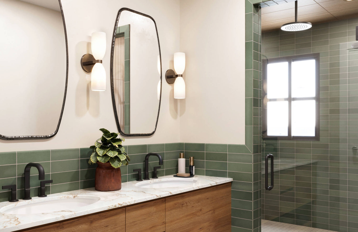
Tiles in gentle green tones can create a nature-inspired environment that feels peaceful and restorative. Subtle variations in color and finish help evoke the layered beauty of natural landscapes, as seen with Edward Martin’s Lilah 6x6 Glossy Ceramic Tile in Opal, which appears in the image above. Its soft blend of sage and emerald hues brings quiet depth to the space, while the glossy surface reflects light in a way that enhances the tile’s organic character without overpowering the room.
Similarly, pale blue tiles can replicate the quiet calm of ocean water or clear skies. When paired with wood textures, stone surfaces, or neutral flooring, these cool-toned tiles create balanced color schemes for bathrooms that feel both refreshing and restful.
Warm Colors for Comfort and Balance
Although cool hues often dominate discussions of relaxing interiors, warm tones can also contribute to a calming environment when used thoughtfully. Muted terracotta, sandy beige, and soft clay shades introduce warmth without overwhelming the space.
These tones frequently appear among the best bathroom paint colors because they evoke comfort and familiarity. When used in tile, they offer the same welcoming character while providing the durability and moisture resistance needed for bathroom spaces.
For instance, terracotta-inspired flooring paired with cream walls and natural wood cabinetry can create a bathroom that feels cozy yet refined. Subtle golden accents or mosaic tiles may also add warmth while maintaining a balanced and harmonious palette.
If you're considering warm tones but want to see how they will appear in your own space, Edward Martin’s Augmented Reality (AR) Visualization Tool offers a helpful way to preview tile selections in a real bathroom setting. By allowing you to visualize different colors and layouts within your environment, the tool makes it easier to see how calming bathroom colors interact with lighting, materials, and spatial proportions before making a final decision.

How Lighting Influences Bathroom Tile Color
Lighting has a significant impact on how bathroom tile colors are perceived. Even the most carefully selected palette can look dramatically different depending on natural light exposure and artificial lighting conditions.
Natural light enhances color depth and reveals subtle variations in tile surfaces. This effect is especially noticeable with reflective finishes, such as Edward Martin’s Jaden 2.5x16 Glossy Ceramic Tile in Eggshell, which can be seen in the image above. Its soft off-white tone shifts gently throughout the day as sunlight moves across the glossy surface, creating a brighter and more dimensional appearance that contributes to an airy, calming ambiance.
As evening approaches, artificial lighting begins to influence how colors appear. Warm white lighting highlights the cozy undertones of neutral bathroom color schemes, while cooler lighting emphasizes crisp shades like blue and grey. Tiles with reflective finishes adapt particularly well to changing lighting conditions, helping maintain a balanced and inviting environment throughout the day.

Practical Considerations When Choosing Bathroom Tile Colors
While aesthetics are important, practical considerations should also guide your tile color choices. Maintenance requirements, durability, and cleaning habits all influence how well a tile color will perform over time.
Light tiles such as white, cream, and pale grey can make bathrooms feel brighter and more spacious. These shades are frequently included among the best bathroom paint colors for small spaces because they reflect light effectively. Large-format options like Edward Martin’s Tatum 24x48 Matte Porcelain Tile in Cross-Cut Sand, visible in the image above, further enhance this sense of openness by minimizing grout lines and creating a more seamless surface.
However, lighter surfaces may reveal water spots or dirt more easily, meaning regular cleaning helps maintain their crisp appearance. Darker tile colors, such as charcoal, navy, or deep green, introduce depth and sophistication while concealing minor dirt more effectively. When used strategically, these tones can balance lighter elements and enhance the overall color schemes for bathrooms.
Choosing a tile color that aligns with both aesthetic preferences and practical needs ensures your bathroom remains relaxing and functional for years to come.

Design Elements That Enhance Relaxing Tile Colors
While color establishes the foundation for a calming bathroom palette, other design elements help strengthen that relaxing atmosphere. Tile finishes, textures, and layout patterns can subtly influence how color is perceived, enhancing the overall sense of relaxation within the space.
Tile Finishes and Textures
Tile finish significantly influences how color is perceived within a space. Matte surfaces diffuse light gently and often create a soft, grounded feeling ideal for spa-inspired bathrooms. Glossy tiles reflect light more actively, helping smaller spaces appear brighter and more open.
This interplay between color and finish can be seen with Edward Martin’s Mikayla 5x5 Glossy Ceramic Tile in Cerulean, featured in the image above. The vibrant blue tone introduces refreshing energy to the space, while its glossy surface captures and reflects surrounding light, subtly amplifying the room’s brightness without overwhelming the design.
When combined with contrasting textures such as matte fixtures or patterned mosaic flooring, glossy tiles can add visual energy while still supporting a calming atmosphere.
Tile Shapes and Patterns
Tile shapes and layouts also influence how a bathroom feels. Certain patterns guide the eye smoothly through the space, reinforcing a sense of order and balance.
Large format tiles reduce grout lines and create a seamless appearance that feels open and uncluttered. Subway tiles arranged in stacked or herringbone layouts introduce subtle rhythm without overwhelming the design. Mosaic tiles, when used selectively, add detail and texture that enhance the overall composition.
These design elements contribute to harmonious bathroom color schemes that support relaxation.

Relaxing Bathroom Color Ideas Inspired by Global Design Styles
Beyond individual color choices, many design traditions around the world offer inspiration for serene bathroom palettes. These global influences demonstrate how different cultures use color, materials, and simplicity to create spaces that feel balanced, restorative, and deeply relaxing.
Scandinavian Minimalism
Scandinavian interiors emphasize simplicity, light, and natural materials. Bathrooms inspired by this style often feature white, beige, or pale grey tiles paired with wood accents and soft lighting.
These palettes resemble many popular bathroom paint colors because they create clean, quiet environments that feel airy and peaceful.
Mediterranean Inspired Palettes
Mediterranean interiors draw inspiration from coastal landscapes. Soft blue tiles, aqua accents, and warm terracotta flooring create color schemes for bathrooms that feel refreshing yet grounded.
Even subtle blue tile features around a bathtub or vanity can introduce a coastal calm that transforms the space into a relaxing retreat.
Japanese Zen Influence
Japanese design emphasizes balance, simplicity, and connection to nature. Pale green tiles paired with wood textures and stone surfaces create a tranquil atmosphere reminiscent of traditional spa environments.
These calming bathroom colors reflect natural landscapes and encourage a sense of quiet mindfulness.
Tropical Inspired Bathrooms
Tropical design blends vibrant greens with aquatic tones to create bathrooms that feel lively yet restorative.
A deep botanical palette can evoke the richness of lush natural landscapes, much like the atmosphere created with Edward Martin’s Jaden 2.5x16 Glossy Ceramic Tile in Hunter, visible in the image above. The elongated format adds subtle vertical texture, while the glossy finish reflects light in gentle waves that enhance the tile’s deep green coloration.
When paired with warm metallic fixtures, natural wood accents, or surrounding greenery, this palette introduces a sense of tropical calm that transforms the bathroom into a refreshing retreat.
Choosing the Right Relaxing Tile Color for Your Bathroom
The most relaxing tile colors for bathrooms often include cool hues such as soft blues and greens alongside versatile neutrals like beige, grey, and warm white. These palettes are commonly used in spa-inspired interiors because they promote a sense of balance, brightness, and tranquility.
Ultimately, the best choice depends on how color interacts with your bathroom’s lighting, layout, and surrounding materials. Exploring tile samples in person can help you better understand subtle color variations and finishes, and Edward Martin offers a curated selection of tile samples so you can confidently choose an option that complements your bathroom’s calming design vision.
