


When you bring wall art into your home, you are doing more than simply filling a blank space. You are also shaping how the room feels, guiding where the eye naturally settles, and influencing how the entire space comes together. For that reason, the correct way to hang wall art is not complicated, but intentional. It requires an understanding of height, scale, spacing, balance, and how each piece relates to its surroundings.
In this article, you will find clear guidance on where to position your artwork, how to choose the right size, how to arrange multiple pieces, and how to hang them properly. Throughout the article, we will guide you step by step, clearly and practically, helping you approach each decision with confidence. By the end, you will understand not only what to do, but also why each choice matters.

Proper Art Placement and Viewing Height
Before thinking about nails or hardware, it helps to consider where your eyes naturally rest when you enter a room. The correct height makes artwork feel comfortable and visually connected to the space. When placement ignores natural sightlines, even a well-chosen piece can seem out of place.
Eye Level as a Starting Point
A reliable guideline is to center artwork approximately 57 to 60 inches from the floor to the midpoint of the piece. This measurement aligns with the average standing eye level, allowing the artwork to be viewed comfortably without strain. When art is hung too high, it can feel detached from the rest of the room. When it sits too low, the space may feel visually compressed. Using eye level as a starting reference helps ensure the placement feels balanced and deliberate rather than arbitrary.
Adapting for Seated Spaces
Not every room is experienced from a standing position. In living rooms, dining areas, or reading corners, artwork is often viewed while seated. In these settings, lowering the piece slightly helps align it with seated eye level and creates a more comfortable viewing experience.
This small adjustment can significantly change how the room feels. Instead of appearing detached from the furniture, the artwork becomes visually connected to the seating area and feels like a natural part of the space.
Relating Art to Furniture
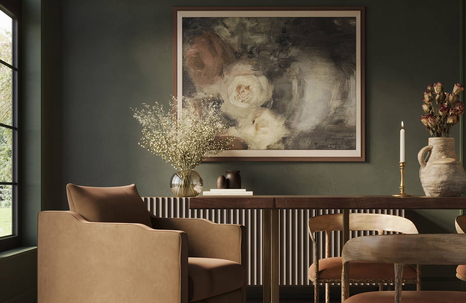
When hanging art above a sofa, console, or bed, the goal is to create a clear visual connection between the artwork and the furniture beneath it. A common guideline is to position the bottom of the frame about 6 to 10 inches above the top of the furniture. This spacing helps the elements feel unified rather than separate. Without that visual connection, the artwork can feel disconnected, as if it were placed independently of the furniture rather than integrated into the room’s overall composition.
The dining setting featured above illustrates this principle clearly, with Edward Martin’s Dusk Fold Wall Art positioned to establish a strong visual connection to the console below. Hung with intentional spacing, the piece feels anchored rather than suspended, reinforcing the relationship between the artwork and the dining table beyond. Its scale and placement create a composition that reads as balanced, cohesive, and thoughtfully integrated within the room’s architecture.
Considering Ceiling Proportion
Ceiling height plays an important role in determining placement. In rooms with higher ceilings, artwork may need to be positioned slightly higher to maintain proportion and avoid leaving too much unused wall space above. In standard-height rooms, a more restrained approach works best. Keeping artwork within a natural viewing range helps maintain balance and prevents the upper portion of the wall from feeling visually heavy.

Choosing the Right Size and Scale for the Wall
Placement alone is not enough if the artwork is not proportionate to the wall. Before hanging anything, it is important to evaluate scale in relation to the surrounding space. The size of a piece determines whether it feels balanced and anchored or small and out of place.
Matching Width to Surroundings
When hanging art above furniture, proportion is key. A helpful guideline is to measure roughly two-thirds of the furniture’s width, creating balance without overwhelming the space. For instance, above a six-foot sofa, a piece measuring around four to four and a half feet wide often feels appropriately scaled. This proportion allows the artwork to complement the furniture beneath it rather than compete for attention.
A dining nook shown in the photo above clearly demonstrates this relationship. Edward Martin’s Hearthline Wall Art is positioned so its width closely aligns with the banquette below, creating a strong visual anchor for the seating area. Rather than dominating the wall or appearing undersized, the piece feels appropriately scaled within the space's architectural framing. By matching the artwork’s width to its surroundings, the overall composition remains cohesive and well-balanced.
Understanding Wall Breathing Room
A large, open wall can make a small piece of artwork appear isolated or insignificant. In these situations, it often helps to select a larger piece or create a grouped arrangement that occupies a more appropriate portion of the wall. At the same time, negative space plays an important role. Leaving adequate margins around the artwork allows it to stand out without feeling crowded. When spacing is thoughtfully considered, the wall supports the piece rather than overwhelming it.
Vertical and Horizontal Orientation
The proportions of the wall itself should guide the orientation of the artwork. Tall, narrow walls tend to work well with vertical pieces, as they draw the eye upward and naturally reflect the room’s height. Wider walls, on the other hand, tend to accommodate horizontal artwork more comfortably. When the orientation of the piece aligns with the architecture, the overall result feels cohesive and well-balanced.
Testing Before Committing
Before making any holes in the wall, it is helpful to map out the placement using paper templates cut to the size of your artwork. Tape the outlines to the wall and take a few steps back to see how everything looks in context. This small effort can prevent unnecessary adjustments later. It also allows you to assess scale, spacing, and alignment from different angles before finalizing the placement.

Planning Balanced Arrangements and Gallery Walls
When displaying more than one piece, thoughtful structure becomes essential. A gallery wall should feel cohesive rather than accidental. With thoughtful planning and a clear approach to composition, multiple pieces can come together cohesively and well-balanced.
Starting with an Anchor Piece
When creating a gallery arrangement, it helps to begin with one central piece that naturally draws attention. Place this piece first so it can set the foundation for the rest of the layout. From there, the surrounding artwork can be arranged in relation to it. Without a clear anchor, the overall display may feel disjointed rather than unified.
This approach is illustrated in the photo featured above, where Edward Martin’s Quiet Study Wall Art serves as the visual anchor within the gallery wall. This large framed piece establishes scale and direction, allowing the smaller artworks nearby to feel intentionally placed rather than randomly arranged. Because the anchor is clearly defined, the surrounding frames align more naturally and maintain visual balance. As a result, the entire composition feels cohesive and thoughtfully structured.
Establishing Consistent Spacing
Maintaining even spacing between frames helps the arrangement feel neat and thoughtfully put together. In many cases, leaving about 2 to 3 inches between pieces provides enough separation without breaking visual continuity. Even spacing also helps the display feel organized and intentional. When gaps vary noticeably, the eye tends to focus on the irregularity rather than the artwork itself.
Aligning with Invisible Guidelines
Even in asymmetrical layouts, alignment remains important. Choosing a consistent reference point, such as aligning top edges or centering pieces along a vertical line, creates underlying order. These invisible guidelines provide structure without making the arrangement feel rigid. While viewers may not consciously identify the alignment, they will naturally sense the balance it creates.
Distributing Visual Weight
Not all artwork carries the same visual presence, as size, color depth, and frame thickness can influence how heavy a piece appears. Larger or darker works tend to draw more attention and therefore feel visually heavier. When arranging multiple pieces, it is important to avoid concentrating these heavier elements on just one side. Distributing them evenly throughout the layout helps the overall composition feel steady and well-balanced.

Using the Right Tools and Hardware for Secure Installation
Even the most thoughtfully planned placement can fall short if the installation is not secure. The correct way to hang wall art also involves understanding the proper tools and hardware needed to support it safely and reliably.
Identifying Wall Material
Different wall materials require different types of hardware. Drywall, plaster, brick, and concrete each have specific load-bearing characteristics that affect how artwork should be mounted. Before installing anything, it is important to determine exactly what type of surface you are working with. Using the correct anchors and fasteners helps maintain stability and reduces the risk of unnecessary damage to the wall.
The photo featured above illustrates this consideration effectively. Edward Martin’s Hollow Morning Wall Art, designed with hardware pre-attached and ready to hang, is mounted over a tiled fireplace surround finished in Natasha 2x6 Matte Porcelain Tile in Bone. Because tile and masonry surfaces differ from standard drywall, installation requires anchors suited to the material beneath the tile. When the wall type is properly identified and matched with suitable hardware, the artwork stays securely in place while the surface remains protected.
Matching Hardware to Weight
Artwork can vary significantly in weight depending on its size, frame, and glazing. Lightweight pieces can usually be supported with standard picture hooks, while heavier works typically require reinforced anchors or toggle bolts designed to handle the appropriate weight. Selecting hardware based on the actual weight of the piece reduces the risk of loosening over time. Proper support not only protects the artwork but also keeps it securely and reliably in place over time.
Ensuring Level Placement
Using a level tool is a simple but essential step in the installation process. Even a slight tilt can become obvious once the artwork is placed near furniture lines, ceilings, or door frames. Taking the time to measure carefully before securing the piece helps achieve a clean result. Careful alignment at the start prevents the need for repeated adjustments later.
Protecting the Surface
While secure mounting is essential, small protective details can make an equally lasting difference. For example, adding felt pads to the back corners of a frame helps prevent scratches and scuff marks on the wall. In addition, these pads allow the artwork to rest more evenly against the surface, reducing movement over time. Ultimately, proper installation is not only about strength and stability, but also about preserving both the wall and the artwork for years to come.

Coordinating Wall Art with Lighting and Room Function
Once artwork is securely in place, the surrounding environment begins to shape how it is perceived. Lighting and how a room is used both affect how the artwork is experienced from day to day.
Managing Natural Light Exposure
Natural light can enhance a room, but direct sunlight may gradually fade pigments and alter colors. For this reason, it is best to position artwork where it receives indirect light rather than prolonged exposure to strong rays. Sheer window coverings or strategic placement can help diffuse brightness. By managing light carefully, you preserve the artwork’s color and overall condition over time.
Incorporating Accent Lighting
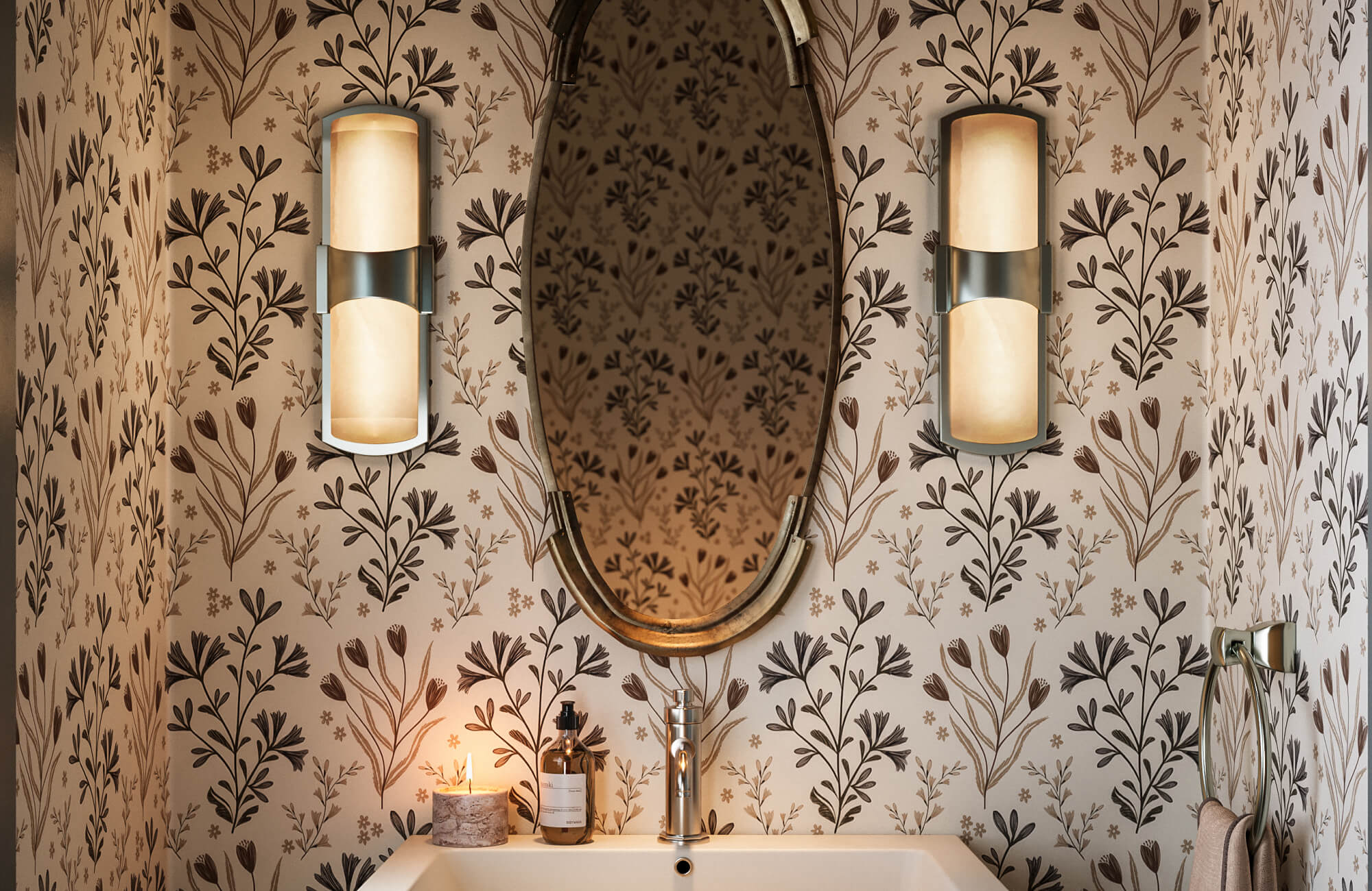
In some cases, additional lighting can help highlight a specific piece. Picture lights or adjustable fixtures allow you to direct illumination precisely where it is needed. Choosing neutral white bulbs helps maintain accurate color representation without casting unwanted tones. When thoughtfully placed, accent lighting further enhances detail while keeping the focus on the artwork itself.
This effect is demonstrated in the photo featured above, where Edward Martin’s Golden Drift Wall Art is framed by the warm glow of the Alena Wall Sconce in Aged Brass. Positioned on either side of the artwork, the sconces provide balanced, focused illumination that draws attention to the piece without overwhelming it. The lighting gently highlights the artwork’s texture and tones while maintaining the bathroom’s calm, relaxing atmosphere. As a result, the wall art becomes a refined focal point, supported by lighting that feels purposeful and integrated.
Aligning with Room Activity
The function of a room should influence the type and placement of artwork within it. For example, a dining area may benefit from pieces that encourage conversation, while a bedroom often calls for imagery that promotes calm. Consider how the space is used throughout the day and who spends time there. When artwork supports the room’s purpose, it feels integrated rather than incidental.
Minimizing Glare
In bright spaces, reflective glass can create glare that obscures the artwork. This issue becomes more noticeable when light sources sit directly opposite the frame. Opting for non-reflective glazing can significantly reduce visual interference. As a result, the artwork remains clear and viewable from multiple angles within the room.

Avoiding Common Mistakes That Disrupt Harmony
Even with careful planning, small missteps can affect the overall balance of a room. Understanding common mistakes makes it easier to avoid them and achieve a more cohesive result.
Hanging Art Too High
One of the most common mistakes is hanging artwork too close to the ceiling. When placed too high, the piece can feel disconnected from the rest of the room and separate from the furnishings below. Ideally, artwork should stay within a comfortable viewing range so it naturally relates to eye level and surrounding furniture. Keeping it visually grounded helps the space feel cohesive and thoughtfully arranged.
Choosing an Incorrect Scale
Selecting artwork that is too small for a large wall can make it appear isolated and underwhelming. Instead of leaving a single small frame on its own, consider grouping it with other pieces or selecting a larger work that better fits the space. Proportion has a direct impact on how confident and balanced a display feels. When scale is appropriate, the artwork holds its presence without competing with its surroundings.
Ignoring Measurement
Relying on guesswork can easily lead to uneven spacing or misaligned placement. Taking the time to measure carefully ensures consistency and symmetry where needed. Even small discrepancies can become noticeable once everything is in place. Taking the time to measure carefully helps the final result feel neat, balanced, and thoughtfully arranged.
Hanging Wall Art the Right Way
The correct way to hang wall art comes down to balancing height, proportion, arrangement, secure installation, and awareness of the surrounding space. When you pay attention to how the eye moves through a room, how furniture grounds the wall, and how lighting influences visibility, the artwork feels integrated rather than incidental. Each step, from placement to mounting, contributes to the overall result. With thoughtful planning and careful execution, you can achieve a display that feels natural, secure, and visually well-balanced.
If you’d like guidance tailored to your specific space, you can always reach out for personalized advice or explore a professional design service to help you plan your layout with confidence.