


Wallpaper can transform a small room, but the pattern you choose plays a key role in how the space is experienced. In small spaces, wallpaper patterns are not only decorative, but they also influence how the eye moves, how walls are perceived, and whether a room feels open or confined. Choosing the right pattern involves more than personal preference. It requires understanding how scale, direction, spacing, and color work together to shape the overall feel of a room. In this article, you will learn how different wallpaper patterns affect small spaces and how to make an informed decision that creates a balanced and visually comfortable environment.

How Pattern Scale Affects Perception of Space
The scale of a wallpaper pattern plays an important role in how a small room is perceived. Rather than altering the physical dimensions, pattern size influences how the eye reads the space, which in turn affects whether it feels open or confined.
Small-Scale Patterns
Small, closely repeated motifs allow the wall to read as a continuous surface rather than a series of visual breaks. This sense of continuity helps the eye move more smoothly across the room, making the space feel more open than it is. This type of pattern works well when a subtle backdrop is needed, as it does not compete with furniture or surrounding elements. Because the design integrates easily into the wall, it supports the overall space without drawing too much attention.
This effect can be seen in the photo above, with Edward Martin’s Florette Wallpaper in Taupe II, 52" x 132", delicate, evenly spaced motifs create a soft, uninterrupted surface. Its pattern blends into the background, allowing the architectural details and finishes to remain the focal point, reinforcing a sense of openness within a compact space.
Large Scale Patterns
Large patterns may seem unexpected in small rooms, yet they can work effectively when there is enough spacing between elements. Rather than covering the wall with many elements, a few larger motifs create clearer visual pauses, making the surface easier to read. This approach reduces visual clutter and allows the eye to take in the wall more comfortably. To maintain balance, it is best to choose designs that feel open and not overly intricate, so the pattern does not appear heavy or overwhelming.
Medium Scale Balance
Medium-scale patterns offer a balanced approach between subtle and more expressive designs. They introduce visual interest without overwhelming the space, particularly when the contrast is kept controlled. This option works well when a room needs added character while still maintaining a sense of calm. To keep the overall look cohesive, the pattern mustn't divide the wall into too many competing sections.

Directional Patterns That Influence Room Proportions
Patterns with a clear direction can influence how a room’s proportions are perceived. By guiding the eye along a specific path, they can make a space feel taller, wider, or less confined.
Vertical Patterns
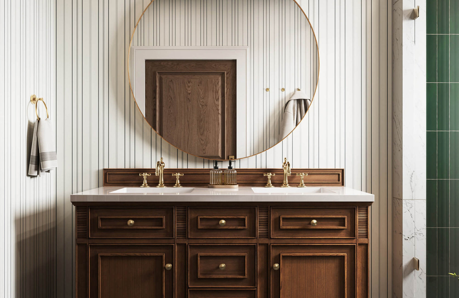
Vertical lines or elongated motifs naturally draw the eye upward. When applied to a wall, they create the impression of added height, making them especially useful in rooms with lower ceilings. This approach offers a way to introduce a sense of vertical lift without altering the space’s structure. The effect remains subtle, yet it can noticeably improve how the room is perceived.
This effect is clearly illustrated with Edward Martin’s Franklin Wallpaper in Olive, 52" x 132", as shown in the photo above, where its fine vertical lines guide the eye upward in a steady rhythm. Its linear pattern enhances the wall height behind the mirror, helping the compact space feel more elongated while maintaining a clean, cohesive look.
Horizontal Patterns
Horizontal patterns influence perception by extending the visual width of a room. In narrower spaces, they help ease the sense of confinement by drawing the eye outward along the walls. To maintain a clean, cohesive look, it is important to keep the spacing consistent. This allows the pattern to enhance the room’s proportions without making the surface feel disjointed.
Diagonal Movement
Diagonal patterns introduce a sense of movement that shifts away from strict vertical and horizontal lines. This can help soften the edges of a room that feels too rigid or box-like. As the eye is no longer guided in a single direction, it moves more freely across the surface. This creates a more relaxed visual experience, making the space feel less confined.

Pattern Density and Visual Breathing Room
Beyond size and direction, the spacing within a pattern plays a key role in how comfortable a wall feels to look at. Pattern density influences whether a design appears open and balanced or visually overwhelming.
Low-Density Designs
Patterns with more space between elements allow the wall to feel lighter and easier to read. This creates a sense of calm, which is especially important in small rooms where visual clarity matters. This approach works well when the goal is to maintain an open feel while still introducing pattern. The design remains present, but it does not overwhelm the space.
High-Density Patterns
Dense patterns can still be used in small spaces, but they require thoughtful placement. When applied across every wall, they can make the room feel more enclosed. A more effective approach is to limit them to a single area, allowing the pattern to stand out as a feature rather than dominate the entire space. This helps maintain balance while still introducing visual interest.
In this case, the use of Edward Martin’s Botanique Wallpaper in Winter, 52" x 132" highlights how a closely arranged botanical pattern can shape the overall atmosphere of a compact room. As shown in the photo above, the consistent, all-over floral motif creates a more immersive setting, giving the space a defined, intimate character while maintaining visual cohesion.
Layered Textures
Subtle, tonal patterns introduce depth without relying on strong contrast. They add character to the wall while maintaining a composed and understated appearance. This approach works well when a more refined look is preferred. Rather than drawing immediate attention, the pattern reveals itself gradually, contributing to a balanced and visually comfortable space.

Choosing Patterns Based on Room Function
The way a room is used should inform your choice of wallpaper pattern. Each space accommodates a different level of visual activity, and aligning the pattern with its function helps create a more comfortable and appropriate environment.
Bathrooms
Bathrooms allow for more expressive patterns, as they are typically used for shorter periods. This makes it easier to introduce stronger designs without overwhelming the home’s overall feel. This space can accommodate patterns that might feel too bold in larger or more frequently used areas. As a result, it offers an opportunity to introduce more distinct design choices in a controlled and intentional way.
This approach is reflected in Edward Martin’s Brocade Wallpaper in Black/Tan II, 52" x 132", as shown in the photo above, where the high-contrast pattern creates a more dramatic visual impact. Its traditional damask motif adds depth and character to the compact bathroom, allowing the space to feel layered and intentional while still maintaining the home’s overall balance.
Bedrooms
In bedrooms, patterns that feel steady and consistent tend to work best. Repetition without strong contrast helps create a more restful environment. This allows the wallpaper to support relaxation rather than draw attention. As a result, the space feels more settled, which is important in a room designed for rest.
Workspaces
In workspaces, clarity is essential. Patterns should support focus rather than draw attention away from tasks. Structured designs with controlled repetition tend to work best, as they help maintain a sense of order. At the same time, they introduce enough visual interest to keep the space from feeling too plain.

Using Pattern Placement to Control Visual Focus
Where wallpaper is applied has a direct influence on how a room is experienced. Thoughtful placement highlights specific areas while keeping other parts of the space visually understated.
Accent Walls
Applying wallpaper to a single wall naturally establishes it as the focal point of the room. This approach is particularly effective for stronger patterns that may feel overwhelming if used throughout the entire space. By focusing the design on one area, the room gains a clear point of interest. At the same time, it maintains a sense of openness and balance.
Full Room Coverage
Covering all walls can be effective when the pattern is soft and consistent. This approach creates a unified look, allowing the walls to feel connected rather than separate. It works particularly well when the goal is cohesion, as the pattern blends into the overall space. Instead of standing out, it becomes part of the background, supporting a more seamless visual experience.
A similar effect can be achieved with Edward Martin’s Essex Wallpaper in Black II, 52" x 132", as shown in the photo above, where its understated, repeating pattern carries across the entire room. Its continuous application allows the walls to read as one cohesive surface, giving the space a calm, grounded feel while letting the furniture and architectural elements take visual priority.
Partial Applications
Applying wallpaper in select sections allows you to introduce a pattern without covering the entire room. This can include areas above paneling or within framed sections of the wall. This approach helps maintain openness while still adding visual detail. It also gives you greater control over where attention is directed within the space.

Coordinating Patterns with Color for Spatial Effect
Color plays an important supporting role in how a wallpaper pattern is perceived. When considered together, pattern and color can influence whether a space feels more open or more enclosed.
Light Backgrounds
Patterns set on lighter backgrounds reflect more light, which helps a room feel less enclosed. This is especially beneficial in smaller spaces, where brightness contributes to a greater sense of openness. Lighter bases also allow the walls to recede visually rather than stand out. As a result, the pattern enhances the space without making it feel confined.
Low Contrast Combinations
When the colors within a pattern are close in tone, the overall design appears more cohesive. This reduces visual interruption and prevents the wall from feeling overly busy. As a result, the space maintains a calm and balanced atmosphere. The pattern then integrates more naturally into the room without drawing excessive attention.
Monochromatic Schemes
Using a single color family allows the pattern to blend more seamlessly into the space. The design becomes part of the wall rather than a separate visual layer. This approach works well when a more subtle effect is preferred. The room feels unified, while the pattern adds depth without drawing strong attention.
Choosing Patterns That Work With Your Space
The best wallpaper pattern for a small space is not defined by a single style but by how it interacts with the room. In most cases, patterns that are either small and continuous or larger with generous spacing tend to work best, as they avoid visual crowding while keeping the wall easy to read. Directional patterns such as vertical or horizontal designs can further enhance proportions, while low-density and low-contrast patterns help maintain a sense of openness.
When these elements are considered together, the pattern works in harmony with the room rather than against it. This allows you to introduce visual interest while maintaining comfort, resulting in a space that feels balanced, cohesive, and visually open. If you’re unsure which pattern best suits your space, our design service can help you evaluate your room and make informed decisions with clarity and confidence. You can also contact us for guidance in selecting options that align with your layout, lighting, and overall design goals.