


Choosing the best color for outdoor furniture is about more than creating a beautiful patio. The right shade can influence how comfortable your seating feels in the sun, how much upkeep it requires, and how well it holds its look through changing weather and seasons. Although color may seem like a purely aesthetic decision at first, it actually plays a major role in how your outdoor space functions day to day.
The best choice also depends on how your furniture interacts with its environment. Sun exposure, surrounding landscape, material type, and your space’s architecture all shape which colors will perform best over time. As you look more closely at these factors, it becomes easier to choose a palette that feels inviting, practical, and timeless rather than simply trendy.

Thermal Performance and Solar Absorption
Color affects more than appearance outdoors. It also influences how hot your furniture feels and how well the finish performs over time in direct sun.
Understanding the Albedo Effect on Different Surfaces
Lighter colors tend to reflect more sunlight, which helps keep outdoor furniture cooler during the hottest parts of the day. Shades like white, sand, light gray, and soft beige are especially practical in sunny climates because they absorb less heat and stay more comfortable to the touch. That makes them a strong choice for seating areas that get long hours of direct exposure.
By contrast, darker colors such as black, charcoal, and deep navy absorb more solar energy. As a result, they often feel much hotter, especially in open patios without shade. Although these darker finishes can look sleek and sophisticated, they usually work best when balanced with umbrellas, covered porches, or climates that are less intensely sunny.
Heat Retention in Metal vs Wood Finishes
Material changes how color performs. Dark metal furniture tends to heat up quickly because metal transfers heat efficiently, so a black or dark bronze frame can become uncomfortable fast in strong sun. Wood, however, usually stays more moderate because it does not conduct heat in the same way, even when it is finished in deeper stains.
That means a darker tone may be more manageable on teak or eucalyptus than on aluminum or wrought iron. If you love a darker modern look, this distinction matters. In many cases, you can keep the moodier palette you want by pairing it with materials that are naturally more comfortable outdoors.
Surface Finish and Heat Perception
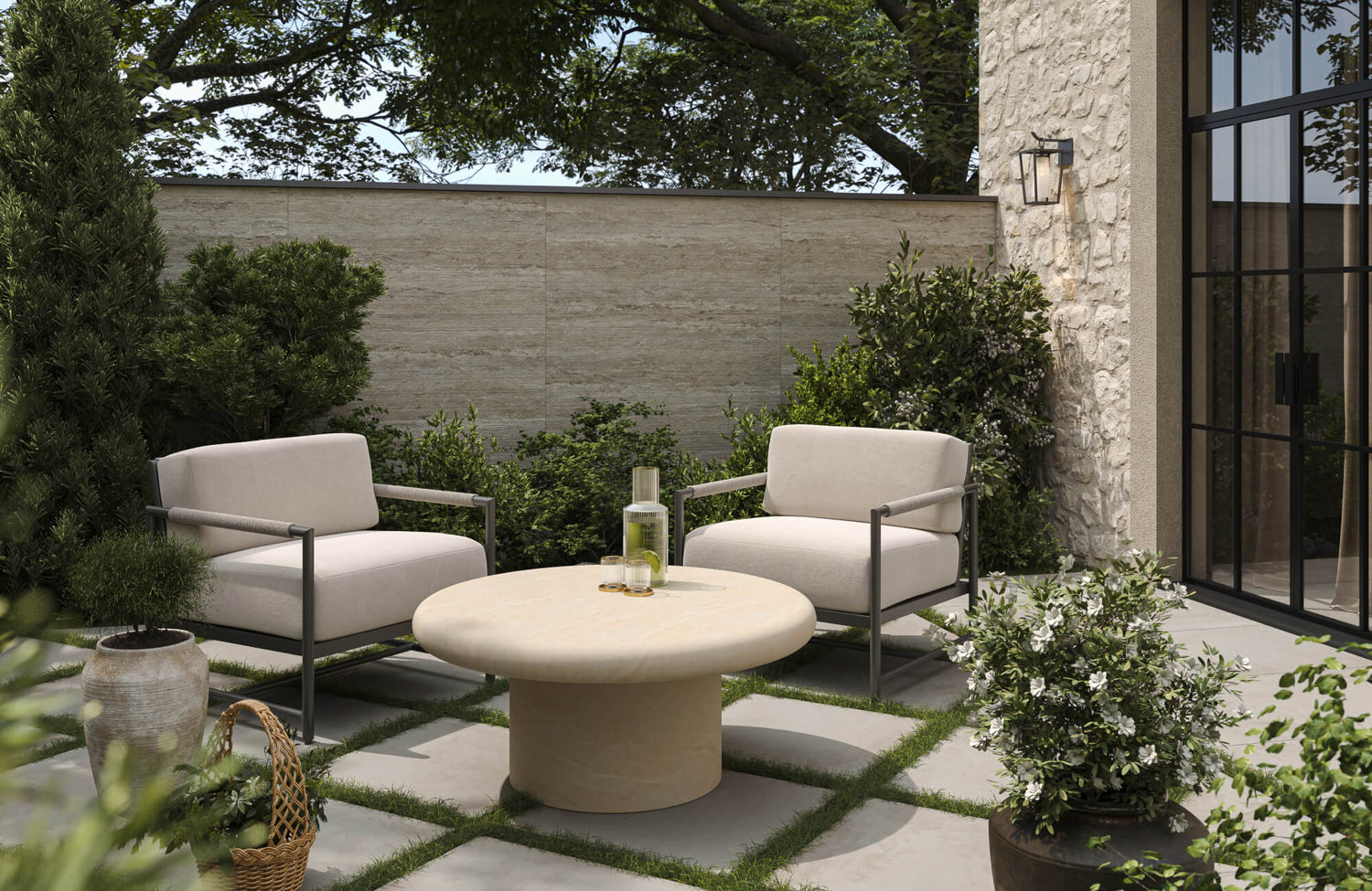
Beyond color alone, the finish of your furniture plays a noticeable role in how heat is experienced, especially when paired with the right palette, as shown in the image above. Lighter tones like the beige, sun-reflective surface of the Seabrook Outdoor Dining Table, 78" help minimize heat absorption while reducing glare through a more matte, diffused finish. This effect is enhanced by the Calandor Outdoor Dining Chair in Vintage Natural, whose warm, golden brown hue and woven texture not only soften visual intensity but also promote airflow, keeping seating cooler in direct sunlight. Similarly, the Sabine Outdoor Sofa in Cream uses a light, neutral color in off-white to reflect heat while its matte upholstery avoids the harsh glare often associated with brighter finishes.
To create balance, darker accents like the Marisette 12" x 27" Down Pillow in Black can be introduced sparingly, adding contrast and depth without significantly impacting overall heat retention—especially when placed in shaded or partially covered areas. Anchoring the same space above, the Cielo Outdoor Console Table in a natural wood tone bridges both light and mid-tone hues, offering warmth without the excessive heat buildup often associated with darker finishes. By combining light-reflective colors with matte and textured surfaces, you can create an outdoor setting that stays cooler, feels more comfortable, and still delivers a visually layered, sophisticated look.

Practical Maintenance and the Camouflage Factor
The best outdoor furniture color should also work with real life. Dust, pollen, water spots, and general wear are unavoidable, so some colors simply make upkeep easier.
Masking Local Environmental Debris
Mid-tone, earthy colors are often the easiest to live with because they hide dirt and debris better than very light or very dark finishes. Shades like taupe, mushroom, driftwood, olive-gray, and weathered brown tend to blend naturally with outdoor conditions, which means they still look presentable between cleanings. This is especially helpful if your patio is near trees, garden beds, or windy areas. A piece like the Verdanta Outdoor Dining Table in Aged Grey, 60", displayed above, fits seamlessly into this approach—its aged gray tone and softly mottled surface help disguise dust, pollen, and everyday wear while maintaining a refined, grounded look.
On the other hand, bright white can show grime quickly, while black can highlight dust, pollen, and streaking. For that reason, the most practical choice is often a forgiving neutral with a bit of visual complexity. If your area gets heavy pollen, red dust, or frequent wind-blown debris, choosing a color that visually echoes that environment can make a noticeable difference.
Managing Hard Water Stains and Oxidation
If your furniture sits near a pool, sprinkler system, or coastal setting, water spotting becomes a bigger concern. Dark, flat finishes tend to reveal mineral deposits more clearly, especially when water dries and leaves behind pale marks. Likewise, very dark surfaces may show weathering more quickly if the finish begins to oxidize.
A slightly variegated or matte finish usually performs better because it softens visual contrast. Bronze, textured gray, and weathered wood tones are often more forgiving than uniform black or glossy navy. So if low maintenance matters, it is wise to think beyond the color itself and consider the finish quality too.

Resistance to UV Degradation and Color Fastness
Sun exposure can slowly change outdoor furniture color, sometimes more quickly than expected. Because of that, durability should matter just as much as style when you make your decision.
The Vulnerability of High-Pigment Brights
Bold colors can look striking at first, but they are often more vulnerable to fading in strong sun. Bright reds, vivid blues, saturated purples, and intense greens tend to lose their richness faster, particularly on lower-quality fabrics or painted surfaces. Over time, they may appear chalky, uneven, or washed out, which can make even newer furniture look dated.
That does not mean you have to avoid color altogether. It simply means bright shades are often better used in accents like cushions, pillows, or umbrellas rather than large permanent pieces. This approach lets you enjoy a lively palette without committing your biggest outdoor investment to the colors most likely to fade.
Stability of Earth Tones and Neutrals
Neutrals and earth tones usually age more gracefully outdoors. Colors such as stone, clay, sand, taupe, olive, warm gray, and muted brown tend to hold their visual integrity longer because fading is less obvious and the tones already feel natural in exterior settings. Even after years of sun exposure, they often continue to look intentional rather than worn out. This is especially evident in pieces like the Elysia Mid Sofa, where soft neutral upholstery in a light sand or warm beige tone not only reflects sunlight to stay cooler but also resists the visible effects of fading over time, as seen in the photo above.
This is one reason these shades remain popular year after year. They are dependable, easy to coordinate, and generally less risky for larger pieces like dining sets, lounge chairs, or sectional frames. If you want the safest long-term option, muted neutrals are often the strongest choice.
Role of Protective Coatings and Finishes
Although color choice is important, the protective finish applied to your furniture can be just as critical in preventing fading. High-quality UV-resistant coatings help preserve color integrity by reducing the impact of prolonged sun exposure. Without this protection, even neutral tones can gradually lose their depth and appear dull over time.
Investing in finishes designed for outdoor durability also ensures that your chosen color maintains its intended look for longer. This is particularly important for painted metals and synthetic materials, where the outer layer acts as the primary defense against environmental stress. With the right coating, your furniture can retain both its color and overall finish despite constant exposure.

Architectural Integration and Visual Weight
Outdoor furniture should feel connected to the area rather than randomly placed beside it. Color helps create that connection by echoing the space’s materials, trim, and overall mood.
Anchoring Large Spaces with Dark Tones
In larger patios or open backyard layouts, darker furniture colors can provide useful visual weight. Charcoal, deep bronze, espresso, and dark gray like Vela End Table help define seating zones and make furniture feel substantial against wide expanses of stone, decking, or lawn. Without that grounding effect, large spaces can sometimes feel scattered or under-furnished.
These darker tones also work well when they repeat details already present in the space, such as black window frames, dark roofing, or bronze exterior hardware. As a result, the furniture looks more integrated and architectural. In spacious settings, this can create a polished, intentional feel that lighter colors may not always achieve.
Expanding Small Patios with Low-Contrast Hues
In smaller patios, balconies, or enclosed courtyards, lighter and lower-contrast colors usually work better. When furniture sits close in value to the flooring or surrounding walls, the eye moves more smoothly through the space. This makes the area feel calmer, more open, and less visually crowded. Soft grays, warm beige, light teak, and sandy neutrals are especially effective here. This is well illustrated above by the Lina Outdoor Coffee Table in Cream, whose gentle beige hue and softly textured surface echo surrounding tones rather than compete with them, allowing the layout to feel cohesive and visually expansive.
Soft grays, warm beige, light teak, and sandy neutrals are especially effective here. Instead of demanding attention, they help the furniture blend into the setting and support an airy atmosphere. If your goal is to make a compact outdoor area feel bigger, this quiet, tonal approach is often the best direction.
Coordinating with Natural Surroundings
Your furniture color should also respond to the surrounding landscape. Whether your outdoor space is framed by greenery, stone, or desert tones, choosing colors that echo these elements helps create a more cohesive and grounded environment. This approach allows your furniture to feel like a natural extension of its setting.
For example, earthy browns and olive tones blend seamlessly into garden-heavy spaces, while sandy beiges and warm grays pair well with stone or coastal surroundings. By aligning your furniture with both built and natural elements, the entire space feels more intentional and visually connected.

Psychological Impact and Zone Definition
Color shapes the mood of an outdoor space. Depending on the palette, your furniture can help create a retreat-like environment or a more energetic place for gathering and entertaining.
Creating a Restorative Sanctuary with Cool Tones
Cool tones tend to feel calm, restful, and refreshing outdoors. Soft blue, sage, misty gray-green, and muted slate can make a patio feel like an escape, especially when they reflect the colors of the sky, trees, or surrounding plants. These shades are particularly effective in spaces meant for quiet mornings, reading, or unwinding at the end of the day.
Because they visually recede, they also help the space feel less busy. This makes them a smart choice if you want your outdoor area to feel serene rather than styled too aggressively. When paired with natural textures like wood, linen, or stone, cool tones create a setting that feels both comfortable and timeless.
Defining Social Hubs with High-Energy Accents
Warmer colors create a different kind of atmosphere. Terracotta, rust, mustard, deep coral, and even teal can energize a space and make it feel more sociable. These tones naturally draw the eye, so they work well in dining areas, conversation sets, or fire pit zones where you want the setting to feel lively and welcoming.
Still, balance matters. Rather than using high-energy colors for every major piece, it is often more effective to keep the furniture base neutral and layer in brighter tones through cushions or accent chairs. That way, the space feels animated without becoming overwhelming.
Using Color to Guide Movement and Flow
Color can subtly influence how you move through and experience an outdoor space. Softer, more neutral tones such as warm beige, light taupe, soft gray, and weathered wood create a sense of continuity, allowing the eye to travel smoothly across different zones. This works especially well in spaces designed for relaxation, where a calm and uninterrupted visual flow helps the environment feel open and cohesive. Seating elements like the Corvin Outdoor Swivel Chair in Cream, featured above, contribute to this effect with their light, neutral upholstery, which blends seamlessly into surrounding tones while maintaining a soft visual presence that doesn’t interrupt the overall palette.
In contrast, introducing slightly bolder or contrasting colors in specific areas can help define function. For instance, a dining zone or fire pit area can feel more distinct when supported by warmer or deeper tones like terracotta, rust, deep olive, or charcoal. By using color strategically, you can guide how each part of your outdoor space is perceived and used without relying on physical barriers.

Seasonal Versatility and Trend Longevity
Outdoor furniture is a long-term purchase, so the best color should work beyond one season or trend cycle. A smart choice will still feel relevant whether the garden is in full bloom or the landscape looks bare and quiet.
Year-Round Appeal of Sophisticated Neutrals
Sophisticated neutrals are often the most versatile choice because they adapt easily throughout the year. Colors like greige, charcoal, warm gray, taupe, and muted navy can feel fresh in spring, grounded in summer, cozy in autumn, and crisp in winter. That flexibility makes them especially useful for larger furniture pieces that you do not want to replace frequently.
They also offer a strong foundation for seasonal styling. You can shift the mood with pillows, throws, planters, or rugs without changing the furniture itself. Because of that, neutrals tend to offer the best balance between timelessness and adaptability.
Contrasting Against Seasonal Foliage Changes
Your landscape changes throughout the year, and furniture color should still work against those shifting backdrops. A color that looks vibrant in summer greenery might feel out of place once leaves turn brown or fall away. This is why transitional shades, such as bronze, weathered teak, olive-gray, and slate, tend to perform so well across seasons.
These tones also carry enough richness to stand out when everything is lush, yet enough subtlety to remain harmonious when the garden becomes quieter. In other words, they do not depend on peak-season scenery to look good. That makes them a more dependable choice for year-round outdoor spaces.

Best Color Choices for Different Outdoor Settings
Although there is no single universal answer, some colors consistently perform better depending on the space and climate. The best choice becomes clearer when you match color to how and where the furniture will be used.
Best Colors for Hot, Sunny Climates
If your outdoor area gets intense sun, lighter colors are usually the most practical. White, sand, light taupe, pale gray, and sun-washed wood tones stay cooler and make the space feel brighter and more comfortable. These colors are especially useful for poolside seating, uncovered patios, and south-facing decks where heat buildup can quickly become a problem. This is also effective in bar or counter seating, where pieces like the Darcy Outdoor Counter Stool in Cream feature a soft, light neutral finish that reflects sunlight while maintaining a clean, airy presence within the space, as displayed in the picture above.
That said, pure white is not always the easiest to maintain. For a more forgiving option, off-white, greige, or warm stone often delivers the same airy look with less visible dirt. In very sunny environments, these softer neutrals are often the most balanced choice overall.
Best Colors for Covered and Shaded Areas
If your outdoor space is mostly shaded or covered, you have more flexibility with color choice. Darker tones such as charcoal, deep brown, or navy can work well in these environments because they are less likely to overheat without direct sun exposure. These colors can add depth and contrast, making the space feel more intimate and defined. At the same time, incorporating lighter cushions or accents can prevent the overall look from feeling too heavy. In shaded settings, this balance also allows you to enjoy richer color palettes while still maintaining comfort and visual clarity.
If you want a color that is stylish, low-risk, and easy to live with, mid-tone neutrals are usually the best answer. Warm gray, taupe, bronze, weathered wood, and muted charcoal work across many styles and climates. They hide wear reasonably well, coordinate with changing accessories, and tend to age gracefully. These shades also give you more freedom as your taste evolves. Whether you later add bold cushions, a patterned outdoor rug, or a more natural garden palette, they continue to work. For most people, that combination of flexibility, practicality, and timeless appeal makes them the smartest long-term investment. The best color for outdoor furniture is usually one that balances visual appeal with real-world performance. In most spaces, that means choosing versatile neutrals or grounded earth tones that stay cooler, hide wear more easily, coordinate with the space and landscape, and remain relevant through shifting seasons. If you want to introduce more personality, brighter or deeper hues often work best as accents rather than the foundation. When you approach color with both beauty and durability in mind, your outdoor furniture helps create a space that feels comfortable, cohesive, and built to last. If you are unsure which colors will work best for your space, getting expert guidance can make the process much easier. By visiting the our contact page, you can connect with a team that can help you refine your choices based on your climate, layout, and overall design goals. This ensures that your outdoor furniture not only looks cohesive but also performs well over time, giving you a space that feels both intentional and lasting!Best Colors for Versatile, Long-Term Use
Choosing the Best Outdoor Furniture Color for Comfort, Durability, and Style