


Choosing the best rug color starts with understanding your space. While there is no single color that works for every room, the right choice should complement your décor, support your lifestyle, and create the mood you want. Neutral shades like beige, gray, ivory, and taupe are often the most versatile, while darker tones help hide wear, and bold colors can turn the rug into a focal point. From making a room feel brighter and more open to adding warmth, depth, or contrast, rug color plays an important role in how a space looks and feels. This guide explores key factors to consider when choosing a rug color that feels both stylish and practical for your home.

Color Psychology and Its Effect on Spaces
Rug color can influence how a room feels, from warm and energetic to calm and restful. It can create a cozy atmosphere, promote focus and relaxation, or provide a neutral backdrop that allows other design elements to stand out.
Warm Colors for a Cozy and Social Atmosphere
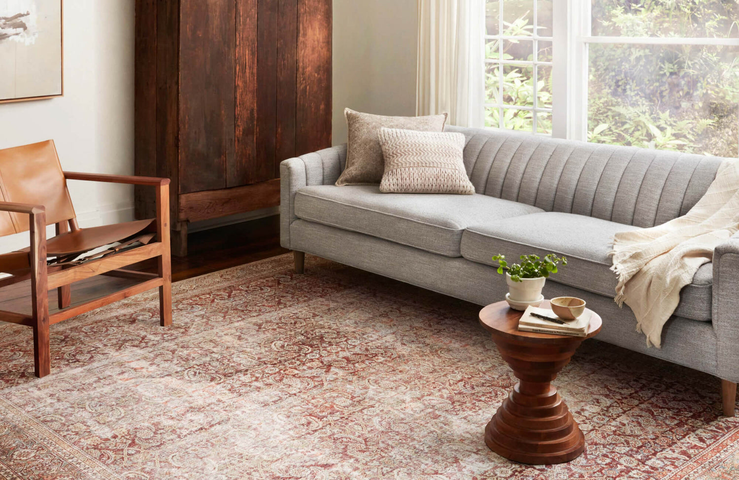
Reds, oranges, and yellows bring warmth and energy, making them ideal for living rooms and social spaces. These hues add vibrancy and can help create a setting that feels welcoming and conversational.
Pairing this type of rug with neutral furniture, such as a cognac leather sofa or beige accents, keeps the bold color from overwhelming the room. A distressed pattern also adds character, making the space feel curated yet relaxed.
Reds, oranges, and yellows bring warmth and energy, making them ideal for living rooms and social spaces. These hues enhance a room’s vibrancy, fostering connection and conversation.
Cool Colors for Calm and Focus
Blues, greens, and purples create a relaxing environment, making them well-suited for bedrooms, workspaces, and quiet corners. These hues promote a sense of ease and can help support concentration.
Lighter cool tones, such as pale blue and lavender, create an airy feel. Deeper shades, such as navy or forest green, add sophistication and help ground the room. In a home office, a soft blue rug paired with white shelves and a minimalist desk setup can create a clean, distraction-free workspace. In a dining room, a deep green rug under a walnut table can help the space feel calm, grounded, and inviting.
Neutral Colors for Versatility and Balance
Beige, gray, ivory, taupe, and white provide a flexible foundation, allowing other design elements to stand out. If you are unsure which rug color to choose, a neutral shade is usually the most adaptable starting point. These colors work across a wide range of aesthetics, from modern minimalism to classic elegance.
For example, a light gray rug can complement different furniture styles while maintaining a timeless look. In a living room with white walls and natural wood accents, a neutral woven rug adds warmth without overpowering the design. Edward Martin’s Haverford Rug in Platinum / Bronze, as shown in the photo featured above, illustrates this beautifully, grounding the seating area with a soft, layered palette that ties together the wood beams, brick fireplace, and upholstered furniture.
To keep a neutral palette engaging, texture plays an important role. Woven, high-low pile, or gently distressed designs can add depth without disrupting the room’s overall calm. The Haverford Rug’s platinum and bronze tones bring subtle contrast and dimension to the space, showing how a neutral rug can feel warm, polished, and visually rich without overwhelming the room.

Practical Considerations for Functionality
Aside from aesthetics, a rug’s color influences how well it hides stains, maintains its appearance, and responds to different lighting conditions. Choosing the right shade can make wear less noticeable, reduce visible stains, and support a room’s overall design.
Light Colors Brighten and Expand Spaces
Whites, creams, pale grays, and soft pastels reflect light, making rooms feel larger and more open. These shades are especially useful in smaller rooms, apartments, or dimly lit areas where you want to maximize brightness. A pale beige or off-white rug, for example, can make a compact living area feel more spacious.
While light-colored rugs enhance openness, they may require more upkeep. Choosing a stain-resistant or easy-to-maintain material improves everyday practicality, especially in busy areas.
Dark Colors Conceal Stains and Add Depth
Dark gray, navy blue, and dark brown help hide dirt and wear, making them ideal for entryways, family rooms, dining rooms, and other busy areas. Beyond their practicality, these rich colors add depth and create a more grounded, sophisticated atmosphere.
A dark blue rug under a sectional sofa can offer both elegance and function. In a dining space, darker rugs are especially useful because they help minimize the appearance of crumbs, chair movement, and everyday wear beneath the table. Edward Martin’s Davies Rug in Graphite / Fog, as shown in the photo featured above, demonstrates this balance well, anchoring the room with a dark gray, textured foundation while complementing the wood dining table, light upholstered chairs, and deep green walls.
To keep the room from feeling too heavy, pair darker rugs with lighter furniture, metal accents, or natural wood finishes. Davies Rug’s dark gray and light gray tones add contrast without overwhelming the space, creating a polished look that still feels warm, comfortable, and practical.
Patterned Rugs Mask Stains and Enhance Style
Patterns help camouflage everyday wear while adding personality and movement to a room. Multi-colored patterns are especially effective because they break up the appearance of stains, crumbs, and daily use. Geometric, floral, Persian-style, or abstract designs are useful in busy areas such as living rooms and dining spaces.
A bold kilim rug can add a bohemian touch, while a subtle two-tone pattern keeps the look more refined. In a dining area with dark wood furniture, a Persian-style rug with intricate motifs can help disguise minor spills while adding warmth and character.
To maintain visual harmony, keep the surrounding furniture simple so the rug can stand out as the statement piece. A neutral-toned sofa paired with a high-contrast patterned rug, for example, can create a dynamic look without making the room feel overcrowded.

Coordinating Rug Colors with Existing Décor
The right rug color can enhance a room by creating contrast, blending seamlessly, or reinforcing a layered color palette. Whether you prefer a subtle monochromatic scheme, a smooth analogous palette, or a bold complementary combination, thoughtful color coordination helps create a pulled-together design.
Monochromatic Schemes Keep Spaces Sophisticated
A monochromatic color scheme uses one color in varying shades. This approach adds depth and elegance without creating visual conflict. By layering tonal variations, the room can feel refined rather than flat.
For example, a light gray rug with darker gray accents can create a subtle contrast in a modern office. If the room has charcoal walls, a mid-tone gray rug can soften the space while allowing black furnishings and metallic desk accessories to stand out.
Texture is especially important in monochromatic rooms. High-low pile patterns, woven details, and a mix of matte, glossy, or metallic finishes can add visual interest. In a formal dining area, a plush gray rug under a dark-stained wood table can balance the contrast while keeping the setting polished and inviting.
Analogous Colors Create a Seamless Look
Analogous colors sit next to each other on the color wheel, such as green, teal, and blue. Because these shades naturally relate to one another, they create a smooth and unified look.
A gradient rug that transitions from deep blue to light green, for instance, can enhance a calm and cohesive atmosphere. In a bedroom with sage green walls, a teal rug with subtle color variations can add depth while complementing soft seafoam bedding. This approach is especially effective in open-concept spaces, where color continuity helps the rooms feel connected.
A coastal-inspired living room can also benefit from an analogous palette. A blue-green rug paired with whitewashed wood furniture and woven rattan accents creates an airy, relaxed look while keeping the color story consistent.
Complementary Colors Add Contrast and Energy
Complementary colors sit opposite each other on the color wheel, such as blue and orange. This pairing creates contrast and energy while balancing warm and cool tones.
A navy rug with orange accents can strike a strong balance between richness and warmth. Edward Martin’s Pascal Rug in Spice / Cobalt, as shown in the photo above, brings this idea to life through a balanced palette that adds color without overwhelming the room. The red-beige tones connect with the wood coffee table, window trim, and tan accent chairs, while the blue details introduce a cooler contrast that keeps the space feeling layered and fresh.
To keep bold contrasts from feeling overwhelming, incorporate neutral elements such as beige seating, natural wood, or soft white walls. In this setting, the cream sofa and white walls soften the rug’s stronger colors, while the visible wood grain helps bridge the warm and cool tones for a cohesive, welcoming look.

Lighting and Its Impact on Rug Color
A rug’s appearance can shift depending on natural and artificial light. Sunlight can reveal color depth and texture, while artificial lighting can shift undertones and affect how warm or cool a rug looks. Considering lighting before choosing a rug color helps ensure the shade works well throughout the day.
Natural Light Enhances Color Depth
Sunlight reveals a rug’s true hues and highlights subtle variations in texture and tone. In rooms with abundant natural light, colors often appear brighter and more vibrant. However, strong sun exposure can also cause fading over time.
This effect is especially clear with Edward Martin’s Hutchinson Rug in Fog / Crimson, as shown in the photo featured above. The natural light softens its rug’s red, blue, and cream tones while bringing out the detail in its distressed pattern, allowing the color variation to feel layered rather than overpowering.
For sunny spaces, earth tones and medium neutrals are also practical choices because they tend to hold their appearance better over time. Sheer curtains or window treatments can also help control sunlight without making the room feel dark.
Artificial Light Changes Color Perception
Artificial lighting can alter how rug colors appear. Warm lighting enhances reds, oranges, yellows, and warm browns, making them feel richer. Cool LED lighting can intensify blues, greens, and grays, making them look sharper or sometimes slightly colder.
In a dining room with warm pendant lighting, a terracotta rug may take on a deeper and more inviting tone. Layering table lamps, sconces, or floor lamps can help balance the light and reduce harsh shadows.
In a workspace with cool LED lighting, a rug with cooler undertones may maintain a cleaner and more consistent appearance. This prevents the color from looking too muted, muddy, or out of place under artificial light.
Shadows Add Depth and Texture
Shadows can make textured rugs appear darker or more dimensional, which affects how the color reads throughout the day. High-pile, woven, and hand-textured rugs often reveal more depth as light moves across their surface.
For example, a shag rug positioned near a large window may shift in appearance as natural light changes, giving the color more depth. In a living room with recessed ceiling lights, a woven jute rug can appear warmer and more defined as shadows highlight its natural fibers. This interplay between light, texture, and color can make a rug feel more dynamic without relying on a bold shade.

Choosing a Rug Color for Your Lifestyle
The ideal rug color should suit your household’s practical needs while complementing your preferred aesthetic. From durable shades for pets to stain-concealing designs for children and refined tones for formal spaces, the right color can support both function and style.
Best Rug Colors for Homes with Pets
Mid-range earth tones and multi-tonal rugs help disguise pet hair, dirt, and everyday messes. A low-pile rug in shades of gray, brown, taupe, or mixed neutrals can be especially practical because it reduces the visibility of shedding and is easier to maintain. For added longevity, materials such as wool, nylon, and polypropylene can withstand frequent movement and regular cleaning. Routine vacuuming and a pet-friendly rug protector can also help preserve the rug’s appearance.
Family-Friendly Colors Resist Stains and Wear
Darker rugs, mid-tone colors, and patterned designs are ideal for homes with children because they conceal stains, crumbs, and everyday messes better than pale solids. Charcoal, taupe, medium brown, navy, and multi-tonal patterns are especially practical for family rooms, play areas, and dining spaces.
Beyond practicality, these colors can add depth and warmth to a room. Edward Martin’s Marroway Indoor/Outdoor Rug in Brown / Black, 7'10" x 10'9", as shown in the photo above, supports this idea with a brown-and-black pattern that helps hide dust, dirt, and wear. Its indoor/outdoor construction also makes it a practical choice for casual lounge areas, covered patios, and other family-friendly spaces where durability matters.
A stain-resistant, low-pile rug in a speckled or patterned design can minimize visible spills while still feeling soft and comfortable. Durable materials such as wool blends or dense synthetics offer a strong combination of comfort, style, and longevity.
Formal vs. Casual Color Choices
Muted tones often suit formal spaces, while bold colors and playful patterns work well in casual rooms. Since color influences atmosphere, the right hue can help define how polished, relaxed, or energetic a room feels. A Persian-style rug in deep jewel tones can add sophistication to a dining room or sitting area. In contrast, a bright geometric rug can energize a playroom, family room, or creative space. Classic colors such as navy, ivory, gray, and burgundy create a refined look, while brighter shades give a space a more relaxed and expressive feel.
Choosing the Right Rug Color
The best rug color depends on your space, lifestyle, lighting, and design goals. These options show how rug color can serve different needs: neutral shades offer the most versatility, light colors can make a room feel larger, dark colors help hide stains, and patterned rugs add style while supporting everyday practicality. Warm hues create a cozy and social atmosphere, while cool tones promote calm and focus.
By considering how a rug color interacts with your décor, lighting, and daily routine, you can choose a shade that feels both beautiful and functional. The right rug should not only complement your room but also support the way you live in it.
With so many factors to consider, selecting the ideal rug color can feel overwhelming. For more tailored guidance, explore our design services or contact our team for expert advice and personalized recommendations. We can help you choose a rug color that complements your home, supports your lifestyle, and creates the right mood for your space.

