


The way lighting reveals color can completely change how a room feels. A paint shade that looks rich in daylight may seem dull under the wrong bulb, and décor that once felt inviting can lose its character if colors appear muted. This is where CRI, or Color Rendering Index, becomes essential. It measures how accurately a light source reflects true colors, helping you see finishes, artwork, and even skin tones as they’re meant to be. In this blog, we’ll explore what CRI means, how it differs from other lighting metrics, and when choosing higher CRI lighting makes a real difference.

The Basics of CRI
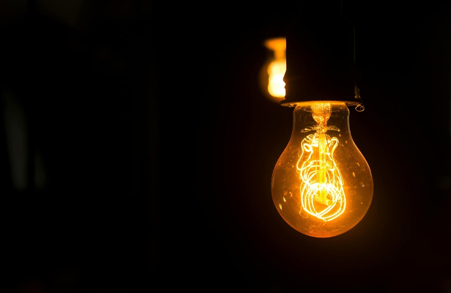
CRI, or Color Rendering Index, is one of the most important yet overlooked aspects of lighting. It tells us how accurately a light source reveals colors compared to natural sunlight. By understanding how CRI works, homeowners and designers can make more informed choices about the quality of light in their spaces.
What CRI Actually Measures
CRI measures how true colors appear under a given light source compared to how they would look in natural daylight. It evaluates how reds, blues, greens, and other hues are represented without distortion or dullness. A high CRI means objects look vibrant and realistic, while a low CRI can make them appear muted or washed out. This accuracy is critical in environments where color clarity matters, such as living spaces, bathrooms, or retail displays. Simply put, CRI provides a benchmark for understanding the quality of artificial lighting.
How The CRI Scale Works (0–100)
The CRI scale runs from 0 to 100, with higher numbers indicating better color accuracy. A CRI of 80 is generally considered acceptable for most residential spaces, while 90 and above is preferred for areas where true-to-life color is essential. Lights with CRI below 70 often distort colors significantly, making spaces feel flat or unnatural. The closer the number is to 100, the more the lighting mimics the effects of natural daylight. This simple scale helps consumers compare lighting products with ease.
Lighting Examples With Different CRI Levels
To understand CRI in practice, consider how a fruit bowl looks under different lights. With a CRI of 95, the apples and oranges appear bright, crisp, and true to their natural shades. At a CRI of 80, the colors are still recognizable but slightly less vibrant. Drop down to 60, and the fruit begins to look dull or faded, with reds and greens especially losing their richness. These examples show how CRI directly affects the way we perceive everyday surroundings.

Why CRI Matters For Your Home Or Business
Lighting isn’t only about how bright a space feels—it also affects how true and appealing colors appear. A high or low CRI can completely change the mood of a room, the accuracy of interior design, and even how products are perceived in business settings. This makes CRI a practical factor in creating spaces that look and function their best.
How CRI Affects Color Accuracy In Interiors
In homes, CRI directly influences how finishes, paint colors, and décor appear under artificial light. A vanity painted navy blue or walls in soft beige may look different depending on the CRI of the fixture above. High CRI lighting ensures those tones remain true to their intended look, maintaining design harmony. On the other hand, low CRI lighting can make surfaces appear dull, distorted, or mismatched. By preserving accurate colors, high CRI lighting helps interiors feel cohesive and well-designed.
The Role Of CRI In Workplaces And Retail
In offices, studios, or retail stores, CRI plays a critical role in productivity and presentation. Designers, artists, and professionals who work with color depend on accurate lighting to evaluate details correctly. In retail, high CRI ensures that clothing, furniture, or artwork reflects their real colors, making them more appealing to customers. Low CRI lighting risks making products look cheap or uninviting, even if they’re high-quality. For businesses, investing in high CRI lighting directly impacts both workflow and customer experience.
Everyday Benefits Of Choosing Higher CRI Lighting
Even in everyday life, high CRI lighting improves how you interact with your surroundings. Food on the kitchen counter looks fresher, clothes in the closet display their true shades, and skin tones in the mirror appear natural. This not only improves practicality but also creates a more pleasant atmosphere at home. With accurate colors, spaces feel warmer, more vibrant, and inviting. Choosing higher CRI lighting is a simple way to make daily routines more comfortable and visually satisfying.

CRI vs Other Lighting Metrics
CRI is important, but it’s not the only factor to consider when evaluating lighting. Other measurements like lumens, Kelvin, and TM-30 also play major roles in how light looks and performs. Understanding the differences helps you choose lighting that balances brightness, accuracy, and overall atmosphere.
CRI vs Lumens: Color vs Brightness
CRI and lumens measure very different aspects of lighting, though they are often confused. While CRI measures how accurately colors appear under a light, lumens measure the total amount of light emitted, or brightness. A fixture may produce a high lumen output but still have a poor CRI, leaving colors looking washed out despite the brightness. On the other hand, a light with excellent CRI but very low lumens may feel too dim to be practical. Both metrics need to work together to create lighting that is both useful and visually pleasing.
In everyday terms, lumens affect whether a room feels well-lit, while CRI affects whether what you see looks natural. For example, a bright kitchen light with poor CRI can make food look unappetizing, even if the space is technically well-illuminated. Conversely, a warm reading lamp with high CRI can make a book’s pages look crisp and clear, but without enough lumens, it may not provide enough usable light. Striking the right balance ensures you don’t sacrifice visibility for accuracy, or vice versa. This makes pairing lumens and CRI an essential step in lighting design.
CRI vs Kelvin: Color Accuracy vs Color Temperature
Kelvin measures the color temperature of a light source, ranging from warm yellowish tones to cool bluish tones. CRI, on the other hand, focuses on how accurately colors are rendered regardless of temperature. A light could have a warm 2700K glow but still have poor CRI, making colors look flat. Similarly, a cool 5000K daylight bulb can be bright and crisp, but only effective if its CRI is high enough to show true colors. The two metrics work hand in hand to shape the look and feel of a room.
The key is understanding how they influence perception together. A high Kelvin light with low CRI may feel sterile, while a warm light with high CRI can make a bathroom or bedroom feel cozy yet accurate. Designers often combine both factors, using Kelvin to set the mood and CRI to ensure accuracy. For example, in a living room, a 3000K light with CRI above 90 offers warmth without dulling furniture tones. By considering both, you create spaces that feel both intentional and authentic.
TM-30: The Newer Standard To Know
TM-30 is a newer and more comprehensive standard for measuring color quality compared to CRI. While CRI looks at eight color samples to calculate accuracy, TM-30 evaluates over 90 color samples, giving a much broader picture. This allows TM-30 to show not only accuracy but also how saturated or vivid colors appear. As a result, TM-30 is often more reliable for evaluating advanced lighting technologies like LEDs. Its detail helps avoid the oversimplification that CRI sometimes creates.
For most homeowners, CRI remains the most common and accessible metric, but TM-30 is gaining attention in professional settings. Architects, designers, and retailers often prefer it because it reveals subtle differences that CRI can miss. A light with high CRI might still underperform in saturation or vibrancy, which TM-30 helps identify. As LED and smart lighting continue to advance, TM-30 could become the go-to standard. Still, for everyday purchases, knowing CRI and Kelvin is usually enough to make an informed choice.

When To Prioritize High CRI Lighting
Not every room requires lighting with a perfect CRI score, but some spaces benefit greatly from it. Areas where colors, detail, and overall appearance matter most are where high CRI proves its value. Below, we’ll explore when investing in higher CRI lighting makes the biggest impact.
Living Rooms And Bedrooms
In living rooms and bedrooms, CRI influences how inviting and comfortable the space feels. High CRI lighting helps furniture, textiles, and wall colors appear natural, enhancing the overall design. Without it, tones may look dull or mismatched, undermining the warmth of the space. In bedrooms, high CRI also ensures that fabrics, bedding, and artwork display their true shades, creating a more relaxing atmosphere. These rooms benefit from accurate color because they’re places where comfort and aesthetics go hand in hand.
While task lighting isn’t the primary concern in these rooms, the right CRI still contributes to ambiance. Richer wood finishes, vivid textiles, and accent pieces stand out more under accurate lighting. This gives the space a polished and cohesive look without feeling forced. Even if a slightly lower CRI works functionally, investing in a higher CRI here enhances everyday enjoyment.
Kitchens, Bathrooms, And Task Areas
Kitchens and bathrooms rely on precision, which makes CRI especially important. In the kitchen, accurate lighting ensures food looks fresh and natural, making meal preparation both safer and more enjoyable. Bathrooms also benefit from high CRI because it shows true skin tones, which is crucial for grooming or applying makeup. These details highlight how CRI improves not only appearance but also the practical use of light in daily life.
High CRI also helps showcase the finishes you’ve invested in for these spaces. Cabinetry, tile, and countertops appear in their intended shades rather than distorted under poor-quality light. In task areas such as home offices or craft rooms, it reduces visual strain and helps details appear clearer. This combination of practicality and design accuracy makes a higher CRI a smart choice wherever precision matters.
Workplaces And Galleries
In professional environments, CRI often determines how well work is done and how products are perceived. Offices and studios with high CRI lighting provide clarity that supports productivity, especially in design or technical fields. Galleries and museums also rely on it to present artwork in its true form, protecting the integrity of colors and details.
The value of high CRI in these spaces is closely tied to trust and effectiveness. Customers are more likely to purchase when products appear vibrant and true to life, and professionals can perform better when colors are displayed accurately. For artists and designers, high CRI makes the difference between precision and compromise. Businesses that invest in it create environments that feel reliable and engaging. In settings where impression and detail matter, high CRI is less of a luxury and more of a necessity.

How CRI Connects To Lighting Fixtures
The fixture you choose shapes not only the look of your bathroom, hallway, or living space but also how CRI performs. Each type of fixture highlights different surfaces, textures, and colors, making CRI an important factor in how the final result is perceived. Understanding how CRI interacts with fixtures ensures your lighting feels purposeful and true to design.
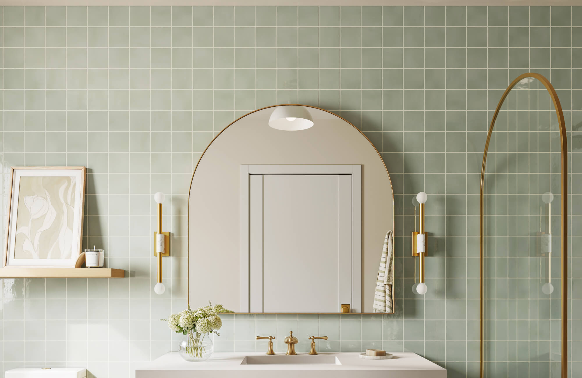
Sconces
Sconces, like our Johansson Wall Sconce in Antique Nickel above, are often used as accent or task lighting, which makes CRI especially important in how walls, finishes, and skin tones appear. High CRI ensures the light doesn’t distort color, keeping painted surfaces and decorative elements looking authentic. In bathrooms or hallways, this accuracy prevents shadows from dulling the overall effect. Without good CRI, sconces can make spaces feel flat, even if the design is beautiful. Choosing sconces with a higher CRI brings clarity and warmth to focused areas.
Pendants
Pendant lights are typically placed over kitchen islands, dining tables, or seating areas where both clarity and mood matter. A high CRI allows food, finishes, and furniture to appear more vivid and natural under the downward light. Because pendants are positioned close to surfaces, a poor CRI can exaggerate dullness or distortion. With accurate rendering, pendants create a lively and balanced atmosphere. This makes CRI essential when pendants serve as both functional and decorative lighting.
Chandelier
Chandeliers are statement pieces, and CRI affects both the fixture itself and the space it illuminates. Crystals, metals, and finishes on the chandelier show their true brilliance only under high CRI lighting. In dining rooms, accurate CRI also ensures that table settings and food look appealing. Without it, the chandelier’s impact may feel diminished, no matter how elegant the design. Pairing a chandelier with a strong CRI brings together drama and authenticity.
Flush Mount
Flush mount fixtures provide broad coverage, so their CRI rating influences how the entire room feels. High CRI ensures that walls, flooring, and furniture show their intended tones without distortion. Because these fixtures often serve as the main light source, their accuracy sets the stage for the rest of the design. A low CRI flush mount can make spaces look dull, even when brightness is sufficient. Selecting fixtures with high CRI keeps general lighting clear and inviting.
Picture Lights
Picture lights are designed to showcase artwork, photography, or wall features, making CRI a critical factor. High CRI prevents artwork from looking washed out, ensuring details and colors remain true. Even subtle differences in tone become noticeable when the lighting highlights a specific piece. A poor CRI can diminish the impact of art by muting its vibrancy. For displays to look authentic, picture lights should always prioritize accurate color rendering.
Linear
Linear fixtures are often used in kitchens, offices, or modern living spaces, where consistent coverage matters. With high CRI, surfaces such as counters, desks, and cabinets appear clear and vibrant along the entire length of the fixture. Poor CRI can create a washed-out or uneven effect, reducing both function and style. In contemporary interiors, where clean lines dominate, this accuracy is especially important. Linear fixtures paired with strong CRI combine sleek design with dependable performance.
Making Smart Lighting Choices With CRI
Color Rendering Index may sound technical, but its impact is easy to see in everyday life. From the warmth of a living room to the accuracy needed in a kitchen or gallery, CRI determines whether colors look natural, vibrant, and true to design. A higher CRI creates comfort, clarity, and consistency across different spaces, helping your lighting do more than brighten a room—it enhances how you experience it. By understanding how CRI compares with lumens, Kelvin, and fixture types, you can make better choices that fit both style and function.
If you’re unsure which lighting options will bring out the best in your home or business, professional guidance can simplify the process. Our design consultation can provide tailored advice on CRI ratings, fixture choices, and overall layout to ensure your space feels both beautiful and practical. With expert input, you’ll have the confidence to choose lighting that highlights your interiors the way they were meant to be seen.