


Your dining table is the heart of shared moments, and the chairs that surround it help set the mood for every gathering. Choosing the right chair color for a wooden table isn’t just about matching tones; it’s about creating balance, harmony, and personality within your space. The right pairing can also make your dining area feel brighter, cozier, or more sophisticated.
In this article, you’ll uncover how wood undertones, color contrast, and design styles work together to shape a cohesive and inviting dining atmosphere. Whether you love the simplicity of natural wood, the charm of farmhouse warmth, or the boldness of modern contrast, you’ll find practical tips to help you choose chair colors that beautifully complement your wooden table and tell your design story with confidence.

Decoding Wood Undertones for Cohesive Design
Before selecting your dining chairs, it’s crucial to understand your table’s wood tone and undertone. This subtle yet powerful detail determines how colors interact within your dining space and sets the mood for the entire room. Once you can read these undertones, every color choice, from upholstery to accents, becomes more intentional and visually balanced.
Warm vs Cool Wood Tones
Every type of wood tells a color story through its undertones. Warm woods, such as cherry, walnut, and red oak, often reveal golden, reddish, or amber hues that bring a sense of coziness and depth. These tones radiate warmth and work beautifully with earthy, inviting shades. In contrast, cool woods like maple, birch, or white ash display gray, bluish, or even violet undertones that create a calm, contemporary mood.
To pinpoint your table’s undertone, take a moment to observe it under natural daylight. Hold up a neutral gray or white surface next to the wood. If the table glows richer and golden, you’re looking at a warm undertone; if it appears crisp and muted, it leans cool. This quick visual test also helps you understand your table’s “temperature,” which becomes your guide for choosing dining chair colors that either echo its tone or artfully contrast it.
A perfect example of this balance can be seen in the image above, featuring our Foster Dining Chair in Onyx Leather. Its deep black hue pairs beautifully with medium to dark wood tones, creating a refined contrast that enhances the table’s warmth while grounding the overall palette. The combination of the chair’s sleek leather texture and rich wooden frame showcases how cool, dark tones can elevate the depth and sophistication of a space rooted in natural materials.
Spectroscopic Influence of Grain Structure
The story of undertones doesn’t end with color; it continues through texture. The grain structure of your wooden table affects how light interacts with its surface, subtly influencing the color you perceive. Closed-grain woods, like maple, reflect light evenly, creating a smoother and often cooler appearance. Meanwhile, open-grain woods, such as oak or ash, refract light in multiple directions, deepening their warmth and highlighting intricate variations in tone.
This relationship between light, finish, and grain creates what’s known as the metameric effect, a fascinating phenomenon where colors appear to shift under different lighting conditions. You might notice your table looking warmer in daylight but cooler under artificial light. Being aware of this effect allows you to test chair colors under multiple lighting scenarios, ensuring they remain cohesive no matter the time of day.
Harmonizing Undertones with Chair Color Saturation
When selecting dining chair colors, the goal is harmony. Instead of focusing solely on hue, pay attention to saturation and value. Warm woods pair effortlessly with equally warm, muted tones like camel, taupe, or olive, creating a comfortable and inviting ambiance. An example of this is our Bower Dining Chair in Brown, which complements warm wood undertones beautifully while adding depth and balance to the overall palette. On the other hand, cool woods feel naturally balanced when surrounded by shades of charcoal, navy, or steel, lending a sleek and composed character to the space.
To refine your selection, gather fabric swatches and finish samples, and view them beside your table in both natural and artificial light. This small step helps you visualize how the undertones work together across materials and textures. By tuning in to these subtle shifts, you also ensure that your dining area feels cohesive and well-considered, a space where every element, from the grain of the wood to the color of your chairs, contributes to a unified visual rhythm.

Balancing Contrast and Coordination in Dining Sets
Design success lies in finding the sweet spot between contrast, which adds drama and focus, and coordination, which creates flow and unity. When balanced well, the interplay between these two approaches defines not only your dining area’s aesthetic but also its emotional rhythm.
Engineering Visual Contrast
Contrast brings a sense of energy and visual hierarchy to your dining space. It draws the eye, making your table and chairs feel intentional rather than repetitive. When you pair a light wood table with deep-toned chairs like matte black, espresso, or charcoal, you create a striking composition that feels bold yet grounded. Conversely, if your dining table is made from dark walnut or mahogany, lighter chairs in cream, white oak, or pale gray can lift the weight of the ensemble, adding balance and visual relief.
If you’re uncertain about going fully contrasting, start small. Try introducing one chair in a contrasting color at the head or foot of the table. This approach lets you gauge how the contrast feels in your space without overwhelming the setting. Over time, if the combination feels right, you can expand it across the entire dining set for a cohesive but eye-catching result.
Cultivating Seamless Tonal Coordination
Coordination offers a quieter kind of elegance. Instead of commanding attention through contrast, it weaves continuity and calm into the design. When your dining chairs share similar tones with your table, such as tan linen paired with honey oak or gray upholstery paired with ash, the look feels cohesive and balanced. This tonal similarity is especially effective in small spaces or open-concept homes, where a sense of visual flow helps the room feel spacious and uncluttered.
Our Rita Dining Chairs in Taupe in Taupe, Set of 2, featured in the photo above, demonstrate how neutral hues can bring warmth and texture to a coordinated setting. Their soft beige-taupe fabric complements the natural wood tones of the table, creating a seamless visual connection that feels airy yet grounded. This pairing also shows how subtle color harmony can elevate a space, turning simplicity into sophistication through tone, texture, and thoughtful design.
The key to achieving successful coordination lies in subtle variation. Even within a unified color family, tiny shifts in tone or texture keep the arrangement from feeling monotonous. Soft textiles, brushed finishes, or gently curved chair silhouettes can also add depth while maintaining harmony across the dining area.
Subtle Differentiation Within Harmonious Schemes
When you’re working with tone-on-tone combinations, a bit of differentiation is essential to avoid flatness. You can achieve this by introducing slight contrasts through texture, sheen, or structure rather than through color alone. For instance, pairing brown linen-upholstered chairs with black metal legs beside a wooden table introduces a layer of sophistication without breaking visual unity. A standout example of this approach is our Gideon Dining Chair in Blue, which adds a refined pop of muted color and texture that enhances harmony without overwhelming the space. The interplay between fabric, metal, and wood creates a tactile richness that feels balanced rather than busy.
Transitioning between materials also helps highlight each element in your dining setup. A smooth wooden tabletop juxtaposed with a textured chair seat, for example, allows both materials to shine while maintaining cohesion. These subtle variations ensure your space feels thoughtfully designed, an environment where contrast and coordination coexist in perfect rhythm.

Exploring Popular Color Pairings by Wood Type
Knowing the general color family of your dining table helps you make confident chair color choices that naturally complement its tone. Each wood type interacts with color in its own way, shaping the atmosphere and depth of your dining space.
Light Woods
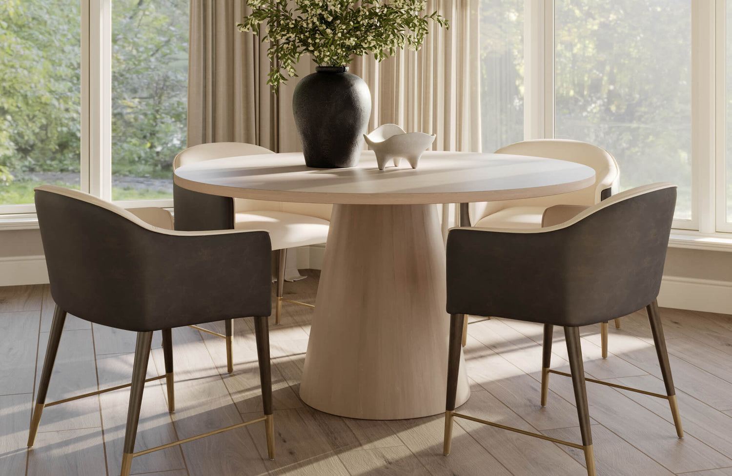
Light woods such as birch, pine, and ash exude an airy, natural charm that can make your dining area feel open and relaxed. To maintain this sense of lightness, pairing them with white or light gray chairs creates a clean, minimalist aesthetic. These combinations work beautifully in Scandinavian or modern interiors where simplicity and calm take center stage. If you prefer more dimension, soft contrasts like navy or sage green can introduce subtle depth without overpowering the table’s pale grain.
Because light woods have a soft visual presence, it’s also important to add structure through form and shape. Chairs with defined silhouettes, bold legs, or textured upholstery, such as our Clark Outdoor Dining Chairs in Louis Cream, Set of 2, help prevent pale tones from fading into the background. Their soft cream finish and sturdy frame add both warmth and dimension, ensuring the space feels balanced, refreshing, and visually engaging.
Medium Woods
Medium-toned woods, such as oak and teak, offer the most versatility because they sit comfortably between light and dark. These woods pair beautifully with warm, earthy hues that highlight their natural richness, such as olive, warm beige, or deep charcoal. Each of these tones also enhances the wood’s organic appeal, creating a grounded, inviting atmosphere.
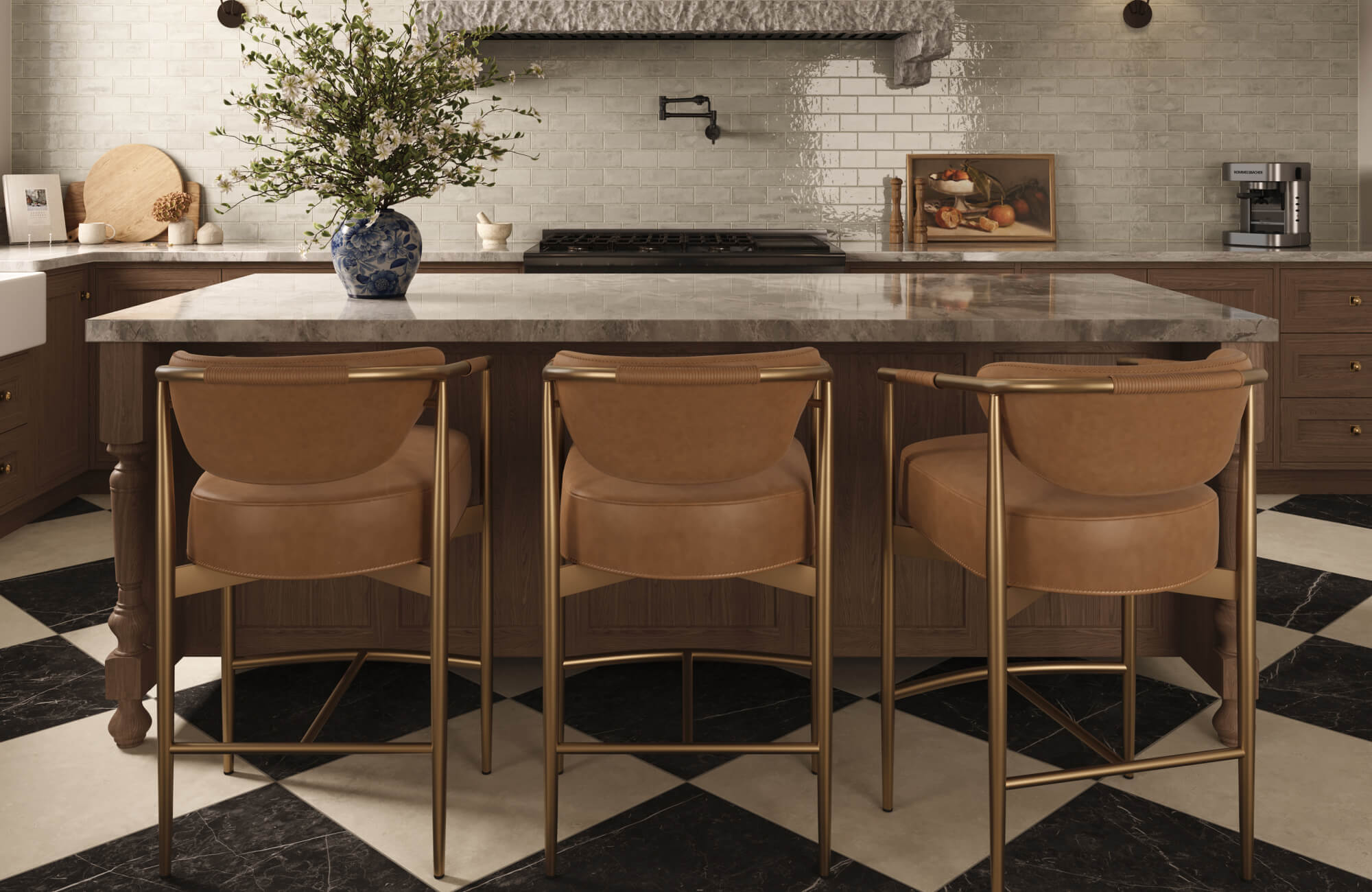
Additionally, texture plays an important supporting role. Incorporating tactile elements like rush seating, pieces with a woven rattan back, such as our Vivian Dining Chair in Black, or nubby linen upholstery deepens the visual experience and keeps the color palette from feeling too uniform. These subtle textural differences also make the combination of wood and chair feel layered, timeless, and full of character, perfect for spaces that balance comfort with understated sophistication.
Dark Woods
Dark woods such as mahogany and walnut command attention with their depth and drama. To balance their richness, chairs in lighter or more vibrant shades can bring life and clarity to the scene. Crisp ivory, pale beige, or even saturated jewel tones like emerald, sapphire, or mustard provide a striking contrast that highlights the table’s grain and craftsmanship. These colors not only brighten the overall composition but also infuse a sense of personality and elegance into the dining area.
To keep darker wood sets from feeling too heavy, introducing reflective or luminous elements can make a noticeable difference. Details like brass or chrome chair legs, textured fabrics, or subtle metallic accents add sparkle and break up the visual density of dark tones. The result is a dynamic, balanced composition that feels rich but never oppressive.
One refined example of this balance is our Shaffer Dining Chair in Tan Leather. As shown in the picture above, its warm camel-brown tone perfectly complements the depth of a dark wood table, softening the overall palette while maintaining an elegant sense of contrast. The supple leather texture also adds warmth and sophistication, creating a space that feels both modern and timeless, an ideal choice for those who appreciate understated luxury in dining design.

Aligning Color Pairings with Interior Style and Mood
The right dining chair color does more than match your table. It also shapes the mood and supports your overall design style. Every interior carries its own personality, and your chair colors should complement that character while making the space feel intentional and inviting.
Modern and Minimalist Spaces
In modern and minimalist interiors, simplicity and precision define the aesthetic. Monochromatic palettes featuring white, gray, or black allow the clean lines of your furniture to take center stage. These neutral tones emphasize structure and proportion, drawing attention to the craftsmanship rather than the color itself. However, without variation, such schemes can feel overly sterile.
To keep your dining space visually engaging, introduce subtle contrasts in finish and texture. A mix of matte and glossy surfaces adds dimension, while geometric or sculptural chair designs bring movement to an otherwise restrained palette. For instance, our Elena Dining Chair in Ernst Silverstone beautifully embodies this balance. Its soft light gray upholstery complements the rich wood tones of the table in the image above, creating a harmonious blend of warmth and sophistication. The chair’s clean silhouette and tactile fabric also offer both comfort and elegance, perfectly suiting modern interiors that value quiet luxury and timeless appeal.
Farmhouse and Rustic Styles
Farmhouse and rustic interiors thrive on comfort, warmth, and lived-in charm. For these styles, warm earth tones and soft, timeworn finishes are the perfect companions to wooden tables. Chair colors such as sage, taupe, cream, or muted gray echo the organic hues found in nature, reinforcing the cozy and approachable essence of the look.
Mixing natural and painted chairs also adds an element of authenticity, as though each piece has its own story. Pairing a distressed oak or pine table with lightly weathered chairs creates an inviting, collected feel rather than a staged arrangement. The combination of familiar textures and gentle color variations turns your dining area into a welcoming space that feels both timeless and personal.
Contemporary and Eclectic Designs
Contemporary and eclectic styles celebrate creativity, individuality, and a willingness to take risks. In these spaces, color becomes a powerful tool for self-expression. Vibrant hues like mustard yellow, teal blue, or cranberry red can instantly energize a wooden table, turning it into a statement piece rather than a backdrop. These bold tones also lend character and dimension while reflecting your personality and sense of adventure.
To maintain cohesion, balance the vibrancy with shared undertones or finishes. For example, pairing mismatched chairs in different colors but similar textures that echo your table’s wood grain keeps the look unified. This approach allows you to experiment freely without losing harmony, resulting in a dining space that feels dynamic, expressive, and unmistakably yours.

Utilizing Mixed and Two-Tone Chair Combinations
Mixing chair styles and finishes is one of the most expressive ways to give your dining space a custom, lived-in feel. When approached with intention, it turns an ordinary dining set into a layered design statement that feels curated rather than mismatched.
Neutrals and Strategic Accents
A strong foundation begins with neutrality. Starting with a base of neutral chairs, such as beige, gray, ivory, or soft wood tones, creates a calm backdrop that allows accent colors to stand out gracefully. Once your base is established, introduce a pair of bold chairs in hues like emerald green, mustard yellow, or deep navy. These accent chairs bring energy and visual rhythm to your setup, making the dining table feel more dynamic and personalized.
Placement also plays a crucial role in maintaining visual balance. Position your accent chairs at the head and foot of the table to draw the eye naturally toward the center. This arrangement creates symmetry and gives the room a sense of completeness without overwhelming it with color. The contrast between neutral and vibrant tones sparks interest, but because it’s controlled, it still feels elegant and intentional rather than chaotic.
Layering Depth Through Material Mixing
A mix of materials adds richness that pure color alone can’t achieve. Combining upholstered, wood, and metal chairs introduces texture and tactile variety, helping your dining area feel multidimensional. The key is restraint: choose one unifying element, such as a shared color family, similar sheen, or consistent silhouette. This subtle repetition ties the different materials together, creating a look that’s diverse yet harmonious.
A perfect example of this concept is our Leticia Outdoor Dining Chair in Cream. Pictured above, its soft cream weave and dark frame create a sophisticated two-toned contrast that complements light or medium wood tables beautifully. The combination of airy upholstery and sleek structure also brings depth and balance, showing how thoughtful material mixing can add visual interest while keeping the overall aesthetic light and cohesive.
Building on this idea, pairing fabric-upholstered chairs with slender metal frames alongside solid wood seats can produce a striking yet cohesive blend. Introducing a few armchairs or armless designs within the same palette can further enhance the composition, adding comfort and subtle variation without disrupting harmony. Altogether, the interplay of soft and hard textures invites visual movement while preserving balance. When done thoughtfully, mixed-material seating brings life to your dining area, reflecting a sense of creativity and confidence that feels both modern and timeless.
Crafting a Cohesive Dining Experience
Finding the best dining chair colors for a wooden table is ultimately about the connection between tones, textures, and the mood you want to create. Once you understand your table’s undertone and balance it with complementary or contrasting shades, your space naturally comes together. The key lies in blending harmony with personality, allowing color and material to work hand in hand. When every element feels considered and unified, your dining area becomes more than a place to eat. It also transforms into a reflection of warmth, style, and togetherness that welcomes everyone to stay a little longer.
To ensure every design choice feels intentional and aligned with your vision, you can seek expert advice from our team. Our specialists can help you select dining chairs, finishes, and color combinations that perfectly complement your wooden table and overall interior aesthetic. Visit our Contact Us page to connect with our team and discover how professional insight can elevate your dining space into one that feels cohesive, inviting, and uniquely yours.