


Wallpaper can instantly transform a room, but not all wallcoverings are created with the same level of care. Beyond color and pattern, the true measure of quality lies in the materials, printing precision, surface treatment, and finishing details behind the design. Subtle elements like substrate strength, pigment layering, and seam accuracy often determine how refined the final result will feel. In this blog, we’ll break down the craftsmanship details that define high-quality wallpaper so you can evaluate it with greater confidence.

Material Integrity and Substrate Quality
High-quality wallpaper begins with what you cannot immediately see. The base material determines how the wallcovering performs over time, from flexibility and stability to durability and breathability. Before texture, print, or finish is applied, craftsmanship is already defined by the integrity of the substrate itself.
Non-Woven vs Traditional Paper Foundations
The foundation of wallpaper plays a major role in how it holds up in real-world conditions. Non-woven substrates are typically made from a blend of natural and synthetic fibers, which gives them flexibility and dimensional stability. They are less prone to shrinking or expanding, which helps maintain pattern alignment across the wall. Traditional paper backings, while still used, tend to be more delicate and sensitive to moisture fluctuations. A well-manufactured non-woven base often feels more substantial in hand and performs more consistently over time. The choice of foundation reflects the level of attention given to both durability and long-term appearance.
Weight, Thickness, and Tear Resistance
Wallpaper weight is not just a technical specification; it directly affects how the material behaves once installed. Heavier, well-constructed wallcoverings tend to resist tearing and stretching, which helps preserve clean edges and consistent seams. Thickness also contributes to how well the wallpaper conceals minor wall imperfections. Thin, low-grade paper can feel fragile and may crease easily during handling. A quality substrate maintains its structure without feeling overly stiff or brittle. That balance between strength and flexibility is often a clear indicator of careful manufacturing.
Breathability and Wall Compatibility
Breathability is another detail that separates high-quality wallpaper from basic alternatives. Certain substrates allow walls to release trapped moisture, which helps reduce the risk of bubbling or peeling over time. This is especially important in spaces where temperature and humidity levels fluctuate. Materials that support airflow behind the surface tend to perform better in the long term. Compatibility with different wall types also reflects thoughtful product development. When the substrate is engineered to work with a range of interior conditions, it demonstrates a deeper level of craftsmanship beneath the visible surface.
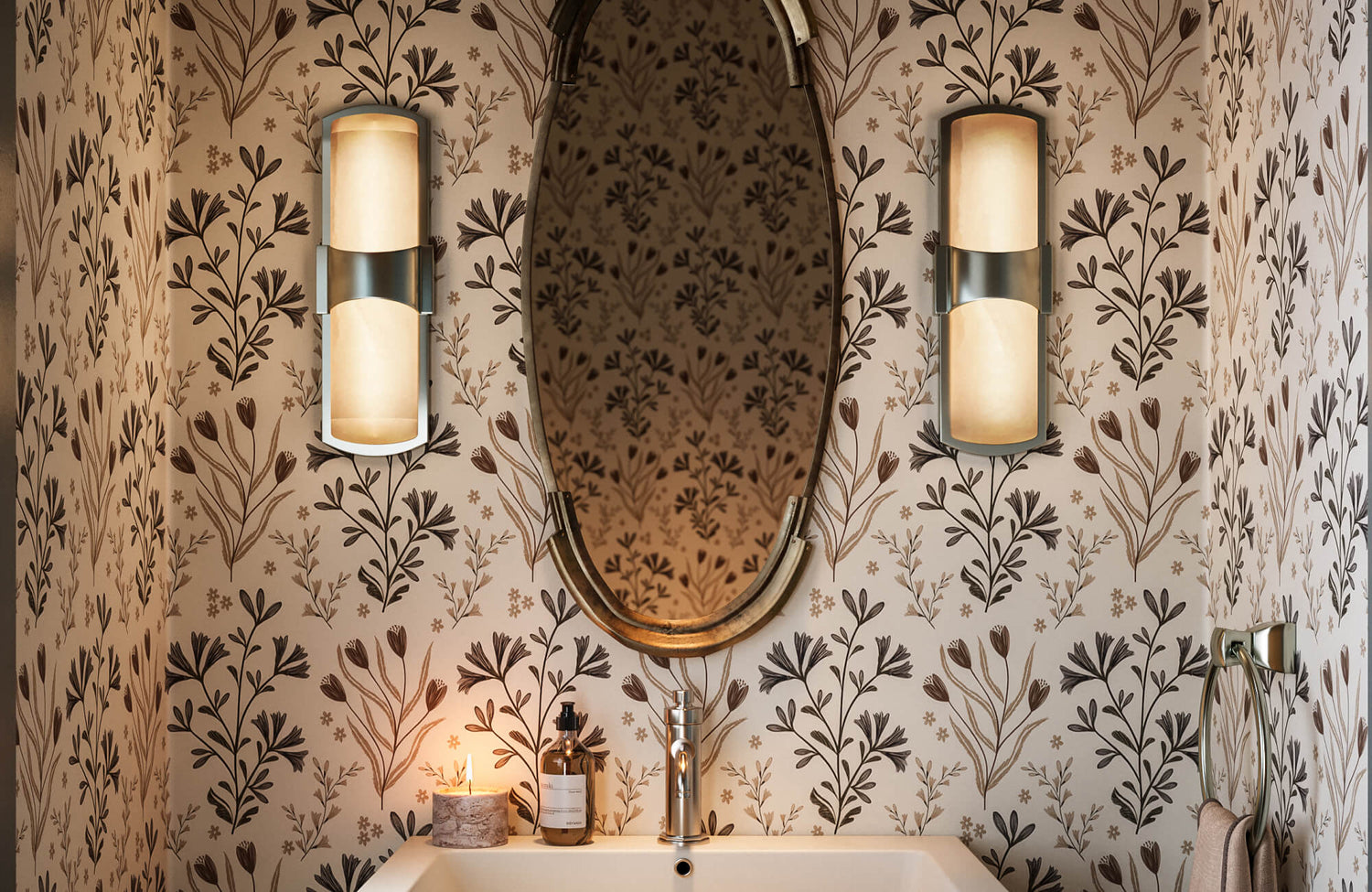
When breathability and wall compatibility matter, especially in moisture-prone spaces, our Brocade Wallpaper in Black/Tan II, 52" x 132" above, is engineered to perform. Digitally printed on lightly textured DreamScape Terralon and rated for commercial interiors and full bathrooms, it is designed to handle humidity shifts without compromising surface integrity. The matte brown canvas layered with a black damask motif retains its depth while maintaining structural stability beneath the print. Its extra-wide, full-height sizing also minimizes seams, reinforcing both durability and visual continuity.

Precision in Printing and Color Application
Once the foundation is strong, the next indicator of quality appears in the printing itself. Precision in color, clarity, and alignment determines whether a wallpaper feels refined or flat. High-level craftsmanship shows up in sharp edges, balanced saturation, and consistency that holds steady from the first roll to the last.
Sharp Registration and Pattern Alignment
Registration refers to how accurately each color layer lines up during printing. In high-quality wallpaper, lines appear crisp, edges remain defined, and multi-color designs do not blur into one another. Even intricate details should look intentional rather than slightly offset. When registration is precise, patterns feel controlled and clean from a close distance. Poor alignment, on the other hand, often reveals itself in faint shadows or doubled outlines around shapes. Strong craftsmanship ensures that every printed layer lands exactly where it should.
When precise registration is what keeps a bold contour pattern from feeling chaotic, our Plateau Wallpaper in Taupe II, 52" x 132", illustrates that clarity beautifully. As shown above, the dark taupe abstract lines sit cleanly against the white field, allowing the composition to feel intentional rather than visually crowded. Each curve remains distinct without soft shadows or blurred edges, so the pattern reads clearly both up close and from across the room. The extra-wide, full-height scale further supports that continuity, helping the design flow smoothly with fewer visual interruptions.
Color Saturation Without Bleeding
Color application should feel rich and controlled, not muddy or overly dense. Well-manufactured wallpaper achieves saturation that enhances depth while maintaining clarity around edges. Pigments should not bleed into neighboring areas or soften details unintentionally. Balanced saturation also prevents colors from appearing washed out under natural or artificial light. The surface should hold its tone evenly across the design. When color is applied with care, the wallpaper maintains its vibrancy without sacrificing sharpness.
Layered Pigments and Dimensional Depth
Quality wallpaper often relies on layered printing techniques to create subtle depth within the design. Multiple passes of pigment can introduce shadowing, highlights, and tonal variation that make the surface feel more dimensional. This layering adds complexity without overwhelming the eye. Instead of appearing flat, the design gains a sense of movement and visual texture. Careful pigment layering allows even understated patterns to feel elevated. The difference becomes noticeable when you compare it to a single-pass print that lacks nuance.
Consistency From Roll to Roll
Consistency across rolls is a hallmark of controlled production. Each roll should carry the same color balance, clarity, and print precision as the next. Inconsistent printing can lead to visible variation once applied across a wall. High-quality wallpaper undergoes inspection processes to ensure uniformity before it leaves the manufacturer. This attention to consistency reflects disciplined manufacturing standards. When rolls match seamlessly in tone and detail, it signals a commitment to quality at every stage of production.

Surface Texture and Embossing Techniques
Beyond print precision, surface treatment is where wallpaper begins to feel elevated. Texture, embossing, and raised detailing introduce a dimension that flat prints simply cannot replicate. When craftsmanship extends to the surface finish, the design gains depth, realism, and a more refined presence on the wall.
Embossed vs Printed-Only Surfaces
Embossed wallpaper carries a physical texture that you can both see and feel. Raised patterns, subtle ridges, or pressed motifs add dimension that creates a more immersive surface. In contrast, printed-only wallpaper relies solely on visual illusion, which can appear flat under certain lighting conditions. Embossing enhances realism, especially in designs that mimic grasscloth, linen, or plaster finishes. The tactile quality adds a layer of authenticity that printed texture alone often cannot achieve. When embossing is executed with precision, it feels intentional rather than exaggerated.
Hand-Applied or Specialty Finishes
Some high-quality wallpapers incorporate specialty techniques such as hand-applied metallic accents, layered inks, or artisanal detailing. These finishes introduce slight variation that prevents the surface from feeling overly uniform. Unlike mass-produced flat prints, handcrafted touches create a more nuanced visual experience. The detailing may be subtle, but it adds character when viewed up close. Specialty finishes also demonstrate a higher level of manufacturing control and artistic input. This attention to surface refinement signals a more elevated production process.
Texture That Enhances Light Interaction
Texture changes the way light moves across a wall. Raised elements catch highlights, while recessed areas create soft shadows that shift throughout the day. This interaction gives the wallpaper a dynamic quality, even in neutral designs. Flat surfaces tend to reflect light evenly, which can make patterns feel less dimensional. When texture is thoughtfully integrated, it adds quiet movement without overwhelming the space. Subtle surface variation often becomes one of the most noticeable markers of high-quality craftsmanship.
Texture becomes most noticeable when it subtly shifts under changing light, adding dimension without demanding attention. As shown above, our Essex Wallpaper in Black II, 52" x 132" illustrates this beautifully, with layered linework that softens the checkerboard pattern and prevents it from feeling overly rigid. The warm off-white base paired with fine dark gray detailing creates a surface that feels visually active yet controlled. Rather than reflecting light flatly, the lightly textured finish introduces gentle depth that evolves throughout the day, giving the wall a more nuanced presence.

Seam Construction and Pattern Continuity
Even the most beautiful wallpaper can fall short if the seams disrupt the design. High-quality craftsmanship shows in how cleanly patterns align from panel to panel and how precisely each roll is cut. When transitions are nearly invisible, the wall reads as one continuous surface rather than a series of separate strips.
Clean Edge Trimming and Roll Accuracy
Precision trimming is one of the quietest indicators of manufacturing quality. Each roll should be cut evenly, with straight edges that allow panels to meet cleanly without gaps or overlap. If edges are inconsistent or slightly off, alignment becomes difficult, and the final installation can look uneven. Accurate roll sizing also ensures that patterns repeat at predictable intervals, making layout planning more reliable. Quality control during cutting reduces the risk of frayed edges or subtle inconsistencies along the seam line. When trimming is exact, the panels sit flush against one another with minimal adjustment.
Invisible Seams and Pattern Flow
Pattern continuity across seams is where true craftsmanship becomes visible. High-quality wallpaper is designed so that motifs align naturally when panels are placed side by side. The goal is to maintain uninterrupted visual flow, especially in designs with strong vertical or horizontal elements. When alignment is precise, the eye moves across the wall without catching abrupt breaks. Even intricate patterns should connect seamlessly without noticeable shifts. A well-executed seam allows the wallpaper to feel cohesive and intentional rather than pieced together.

Durability, Washability, and Long-Term Performance
Craftsmanship is not only about how wallpaper looks on day one, but how it holds up years later. Durability shows in how well the surface resists fading, cleans without damage, and maintains its structure over time. High-quality wallpaper is engineered to preserve both color and finish, even as light exposure and daily contact gradually test the surface.
Fade Resistance and UV Stability
Exposure to natural light can slowly alter color if pigments are not properly formulated. High-quality wallpaper uses inks and coatings designed to resist UV-related fading, which helps preserve tonal depth and clarity. Without that stability, darker hues may dull and lighter shades can yellow over time. Quality control in pigment selection and curing processes plays a major role in maintaining visual consistency. Even in rooms with strong daylight, a well-made wallcovering should retain its intended color balance. Fade resistance is often subtle at first, but it becomes obvious over the years.
In a softly lit setting like the one shown above, where daylight gently washes across the wall, fade resistance becomes essential. Our Windsor Wallpaper in Grey I, 52" x 132" keeps its light gray base and crisp white tile-inspired linework looking balanced even with ongoing sun exposure. The pigments are developed to hold their tone, so the structured pattern stays clear rather than gradually dulling. Over time, that color stability helps the space maintain its calm, graphic presence instead of feeling uneven or washed out.
Surface Protection and Cleanability
Daily living inevitably brings contact, whether through light scuffs, dust, or occasional marks. A well-crafted wallpaper incorporates protective finishes that allow gentle cleaning without lifting ink or damaging texture. Scrubbability ratings provide guidance on how much maintenance the surface can handle. Higher-grade wallcoverings are designed to withstand careful wiping without disrupting color saturation or surface detail. The protective layer should feel integrated rather than plasticky or overly glossy. Cleanability is not just about convenience; it reflects thoughtful engineering beneath the visible design.
Resistance to Peeling or Curling Edges
Edges are often the first place where lower-quality wallpaper begins to fail. Curling corners or lifting seams can result from weak surface bonding or inadequate finishing processes. High-quality wallpaper maintains stable edges that remain flush against the wall when properly applied. This stability is a sign of disciplined production standards and thorough testing. When edges hold firm over time, the wall continues to read as a seamless surface. Long-term performance ultimately depends on how well every layer works together under real conditions.

Finishing Details That Separate Good From Exceptional
The final indicators of quality often appear in the details most people overlook. Beyond print and texture, production standards show up in how rolls are labeled, packaged, and managed from batch to batch. These behind-the-scenes elements reflect a manufacturer’s commitment to precision and accountability.
Dye Lot Consistency Across Orders
Dye lot management plays a critical role in maintaining color uniformity. Even slight variations in pigment formulation can create noticeable shifts when multiple rolls are installed side by side. High-quality manufacturers carefully track production batches to ensure consistency within and across orders. Clear labeling of dye lots allows for accurate coordination during purchasing and planning. When color remains consistent from one roll to the next, it signals disciplined production control. That level of attention prevents subtle mismatches that can disrupt an otherwise seamless wall.
Protective Packaging and Roll Inspection
The condition of the wallpaper upon arrival also reflects overall craftsmanship standards. Rolls should be securely wrapped to prevent creasing, edge damage, or exposure to moisture during transit. Protective packaging indicates that the manufacturer anticipates handling risks and plans accordingly. In addition to packaging, thorough inspection before shipment helps catch defects early. Quality control teams review alignment, color consistency, and surface integrity before rolls leave the facility. When packaging and inspection are handled with care, it reinforces confidence in the product from start to finish.
Clear Installation Guidance and Labeling Standards
Clear labeling and detailed guidance are often overlooked but highly valuable. Roll measurements, repeat information, and batch details should be easy to read and accurate. Comprehensive instructions demonstrate that the manufacturer understands how the product will be handled in real-world settings. Precise documentation reduces confusion and supports proper execution during installation. Organized labeling also reflects a systematic production process behind the scenes. When information is communicated clearly, it underscores a higher level of professionalism and manufacturing discipline.
Choosing Wallpaper That Reflects True Craftsmanship
High-quality wallpaper is defined by details that extend far beyond surface appearance. From substrate integrity and print precision to seam continuity and long-term durability, each layer contributes to how the wallcovering performs and feels over time. When craftsmanship is consistent at every stage, the finished wall reads as intentional, refined, and cohesive. Understanding these technical distinctions allows you to evaluate wallpaper with a more informed and critical eye.
If you are unsure which material, finish, or construction level is right for your space, our Personalized Design Consultation can help you make that decision with clarity. We consider lighting conditions, room function, wall type, and long-term design goals before recommending specific wallcovering options. With thoughtful guidance, you can select wallpaper that not only looks beautiful on day one but continues to perform beautifully for years to come.
