


A blue rug has the power to define a space; serene, versatile, and full of depth. Whether you’re drawn to the airy charm of sky blue or the timeless sophistication of navy, the colors that frame it play a key role in shaping the room’s atmosphere. In this article, we’ll look at how to make your blue rug stand out through well-balanced color pairings, complementary materials, and thoughtful design choices that can bring harmony and character to your home.

The Mood and Tone of Blue
Before choosing complementary colors, it’s important to understand what your shade of blue conveys. Often linked to calm, clarity, and balance, blue can also create very different impressions depending on its tone, depth, and the space it inhabits.
Cool vs Warm Undertones
The first step in pairing colors effectively is recognizing your rug’s undertone. Cool blues, with subtle hints of gray or silver, pair effortlessly with crisp whites, black accents, and chrome finishes, creating a sleek, refreshing look that suits modern or minimalist interiors. Warm blues, which lean toward green or turquoise, pair naturally with beige, cream, or brass tones for a softer and more inviting atmosphere.
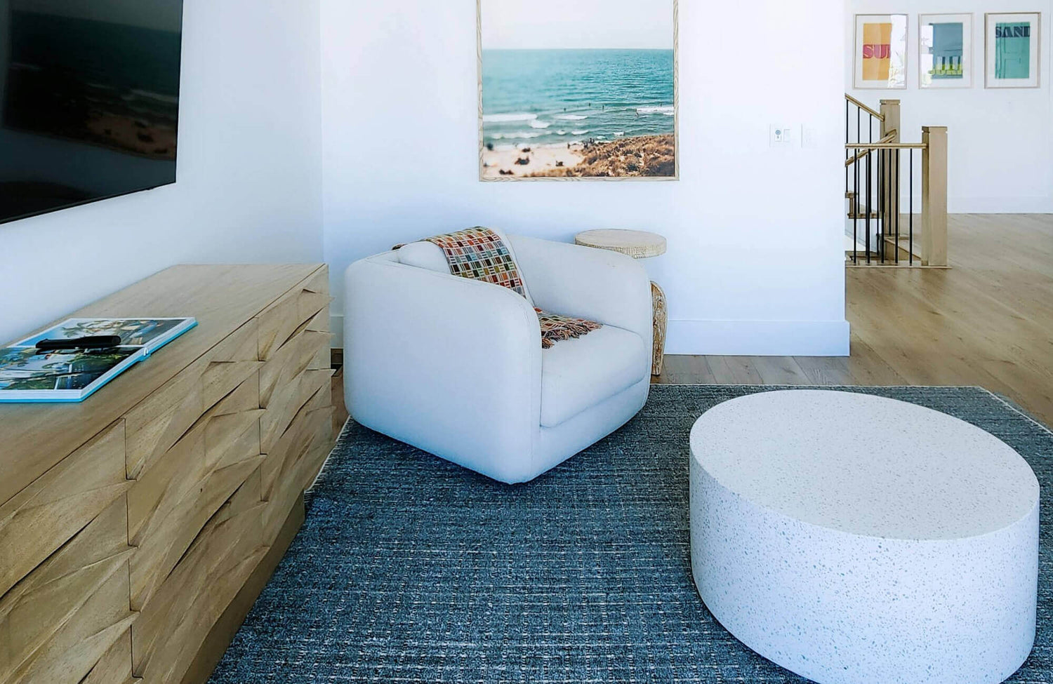
In the photo displayed above, Edward Martin’s Lafferty Wool Blend Rug in Ocean showcases how cool undertones can add subtle sophistication to a room. Its gray-blue base complements the warm wood and tan leather furnishings, striking a perfect balance between contemporary calm and natural warmth. Once you identify whether your blue feels cool and crisp or warm and sunlit, choosing complementary colors becomes an intuitive and rewarding process.
Lightness and Saturation
The depth and intensity of blue can completely transform a space. A light blue rug, like our Mallory Wool Pile Rug in Ocean, brings an airy, open feel, ideal for smaller rooms or spaces with limited natural light. In contrast, darker tones like navy or denim add weight and sophistication, creating a refined foundation for statement décor. To maintain visual balance, offset darker rugs with lighter walls, or pair pale rugs with deeper wood tones and richly colored accents for a well-rounded look.
Emotional Impact
Every color evokes emotion, and blue’s versatility makes it especially effective for shaping mood. Soft powder blues can bring calm and relaxation, making them perfect for bedrooms or quiet corners. Deeper shades, such as cobalt or royal blue, can introduce energy and focus, ideal for living rooms or workspaces. Consider the atmosphere you want to create: peaceful, inviting, or vibrant, and let that intention guide your palette. When your rug’s tone aligns with the mood of the space, the result feels balanced and effortless.

Complementary Neutrals That Ground Blue
Neutrals serve as the foundation that keeps blue feeling balanced and connected within a space. They let your rug take center stage while providing a sense of calm and visual harmony. The right neutral choice depends on your desired mood; whether you prefer a clean, modern contrast or a softer, more inviting atmosphere.
Whites and Off-Whites
White is one of blue’s most timeless and versatile partners. A light blue rug against crisp white walls brings a fresh, coastal feel, while softer shades like ivory or cream create a more relaxed and welcoming atmosphere. To prevent white from feeling too stark, layer in texture through linen cushions, woven baskets, or a jute pouf. These natural details also add warmth and balance, allowing the blue rug to remain the subtle focal point of the space.
In the photo shown above, Edward Martin’s Pascal Polyester Face Rug in Indigoshows how a blue rug can effortlessly anchor a white or neutral interior. Its soft tone and intricate pattern introduce depth and interest, while the clean backdrop keeps the overall look airy and cohesive. This combination of color and texture creates a serene, polished atmosphere that feels both inviting and effortlessly balanced.
Grays and Taupes
For a refined and contemporary look, grays and taupes pair effortlessly with blue. A smoky gray sofa paired with a navy rug creates a sleek, polished look, while taupe or greige tones add gentle warmth that complements open, airy spaces. This combination works because it feels balanced and understated, with each color enhancing the other without overpowering it. Introduce texture through knit throws, metal accents, or matte finishes to add depth and sophistication without creating visual clutter.
Beiges and Browns
Blue and brown have long been a classic pairing, striking a perfect balance between warmth and coolness. A denim blue rug alongside beige furniture creates an easy, organic feel, while deeper woods like walnut or oak add richness and sophistication. To enhance a natural look, incorporate rattan, cane, or leather details. The gentle contrast between earthy tones and blue hues also brings a sense of comfort and refinement that feels effortlessly inviting.

Contrasting Colors That Create Energy
While neutrals provide balance and calm, contrasting colors add vibrancy and visual interest. The right complementary hues can highlight your blue rug as the centerpiece while bringing movement, warmth, and personality to the space.
Orange and Terracotta
Orange, positioned opposite blue on the color wheel, naturally enhances blue’s depth and vibrancy. Terracotta cushions or rust-toned pottery paired with a navy rug can create a bold yet harmonious palette. A little goes a long way; just a few accents can infuse warmth, balance the coolness of blue, and bring a welcoming glow to the room.
Mustard and Gold
Mustard yellow and gold accents complement deep or muted blues with effortless elegance. The warmth of brass lighting or mustard upholstery contrasts beautifully with navy or slate rugs, bringing a rich and inviting sense of balance to the space. This pairing works especially well in mid-century or contemporary interiors, where clean lines let both colors stand out. Gold finishes also reflect light, adding a touch of sophistication and understated glamour to the space.
Coral and Blush
For a softer, more playful look, coral and blush pink offer a lively contrast to light or turquoise blues, like our Pascal Polyester Face Rug in Lake. This palette evokes a breezy coastal or modern bohemian charm that feels both relaxed and uplifting. Introduce these tones through artwork, throw blankets, or floral accents to keep the room vibrant yet harmonious. The key is balance: let the warm hues enhance your rug’s cool foundation without overpowering it.

Monochromatic and Analogous Harmony
Some spaces feel most inviting when colors flow seamlessly from one to another. Staying within the same color family or choosing neighboring hues creates a sense of harmony and layered depth that feels intentional and visually soothing.
Shades of Blue
If you’re drawn to a clean, cohesive look, working within blue’s own spectrum can be striking. Try pairing a navy rug with lighter blue curtains or a mid-tone throw to build subtle variation. Mixing different tones and textures also keeps the palette dynamic while maintaining unity. Incorporate materials such as velvet, ceramic, or matte finishes, each reflecting blue uniquely, to add depth and visual interest.
Blue with Green or Teal
Because blue and green are adjacent on the color wheel, they naturally work in harmony. Pairing a teal accent wall with a navy rug evokes the calm of water and the depth of nature, creating an atmosphere that feels organic and soothing. Enhance this harmony with plants or botanical prints that echo the palette. The touch of green further softens the coolness of blue, leaving the space feeling fresh, balanced, and effortlessly serene.
Blue with Lavender or Lilac
Lavender and lilac bring a gentle sense of creativity and refinement when paired with blue. Together, they create a soft, dreamlike atmosphere that works beautifully in bedrooms or artistic spaces. Even small touches, a lavender throw or lilac vase, can turn a simple room into something layered and expressive. These combinations also shine in spaces with plenty of natural light, where the colors subtly shift and reveal new depth throughout the day.

How Materials and Textures Affect Color Pairing
Colors never stand alone; the materials, finishes, and textures surrounding your rug all influence how its blue tones appear. Elements like surface sheen, fabric weave, and light reflection can subtly transform the way colors interact and balance within a space.
Natural Textures
Natural materials like jute, oak, and linen bring warmth that beautifully balances blue’s cool undertones. A woven basket beside a navy rug or oak furniture paired with a sky-blue rug adds both texture and dimension. When combined with blue, these organic elements create a space that feels grounded, comfortable, and inviting.
In the photo displayed above, Edward Martin’s Pascal Polyester Face Rug in Denim/Burgundy illustrates how texture and tone can work together to achieve that balance. Its woven pattern and layered hues of blue, beige, and rust harmonize effortlessly with the jute base and soft linen furnishings. The result is a space that feels naturally cohesive; warm, tactile, and elegantly balanced.
Metallic and Reflective Surfaces
Reflective materials can subtly transform the way blue interacts with light. Accents like chrome, glass, or brass can add depth and sophistication, enhancing the rug’s visual impact. A brass-framed mirror, for example, complements a deep blue rug by reflecting light and color, creating a greater sense of openness. The balance between shimmering and matte finishes introduces a refined elegance that feels both intentional and contemporary.
Soft Fabrics and Layering
Layering textiles is an effective way to connect colors and create visual harmony. Velvet cushions, wool throws, or linen curtains placed near your blue rug can add both comfort and depth. Mixing textures keeps the space dynamic, while subtle patterns, whether geometric, striped, or floral, can also introduce character without overwhelming the design.

Applying Color to Different Spaces
The way your blue rug interacts with surrounding colors depends on where it’s placed. Each room invites a different mood and function, and blue’s versatility allows it to adapt seamlessly to every setting.
Living Room
A navy or cobalt rug anchors a living room beautifully when paired with tan leather, soft gray, or crisp white. These combinations can create a warm, balanced atmosphere that feels both inviting and timeless. Add metallic lighting or decorative accents to introduce subtle warmth, ensuring the design remains cohesive and polished.
Bedroom
In the bedroom, softer shades of blue can create a calming and restorative atmosphere. Pair your blue rug with cream bedding, sage-green cushions, or blush accents for a soothing, layered look. Light curtains and gentle textures can also help filter natural light, enhancing the tranquil, restful mood of the space.
Dining and Entryway
In shared spaces, a blue rug can ground the room with both style and character. Pair a deep blue rug with a wooden dining table and vibrant artwork for a lively yet refined look. In entryways, navy or teal rugs against white or gray walls also create a polished, welcoming atmosphere that sets the tone the moment you step inside.
Making Your Blue Rug Work Beautifully
A blue rug can pair effortlessly with a wide range of colors, from soft neutrals to bold contrasts. The secret is balance; choosing shades and materials that highlight its undertone and enhance your space. Whether you prefer calm, subtle harmony or vibrant contrast, thoughtful color choices will let your blue rug shine as the centerpiece of your home.
If you’re unsure where to start or want expert guidance in designing your space, our design services team is here to help. Contact us to explore personalized color palettes, material pairings, and layout ideas that bring your vision to life.