


Choosing the right color for dining chairs shapes how a dining space feels, functions, and ages over time. Taking a thoughtful approach from the beginning helps you choose a color that fits daily routines, complements the room, and remains appealing as styles change. Chair color also influences how the dining area relates to the rest of the home, affecting everything from visual balance to overall comfort. When mood, materials, and long-term use are considered together, it becomes easier to make informed decisions rather than choices based purely on decoration.

How Dining Chair Color Shapes Mood and Appetite
Color has a quiet influence on how meals feel and unfold. When selecting dining chair colors, it helps to start with the atmosphere you want to create once everyone is seated, as color can gently influence comfort, mood, and the way people interact at the table.
Warm Colors and Social Energy
Warm tones such as red, brown, and soft earth colors tend to make a dining space feel more active and welcoming. These colors often suit rooms where meals are unhurried, and conversation is part of the experience, since they naturally draw attention toward the table. When used intentionally, warm-colored chairs help the dining area feel inviting and relaxed rather than reserved or overly formal. Balancing them with neutral walls or understated table finishes keeps the overall look grounded and composed.
Cool Colors and Calm Dining Spaces
Cool shades like blue, green, and soft gray create a quieter, more relaxed dining atmosphere. They work well for everyday use, especially in smaller rooms or open layouts where the dining area sits near calmer living spaces. To avoid a flat or overly cool feeling, these chair colors benefit from warmer surrounding elements. Wood tables, natural flooring, or soft textures can also help maintain warmth and visual balance.
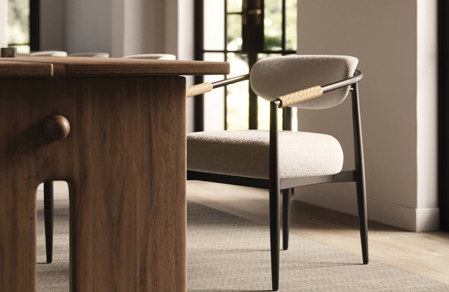
Neutral Colors and Emotional Balance
Neutral chair colors, including beige, taupe, gray, and cream, offer flexibility without drawing attention away from the rest of the room. They respond well to changes in lighting and decor, making them a reliable option over time. This effect is evident in the photo featured above, where Edward Martin’s Leticia Dining Chair in Cream complements the warm wood table and architectural details while maintaining a soft, balanced presence. Adding interest through texture, fabric weave, or gentle contrast with the table prevents the space from feeling bland, keeping the dining area calm, adaptable, and visually complete.

Matching Chair Color to Dining Room Style
Once the overall mood is clear, the next step is to consider how chair color fits within the room’s broader design style. When colors align with the existing aesthetic, the dining space feels cohesive and deliberate rather than assembled over time.
Modern and Contemporary Interiors
In modern and contemporary settings, chair colors typically stay within a refined, limited palette. Shades like black, white, dark gray, and muted earth tones support clean lines and uncluttered forms without drawing unnecessary attention. Matte finishes work particularly well because they soften reflections and help maintain a calm, balanced look. This approach is clearly illustrated in the photo featured above, where Edward Martin’s Clark Outdoor Dining Chairs in Louis Cream pair light upholstery with dark, streamlined frames to reinforce a clean, modern aesthetic. When color, finish, and form align this way, the dining area feels refined while remaining comfortable and inviting.
Traditional and Classic Dining Rooms
Traditional dining rooms benefit from chair colors that reflect existing architectural and design elements. Rich wood tones, deep blues, and layered neutrals often complement details such as moldings, millwork, and classic furniture profiles. Choosing colors that echo these features helps the space feel grounded and cohesive. Rather than matching every element exactly, the chairs should reinforce the room’s character in a subtle, supportive way.
Eclectic and Transitional Spaces
In eclectic or transitional interiors, chair color often plays a unifying role. When a room combines varied materials, finishes, or styles, a consistent chair color helps create visual order. Selecting a single dominant tone allows surrounding elements to vary without overwhelming the space. This balance keeps the room visually interesting while maintaining a sense of structure and clarity.

Choosing Colors Based on Table Material
Chair color decisions become easier when the table is taken into account. As the visual anchor of the dining area, the table sets the tone, and the chairs should either support it quietly or introduce a controlled sense of contrast.
Wood Dining Tables
With wood dining tables, chair colors can either blend in or stand apart, depending on the look you prefer. Lighter chairs paired with darker wood help brighten the space, while closely related tones create a layered, cohesive feel. The choice often comes down to how much emphasis you want the table to have within the room. This balance is clearly demonstrated in the photo featured above, where Edward Martin’s Gideon Dining Chair in Black contrasts with the Rebecca 86" to 120" Dining Table in Greige, allowing the table’s warm wood tone to remain the focal point while the chairs add definition and structure. As long as the undertones relate, both approaches feel intentional and visually resolved.
Glass and Metal Tables
Glass and metal dining tables feel visually lighter, which gives the chair color a more prominent role. In these spaces, deeper tones or more substantial chairs help balance the table’s openness. Adding warmth through color or form prevents the dining area from feeling incomplete or overly minimal. This approach also helps anchor the seating visually, giving the table a stronger sense of place within the room.
Stone and Concrete Tables
Stone and concrete surfaces introduce cooler visual qualities. To offset this, dining chair colors that add warmth or softness work particularly well. Muted neutrals, leather-inspired tones, or gently warm shades help create balance, making the space feel more inviting and comfortable for everyday use. These color choices also soften the contrast between hard surfaces and seating, improving both visual and physical comfort.

Practical Color Choices for Daily Use
Dining chairs need to function well in everyday situations, not just look good in a styled setting. Color plays an important role in how chairs handle wear over time and how much maintenance they require from day to day.
Kid-Friendly and Pet Friendly Colors
Mid-tone colors are often the most practical choice in homes with frequent use. Shades such as gray, brown, or green help disguise minor stains, scuffs, and everyday wear more effectively than very light or very dark options. This is reflected in the photo featured above, where Edward Martin’s Shaffer Dining Chair in Tan Leather demonstrates how a mid-tone color supports everyday practicality while remaining visually adaptable. These colors balance function and appearance, allowing dining chairs to fit naturally into daily routines without drawing attention to wear.
Light vs. Dark Maintenance Needs
Lighter chairs tend to reveal spills and marks more quickly, while darker chairs may show dust, lint, or fading with regular use. Thinking through how often the chairs will be used and cleaned helps guide this decision. In many cases, the durability of the finish or fabric affects long-term satisfaction more than color alone, but choosing both carefully helps make upkeep easier. Matching the color choice to your cleaning habits also helps prevent unnecessary wear from frequent maintenance.
Longevity and Trend Resistance
For everyday dining chairs, colors with lasting appeal are often the most reliable choice. Trend-driven shades can feel limiting as styles shift, even if they look current at first. More timeless colors allow the dining area to adapt to changes in decor, lighting, or accessories without requiring the chairs to be replaced. This approach supports long-term flexibility while protecting your investment in core furnishings.

Using Color to Define Space in Open Layouts
In open layouts, dining chairs often play a key role in establishing visual boundaries. Color offers a subtle way to define the dining area’s purpose without relying on walls or partitions.
Contrast with Surrounding Furniture
Contrasting chair colors help signal where the dining area begins and ends. Choosing a shade that stands apart from nearby living room furniture while still relating through tone or material creates clear visual separation. This approach helps the dining space feel defined without introducing unnecessary visual clutter. It also makes the dining area easier to read at a glance within an open layout.
Coordinating Without Matching
Instead of matching dining chairs exactly to surrounding pieces, repeating similar undertones or finishes creates a sense of connection. This allows the dining area to maintain its own identity while still feeling part of the larger space. The result is a coordinated look that avoids feeling repetitive or overly planned. Subtle coordination also leaves more flexibility for future changes in furniture or decor.
Visual Weight and Balance
Darker or more saturated chair colors help visually anchor the dining area within a larger open room. Paying attention to scale ensures the chairs feel grounded rather than visually heavy. When color and proportion work together, the dining space feels balanced, stable, and clearly defined. This balance helps prevent the dining area from feeling lost within the surrounding space.

Personal Expression Through Dining Chair Color
Dining chairs provide an opportunity to express personal style without committing the entire room to a single design direction. Thoughtful color choices allow individual preferences to come through while keeping the overall space balanced and cohesive.
Statement Colors as Design Anchors
Bold colors such as green, blue, or yellow can act as visual focal points within the dining area. Keeping the surrounding elements more subdued helps these chairs stand out without overwhelming the room. This approach allows color to make a statement while still feeling controlled and intentional. It works particularly well in otherwise neutral spaces that benefit from a clear point of visual interest.
Subtle Color Variation and Layering
Using slight variations within the same color family adds depth and dimension. Chairs with gentle tonal shifts create visual interest while maintaining a sense of harmony. This effect is clearly seen in the photo featured above, where Edward Martin’s Elena Dining Chair in Ernst Silverstone introduces a soft, nuanced tone that layers naturally with the surrounding finishes. This approach is especially effective when you want a refined, layered look that feels intentional rather than high contrast, helping the seating feel visually engaging without drawing attention away from the table.
Seasonal and Flexible Approaches
For those who enjoy refreshing their space, neutral chairs paired with removable cushions or slipcovers offer versatility. This approach makes it easy to update the dining area as seasons or preferences change, without replacing the main seating. It also allows color to be introduced in smaller, more adaptable ways. Over time, this flexibility supports both creativity and practicality.
Finding the Right Color Balance for Your Dining Chairs
The right color for dining chairs reflects how the space is used, how it fits into daily routines, and how you want it to feel over time. When mood, style, materials, and everyday wear are considered together, the decision becomes more intuitive. A thoughtful balance allows dining chairs to support comfort and visual harmony, helping the dining area feel inviting and well-suited to everyday use.
If you would like guidance tailored to your space, you can contact us to explore our design service, where thoughtful planning and practical insight help turn ideas into well-considered decisions.