


Blue bathroom tiles provide a calm, refreshing foundation to any space, but selecting the right colors to complement them can make or break your design. Blue is a versatile color, and how you choose to complement it will define whether your bathroom feels serene and subtle or bold and inviting. In this article, we’ll explore six unique ways to build a cohesive palette around blue tiles, helping you create a bathroom that feels balanced, intentional, and uniquely yours.

Using Neutrals to Create Balance
Neutrals are a reliable starting point when working with blue. They soften its cool tone, enhance its relaxing feel, and create space for texture and depth. Let’s look at a few ways to incorporate neutral shades without making the space feel bland.
Soft Whites and Off-Whites
When paired with blue tiles, clean whites and soft off-whites can create a crisp, balanced contrast that helps the bathroom feel open and airy. Bright white brings a sense of clarity and freshness, while warmer tones such as ivory or cream add a hint of softness that keeps the space from feeling too stark. These shades work particularly well on walls, ceilings, or trim, especially when layered with natural materials such as painted wood or light-toned stone. To avoid a sterile appearance, it also helps to introduce subtle textures such as matte paint, beadboard paneling, or lightly whitewashed cabinetry to add depth without overpowering the simplicity of the palette.
This effect is beautifully illustrated in the bathroom above, where Edward Martin’s Mikayla 2.5x5 Glossy Ceramic Tile in Cerulean forms a striking focal point in the shower. Its rich blue tone is softened by the surrounding use of our Julianna 2x2 Satin Porcelain Mosaic Tile in Carrara on the shower base. This light, marble-inspired surface provides just the right amount of contrast while maintaining a clean, elegant look. The overall combination allows the bold blue to shine, while the soft whites and subtle veining create a sense of calm and cohesion throughout the space.
Beiges and Light Taupes
Beige and taupe bring a gentle, grounded feel that complements blue without drawing attention away from it. These warmer neutrals are particularly useful in bathrooms with abundant natural light or cool-toned lighting, both of which can make blue feel colder than intended. Incorporating beige through wall color or introducing taupe in textiles such as towels or bath mats also helps soften the overall palette. Together, they can create a warm visual balance that feels calm, inviting, and effortlessly refined.
Charcoal and Slate Accents
Charcoal and slate are also great choices for introducing contrast and structure to a blue-tiled bathroom. These deeper tones add visual weight that complements the lightness of blue, helping to create a well-balanced and defined space. Additionally, incorporating dark gray cabinetry, slate-look flooring, or blackened metal fixtures can help anchor the room while maintaining a clean, modern aesthetic. This pairing not only adds depth but also contributes to a more cohesive and intentional design.

Embracing Warm Tones for Contrast
Adding warm tones is a thoughtful way to bring contrast and energy into a blue-tiled bathroom. When used with care, these colors can brighten the space, introduce balance, and bring in personality, without overshadowing the calming effect of blue.
Rust and Terracotta
Rust and terracotta introduce natural warmth with a hint of rustic elegance, making them a strong complement to blue bathroom tile. These earthy reds pair particularly well with navy and sky blue, adding depth and richness without creating harsh contrast. Integrating them through elements like ceramic planters, accent tiles, or wall décor is an effective way to bring in warmth while maintaining a cohesive and balanced look.
This combination is well-illustrated in the space above, where Edward Martin’s Maisie 4x4 Glossy Ceramic Tile in Ocean creates a serene, light blue backdrop in the shower. The use of our Catalina 7x8 Hexagon Matte Porcelain Tile in Clay on the floor introduces terracotta-inspired tones that ground the palette and bring in a subtle sense of warmth. The contrast between the glossy blue walls and the matte, earth-toned floor tile adds visual interest while keeping the overall design calm and cohesive. This pairing also demonstrates how warm tones can support and elevate cool colors without overpowering them.
Mustard Yellow Accents
Mustard yellow, rooted in warm golden tones, naturally complements blue by sitting opposite it on the color wheel. This contrast introduces vibrancy and warmth while still maintaining a polished, understated look. Adding mustard through pendant lighting, tile accents, or patterned textiles can also create visual interest and focal points, all without interrupting the overall harmony of the space.
Peach and Coral Touches
Peach and coral offer a softer, more uplifting alternative to deeper warm tones like terracotta. These shades pair especially well with light blue or aqua tiles, contributing to a fresh, coastal feel or a more playful, relaxed atmosphere. Incorporating them through bath linens, soap dishes, or framed artwork is a simple way to add warmth and personality without overwhelming the space.

Bringing in Nature with Organic Colors
Nature-based tones work especially well with blue, reinforcing its calming quality and giving your bathroom a serene, grounded feel. Drawing inspiration from outdoor elements can help your space feel more cohesive, soothing, and timeless.
Olive and Sage Greens
Olive and sage greens draw inspiration from nature and pair seamlessly with blue, making them a strong choice for a soothing, grounded palette. These muted tones introduce a subtle botanical influence that feels both fresh and calming. Incorporating sage-green towels, an olive-toned vanity, or even a potted plant can also soften the overall look while reinforcing a relaxed, organic feel.
Sandy Tans and Driftwood Browns
Sandy tans and driftwood browns bring a naturally sun-washed look that feels both relaxed and effortless. These tones provide a gentle contrast to deeper blues while adding soft, complementary warmth to lighter shades. Incorporating them through elements like wood-framed mirrors, open shelving, or woven storage baskets reinforces a coastal or nature-inspired aesthetic. Their versatility also makes them a reliable choice for adding texture and balance without overwhelming the space.
Stone and Pebble Shades
Stone and pebble-inspired shades, such as soft greys and muted greiges, offer a subtle way to add texture and depth without competing with the color of your blue bathroom tiles. These tones work especially well when used in floor tiles, stone-look accessories, or understated accent walls, helping to create a layered, calming atmosphere. By introducing natural variation in tone and surface, they contribute to a serene, balanced palette that feels cohesive and refined.
This approach is demonstrated in the shower design above, where Edward Martin’s Miley 4.5x9.1 Glossy Porcelain Tile in Ice forms a sleek blue backdrop, enhanced by the speckled texture of our Leighton 35x35 Matte Porcelain Tile in Multicolor on the walls and floor. The combination blends the subtle movement of stone with the cool elegance of blue, creating a space that feels modern yet grounded. The terrazzo-inspired surface introduces organic variation while maintaining a clean, cohesive look, perfect for those seeking a refined and natural aesthetic.

Highlighting Blue Through Monochromatic Layers
If you're drawn to the calming qualities of blue, working within the same color family can also be incredibly effective. A layered monochromatic palette adds depth and dimension without introducing contrasting tones, allowing you to build a cohesive and visually rich space.
Navy and Midnight Accents
Navy and midnight blues offer a rich, grounded contrast that stays within the blue color family while adding visual depth. These deeper shades are especially effective in anchoring a space and bringing definition to elements like vanities, built-ins, or accent walls. When applied with care, they can also add structure and sophistication without making the room feel heavy or enclosed, maintaining a sense of balance throughout the design.
Powder Blue and Sky Variations
Lighter shades, like powder blue and sky blue, help maintain a soft, airy atmosphere, making them especially effective in smaller or low-light spaces. These tones reflect natural and artificial light well, which can also make a room feel more open and inviting. Incorporating them through textiles, accent décor, or painted surfaces is an easy way to introduce color while staying within the blue family. This subtle approach also keeps the palette cohesive and adds brightness without overwhelming the space.
Aqua and Teal for Freshness
Aqua and teal offer a lively, refreshing layer of color that pairs well with a blue tile foundation. Their subtle green undertones make them particularly compatible with navy or marine blue, adding dimension without clashing. Introducing these shades through glass accessories, mosaic tile details, or a bold painted accent, such as a vanity or interior door, can also infuse the space with energy while keeping the overall palette unified and intentional.

Pairing Metals and Fixtures for Visual Harmony
In addition to wall colors and accessories, fixtures and hardware play a key role in shaping the overall look and feel of a bathroom. The right metal finish can enhance blue bathroom tiles and reinforce your design style, whether it's modern, traditional, or somewhere in between.
Brushed Nickel and Stainless Steel
Brushed nickel and stainless steel are sleek, cool-toned finishes that pair effortlessly with blue bathroom tiles. Their clean, understated appearance makes them a practical choice for fixtures such as faucets, towel bars, and cabinet pulls. These metals reflect light subtly, adding a polished touch without drawing too much attention; an advantage in modern, minimalist, or transitional designs. Their versatility and durability can also make them a reliable option for creating a cohesive, contemporary bathroom.
Aged Brass and Gold Tones
Aged brass and gold finishes introduce a warm, refined contrast that enhances the coolness of blue without overwhelming it. These tones work especially well in lighting fixtures, mirror frames, or hardware, where their subtle sheen draws attention without feeling out of place. Their classic appeal brings a sense of depth and elegance, making them a fitting choice for both transitional and vintage-inspired designs. When used thoughtfully, they can also elevate the overall look while maintaining a cohesive, balanced palette.
Matte Black for Bold Contrast
Matte black fixtures offer a bold, modern edge that provides a strong visual contrast to a blue-tiled bathroom. When paired with lighter shades of blue, they can introduce definition and help create a more structured, intentional layout. Incorporating black finishes through exposed plumbing, showerheads, or hardware can also lend a crisp, tailored appearance that feels both contemporary and cohesive. This choice works particularly well in designs that lean minimalist or industrial, where clean lines and high contrast take center stage.

Lighting and Color Psychology
Lighting affects more than just visibility; it also shapes how colors appear and influences the overall mood of a space. In a bathroom, where both natural and artificial light have a strong impact, understanding how lighting interacts with color can guide more thoughtful and effective design decisions.
Cool vs Warm Bulbs
The temperature of your lighting also plays a key role in how blue and surrounding colors are perceived. Cool white bulbs tend to enhance blue tones, giving the space a crisp, modern look. On the other hand, warm white bulbs soften the overall palette, making them a better fit when the design includes beige, brass, or other warm finishes. Choosing the right bulb color also helps reinforce the atmosphere you want to create, whether it’s bright and energizing or warm and relaxed.
Mood and Emotional Impact
Color has a significant influence on the overall mood of a space. Blue is often associated with calmness and clarity, and pairing it with gentle tones like sage or soft gray can deepen that sense of tranquility. In contrast, adding more vibrant colors such as coral or mustard, especially under warm, bright lighting, can introduce energy and uplift the space. It’s also helpful to think about how you use the bathroom daily, whether for unwinding at night or getting ready in the morning, and select colors that align with the experience you want to create.
Playing with Natural Light
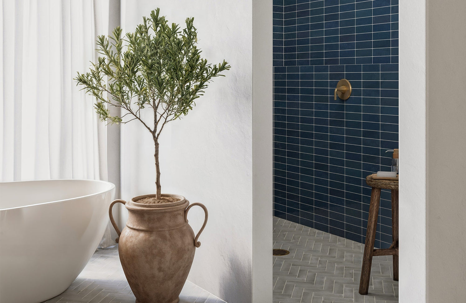
If your bathroom includes a window, it’s worth making the most of the natural light it provides. Daylight enhances the depth and undertones of blue tiles, often revealing subtle variations that artificial lighting can overlook. To maximize this effect, consider using sheer or light-colored curtains and incorporating reflective surfaces, such as mirrors or glossy tiles like our Teagan 3x12 Glossy Ceramic Tile in Denim, as displayed in the photo above, to help distribute light throughout the room. This not only highlights the richness of your color palette but also helps the space feel brighter and more open.
Creating a Cohesive Look Around Blue Bathroom Tiles
Blue bathroom tiles offer a calm, versatile foundation that can easily adapt to a variety of design styles. Whether you're drawn to the subtlety of neutrals, the vibrancy of warm accents, or the richness of layered blue tones, the colors you incorporate around them will shape the overall mood and visual balance of the space. When combined with thoughtful textures, finishes, and lighting, these elements work together to create a bathroom that feels both cohesive and personal.
To explore color pairings in real time, try our AR Visualizer Tool and see how different finishes and tones work with your favorite blue tile styles in your own space. Need help pulling your vision together? Contact our design team for personalized guidance—we’re here to help you create a bathroom that feels both functional and uniquely yours!
