


A backsplash does more than shield your walls; it also helps define the atmosphere of your kitchen. The right color can enhance brightness, create depth, and add a sense of openness that extends beyond its functional role. When chosen thoughtfully, it becomes one of the most effective ways to make a smaller kitchen feel larger. In this article, we’ll explore how different colors, finishes, and design choices can work together to create a space that feels open, balanced, and welcoming.

The Role of Color in Perceived Space
Color plays a major role in how we perceive the size of a room. In kitchens, where space can feel limited, the backsplash becomes one of the details that most strongly affects the overall impression of openness or confinement.
Light Colors and Visual Expansion
When you use light shades such as white, cream, or pale gray, the tiles reflect more light throughout the kitchen. This reflective quality makes walls seem to recede, creating an atmosphere that feels open and breathable. In a smaller kitchen, this effect provides a brighter backdrop that gives the impression of more space than the room actually offers. Light-colored backsplashes also pair easily with various cabinet finishes, providing flexibility while still enhancing the sense of space.
This effect is illustrated in the photo displayed above, where Edward Martin’s Juliet 2.5x10 Matte Porcelain Tile in Pearl adds a soft, luminous surface that brightens the kitchen while maintaining a clean and cohesive look.
Monochrome Flow
If the backsplash blends with your cabinets and walls, you can eliminate sharp contrasts that break up the space. This continuous flow of color creates a unified look, allowing the kitchen to appear as one larger whole instead of a collection of separate surfaces. The seamless transition is especially effective in compact layouts, where visual interruptions can quickly make the room feel confined. By carrying a single tone across multiple surfaces, you can further achieve both simplicity and the illusion of more space.
The Psychology of Cool Tones
Soft blues, greens, and grays not only bring a calming quality to the kitchen but also add depth and dimension. These cooler shades naturally guide the eye outward, creating the impression of distance and openness. When used thoughtfully in a backsplash, they can introduce subtle variation that adds dimension to the room without overwhelming it. Additionally, cooler tones complement both light and dark cabinetry, making them a versatile choice for kitchens of different styles and sizes.
Exploring color in theory is helpful, but seeing it in your own kitchen makes the impact much clearer. With our AR tool, you can preview how different backsplash shades interact with your cabinets, counters, and lighting, giving you the confidence to make the right choice before installing.

White and Neutral Palettes That Amplify Space
White and neutral backsplashes are a classic choice for making kitchens feel larger. They can brighten the room, create balance, and adapt easily to many design styles, which makes them both practical and timeless.
Classic White Subway Tile
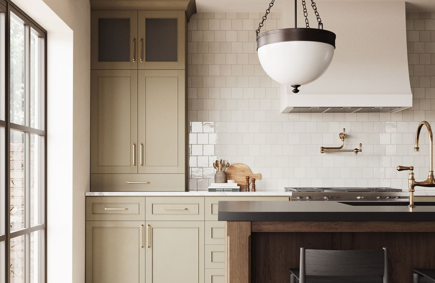
White subway tiles are known for their clean lines and reflective surface, making them a reliable choice for opening up a kitchen. In a simple stacked layout, they can create an uninterrupted rhythm that visually broadens the walls. When arranged in an offset pattern, they can introduce subtle movement, guiding the eye across the surface and giving the illusion of extended space. Because they work in both modern and traditional settings, white subway tiles also offer flexibility while still contributing to a brighter, more expansive feel.
Warm Neutrals for Soft Contrast
Colors like tan, cream, and light brown can soften the look of the kitchen while still keeping it bright and open. Unlike pure white, which may feel a bit harsh, these shades can add comfort while still keeping the space bright. Choosing warm neutrals further helps you keep the airy quality of a light backsplash while making the room feel more approachable. They also pair nicely with wood cabinets or natural finishes, creating a balanced and inviting space.
This balance is demonstrated in the photo featured above, where Edward Martin’s Harley 3x12 Polished Porcelain Tile in Greige brings warmth and subtle depth, complementing the natural wood cabinetry while maintaining an open, light-filled atmosphere.
Layered Neutrals with Texture
A neutral backsplash doesn’t have to look flat or ordinary to make a kitchen feel open. Mixing finishes such as matte, glossy, or lightly patterned tiles introduces depth while preserving a sense of spaciousness. These subtle variations can keep the surface from feeling one-dimensional and bring a quiet character to the room without overwhelming it. By layering neutrals in this way, you can also strike a balance between interest and simplicity, creating a kitchen that feels both dynamic and open.

Reflective Finishes That Enhance Light
Color is only part of what shapes how spacious a kitchen feels. The finish of the backsplash can be just as important. Glossy and reflective tiles bounce light around the room, creating a brighter atmosphere and making the walls seem to stretch beyond their actual limits.
Glass Tile Effects
Glass tiles act almost like mirrors, bouncing both natural daylight and task lighting across the kitchen. This reflective quality can double the sense of depth, especially in spaces with few or small windows. When placed near under-cabinet lighting or along a feature wall, they not only brighten the room but also create a sparkling effect that feels lively and open. Their ability to shift appearance depending on the light further makes them an adaptable choice for kitchens of all sizes.
Metallic Accents
Tiles with metallic touches, such as brushed silver, gold, or soft champagne, can bring a subtle shimmer that guides the eye along the backsplash. This gentle shine expands the perception of width and height, adding dimension without taking over the design. Additionally, metallic finishes work well as accents mixed with neutrals, providing just enough contrast to brighten the space while maintaining a polished look. Because they reflect surrounding colors, they further shift with the light, giving the room a dynamic look throughout the day.
Glossy Ceramics
Ceramic tiles in light shades with a glossy finish can bring brightness similar to glass but with a more traditional touch. Unlike matte surfaces, gloss reflects light into the room, creating the impression of greater openness from different angles. With a wide range of shapes and sizes available, glossy ceramics allow you to create a look that feels both personalized and timeless. They’re also durable and easy to maintain, making them as practical as they are visually effective.
This balance of beauty and function is evident in the photo shown above, where Edward Martin’s Jaden 2.5x16 Glossy Ceramic Tile in Dove enhances the backsplash with a luminous sheen that elevates the design while keeping the space light and airy.

Strategic Use of Bold and Dark Colors
While light colors often dominate discussions about enlarging a kitchen, darker backsplashes can also work if used carefully. It’s about knowing where and how to apply them so they can add depth instead of enclosing the space.
Contrast for Depth
Pairing a dark backsplash with lighter cabinets creates a striking contrast that makes the wall appear to recede. This depth effect is particularly effective in long, narrow kitchens, where a flat surface might otherwise emphasize the limited width. By setting back the darker tones against brighter surroundings, you can create balance and introduce dimension. The result is a layered look that adds character to the kitchen while making the space feel more open and inviting.
In the photo featured above, Edward Martin’s Mikayla 5x5 Glossy Ceramic Tile in Espresso demonstrates how a rich, dark backsplash can provide dramatic contrast against natural wood cabinetry, adding both depth and warmth without closing in the space.
Accent Walls vs. Full Coverage
If you want to add bold color, focusing it in one area, such as behind the stove or sink, can be more effective than covering every wall. This approach creates a focal point that draws the eye, giving the kitchen personality without making it feel smaller. Framing the accent wall with lighter tones further keeps the kitchen bright and airy while still allowing the darker backsplash to make its statement. This method also works well in both compact and larger kitchens, giving you flexibility to experiment with color.
Pairing with Open Shelving
Dark or bold backsplashes feel less overwhelming when paired with open shelving instead of closed cabinets. The open shelves can break up the stretch of color, letting light move more freely and softening the overall effect. This pairing further adds contrast and drama while still preserving a sense of openness. It also gives you space to display dishes or decorative pieces, which brings variety and keeps the kitchen feeling warm and welcoming.

Patterns, Layouts, and Grout Choices
Even the best color choice can fall short if the layout and details are overlooked. Tile patterns, scale, and grout color all influence how spacious a kitchen appears, often as much as the tiles themselves.
Vertical and Horizontal Orientation
The direction of your tile layout can strongly influence how spacious the kitchen feels. Vertical patterns can draw the eye upward, creating the impression of added height and making low ceilings appear taller. Horizontal layouts, on the other hand, visually stretch the walls, which is especially effective in narrow kitchens. When paired with light-colored tiles, these orientations can become even more powerful, enhancing the illusion of space to suit the proportions of your room. Even minor layout changes can also make a big difference in how open the kitchen feels.
Large-Format Tiles
Larger tiles lessen grout lines, creating a backsplash with a cleaner, more seamless appearance. This uninterrupted surface further helps the eye move smoothly from one side of the wall to the other, giving the impression of a wider, more open space. In smaller kitchens, the effect is especially noticeable, since every break in the design can draw attention to limited dimensions. Large-format tiles can also bring a modern feel, combining practicality with a sleek, stylish finish.
This impact is evident in the photo displayed above, where Edward Martin’s Giselle 24x24 Polished Porcelain Tile in Shell enhances the kitchen with a continuous, polished surface that makes the space feel expansive and refined.
Grout Color Tricks
Grout color may seem like a small detail, but it has a big impact on how spacious a backsplash appears. When grout matches the tile, the surface becomes seamless, creating the impression of a continuous wall. Dark grout with light tiles, on the other hand, emphasizes every line and can make the space feel more divided. To make the space feel more open, it’s usually best to choose grout in a shade similar to your tiles. For a touch of contrast, a slightly lighter or darker grout can also add definition without interrupting the overall flow.

Coordinating with Cabinets, Counters, and Flooring
A backsplash is never just an isolated feature; it works with cabinets, counters, and flooring to shape the overall look of the kitchen. When these elements work together, the kitchen feels more open and cohesive, strengthening the impression of a larger space.
Light on Light Combinations
When light cabinets and backsplashes are paired together, the kitchen benefits from an easy, uninterrupted flow. Without sharp contrasts, the surfaces merge visually, removing barriers that might otherwise make the room feel smaller. This approach is also effective in compact kitchens, where continuity plays a key role in creating a sense of space. In addition, light-on-light combinations reflect much of natural and artificial light, helping the entire room feel brighter and more inviting.
Balanced Contrast with Counters
Dark countertops can anchor the design, but pairing them with a light backsplash prevents the kitchen from feeling heavy. The contrast between the two surfaces creates balance, keeping the layout fresh and open. When the ratio is right, the backsplash also lightens the vertical space while the counters provide depth, giving the kitchen a layered and airy look. This strategy works particularly well in modern kitchens, where bold contrasts can enhance style without sacrificing openness.
Flowing Into Flooring
Coordinating the backsplash with the floor color helps tie the kitchen together, creating a natural flow from top to bottom. This connection avoids abrupt changes in tone that can break up the design and make the room feel smaller. When the colors work in harmony, the space appears more unified and, in turn, larger. Carrying similar tones across surfaces also creates a design that feels balanced, visually calming, and comfortably expansive.
Choosing the Right Kitchen Backsplash Color
The backsplash colors that make a kitchen look bigger are those that reflect light, create a sense of flow, and complement the surrounding finishes. For example, light neutrals such as white, cream, or soft gray are especially effective, as they can brighten the room and make walls seem to recede. In addition, reflective options such as glass or glossy ceramics can build on this effect, while bold or darker tones, when used carefully with lighter surfaces, can add depth without closing in the space. Ultimately, the best choice will depend on your kitchen’s layout and style, but a well-chosen backsplash color can always make the space feel more open, cohesive, and inviting.
If you’re planning a kitchen update and want expert guidance in choosing the right backsplash color, feel free to contact us. Our design team is here to help you find the perfect combination that makes your kitchen feel brighter, larger, and tailored to your style.