


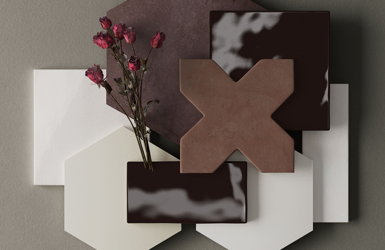
Shopping for tile online has transformed the way people approach renovation and interior planning. A kitchen floor, shower wall, or entryway no longer needs to be imagined solely from a small showroom display or a static product image. Digital tools now allow entire surfaces to be previewed directly within a room, helping buyers compare layouts, proportions, and overall material direction before placing an order.
Even with those advancements, tile remains one of the most tactile materials used in the home. Texture, finish, undertones, and surface variation rarely translate with complete accuracy through a screen alone. That distinction is precisely why augmented reality visualization and physical tile samples serve different but equally valuable purposes. One helps contextualize scale and spatial flow, while the other reveals the material qualities that influence how a tile will actually live within a space.

Celia 5x10 Glossy Ceramic Tiles in Royal Green wrap the curved kitchen island, illustrating how lighting, reflective glaze, and surrounding finishes can alter the perception of tile color and texture.
Why Visualizing Tile Before Buying Matters
Tile influences a space through light, texture, proportion, and material depth, making it more complex to evaluate online than many other finishes. Digital imagery can communicate general appearance, though it rarely captures how a surface will fully respond within a specific environment.
How Tile Appearance Changes Across Environments
A tile that appears warm beige in one setting may lean gray or taupe in another depending on surrounding light sources. Natural daylight often reveals undertones more clearly, while warmer interior lighting can soften contrast and deepen color saturation.
Reflective finishes introduce additional complexity. Glossy ceramic wall tile can amplify light beautifully in compact spaces, though its sheen may appear dramatically different throughout the day. Textured porcelain surfaces also react differently to angled light, which can exaggerate shadowing and surface movement. Screen settings and photography can also influence how tile color and finish appear digitally.
Why Scale and Layout Are Difficult To Judge Online
Tile dimensions often feel different in context than they do in specification sheets. A 24x48 porcelain tile may appear balanced in a large open-plan kitchen but overwhelming inside a narrow powder room. Smaller mosaics can create beautiful detail, though excessive grout lines may visually crowd expansive floors.
Pattern repetition becomes another important consideration. Veined marble-look porcelain, encaustic-inspired motifs, and geometric layouts all distribute movement differently across larger surfaces. Viewing a single product image rarely communicates how repetition will unfold throughout an entire room. Layout direction also influences perception. Running rectangular tile lengthwise can visually elongate a space, while stacked vertical applications tend to emphasize ceiling height.
Why Texture and Finish Require Closer Evaluation
Texture is one of the least translatable qualities in digital shopping. Matte porcelain with subtle stone relief may appear flat online despite having rich tactile depth in person. Likewise, a polished surface that looks refined on screen could produce more reflectivity than expected once installed beneath direct lighting. Fluted glossy surfaces such as Edward Martin’s Celia 5x10 Glossy Ceramic Tiles in Royal Green show how light, shadow, and surface dimension can shift dramatically depending on the environment.
Surface finish also influences maintenance expectations and functionality. Slip resistance, edge detailing, and grout visibility all contribute to how a tile performs beyond aesthetics. For installation-related decisions involving substrate conditions, grout spacing, or slip resistance requirements, consulting a qualified tile professional remains advisable.
The AR flooring preview helps visualize scale and layout continuity by placing tiles directly within the kitchen alongside existing cabinetry and finishes.
What AR Visualization Helps You Understand
As online tile selection becomes more visually sophisticated, augmented reality offers a more contextual way to assess layout and proportion before ordering. Its greatest advantage lies in improving spatial accuracy by placing materials within the scale and conditions of real rooms rather than isolated product imagery.
How AR Helps Visualize Tile Within Real Spaces
One of the strongest advantages of AR visualization is contextual scale. A tile may feel appropriately proportioned on a sample board yet read completely differently across an entire floor or shower surround. Viewing materials within a room helps clarify whether a format complements the architecture or competes with it.
Edward Martin’s AR Visualization Tool supports this process by allowing tile collections to be previewed directly within a space before ordering. That added context can make it easier to evaluate layout flow, tonal balance, and how tile interacts with surrounding finishes under more realistic conditions. Viewing tile within the context of cabinetry, fixtures, and adjacent materials can also help identify tonal conflicts earlier in the selection process.
AR also simplifies design comparison by placing multiple finishes, patterns, or layouts within the same visual environment. Pattern-heavy surfaces, directional installations, and contrasting finishes become easier to evaluate spatially, particularly across open-concept interiors or connected flooring transitions.
Where AR Visualization Has Practical Limitations
Despite its advantages, AR should not be treated as a flawless material simulation. Certain textures, reflective finishes, and handcrafted surfaces remain difficult to evaluate digitally with complete realism.
Natural stone-look porcelain and high-variation ceramic tile often contain tonal movement that becomes more apparent in person than through rendered imagery. Grout depth, edge profiles, and tactile texture likewise remain easier to assess physically. AR works best as a spatial planning tool rather than a definitive material confirmation method, which is why physical tile samples remain an important part of the selection process.

4x4 samples of Palmer Raw and Chiseled Porcelain Tiles in White reveal how subtle texture variation and surface relief become more noticeable through side-by-side physical comparison.
What Physical Tile Samples Reveal That Digital Tools Cannot
Even with stronger digital visualization, certain material qualities still require direct interaction. Surface texture, finish depth, tonal variation, and lighting response often become clearer once a tile is viewed within the physical environment where it will ultimately be installed.
Why Real Lighting Conditions Matter
Lighting alters tile more dramatically than many expect. A creamy white porcelain may appear soft and warm in afternoon sunlight but noticeably cooler beneath recessed LEDs at night. Veining within marble-look tile can also shift in prominence depending on directional shadows and surface reflectivity.
Texture further influences how a surface is perceived within a space. A softly textured porcelain can introduce warmth and dimension into minimalist interiors, while smoother polished surfaces create sharper reflectivity and a more formal visual character. Subtle distinctions between Edward Martin’s Palmer 4x4 Raw in White Sample and Palmer 4x4 Chiseled in White Sample demonstrate how texture alone can alter the visual depth and movement of a neutral palette.
Testing tile samples throughout the day helps uncover these variations before installation begins. Kitchens, bathrooms, and entryways frequently experience changing light conditions that affect material perception hour by hour, while viewing samples in their intended orientation often reveals details less noticeable in isolated product imagery.
Maintenance expectations should also be evaluated alongside appearance. Certain finishes and grout pairings may require different cleaning approaches depending on the material. Always follow manufacturer care guidelines for routine maintenance and cleaning to preserve finish integrity over time.
Material Coordination and Purchase Uncertainty
Tile rarely exists in isolation. Countertops, wood flooring, wall paint, metal finishes, and textiles all contribute to how a surface ultimately reads within a room.
Physical samples make those relationships easier to assess accurately. A porcelain tile that appears neutral online may suddenly reveal green, pink, or blue undertones when placed beside cabinetry or natural wood. Grout selection also becomes more precise when viewed directly against the tile itself, particularly in layered interiors where subtle tonal balance carries much of the visual sophistication.
Physical samples also reduce uncertainty before committing to large tile orders. That reassurance becomes especially valuable with high-variation surfaces such as zellige-inspired ceramic tile, natural stone looks, or richly textured porcelain where tonal movement and finish depth may appear more nuanced in person than through digital previews alone.

Mila 4x4 Glossy Ceramic Tiles in Jade paired with the Shirley Small Mirrors in Antique Brass Iron show how combining spatial visualization with hands-on sample evaluation helps confirm color depth, reflectivity, and material coordination.
Why AR Visualization and Tile Samples Work Better Together
AR visualization and physical samples answer different questions during the selection process. One helps clarify spatial composition, while the other confirms how the material actually feels and behaves under real-world conditions.
A Recommended Workflow for Choosing Tile More Confidently
A more effective process often begins with digital narrowing. AR visualization helps reduce a broad range of options into a smaller group of realistic candidates based on scale, tone, and layout compatibility.
Once those selections feel directionally aligned, physical tile samples allow for deeper material evaluation. Viewing samples beside cabinetry, flooring, and paint colors creates a clearer understanding of how the tile will integrate into the completed environment.
Grout coordination should also be tested before final ordering. Even subtle grout shifts can dramatically alter the overall appearance of a tile installation, particularly with lighter surfaces or heavily patterned layouts. Before installation, reviewing final layout plans with an experienced tile installer remains important, especially for large-format tile, directional veining, or specialty patterns requiring precise alignment.
Why This Hybrid Approach Reduces Expensive Mistakes
Most tile dissatisfaction stems from mismatched expectations rather than defective material. A floor may feel too busy once installed, a finish may reflect more light than anticipated, or undertones may clash with surrounding surfaces.
Glossy handmade-style surfaces such as Edward Martin’s Mila 4x4 Glossy Ceramic Tiles in Jade often reveal far more tonal variation and reflectivity in person than digital previews alone can communicate. Using both AR visualization and physical samples reduces those surprises substantially by creating stronger alignment between imagined outcomes and real-world results.

The Remi 2x17 Glossy Ceramic Tile in Rust Deco product page pairs immersive styling with close-up material imagery, though surface depth and scale often become clearer through in-person evaluation.
Common Mistakes Buyers Make When Evaluating Tile Online
Most tile selection issues stem from incomplete evaluation rather than the material itself. When scale, finish, or surface variation are considered too narrowly, even well-designed interiors can feel visually disconnected once installation is complete.
Product photography is designed to communicate overall appearance clearly, though studio conditions rarely mirror residential environments precisely. Camera exposure can soften texture, brighten color, or reduce visible variation depending on how the image was captured. Screen settings introduce additional inconsistency, which is why digital imagery should be treated as visual guidance rather than exact material representation.
Scale can also become difficult to judge without environmental context. Large-format porcelain may create cleaner visual continuity across expansive spaces, while smaller tile formats introduce denser rhythm and surface movement. AR visualization helps contextualize these relationships more accurately by placing tile within the proportions and architectural conditions of a real room. Skipping physical sample testing introduces another common source of dissatisfaction. Undertones, finish depth, and tactile texture often become clearer only through direct interaction, particularly when coordinating tile alongside cabinetry, flooring, countertops, and fixed architectural elements that cannot easily be changed later.
Once the slim matte format of Dani 1.6x5 Matte Ceramic Tile feels right for the space, comparing the Cream, Sage, and Dove samples side by side makes it easier to refine the final palette direction.
How To Use AR Visualization and Tile Samples Effectively
The value of these tools depends less on access and more on how intentionally they are used throughout the decision-making process. A more thoughtful evaluation approach creates stronger alignment between digital planning, material expectations, and the finished result.
Best Practices for Using AR Visualization
AR previews work best when rooms are scanned from multiple perspectives rather than a single fixed angle. Walking through the space digitally helps reveal how tile behaves across transitions, corners, and changing spatial conditions.
Comparing several layout directions can also uncover subtle differences in room perception. Vertical installations may emphasize ceiling height, while horizontal applications often create a calmer visual rhythm. Keeping grout assumptions realistic matters as well. Extremely thin grout joints shown digitally may not always reflect practical installation conditions depending on tile type and substrate requirements.
How To Compare Multiple Tile Options Efficiently
Comparisons become more manageable when selections are narrowed intentionally rather than evaluating dozens of materials simultaneously. Grouping options by finish, undertone, or intended application helps isolate meaningful differences more clearly. For example, Edward Martin’s Kai 12x24 Fluted Matte Porcelain Tiles in Marine introduces structured texture and tonal depth, while the Marlow 24x48 Matte Porcelain Tile in Roman offers a softer stone-inspired finish suited to quieter, more understated palettes.
Photographing samples throughout the day can also reveal lighting shifts that may not feel obvious in real time. Viewing those images side by side often clarifies which material maintains the strongest consistency across varying conditions. Ultimately, the most successful tile selections tend to emerge from a balance of visual planning and tactile confirmation rather than relying exclusively on one method alone.
Choosing Tile With Greater Confidence Before You Buy
Tile selection involves far more than choosing a color or pattern from a product page. Scale, texture, finish, lighting, and material variation all influence how a surface ultimately feels once integrated into a home. Because those qualities cannot be evaluated fully through a single medium, relying on only digital previews or only physical samples leaves important information unresolved.
AR visualization offers valuable spatial clarity by helping buyers understand layout, proportion, and overall room cohesion before ordering. Physical tile samples provide the material confirmation necessary to evaluate finish depth, texture, undertones, and lighting response within real conditions. Together, they create a more complete and reliable decision-making process. Edward Martin’s approach reflects that balance thoughtfully. By pairing immersive digital visualization tools with carefully curated sample access, the selection experience becomes less about guesswork and more about informed material confidence rooted in how tile will truly live within a space.
