


Blue and green vanities offer more than just color; they influence the emotional tone of your bathroom. From soft pastels to deep jewel tones, these shades can shape how calm, grounded, or refreshed your space feels throughout the day. In this article, we explore the psychology behind each hue, how lighting and finishes affect their appearance, and what works best for your routine and design goals. Whether you're drawn to sage or navy, you'll find practical tips to help create a calming bathroom that truly suits you.

Why Color Choice Matters in a Calming Bathroom
Choosing the right color for your vanity isn’t just about style; it sets the emotional tone for your entire bathroom. Because bathrooms are where many of us begin and end our days, the color you see most can directly influence how calm, grounded, or refreshed you feel.
The Psychology Behind Calming Bathroom Colors
Cool tones like soft blues and muted greens are known to ease stress and promote relaxation, ideal for a space meant to help you recharge. These shades mimic elements of nature, like water and foliage, which the brain often associates with stillness and clarity. In a bathroom, where morning and evening rituals happen, these colors subtly cue the body to slow down and breathe. Unlike bold or saturated tones that stimulate the senses, cool hues create a sense of openness and quiet. Whether you’re rushing to get ready or winding down with a warm bath, your surroundings play a role in shaping your mindset.
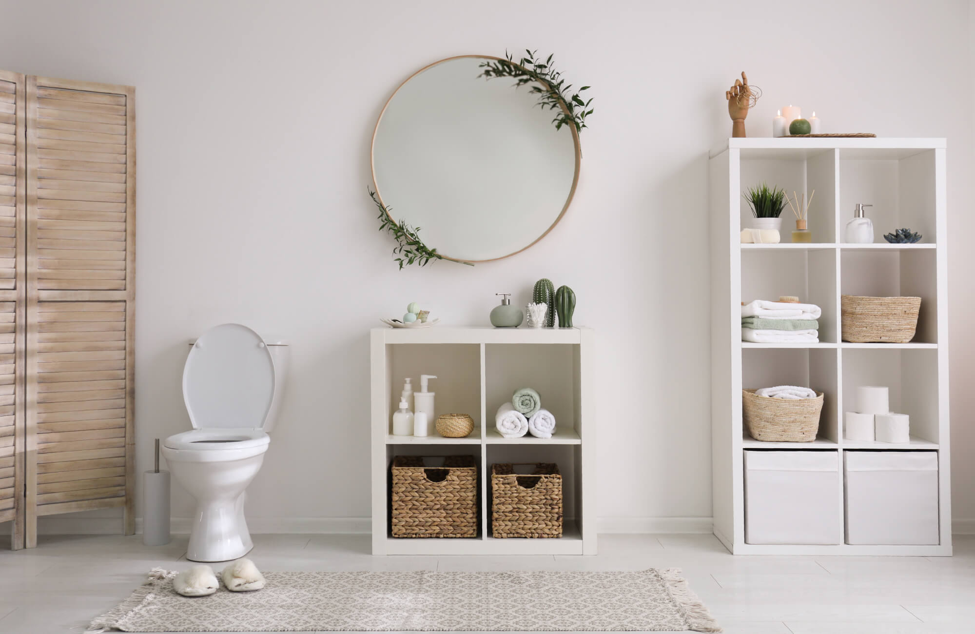
Why Vanities Anchor the Bathroom’s Mood
The vanity often serves as the visual centerpiece of a bathroom, making it a powerful tool for shaping the room’s atmosphere. A calming blue or green vanity can instantly shift the space from sterile or stark to soothing and spa-like. Since the vanity usually includes a mirror and lighting, both high-use areas, its color carries more visual weight than other features. That’s why choosing a balanced tone here helps tie together the rest of the palette without overwhelming the senses. It becomes the thread that connects tile, walls, and decor into one cohesive, calming whole.
Tone, Finish, and Lighting Interactions
A calming shade isn’t just about the color swatch; it’s also about how that color interacts with light and texture. For example, a glossy mint vanity can reflect more light and feel fresher, while a matte sage may read softer and more grounded. Natural light will bring out the blue undertones in green, while warm artificial light might shift a soft blue toward gray. Even the direction your bathroom faces can affect how a color reads throughout the day. That’s why testing finishes and observing color shifts in real lighting is key to maintaining the serene effect you’re aiming for.

What Blue Brings to a Bathroom Space
Blue is a flexible choice that works across many bathroom styles, but it’s the specific tone that determines the overall feel. From barely-there pastels to deep, moody navies, different blues offer different levels of calm, depth, and design presence.
Soft Blues for Spa-Like Serenity
Lighter blues, like powder or ice blue, tend to evoke cleanliness and clarity, perfect for bathrooms that aim to feel fresh and uncluttered. These tones work especially well in coastal or Scandinavian-inspired spaces where airiness and natural light are key. A soft blue vanity can blend quietly into white or cream surroundings, creating a restful palette without looking washed out. To keep the space from feeling too cool or sterile, consider adding warm woods, woven textures, or soft gold fixtures. This approach works best in smaller bathrooms, too, as light blue can visually expand the space.
Navy and Slate Blues for Rich, Grounded Looks
Darker shades like navy, denim, or slate bring a sense of weight and polish to bathroom design, while still maintaining the calming effects of blue. These deeper hues work well in both traditional and modern settings, especially when contrasted with crisp white walls or marble tile. A navy vanity, for example, becomes a strong focal point that feels both timeless and tailored. These tones pair beautifully with brushed brass or matte black hardware for a refined, high-end finish. If your space has good natural light, dark blue won’t feel too heavy; it’ll just add dimension and quiet confidence.
Pairing Blue Vanities With Tile, Hardware, and Walls
The success of a blue vanity often depends on what surrounds it, so coordination is key. Soft blues pair well with warm-toned tiles like ivory or light beige, while navy and slate look sharp next to cooler grays or white subway tile. When it comes to hardware, gold and brass add warmth and contrast, while chrome or matte black create cleaner, modern lines. Wall color should support the vanity without competing; off-white, pale gray, or even soft sage can create balance. Altogether, the right pairings let the blue feel intentional and grounded, not like a pop of color that came out of nowhere.

What Green Adds to the Bathroom Environment
Green brings an earthy, grounding tone to bathrooms, making it a natural fit for spaces designed to recharge. Unlike trend-based colors, it adapts easily to different styles, from modern minimalism to vintage charm, while always offering a touch of biophilic calm.
Sage and Olive for Organic, Relaxed Vibes
Softer greens like sage, such as our Daisy 48" Single Vanity in Sunwashed Oak with Embossed Shagreen and 3 cm White Zeus Quartz Top above, and olive offer a quiet sense of comfort that blends easily with natural materials. These muted tones work well with wood vanities, stone tile, and brass fixtures, making them ideal for bathrooms aiming for warmth without feeling rustic. Sage in particular feels fresh but not cold, and olive adds just enough richness to support deeper design elements. Both colors bring a sense of timelessness, so they won’t feel outdated if your style evolves. They’re also versatile enough to support layering with neutrals, whites, or even matte black accents.
Emerald and Forest for Bold Calmness
Deep greens like emerald and forest create visual impact without sacrificing the calming qualities that make green so appealing. These hues feel more dramatic and luxurious, especially when paired with marble surfaces or metallic fixtures. An emerald vanity can ground the space and act as a centerpiece, but still maintain a natural, composed energy. Unlike blues of similar depth, these greens tend to reflect a richer warmth, making them ideal for bathrooms that balance boldness with serenity. Used thoughtfully, they offer sophistication without feeling too formal.
Styling Green Vanities With Warm or Cool Palettes
One of green’s biggest strengths is its ability to bridge warm and cool palettes with ease. Muted greens pair beautifully with beige, taupe, or walnut tones, while more saturated greens hold their own next to grays, white tile, or brushed nickel. This adaptability makes green a smart choice if your bathroom includes mixed finishes or layered textures. For modern looks, pair deep green with black fixtures and light oak or ash wood. For something more traditional, soft green with cream walls and antique brass creates a look that’s cozy and refined.

Blue vs. Green: Which One Works Best for You?
Choosing between a blue or green vanity isn’t just about preference; it’s about how you live, how your space functions, and whether your style tends to evolve. Both hues can offer calm and character, but each responds differently to lighting, finishes, and daily wear. In this section, we’ll break down which shade may better suit your lifestyle now and in the long run.
What Feels Calming to You Based on Use and Routine
How you use your bathroom plays a big role in which color will actually feel calming. If you get ready early in the morning, soft blues tend to feel fresher and brighter in cool light. For evening routines or dimmer spaces, muted greens may bring a cozier, grounded tone that doesn’t feel stark. Consider when you spend the most time in the space and how color affects your focus, energy, or ability to unwind.
You should also think about how often you like to refresh your decor. If your space is more fixed, choose the tone that feels right with your current routine and lighting. But if you tend to update textiles, paint, or hardware every few years, opt for the base color that gives you flexibility without overwhelming the space. The goal is to choose a color that supports how your bathroom works day to day, not just how it looks on a mood board.
Maintenance and Finish Concerns With Each Color
Some vanity colors are more forgiving than others when it comes to everyday mess. Deeper blue, especially in a satin or matte finish, tends to show water marks, fingerprints, and dust less visibly than glossy greens or light pastel tones. On the other hand, olive or sage green can be better at disguising streaks from cleaning products or soap residue. The way the light hits your vanity throughout the day will also affect how often you notice surface flaws.
If low maintenance is a priority, consider combining your chosen color with a textured or brushed finish. This can soften reflections and hide minor imperfections more effectively. Glossy finishes may add a sleek look but demand more upkeep, especially in households with kids or shared bathrooms. Think not just about what looks beautiful new, but what still looks great after a week of real use.
Long-Term Flexibility If You Plan to Redecorate
Over time, your style might shift, and your vanity color should be able to shift with it. Blue, especially navy or slate, works well with both modern metals like chrome and more traditional finishes like brass or oil-rubbed bronze. Green, meanwhile, has a wide pairing range from warm wood and earthy neutrals to cool stone and crisp whites. The key is choosing the tone that plays nicely with future changes in wall color, fixtures, or layout.
If you expect to change other elements of your bathroom often, lean toward a mid-tone or desaturated version of either hue. These offer the most range without locking you into one specific palette. Think of the vanity as your anchor, something that doesn’t need replacing every time your taste evolves. The right shade of blue or green can stay stylish across seasons and design phases.

When to Use Bold vs. Muted Shades in Calming Designs
Muted colors often create a sense of quiet softness, making them ideal for bathrooms meant to feel restful and airy. Soft sage, powder blue, or misty green tones tend to recede gently into the background, supporting a light, uncluttered atmosphere. These are great choices for smaller bathrooms, especially if you're trying to reflect natural light or keep the space feeling open. If your idea of calm is rooted in minimalism or spa-like stillness, muted shades are the way to go.
As seen above with our Gwen 72" Double Vanity in Pebble Oak with 3 cm White Zeus Quartz Top, a muted green vanity can blend seamlessly into natural light and warm tones while still adding subtle dimension to the room. This combination brings both texture and serenity without overwhelming the eye.
Bold shades, on the other hand, don’t have to feel loud or aggressive. Deep forest greens or navy blues can still feel calming when balanced with neutral walls, warm metals, or natural wood. These saturated colors bring a sense of groundedness and depth, ideal for primary bathrooms where you want a moodier, more anchored aesthetic. They offer calm in a different way: through richness, stability, and confidence.
It all comes down to what visual calm looks like to you. Do you relax more in light, airy environments or feel soothed by enveloping, cocoon-like color? Muted shades often feel breezy and flexible, while bolder hues give more presence and personality. Let your emotional response guide the choice; both ends of the spectrum can serve a calming space when paired with thoughtful finishes and lighting.
If you're drawn to a calming aesthetic but prefer something outside the green and blue spectrum, there are plenty of grounded options to explore. Our vanities also come in nature-inspired finishes like Natural Oak, White Oak, and Black, each offering its own take on warmth, contrast, and timeless appeal. These shades pair effortlessly with both muted and bold palettes, giving you the flexibility to create a soothing space that still feels distinctly yours.

How Lighting Affects the Look of Blue and Green Vanities
Lighting has a dramatic effect on how blue and green vanities actually appear in your bathroom. Natural light can bring out undertones you might not notice in a showroom or online, especially in softer or mid-tone shades. For example, a pale blue may feel crisp and airy in daylight but appear cooler or more muted under artificial bulbs. That’s why sampling your chosen color in your actual space is so important before committing.
Cool-toned lighting like LED or daylight bulbs tends to emphasize the blue in both blue and green vanities, sometimes making them feel icier or more modern. This can be beautiful in contemporary spaces, but it may also shift softer greens into colder territory, especially sage or olive. Warm lighting, such as soft white or incandescent bulbs, adds warmth and softness, giving blue tones a dustier appearance and green tones a more natural, earthy feel. The shift can subtly change the entire tone of your design.
The amount of light matters too. A vanity placed near a large window may feel much brighter or bolder than the same piece tucked into a shadowy nook. If you’re aiming for a calming bathroom, balance is key—consider where the light lands throughout the day and how finishes (like gloss or matte) reflect it. Even the hardware and tile choices nearby can reflect color differently depending on lighting, making your space feel either grounded or off-tone. Planning for lighting upfront ensures your color choice actually looks the way you imagined.
Still Unsure Which Hue Feels Right?
Choosing between blue and green for your bathroom vanity isn’t just about preference; it’s about how that choice works with your lighting, tile, and layout to create a space that actually feels calm. If the decision still feels unclear, it may be because you’re trying to picture how everything will work together, not just the color itself. That’s where a second set of eyes can help. A thoughtful design perspective can save time and prevent costly mismatches later.
Through our free design consultation, we’ll help you match vanity colors with your space’s natural light, finishes, and overall tone, whether you’re drawn to bold emerald or soft slate. Our team works with real layouts and real materials to suggest options that make sense, both visually and practically. No guesswork, no pressure, just curated advice to help you create a calming bathroom that feels intentionally yours.