


Wood look tile has become one of the most influential materials in modern residential design, blending the warmth of hardwood with the durability of porcelain. For those who want the beauty of natural wood without the maintenance concerns, it offers a compelling solution that works in kitchens, bathrooms, basements, and open living spaces alike. Yet one critical decision often determines whether the finished floor feels convincingly natural or unmistakably artificial: the layout pattern.
Choosing between a random staggered layout and a uniform pattern is not simply a matter of personal taste. It affects how realistic the floor appears, how well it performs over time, and how successfully it integrates with the architecture of the home. Understanding the aesthetic implications and the technical realities behind each option allows you to make a confident, informed decision that protects their investment while elevating the overall look of the space.

The Aesthetic Argument for Random Staggering
Random staggering has become the preferred layout for most wood look tile installations because it aligns closely with how real hardwood floors behave visually. When executed correctly, it introduces variation, movement, and subtle irregularity that makes a porcelain surface feel organic rather than manufactured.
Mimicking the Nature of Hardwood Planks
Natural hardwood flooring is inherently imperfect. Boards vary slightly in length, grain pattern, and tonal shading, and these differences are distributed irregularly across the floor. A random staggered layout mirrors this reality by offsetting plank joints at varying intervals rather than locking them into a predictable rhythm. The result is a surface that feels authentic, relaxed, and visually rich.
In homes where wood look tile is intended to replace traditional hardwood, especially in open-plan layouts, this realism matters. A random pattern prevents the eye from detecting a repeating system, which helps the tile disappear into the architecture rather than calling attention to itself. For homeowners who value understated elegance and timeless appeal, this approach delivers a floor that feels grounded and natural.
Breaking Up the Repetition of Print Patterns
Even the highest-quality porcelain tiles rely on printed images to replicate wood grain. While premium manufacturers offer dozens of unique faces per tile series, repetition is inevitable if the layout reinforces it. A uniform pattern can unintentionally line up identical grain images, making the floor feel artificial and overly controlled.
Random staggering disrupts this visual repetition. By shifting plank offsets unpredictably, it scatters similar tile faces throughout the space, reducing the chance that identical patterns will sit side by side. This subtle randomness enhances the illusion of real wood and prevents the floor from looking like a tiled surface pretending to be something else.
Creating Visual Movement and Flow
A thoughtfully staggered layout introduces movement that guides the eye naturally through a room. Instead of stopping abruptly at aligned grout joints, the gaze flows along the length of the planks, reinforcing the linear beauty that makes wood such a desirable flooring choice. This sense of motion can make rooms feel larger, more dynamic, and more inviting.
In long hallways or expansive living areas, random staggering avoids visual monotony. It creates an organic rhythm that complements both traditional and contemporary interiors, allowing the floor to support the overall design rather than dominate it.

The Technical Dangers of the Uniform Brick Lay
While a uniform brick pattern may seem orderly and appealing on paper, it introduces significant technical risks when applied to wood look porcelain tile. These risks affect not only appearance but also long-term performance and homeowner satisfaction.
Understanding the Bow in Porcelain Planks
Porcelain planks are fired at extremely high temperatures, a process that can cause slight warping as the tile cools. This curvature, often referred to as bowing, is a normal characteristic of large-format tiles and is recognized across the tile industry. The center of the plank may sit slightly higher or lower than the ends, even when the tile meets manufacturing standards.
This natural bow becomes problematic when tiles are installed in patterns that align high points with low points. Uniform layouts are particularly vulnerable to this issue because they repeatedly place the same parts of each tile next to one another.
Why the Fifty Percent Offset Causes Lippage
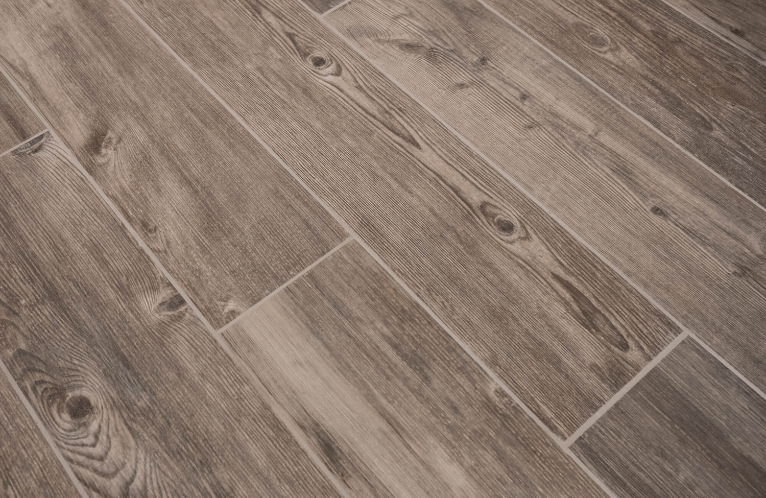
The classic brick lay pattern, where each tile is offset by fifty percent, aligns the center of one plank with the ends of adjacent planks. Because the center is often the highest point and the ends the lowest, this configuration exaggerates height differences between tiles, something that becomes especially apparent with long-format planks like Edward Martin’s Jameson 8x48 Matte Porcelain Tile in Umber, as shown in the image above. The result is lippage, where one tile edge sits higher than the next.
Lippage is more than a cosmetic concern. It creates shadows, catches light unevenly, and can be felt underfoot. In busy areas, it may even pose a tripping hazard. For those expecting a smooth, refined surface, this outcome is disappointing and difficult to correct after installation.
The Unflattering Ladder Effect
Uniform brick patterns also tend to produce what designers call the ladder effect. This occurs when grout joints line up in consistent vertical columns across the floor, creating a rigid, repetitive visual structure. Instead of reading as wood, the floor reads unmistakably as tile.
This effect becomes especially pronounced in large spaces or areas with strong natural light. Sunlight streaming across the floor highlights the repetitive grout lines, reinforcing the artificiality of the layout and undermining the realistic intent of wood look tile.

The Industry Standard The One Third Offset Rule
To balance aesthetics with performance, the tile industry widely recommends a one third offset pattern for wood look porcelain planks. This approach offers the visual benefits of staggering while minimizing the technical risks associated with tile warpage.
How the Thirds Layout Solves Warpage
By offsetting planks approximately one third of their length, the highest points of one tile are less likely to meet the lowest points of another. This distribution reduces height variation at grout joints, making lippage far less noticeable and easier to control during installation, particularly with elongated profiles like Edward Martin’s Preston 8x48 Matte Porcelain Tile in Pine featured in the image above.
The one third offset respects the physical realities of porcelain while still delivering a layout that feels organic and natural. It is a compromise that protects both the appearance and durability of the floor, which is why many manufacturers specify it in their installation guidelines.
Achieving a Stair Step or Zipper Pattern
When executed properly, a one third offset produces what is often described as a stair step or zipper effect. Joints shift gradually rather than abruptly, creating a gentle sense of progression across the floor. This pattern avoids the rigidity of uniform layouts without appearing chaotic or overly random.
For homeowners, this means the floor feels intentional and refined rather than improvised. It offers enough variation to mimic real wood while maintaining a sense of order that suits a wide range of interior styles, from transitional to modern farmhouse.
Utilizing Leveling Clips for Perfection
Even with the right layout, achieving a flawless wood look tile installation requires attention to detail. Tile leveling systems, commonly known as leveling clips, help installers keep adjacent planks flush as the mortar cures. These systems are particularly valuable with long porcelain planks, where even minor height differences can become noticeable.
When combined with a one third offset pattern, leveling clips contribute to a smooth, professional finish that enhances both comfort and visual appeal. For homeowners investing in premium materials, this extra precision ensures the final result meets expectations.

When Uniformity Works Herringbone and Stacked
Although random staggering is ideal for most installations, there are scenarios where uniform patterns not only work but excel. The key lies in choosing layouts specifically designed to accommodate the characteristics of porcelain planks.
The Sophistication of Herringbone Layouts
Herringbone patterns arrange planks at right angles, creating a distinctive zigzag effect that feels both classic and contemporary. Because the planks are oriented differently than in a standard brick lay, the natural bow of the tile is less likely to create problematic lippage, a quality that works beautifully with refined finishes like Edward Martin’s Jameson 8x48 Matte Porcelain Tile in Camel seen in the image above.
This layout introduces visual interest and sophistication, making it a popular choice for entryways, powder rooms, and feature spaces. In homes where design statement matters as much as realism, herringbone offers a refined alternative that still benefits from the durability of wood look tile.
The Modern Edge of Stacked Bond
A stacked bond layout aligns plank ends directly with one another, creating clean, continuous grout lines. While this pattern is unforgiving and requires exceptionally flat substrates and high-quality tile, it can deliver a strikingly modern aesthetic when done correctly. Using Edward Martin’s Augmented Reality (AR) Visualization Tool allows you to preview how a stacked layout will read in your own space, helping confirm scale, alignment, and overall effect before installation.
Stacked layouts work best in contemporary interiors where minimalism and geometry are central themes. Once the visual direction feels right, ordering a tile sample from Edward Martin provides a final layer of confidence, allowing the texture, tone, and finish to be experienced firsthand before committing to a full installation.
Controlling the Grout to Hide the Pattern
Regardless of layout, grout selection has a major influence on how the pattern is perceived. Choosing a grout color that closely matches the tile body minimizes contrast and allows the planks to read as a continuous surface. This technique is especially important in uniform patterns, where visible grout lines can quickly dominate the design.
Thoughtful grout control helps even bold layouts feel cohesive and intentional, ensuring the focus remains on the texture and tone of the tile rather than the grid beneath it.
Realism Requires Controlled Randomness
The question of whether wood look tile should be laid in a random or uniform pattern ultimately comes down to realism, performance, and design intent. For most homeowners seeking the warmth and authenticity of hardwood with the resilience of porcelain, a controlled random stagger, particularly a one third offset, delivers the best balance of beauty and durability.
By understanding how layout influences both appearance and performance, homeowners can make a confident choice that enhances their space for years to come. A well-planned pattern does more than arrange tiles on a floor; it transforms a surface into an experience that reflects quality, craftsmanship, and thoughtful design.