


In the world of refined interior design, few choices are as quietly impactful as the relationship between a bathroom vanity and its surrounding walls. The balance of light and dark within this space doesn’t just define style—it shapes the atmosphere, enhances function, and reflects a homeowner’s sensibility.
Choosing whether the vanity should be darker than the walls invites a dialogue between contrast and cohesion, depth, and clarity. It’s a decision that weaves together aesthetic harmony, technical precision, and enduring elegance. This article explores the nuanced art of vanity and wall color contrast, offering insight rooted in both design sophistication and practical expertise.

Visual Hierarchy and the Role of Contrast in Bathroom Design
Establishing a clear visual hierarchy through purposeful contrast allows a bathroom to feel both structured and thoughtfully composed. When a vanity is darker than the walls, it creates an anchor point within the room, drawing the eye and enhancing the overall architectural balance.
Creating Focal Points through Tonal Weight
Darker vanities naturally command attention, especially when framed against softer, neutral wall tones like off-white or warm gray. This tonal separation helps showcase quality features such as quartz countertops, inset cabinetry, or designer hardware. As a result, the vanity feels less like a utility and more like a curated furniture piece within the layout. This visual weight anchors the bottom half of the room, giving the entire space a sense of grounded sophistication. In transitional and contemporary bathrooms, this effect introduces clarity and order without being overpowering. The entire composition comes together seamlessly, offering a professionally styled atmosphere that feels both intentional and inviting.
Defining Spatial Boundaries and Balance
Assigning a darker tone to the vanity helps establish functional zoning in bathrooms where architectural separations are minimal. This visual cue distinguishes the storage and sink area from the surrounding wall planes, even in small or open-concept layouts. On the other hand, light-colored walls open up the room, enhancing airflow and visual space while preventing the vanity from feeling bulky. Together, this interplay maintains equilibrium between form and function. It's particularly effective when paired with floating vanities or elongated mirrors that echo the linear layout. What emerges is a balanced design that feels expansive without sacrificing definition.
Supporting Design Cohesion through Depth
Incorporating a darker vanity introduces a depth that enriches flat surfaces and adds layers to the bathroom's visual narrative. It offers a textural and tonal contrast to light walls, which can otherwise appear one-dimensional. This depth becomes especially valuable in minimalist designs where decorative elements are deliberately restrained.
A prime example, as displayed in the picture above, is Edward Martin’s Demi 30" Single Vanity in Mid-Century Walnut with 3 cm White Zeus Quartz Top, where the rich wood grain and compact form add instant character and warmth. Its clean silhouette and warm tones also provide a sophisticated counterbalance to lighter or tiled walls, especially when paired with vertical lines and modern brass accents. Instead of clutter, the contrast itself becomes a design feature that draws the eye and invites interaction. The inclusion of complementary materials, such as matte black fixtures or stone surfaces, further deepens the aesthetic. With this approach, the entire space reads as cohesive, refined, and visually sophisticated.

Color Psychology and Emotional Response to Design Palettes
Color plays a pivotal role in shaping how a space feels, guiding emotional perception, and influencing the ambiance of the room. A darker vanity contrasted with lighter wall tones can create a bathroom that feels luxurious, calming, and balanced in energy.
Impact of Dark Vanities on Mood and Perception
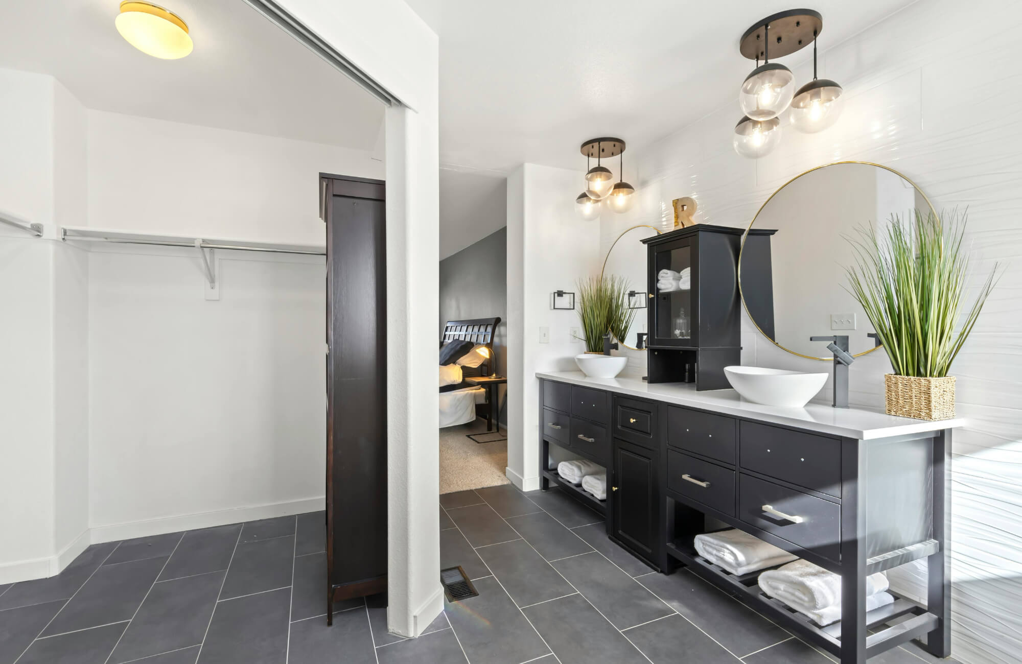
Rich tones like espresso, graphite, and navy are known to evoke feelings of depth, stability, and elegance. When used on vanities, these hues introduce a grounded presence that helps anchor the space emotionally as well as visually. A perfect example of this is the Colton 72" Double Vanity in Sable with 3 cm White Zeus Quartz Top, which pairs a deep, wood-grain finish with a clean white quartz-based surface to create a serene yet luxurious aesthetic. As shown in the photo above, the vanity's substantial tone adds visual richness while complementing the soft wall palette, embodying balance and high-end appeal. This sense of permanence and structure also supports a tranquil atmosphere that echoes spa-like elegance. When paired with sufficient lighting and refined textures, the overall mood becomes warm yet polished. The result is a bathroom experience that feels indulgent without being overwhelming.
Lighter Walls as Emotional Counterbalance
Walls painted in soft neutrals like alabaster, mist gray, or warm ivory create a calming backdrop that enhances a room’s brightness and sense of space. These high-reflectance tones foster a feeling of airiness and order, balancing the weight of a darker vanity below. This combination also promotes a psychological equilibrium that is both restful and invigorating. It’s particularly effective in spaces designed for daily rituals, where a fresh yet soothing environment can influence the rhythm of the day. By reflecting natural and artificial light evenly, light-colored walls enhance the functional performance of the room without disrupting its emotional tone. Together, these elements foster a cohesive palette that feels sophisticated yet comfortable.
Demographic Preferences and Aesthetic Trends
Design preferences can vary significantly by demographic, making contrast choices a strategic consideration in both custom and resale projects. For instance, urban homeowners and millennials often gravitate toward bold, high-contrast palettes that include dark vanities paired with striking accents. In contrast, family-centric and suburban markets tend to favor lighter, airier tones that promote a sense of hygiene and openness. This diversity allows designers to tailor palettes based on client lifestyle, geographic trends, or resale goals. The flexibility of using a darker vanity against light walls also enables both expressive and neutral interpretations without compromising style. It’s a design move that accommodates broad taste while staying grounded in timeless appeal.

Lighting Dynamics and the Effect on Color Performance
The interaction between lighting and color is a foundational element of successful bathroom design. When a darker vanity is paired with lighter walls, it creates opportunities to control brightness, reduce glare, and enhance functionality through strategic lighting.
Understanding Light Reflectance Value (LRV)
Light Reflectance Value, or LRV, measures how much light a surface reflects, making it a critical factor in selecting paint colors for bathrooms. For example, lighter walls typically carry higher LRV scores, above 60, meaning they distribute light more efficiently across the space. This enhanced reflection compensates for the absorptive nature of darker vanities, preventing the space from feeling dim or confined.
A great example of this balance, as featured in the photo above, is our Sasha 60" Double Vanity in Mid Century Walnut with 3 cm White Zeus Quartz Top, which combines rich, warm cabinetry with a high-LRV quartz-based surface and surrounding soft white walls. The result is a visually dynamic yet light-filled bathroom that feels both expansive and grounded. The contrast between low-LRV cabinetry and high-LRV walls also strikes a balance that enhances both visibility and mood, especially valuable in spaces with limited natural light. Thoughtful LRV planning like this ensures both aesthetic and functional success.
Contrast Optimization with Task and Ambient Lighting
A darker vanity absorbs more light, making ambient and task lighting even more critical in maintaining balance. Positioning LED sconces at eye level or integrating lighting into mirrors ensures facial clarity and minimizes harsh shadows. Lighter walls amplify this illumination, dispersing light evenly to maintain a clean and welcoming environment. Layered lighting systems, using a combination of overhead, wall-mounted, and under-cabinet fixtures, also work especially well with this palette. The dark vanity becomes a subtle feature rather than a visual burden, while lighter walls keep the space feeling airy. This combination creates both usability and visual appeal, even under varying lighting conditions.
Finish Choices and Light Interaction
The texture and sheen of surface finishes significantly affect how light behaves within the bathroom. Dark vanities with matte or satin finishes diffuse light gently, avoiding reflective glare that can feel harsh or clinical. On the other hand, walls finished in eggshell or semi-gloss reflect more ambient light, contributing to an even, well-lit environment. This pairing not only enhances visual clarity but also introduces depth and material richness. When combined with natural materials like wood or stone, the contrasting finishes support a layered, tactile experience. Such balance elevates the room beyond utility, turning it into a curated and immersive space.

Market Appeal and Resale Value Implications
Design decisions in the bathroom can influence more than personal comfort; they often affect resale potential and market value. A darker vanity against lighter walls creates a high-impact look that is appealing, memorable, and widely marketable.
Widespread Buyer Preference for Balanced Contrast
Homebuyers frequently respond to bathrooms that offer a sense of visual structure and designer-level detailing. A darker vanity, for instance, introduces just the right amount of character while maintaining mass appeal when set against clean, neutral walls. This contrast delivers a sense of balance that feels both current and timeless, making it easier for potential buyers to visualize themselves in the space. Neutral wall tones, on the other hand, appeal to a broader audience by promoting a feeling of cleanliness and openness. Together, the combination feels upscale without alienating more traditional buyers. It’s a smart strategy for those hoping to maximize aesthetic impact without risking over-personalization.
ROI in Renovation Projects
For homeowners considering renovations, incorporating a darker vanity with light-colored walls is one of the most cost-effective upgrades available. It creates visual interest and suggests custom design without requiring full-scale remodeling. This approach aligns well with bathroom renovation trends that enhance resale value, offering a high-end look at a relatively low investment. Because the color palette is both stylish and flexible, it also increases appeal across a wide demographic range. In competitive housing markets, these kinds of visual updates can influence buyer decision-making. Ultimately, it’s a small change that yields disproportionate benefits in both aesthetics and value.
Staging and Visual Clarity for Showings
In real estate staging, visual simplicity and clarity are essential for creating lasting impressions. For example, a darker vanity adds a sense of depth and contrast that photographs beautifully and translates well during showings. At the same time, light-colored walls enhance spatial clarity and help the vanity stand out as a central feature. This interplay allows for easy visual navigation and makes the bathroom appear larger and more functional. For potential buyers, these cues suggest thoughtful planning and updated finishes. The result is a bathroom that not only shows well but also communicates quality and style.

Material Selection and Long-Term Practical Considerations
Choosing a darker vanity in contrast with lighter walls isn’t just about visual impact; it involves understanding maintenance requirements, durability, and environmental performance. This combination offers a long-term design solution that balances style with everyday practicality.
Material Compatibility for Lasting Performance
Dark vanities are typically constructed from hardwoods, MDF, or powder-coated metals, all of which offer excellent durability when finished properly. These materials pair well with lighter, moisture-resistant wall paints such as acrylic latex in eggshell or satin finishes. Together, this pairing ensures resilience against humidity, staining, and everyday wear. The contrast also enhances compatibility with a wide range of tile and countertop materials, allowing for more flexible styling options. This layered approach makes the bathroom easier to update over time without full replacement. In terms of both longevity and adaptability, the material synergy is a smart investment.
Cleaning and Maintenance Factors
Dark finishes do a better job at concealing scratches and dents, which makes them ideal for busy areas or shared bathrooms. However, they can highlight dust, soap residue, and water spots, requiring more frequent surface cleaning. Light-colored walls, by contrast, tend to hide smudges better and typically need less maintenance overall. This balance between vanity and wall surfaces reduces the overall time and effort required to keep the space looking fresh. It also supports households with varying usage patterns, from single occupants to busy families. The end result is a bathroom that remains beautiful with manageable upkeep.
Finish Longevity and Environmental Considerations
Selecting high-quality finishes and coatings contributes significantly to the lifespan of both vanities and walls. Low-VOC paints and sealants reduce indoor air pollutants while providing excellent coverage and fade resistance. UV-resistant lacquers on vanities help preserve rich, dark tones even in well-lit bathrooms. These protective layers also enhance moisture resistance, preventing warping or discoloration over time. When applied correctly, these finishes contribute to both environmental safety and visual longevity. This approach ensures that the design remains as attractive as it is sustainable.
The Enduring Impact of Thoughtful Contrast
A well-considered contrast between a darker vanity and lighter walls is more than a design preference; it is a statement of balance, intention, and timeless elegance. When crafted with attention to proportion, material, and light, this pairing transforms the bathroom into a space of clarity, comfort, and visual poetry. It honors both the art and function of interior design, delivering beauty that resonates beyond trends. Whether tailored for personal retreat or future resale, this harmonious blend elevates the everyday into something enduring and exceptional. In the hands of thoughtful design, contrast becomes not division, but unity—subtle, striking, and enduring.
For those seeking to bring this vision to life, Edward Martin’s design services offer expert guidance tailored to your space, style, and goals. Whether you're planning a renovation or building from scratch, our team can help you create a cohesive and elevated design experience. Contact us to begin your transformation with thoughtful contrast that endures in both beauty and function!