


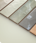

Choosing between light and dark shower tiles affects more than appearance. It influences how the space feels during daily use, how visible wear becomes over time, and how the design holds up as habits and needs change. When making a decision, the focus is on how the shower functions in real life rather than how it appears in photos. Understanding how color interacts with space, light, and maintenance helps you make an informed choice that feels practical, comfortable, and lasting.

Visual Impact and Perceived Space
Light and dark tiles influence how a shower is perceived as soon as you enter the space. Rather than considering color in isolation, it is helpful to examine how tone interacts with proportions, enclosure type, and sightlines to shape the overall sense of openness or enclosure.
How Light Tiles Expand Small Showers
Light-colored tiles reflect available light across the shower, which helps soften visual boundaries between walls and reduces the sense of enclosure. In smaller or more compact layouts, this effect helps surfaces feel continuous and visually open rather than broken up. This approach is especially effective in alcove showers or tub surrounds where minimizing visual breaks can noticeably improve spatial perception.
A large-format light tile, such as Edward Martin’s Leona 24x48 Polished Porcelain Tile in Calacatta, illustrates this effect clearly, as seen in the photo featured above, where broad tile surfaces and subtle veining support a calm, uninterrupted look. When the grout closely matches the tile tone, the surface reads as a single plane, which helps the shower feel wider and taller than it actually is.
When Dark Tiles Create Intentional Depth - H3
In contrast, dark tiles tend to recede visually rather than emphasize edges, which can introduce a greater sense of depth when the shower has sufficient space. In walk-in showers with glass enclosures, darker walls often feel purposeful instead of overwhelming. Scale plays a crucial role here, as larger tile formats reduce the number of grout lines, helping the surface appear more continuous. When the layout allows for it, dark tiles can define the shower as a distinct architectural element without making the space feel smaller.

Daily Maintenance and Long-Term Appearance
Aside from first impressions, tile color has a noticeable impact on how a shower looks between cleanings. It helps to consider factors such as water quality, daily use, and personal tolerance for maintenance when deciding which color will feel more manageable over time.
Water Spots and Mineral Buildup Visibility
Tile color plays a direct role in how water spots and mineral residue appear between cleanings. Light tiles tend to show soap film and mineral deposits sooner, especially in areas with hard water, where buildup can appear as pale, chalky marks. Dark tiles shift visibility toward dried droplets and streaking, which become more apparent under direct lighting. In both cases, softer surface textures can reduce contrast, making routine residue less noticeable over time.
Grout Aging and Color Stability
Grout typically shows signs of change sooner than tile, and its color influences how noticeable that change becomes over time. Without regular sealing and cleaning, light grout can gradually darken, subtly shifting the shower’s overall appearance. By comparison, dark grout avoids this type of discoloration but may fade or develop residue outlines depending on water composition and cleaning methods. For many showers, a mid-tone grout offers a balanced solution, as it helps disguise gradual wear while allowing the tile itself to remain the focal surface.

Lighting Conditions and Tile Performance
Tile color does not exist in isolation, as lighting plays a central role in how it appears once installed. Both artificial and natural light influence whether a surface feels balanced or overpowering, making lighting conditions an important consideration when choosing between light and dark tiles.
Low Light Showers and Color Choice
In showers with limited lighting, darker tiles tend to absorb available light, making the space feel heavier than intended. This effect is more pronounced in interior bathrooms or areas with minimal overhead fixtures. Lighter tiles reflect light across corners and vertical surfaces, helping the shower feel more evenly illuminated. When lighting upgrades are not practical, glossy finishes can enhance visibility without altering the overall color direction.
Natural Light and Contrast Control
When a bathroom receives consistent natural light, darker tile palettes are often easier to balance, as sunlight softens shadows and brings out depth in deeper finishes. This effect is clearly illustrated in the photo featured above, where Edward Martin’s Jojo 2x6 Glossy Ceramic Tile in Forest is paired with Jojo 2x6 Glossy Ceramic Tile in Ivory to create contrast without overwhelming the space. The interplay between the darker and lighter tones benefits from natural daylight, which helps maintain visual clarity and definition.
At the same time, the glossy surface reflects light across the vertical pattern, preventing the darker areas from feeling too heavy. In bright spaces, this balance is further supported by subtle texture and thoughtful coordination with surrounding wall, ceiling, and fixture finishes, keeping contrast controlled and visually comfortable.

Comfort and Psychological Effect
Tile color affects how a shower feels daily, shaping the emotional experience as much as the visual one. Different tones can support varying routines and comfort preferences, making color an equally important consideration aside from appearance.
Light Tiles and Clean Calm Atmospheres
Light tiles often create a sense of clarity and order, making them well-suited to shared bathrooms or spaces used early in the day. Their brightness helps establish a calm, functional environment without drawing too much attention to the surfaces themselves. Pale neutrals provide a relaxed backdrop that allows fixtures, textiles, and finishes to introduce warmth, resulting in a space that feels inviting rather than stark.
Dark Tiles and Enclosed Retreats
Darker tiles tend to draw the focus inward, reducing visual distractions and creating a more private atmosphere. This effect is often associated with relaxation, particularly in primary bathrooms where the shower is intended to feel more like a retreat than a purely functional space. That sense of enclosure is illustrated in the photo featured above, where Edward Martin’s Jaden 2.5x16 Glossy Ceramic Tile in Navy is used to wrap the shower in a deep, continuous tone that visually separates it from the rest of the room. Warm lighting is also important in these settings, as it balances the depth of the darker surfaces, helping them feel comfortable and inviting while maintaining a calm, enclosed presence.

Design Flexibility and Longevity
As preferences evolve, certain tile colors adapt more easily than others. It is useful to consider how permanent a choice may feel and how well it can accommodate future updates without requiring a full redesign.
Light Tiles as Neutral Foundations
Light tiles act as a stable backdrop that works across a wide range of design directions. They make it easier to update fixtures, wall colors, or accessories without creating visual conflict, since the tile itself does not dominate the space. This adaptability is evident in the photo featured above, where Edward Martin’s Kennedy 12x36 Matte Porcelain Tile in Sand Deco provides a soft, neutral surface that supports both warm wood elements and darker accents without feeling tied to a specific trend. Because light tiles are less style-specific, they tend to remain appropriate over time, particularly when a bathroom is refreshed in stages rather than all at once. This flexibility can also help extend the lifespan of the overall design without requiring major changes.
Dark Tiles and Style Commitment
Dark tiles create a more pronounced visual presence, which can work well when the overall design direction is clearly established. That same strength, however, may reduce flexibility as preferences change over time. Using darker tones in focused areas, such as niches or feature walls, can help maintain visual interest without committing the entire space to a single look. This approach allows the rest of the bathroom to adapt more easily as styles and needs evolve.

Cost, Material, and Finish Considerations
Tile color choices are closely tied to practical considerations such as material availability and long-term maintenance or repair needs. These factors are also important once the shower is in regular use, making thoughtful planning essential from the start.
Finish Type and Color Interaction
Finish type influences how tile surfaces perform and age, regardless of color. For example, glossy finishes reflect more light and enhance surface clarity, though they can make imperfections more noticeable over time. In contrast, matte finishes absorb light, reducing glare and softening the appearance of minor wear, even though texture variation may be more apparent on darker tiles. Additionally, textured tiles add traction and visual depth, affecting both comfort and durability. Ultimately, selecting a finish that aligns with daily use and cleaning habits helps the shower maintain a consistent, well-balanced appearance as it ages.
Tile Availability and Replacement Ease
Light neutral tiles are generally easier to match years later if repairs become necessary. Dark or specialized tones may vary by batch or be discontinued, making replacements more noticeable. In high-moisture environments, such as showers, maintaining visual consistency helps preserve the overall finish and avoids patchwork repairs. Planning for future availability can reduce frustration and unexpected costs over time.
Making the Right Choice for Your Shower
Shower tiles can be light or dark depending on how the space is designed and used. Light tiles generally support a brighter, more open feel and adapt easily over time, while dark tiles create depth and a more enclosed atmosphere when lighting and layout allow. By weighing visual impact, lighting conditions, maintenance expectations, and long-term flexibility together, the most confident choice becomes clearer and better aligned with your needs.
If you would like help visualizing how different tile colors might look in your own space, try our AR tool to explore options in real time. For personalized guidance on layout, lighting, and lifestyle, contact us to receive expert support tailored to your project.


