


When planning a room with wallpaper, a common question is whether the paint should be lighter or darker. While there is no single rule that applies to every space, the relationship between paint and wallpaper plays an important role in shaping how balanced, bright, or dramatic a room feels. As we walk through this topic together, we’ll explore the factors that often guide this decision, such as visual contrast, room size, wallpaper patterns, lighting, and the overall mood you want for the space. Once you understand how these elements work together, it becomes easier to make a decision whether lighter or darker paint will complement your wallpaper and help the room feel cohesive.

The Visual Relationship Between Paint and Wallpaper
Before deciding whether lighter or darker paint, consider how the wallpaper interacts with the rest of the room visually. Because wallpaper is often the most noticeable design element, the paint color should work alongside it and enhance the overall look rather than compete for attention.
Color Contrast Basics
Contrast is often the simplest way to determine how paint should work with wallpaper. When wallpaper features deep colors or bold patterns, lighter paint usually helps balance the space. A lighter paint color around the wallpaper helps the room feel more open while keeping the wallpaper as the main focal point.
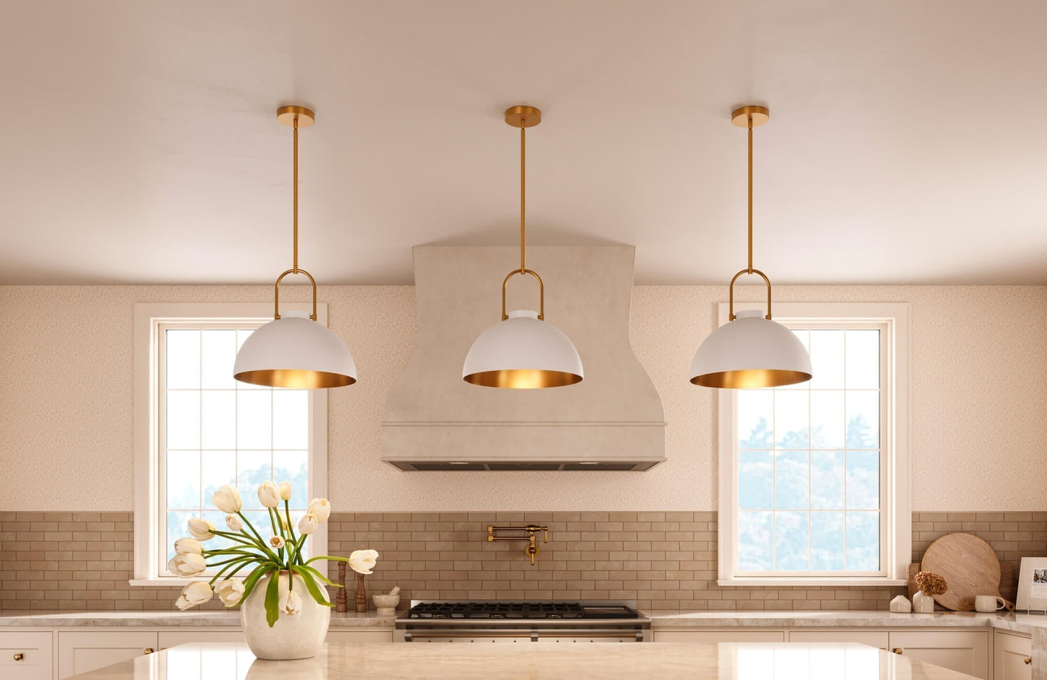
When wallpaper has a pale background or a softer pattern, darker paint can help define the space more clearly. Instead of blending into the walls, the wallpaper stands out because the deeper paint around it creates a natural frame. This effect is shown with Edward Martin’s Windsor Wallpaper in Grey I, 52" x 132", featured in the photo above, where the white striped wallpaper is paired with deeper green cabinetry. The contrast allows the wallpaper to remain subtle while the darker painted elements give the room structure and visual definition.
In many cases, it helps to begin with the dominant color in the wallpaper. If the color is already dark, lighter paint often creates a more balanced look. If the wallpaper is mostly light, slightly deeper paint can add gentle contrast, making the room feel more defined and complete.
Tonal Harmony in Interior Design
In some cases, the most effective pairing is not a strong contrast but a subtle variation. Tonal harmony occurs when paint and wallpaper share the same color family while differing slightly in brightness. This approach creates a cohesive look that feels thoughtful and balanced rather than bold or dramatic.
For example, if your wallpaper has soft beige tones, choosing lighter or slightly deeper paint within the same color family can create a natural layered look. The space gains depth while maintaining a smooth visual flow. This approach works particularly well in living rooms and bedrooms where a calm atmosphere is often preferred. Instead of drawing attention to color differences, the room feels unified while still offering a touch of visual dimension.
When Matching Undertones Matters
Undertones play an important role in determining whether lighter or darker paint will look right beside wallpaper. Even when two colors appear similar at first glance, mismatched undertones can make the combination feel slightly off. Wallpaper with warm undertones usually pairs best with paint that also leans warm, even if the paint is lighter. Similarly, wallpaper with cooler undertones tends to look more balanced when matched with cool-toned paint. Keeping the undertones consistent helps the overall color palette feel more cohesive throughout the room.
When comparing paint samples with wallpaper, it helps to place them side by side under natural light. Seeing them under the same lighting makes it easier to tell whether the undertones work well together before making a final decision.

How Room Size and Spatial Perception Influence Color Choice
The way paint and wallpaper work together can influence how large or compact a room feels. Depending on the space, lighter paint can make a room feel more open, while darker paint can add depth and create a stronger sense of structure.
Making Small Rooms Feel Larger
In smaller rooms, lighter paint often pairs well with wallpaper because it reflects more light and helps reduce visual weight. When wallpaper is used on one wall and the surrounding walls are painted in a lighter shade, the space generally feels more open and comfortable.
For instance, placing patterned wallpaper behind a bed or sofa can create a focal point, while lighter paint on the remaining walls keeps the room from feeling crowded. This balance allows the wallpaper to stand out while the lighter paint helps maintain a bright and airy atmosphere. This approach works especially well in apartments, entryways, and smaller bedrooms where creating a sense of openness is often a priority.
Adding Depth to Large Spaces
Larger rooms can sometimes benefit from deeper paint colors paired with lighter wallpaper. When walls feel too expansive, darker paint can help anchor the space and introduce a clearer sense of structure.
For example, if the wallpaper features soft botanical patterns or pale textures, slightly darker paint on the surrounding walls can keep the room from feeling too open or undefined. This balance is illustrated by Edward Martin’s Greensward Wallpaper in Black/Tan II, 52" x 132", as featured in the photo above, where the rich botanical pattern adds visual depth across the walls, and the surrounding architectural elements and furnishings provide grounding contrast. The darker tones give the room a stronger sense of structure without overwhelming the space.
In this way, the paint complements the wallpaper, adding contrast while helping the room feel more balanced overall.
Ceiling and Trim Color Effects
Another factor that can affect the balance between paint and wallpaper is the color of the ceilings and trim. These elements frame the room and quietly influence how the overall design comes together.
When wallpaper is darker, a lighter ceiling can help the room feel taller and more open. If the wallpaper is light, slightly deeper trim or molding can help frame the walls and make the design stand out more clearly. It often helps to look at the entire vertical surface of the room, since paint, wallpaper, ceiling color, and trim all work together to shape the overall atmosphere.

The Role of Wallpaper Patterns and Visual Density
Wallpaper patterns can vary widely in complexity, from dense prints to subtle textures or minimal shapes. The visual weight of the pattern often helps determine whether lighter or darker paint will work best beside it.
Busy Patterns Need Visual Breathing Room
Wallpaper with intricate patterns or multiple colors often works best with lighter surrounding paint. When a design is visually active, lighter paint helps soften the overall look and gives the pattern space to stand out.
If darker paint surrounds with highly detailed wallpaper, the room can feel visually crowded because both elements draw attention. Lighter paint, on the other hand, creates balance by keeping the surroundings calm while allowing the wallpaper to remain the main feature. In this way, the pattern takes center stage while the paint supports it quietly in the background.
Subtle Wallpapers Allow Stronger Paint
Wallpaper with minimal patterns or soft textures can handle darker paint more comfortably. Because the design is visually restrained, deeper paint colors can introduce richness without overwhelming the space.
For instance, a lightly textured linen wallpaper can pair well with deeper paint on a nearby wall or in an adjacent area. The contrast draws attention to the texture rather than hiding it. In these cases, darker paint does not compete with the wallpaper; instead, it adds contrast that enhances the overall design.
Large vs. Small Pattern Scale
Pattern scale can also influence how paint pairs with wallpaper. Large-scale patterns naturally draw the eye, which often makes lighter paint a better choice for maintaining visual balance.
Smaller repeating patterns tend to behave differently. Because they create a more consistent surface, darker paint can complement them without making the space feel too heavy. This relationship is illustrated with Edward Martin’s Botanique Wallpaper in Winter, 52" x 132", as featured in the photo above, where the delicate botanical repeat creates a steady visual rhythm across the walls while the deeper blue door and trim provide contrast without overwhelming the space.
When choosing a paint color, it often helps to step back and look at the wallpaper from several feet away. Stepping back and viewing the wallpaper from a distance can also help you decide whether lighter or darker paint will create the right balance in the room.

Lighting Conditions That Affect Paint and Wallpaper Pairing
Lighting can influence how paint and wallpaper look together in a room. A combination that feels balanced during the day may look different once the room is lit in the evening.
Natural Light and Color Perception
Natural light shifts throughout the day, which can change how paint and wallpaper look in a room. In spaces with strong sunlight, slightly darker paint can help balance the brightness created by lighter wallpaper. In rooms with less daylight, lighter paint often works better because it reflects the available light and keeps the wallpaper from feeling too heavy.
This effect is illustrated with Edward Martin’s Bower Wallpaper in Taupe I, 52" x 132", featured in the photo above, where the soft botanical pattern appears lighter near the sunlit window and slightly deeper along the interior walls. Natural daylight helps highlight the warm tones in the wallpaper while keeping the darker vanity balanced in the room. Observing the room at different times of day can also help you understand how both the paint and wallpaper respond to changing natural light.
Artificial Lighting Impact
Artificial lighting can also influence how paint and wallpaper appear together. Warm bulbs often make darker paint look richer, while cooler lighting can highlight lighter tones within the wallpaper. Because lighting setups vary from one home to another, it helps to look at paint samples next to the wallpaper under the same lighting that will be used in the room. Doing this can help you spot potential color shifts early and avoid surprises once the space is fully finished.
Orientation of the Room
The direction a room faces can also influence how paint works with wallpaper. For example, north-facing rooms typically receive cooler, softer light, which can make colors appear slightly muted. In these spaces, slightly lighter paint often pairs well with wallpaper and helps maintain a brighter atmosphere.
In contrast, south-facing rooms typically receive stronger and more consistent sunlight throughout the day. Because of this added brightness, darker paint can complement wallpaper without making the room feel enclosed. Keeping the room’s orientation in mind helps ensure that both the paint and wallpaper remain visually balanced throughout the day.

Creating Design Style and Mood Through Color Balance
Beyond practical considerations, choosing lighter or darker paint also influences the overall mood. Different interior styles rely on varying levels of contrast between wallpaper and paint to achieve a particular atmosphere.
Soft and Calm Interiors
For calm interiors, lighter paint paired with wallpaper often helps create a more relaxed atmosphere. When the paint stays light, and the wallpaper features subtle patterns or soft color variations, the room tends to feel peaceful rather than visually intense. This combination works especially well in bedrooms, reading areas, and other spaces where a quiet atmosphere is preferred. In these settings, the wallpaper adds texture and character, while the lighter paint keeps the overall look soft and balanced.
Dramatic and Luxurious Looks
If the goal is to create a stronger visual statement, darker paint can pair beautifully with wallpaper. Deeper paint tones help frame the wallpaper, naturally drawing more attention to its patterns and details.
This effect is evident in Edward Martin’s Strafford Wallpaper in Olive Night II, 52" x 132", featured in the photo above, where the deep olive pattern enriches the walls and adds depth to the space. The darker tones complement the black vanity and warm brass accents, allowing the wallpaper’s subtle pattern to stand out while maintaining a cohesive, refined atmosphere.
This approach works particularly well in dining rooms, powder rooms, and other spaces where a more dramatic design presence is part of the experience.
Transitional and Balanced Designs
Some spaces benefit from a middle-ground approach, where the paint and wallpaper differ slightly but neither one dominates the room. In transitional interiors, we often choose a paint color that falls between the lighter and darker tones already present in the wallpaper pattern. This approach creates a gentle contrast while keeping the overall look connected. As a result, the room feels cohesive and balanced without leaning too dramatic or too minimal.

Practical Techniques Used to Pair Paint With Wallpaper
Even after considering pattern, lighting, and room size, choosing the right paint color can still feel uncertain. Fortunately, a few practical techniques can help ensure that paint and wallpaper work together smoothly rather than compete for attention.
Pulling Colors From the Wallpaper Palette
One simple approach is to choose a paint color that already appears in the wallpaper. When the paint reflects a color found in the pattern, the room tends to feel naturally coordinated and visually connected. If the wallpaper features color variation, choose either the lightest or the darkest tone from the design. Because the color already exists in the wallpaper palette, the combination usually feels balanced and intentional. This approach also makes choosing a paint color easier and helps prevent combinations that might clash with the wallpaper.
Using Accent Walls Strategically
Another helpful approach is to add wallpaper to one feature wall and use paint on the remaining walls. In this setup, the paint works as a supporting color, allowing the wallpaper to stand out without overwhelming the space. If the wallpaper pattern is bold, lighter paint usually works best on the surrounding walls, helping keep the space balanced. When the wallpaper is more subtle, slightly deeper paint can help reinforce the focal point. By choosing where the wallpaper is placed, you can also influence how much attention it draws within the overall design.
Sample Testing Before Final Decisions
Before making a final decision, it helps to test paint samples beside the wallpaper. A color that looks right on a small paint chip can look quite different once it’s applied to a larger area of the wall.
A practical approach is to place larger paint swatches beside the wallpaper and observe them over several days. Viewing them in both daylight and evening lighting makes it easier to see whether the colors remain balanced throughout the day. Taking this step can help you feel more confident that the paint and wallpaper will complement each other once the room is finished.
Choosing the Right Balance Between Paint and Wallpaper
The best balance between paint and wallpaper often comes from letting the wallpaper guide the paint choice. When the wallpaper is darker or visually bold, lighter paint usually helps balance the room and keeps the space from feeling too heavy. On the other hand, when the wallpaper is light or subtle, slightly darker paint can add depth and help define the walls.
The goal is to create harmony rather than competition between the two surfaces. Lighter paint can soften bold wallpaper and keep the room feeling open, while darker paint can frame lighter wallpaper and introduce contrast. By paying attention to lighting, pattern intensity, and the overall mood of the space, it becomes easier to select paint that supports the wallpaper and creates a cohesive look.
If you are still deciding how to pair paint with wallpaper in your space, speaking with a design expert can help clarify your options. You can contact us for guidance or explore our design services to receive tailored recommendations that align with your room layout, lighting conditions, and preferred style.
