


The choice between light and dark blue tile is more than a stylistic preference; it’s a decision that directly shapes your bathroom’s atmosphere, functionality, and visual rhythm. Light blue tiles brighten and visually expand a space, making them well-suited for compact layouts or spa-inspired designs where serenity and openness are key. On the other hand, dark blue tiles deliver bold, dramatic contrast and introduce depth, especially in modern or upscale interiors, though they require thoughtful lighting to avoid visual heaviness.
With that in mind, this article explores how each option influences your bathroom, from lighting dynamics and maintenance needs to long-term appeal, so you can choose the right hue with confidence.

Understanding the Psychology of Blue Hues in Bathroom Design
To truly appreciate the impact of blue in bathroom design, it’s important to understand how different shades influence the way a space feels. From calming and airy to bold and immersive, light and dark blue each tell a distinct emotional story, each capable of transforming the mood of a room in unique ways.
The Serene Influence of Light Blue Tile
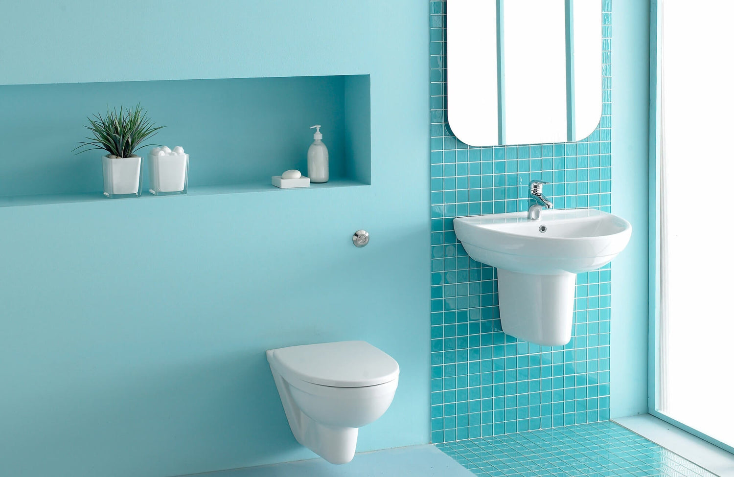
For those seeking calm and clarity, light blue, linked to sky and water, is known for its restorative qualities. In color psychology, it promotes tranquility, mental clarity, and a sense of cleanliness, making it an ideal choice for bathrooms centered on relaxation and well-being.
Beyond mood, its high Light Reflectance Value (LRV) makes it particularly effective in smaller or dimly lit bathrooms, visually expanding the space and amplifying available light. Light blue tiles also pair beautifully with cool-toned neutrals like white, soft gray, or brushed nickel, reinforcing a spa-inspired aesthetic. Whether in ceramic, porcelain, or glass, this hue complements wellness-focused designs with both visual and functional appeal.
The Bold Statement of Dark Blue Tile
In contrast, dark blue brings depth, elegance, and a grounding quality to bathroom interiors. Often associated with stability and introspection, it draws visual cues from ocean depths and twilight skies, ideal for creating a moody, immersive environment.
Thanks to its lower LRV, dark blue absorbs more light, allowing it to add drama and definition when applied selectively to feature walls or floors. It’s especially effective in matte or textured finishes and pairs well with warm metallics and natural materials, delivering a high-contrast, luxurious look. A prime example is Edward Martin’s Olivia 4x16 Glossy Ceramic Tile in Dusty Blue, as displayed in the photo above. It features rich, tonal variation and a reflective surface that elevates the space without overwhelming it, while its elongated format and subtle glaze create a striking, yet refined focal point.
Ultimately, for homeowners drawn to privacy, sophistication, or boutique-style design, dark blue tile offers an emotionally resonant and visually bold solution, especially in larger bathrooms where its intensity can be fully appreciated.

Practical Considerations for Tile Selection
Beyond color and style, practical factors like upkeep and lighting can make or break your tile choice. Understanding how blue tiles perform over time, and how they look under different lighting conditions can help you avoid surprises after installation.
Maintenance and Durability of Blue Tiles
To start, blue tiles are available in ceramic, porcelain, and glass, each offering varying degrees of porosity, durability, and moisture resistance. Porcelain, being denser and vitrified, is particularly suited for wet areas like showers and tub surrounds. Meanwhile, ceramic, though slightly more porous, remains a durable and cost-effective solution for walls and low-activity floors when properly glazed.
Additionally, tile finish significantly impacts maintenance requirements. Glossy surfaces, often found in lighter shades of blue, are easier to wipe clean but may pose a slipping hazard on floors. In contrast, matte and textured finishes, commonly used for darker tiles, provide better traction but may require more maintenance to combat soap scum and mineral buildup. Grout selection also matters: light grout tends to show stains more easily, while darker grout, though better at concealing discoloration, can fade without proper sealing.
Over time, exposure to UV light can cause fading in certain pigments, especially in budget-friendly or sun-drenched installations. To mitigate this, selecting color-bodied or through-body tiles helps maintain visual integrity, as color extends through the tile rather than just the surface. As a rule of thumb, always follow the manufacturer’s care instructions to preserve longevity and appearance.
Lighting and Its Impact on Blue Hues
Equally important to durability is how lighting influences tile color. Natural daylight brings out undertones, cool northern light enhances crispness, while warm southern exposure can soften or mute blues. For this reason, it’s vital to evaluate tile samples in the actual lighting conditions of your bathroom.
Artificial light also adds another layer of complexity. LEDs rated 5000K or higher highlight cool hues clearly, while warm-toned bulbs (2700K–3000K) may distort blues, especially darker tones. Additionally, recessed lighting provides general illumination but may cast shadows that obscure tile texture, whereas sconces or under-cabinet fixtures are ideal for emphasizing surface detail.
Lastly, the tile’s surface finish affects how light is absorbed or reflected. Glossy light blue tiles intensify brightness but can create glare under direct light. On the other hand, matte or satin finishes diffuse light more softly, enhancing comfort and visual calm. One standout example is Edward Martin’s Jaden 2.5x16 Glossy Ceramic Tile in Navy, which responds beautifully to ambient lighting. Its glossy glaze also enriches the tile’s depth and tonal variation. In short, thoughtful lighting design ensures your chosen tile performs well not only in daylight but in daily use.

Design Versatility and Aesthetic Considerations
When it comes to bathroom design, the right shade of blue can do more than just look good; it sets the tone for the entire space. By selecting wisely, you can create a bathroom that feels cohesive, expressive, and tailored to your unique style. To that end, understanding how each hue fits within various design aesthetics is key.
Pairing Light Blue Tiles with Bathroom Styles
For example, coastal designs benefit from pale blue tiles paired with whitewashed wood and nautical accents, reinforcing spa-inspired bathrooms. Meanwhile, in Scandinavian interiors, matte light blue tiles complement minimalist cabinetry and neutral finishes, softening the starkness of white-on-white palettes. Transitional bathrooms also make use of oversized or subtly textured light blue tiles to bridge classic and modern elements while maintaining a soothing, neutral palette.
A perfect illustration of this adaptability is Edward Martin’s Miley 4.5x9.1 Glossy Porcelain Tile in Ice, which features a delicate blue tone and vertical striation that subtly reflects light. As shown in the photo above, it enhances curves and surface movement, pairing beautifully with brass and wood finishes to evoke a serene, spa-like quality.
Additionally, glass tiles in shades like aquamarine or powder blue can introduce a reflective, ethereal layer. Used in niches, backsplashes, or accent walls, they also pair well with natural materials like bamboo or pebble tile, enhancing the sensory atmosphere with a clean and refreshing feel.
Integrating Dark Blue Tiles into Bathroom Aesthetics
In contrast, dark blue tiles bring drama, depth, and sophistication to modern, Art Deco, industrial, and luxury spaces. Shades like navy, indigo, or sapphire serve as bold visual anchors, especially effective in large-format layouts or when used to create striking contrast.
In contemporary settings, large-format dark blue tiles make a minimalist yet impactful statement behind freestanding tubs or in walk-in showers. Art Deco styles benefit from dark blue backdrops adorned with geometric motifs and metallic accents. Similarly, industrial designs can make use of matte navy tiles to add texture and mood, especially when paired with raw finishes like concrete or reclaimed wood.
Beyond their structural role, dark blue tiles also function as luxe accents in boutique-style spaces. Used selectively, such as behind a vanity or across a statement floor, they pair effortlessly with high-gloss marble, floating vanities, and integrated lighting. Their depth provides visual richness while allowing lighter elements to shine.
Ultimately, whether contrasted with white and brass or softened by wood and stone, dark blue tiles offer enduring character. Their ability to move fluidly between classic and contemporary aesthetics makes them a compelling and versatile choice for design-forward bathrooms.

Resale Value and Long-Term Appeal
While personal taste certainly influences bathroom design, it's equally important to consider how your tile choices might resonate with future buyers. In many cases, color selection can influence both perceived value and marketability, whether you’re aiming for broad appeal or something more distinctive.
Broad Market Appeal of Light Blue
For homeowners seeking wide appeal, light blue tiles consistently rank high in resale performance. In real estate staging and color psychology, they’re often viewed as a “safe” choice, neutral enough to attract a broad audience, yet distinctive enough to stand out. Their soft, cool tones also convey cleanliness, calmness, and hygiene, attributes that strongly influence buyer impressions of a bathroom’s condition.
Additionally, this shade performs especially well in warmer climates, where light-reflective surfaces and cooler palettes help create a refreshing, open feel. From a resale standpoint, light blue contributes to what real estate professionals often refer to as “move-in ready appeal.” These tiles blend seamlessly with various design styles and are less likely to prompt renovation, which enhances buyer confidence and perceived value.
Supporting color trends, a Zillow Paint Color Analysis revealed that homes with pale blue bathrooms sold for significantly more than expected. While the study focused on paint, the same principles apply, perhaps even more so, with tile, a permanent and value-adding material.
Ultimately, for sellers planning ahead by five to ten years, light blue tiles offer lasting appeal that aligns with ongoing design trends centered on wellness, simplicity, and universal taste.
Niche Appeal and Statement of Dark Blue
By contrast, dark blue tiles make a stronger, more defined statement. They often appeal to design-conscious buyers who value sophistication and individuality. This boldness can be a major asset, particularly in urban or upscale markets where custom features are highly valued.
However, this specificity may reduce mass appeal. In more conservative regions, dark blue might be seen as a stylistic risk, especially if used extensively. Because of this, strategic restraint is essential: using dark blue as an accent or focal point helps maintain balance while preserving visual impact.
For instance, Edward Martin’s Lilah 6x6 Glossy Ceramic Tile in Marine delivers moody color and irregular texture without overwhelming the space. As featured in the picture above, its compact size makes it ideal for feature walls or shower niches, and it pairs beautifully with soft woods and warm metals to create contrast with elegance.
To support decision-making, the Edward Martin Augmented Reality (AR) Visualization Tool allows users to preview tile placement in real time. Combined with physical samples, this feature helps homeowners confidently assess layout, lighting, and material harmony before committing.
In the end, while dark blue may not match the mass-market appeal of lighter hues, its sustained popularity in boutique and luxury design underscores its long-term value. For those prioritizing bold design with the right planning tools in hand, it offers a distinctive edge in resale potential.

Mixing and Matching Blue Tones
Blending light and dark blue tiles adds visual depth and character to a bathroom when done with intention. Used thoughtfully, the contrast between shades can emphasize architectural features and enhance spatial flow, especially when grounded in value contrast, or the difference in lightness between hues.
To achieve this effect, one popular method is to use light blue on walls or upper surfaces and introduce darker tones on floors or behind vanities. This creates visual balance and mimics natural gradients, like the transition from sky to sea. Alternatively, vertical striping or color blocking with alternating shades can elongate walls or draw attention to recessed elements such as niches or shelving.
Beyond placement, material and finish significantly influence tonal contrast. Glossy light blue glass tiles can be paired with matte navy porcelain for a compelling mix of sheen and texture. Contrasting shapes, such as elongated subway tiles set against hexagonal floors, further enhance rhythm and variation. A standout example is Edward Martin’s Miley 4.5x9.1 Glossy Porcelain Tile in Indigo, which features deep striations and a rich blue glaze. As shown in the photo above, it delivers tonal depth and sleek vertical movement that anchors the space with modern elegance.
At this stage, it’s important to address undertones. Whether you lean warm (like cerulean) or cool (like slate), mixed blues should reside in the same temperature family to avoid visual discord. To ensure compatibility, always test swatches in the room’s actual lighting to confirm they appear unified.
To complete the look, don’t overlook accent details. Coordinating grout colors, metallic finishes, or natural elements like warm wood or white quartz can help bridge tonal shifts and reinforce the overall palette with subtle sophistication.
In the end, mixing blues allows you to layer tone, texture, and emotion, telling a story that is both expressive and curated. When executed with care, this approach brings balance, energy, and design cohesion to bathrooms across a variety of styles.
Choosing the Right Blue for Your Bathroom
Hence, choosing between light and dark blue tile comes down to how you want your bathroom to feel and function. Light blue enhances brightness and openness, while dark blue offers contrast, richness, and grounding. Each has its own strengths, and when paired with the right layout and materials, either can transform your space into something truly timeless and personal.
To carry that vision forward, Edward Martin offers a collection of expertly curated tiles and design resources that simplify the selection process. With an emphasis on quality, tone harmony, and long-term performance, every detail is crafted to help you make thoughtful choices with lasting results!
