


Choosing the perfect bathroom vanity color often presents a design challenge for homeowners: should it boldly contrast the walls or blend in seamlessly? While this may seem like a purely aesthetic decision, it has a significant impact on the room’s spatial feel, lighting dynamics, and overall mood. The relationship between vanity wall color and the surrounding space can make a small area feel larger, set the tone for the design style, and influence how practical and user-friendly the bathroom feels.
This article explores how to determine whether a bathroom vanity should be lighter or darker than the walls. We'll examine the principles of color perception, the role of lighting, material finishes, and design goals to help you choose confidently.

The Color Relationships in Bathroom Design
Designing a bathroom requires thoughtful color planning, especially since the space is often compact and heavily influenced by lighting. Understanding how color contrast and continuity work sets the foundation for smart vanity and wall pairings.
Contrast Versus Continuity
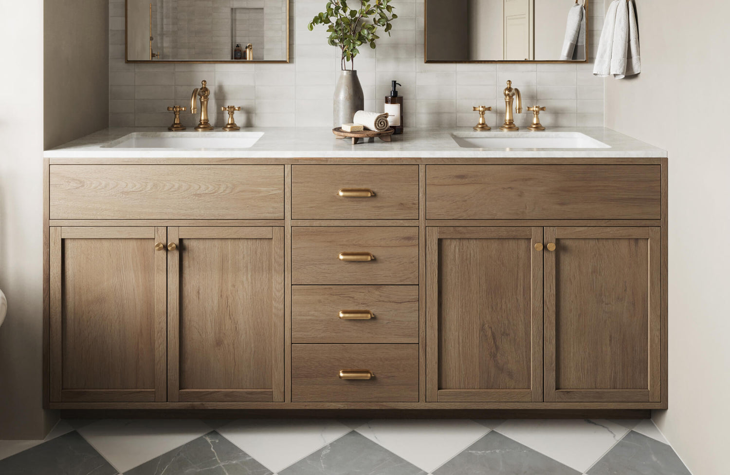
Choosing between contrast and harmony is a key step in vanity selection. A darker vanity against light-colored walls, or vice versa, creates a visually distinct focal point. This strategy adds depth and highlights the vanity as a design element. The Sasha 60" Double Vanity in Mid Century Walnut with 3 cm White Zeus Quartz Top from Edward Martin, featured in the image above, demonstrates this perfectly—its rich walnut tone stands out beautifully against soft neutral backdrops, making it a centerpiece that balances timeless style with modern flair. On the other hand, selecting similar tones between walls and vanity creates a smooth, flowing appearance that can visually expand the space. This approach favors calm, spa-like aesthetics with a focus on serenity and cohesion.
The Role of Lighting in Perception
Lighting plays a major role in how vanity and wall colors appear in real life. Natural light generally brings out true tones, while artificial light can alter color temperature significantly.
In bright, naturally lit bathrooms, both light and dark vanities can appear softer and more balanced. Conversely, artificial lighting, especially in windowless spaces, can shift colors noticeably. Warm-toned lights tend to enhance warm shades and dull cooler ones, while cool-toned lighting can do the opposite.
Finish matters also. Glossy surfaces reflect more light and may appear brighter or even cause glare, while matte finishes absorb light, making colors look deeper. These effects are especially noticeable in smaller bathrooms, where lighting is often limited or directional.
Color Psychology in Small Spaces
In small bathrooms, the psychological effect of color becomes more pronounced. Lighter tones reflect more light, making walls appear farther apart and helping the room feel larger. A light vanity can support this sense of openness, especially when paired with light-colored walls. Darker tones absorb light and tend to feel heavier. While they can add richness and character, using too much dark color in a small space may make it feel confined. However, a dark vanity can still work well if balanced with lighter walls, reflective finishes, or bright accents.

Other Design Factors That Influence Vanity Color
While color contrast is important, other factors such as material, finish, countertops, flooring, and fixtures all affect how a vanity color will look and feel in your bathroom.
Cabinet Material and Finish
A vanity’s material and surface finish can significantly influence how its color is perceived. Wood tones with visible grain add warmth and texture, often softening the look of darker colors. Glossy finishes reflect light, making vanities appear brighter and less heavy, while matte finishes absorb light, giving a deeper, more grounded feel. Considering how these finishes interact with your bathroom’s lighting is essential in determining whether the vanity will visually read as light, dark, or somewhere in between.
Sink and Countertop Color
The sink and countertop play a key role in shaping the overall look of the vanity. A white or light countertop can brighten a dark vanity, creating contrast that softens its appearance and helps it blend more seamlessly with the room. Conversely, a darker countertop on a light vanity adds definition and balance, giving the piece more visual weight. Striking the right balance between these elements ensures the vanity feels cohesive within the space, neither too stark nor overly heavy.
Flooring and Fixtures
The flooring provides the foundation for your bathroom's design and should always be considered in your vanity decision. Light flooring helps brighten the room and balance darker vanities. Dark flooring, when paired with a dark vanity, can create a dramatic effect, but too many dark surfaces may overwhelm the space. Fixture finishes such as chrome, brushed nickel, or brass also play supporting roles. Reflective finishes like chrome enhance brightness, while warm metals like brass add softness and warmth that complement both light and dark cabinetry. All these elements must harmonize to achieve the desired balance and aesthetic cohesion in your bathroom.

When to Choose a Lighter Vanity Than the Walls
Choosing a vanity that is lighter than the walls can help brighten and visually expand a space, especially in smaller or dimly lit bathrooms.
Brightening Small or Dim Bathrooms
Light-colored vanities reflect more light, which can help open up compact spaces or bathrooms that lack natural light. Against slightly darker walls, a white or cream vanity can make the room feel more spacious and breathable. This is a practical and effective strategy for powder rooms or bathrooms with minimal windows.
Creating a Clean and Minimalist Look
Lighter vanities also work well in minimalist or Scandinavian-inspired bathrooms. When paired with white, off-white, or pastel walls, they contribute to a clean, calming look. The continuity between wall and vanity reduces visual clutter, creating a serene, modern feel where fixtures and accessories can stand out subtly. A great example is our Bridgette 36" Single Vanity in Bright White with 3 cm White Zeus Quartz Top, as seen above. Its crisp tone and refined silhouette embody minimalist elegance, allowing the surrounding elements to breathe while keeping the space light and airy.
Balancing Bold Wall Colors
If your bathroom features bold paint, wallpaper, or dramatic tile, a lighter vanity provides needed contrast without adding visual weight. For example, white or pale wood tones can balance out navy walls, emerald tiles, or intricate wallpaper, preventing the space from feeling too busy. This helps showcase bold elements while maintaining visual balance.

When to Choose a Darker Vanity Than the Walls
Darker vanities bring a sense of depth and structure to a space. They are particularly effective when used to contrast lighter wall colors or when defining specific zones in larger layouts.
Creating Depth and Sophistication
Dark vanity tones, such as rich espresso, deep navy, or sleek matte black, offer a striking contrast against light or neutral walls. This adds visual richness and turns the vanity into a focal point, especially in modern, industrial, or transitional designs. A perfect example is our Josephine 48" Single Vanity in Satin Drifted Black Veneer with Carrara Marble Top as seen above, which balances moody depth with elegant texture. Its dark oak finish paired with crisp marble introduces a timeless contrast that grounds the space without overpowering it, echoing the classic sophistication seen in the design above.
Defining Zones in Open or Large Bathrooms
In spacious bathrooms, dark vanities can help break up the space visually. They create contrast that delineates the vanity area from the rest of the layout, such as a tub or shower zone. This provides structure and ensures the room feels curated rather than empty.
Complementing Light and Neutral Wall Palettes
Pairing a dark vanity with neutral wall tones like beige, off-white, or pale gray is a classic way to add contrast and depth without relying on bold color. The vanity acts as a visual anchor, standing out against light walls while maintaining a sense of openness. This contrast adds sophistication and structure, making it especially effective in transitional and modern spaces. It also pairs well with a variety of fixture finishes, from chrome to brass, and works particularly well in larger layouts where the richness of a dark vanity enhances the overall design without overwhelming the room.

Popular Color Combinations and Design Themes
Some vanity and wall color combinations have become timeless favorites for a reason. Here are a few pairings that consistently create visually appealing, balanced results.
Classic White Walls with Navy or Black Vanities
Pairing classic white walls with a navy or black vanity creates a clean, high-contrast look that brings sophistication to any bathroom. The white walls enhance brightness and openness, while the dark vanity serves as a striking focal point. This combination works well in both small and large spaces, maintaining an airy feel without sacrificing visual weight. It’s a versatile choice that complements modern, transitional, and industrial styles, and it also pairs beautifully with a variety of hardware finishes, from polished chrome to matte black or brass.
Beige or Warm Greige Walls with Wood-Tone Vanities
Pairing beige or warm greige walls with wood-tone vanities creates a naturally warm and inviting bathroom. The soft neutrality of the walls offers a calming foundation, while wood tones introduce organic texture and warmth. A vanity like our Abigail 60" Single Vanity in Light Natural Oak with 3 cm White Zeus Quartz Top, shown in the photo above, embodies this balance perfectly—its light oak finish brightens the room while maintaining a grounded, earthy presence. This combination thrives in farmhouse, Scandinavian, and rustic-inspired spaces where subtle comfort and timeless style are essential.
Soft Pastel Walls with Off-White or Taupe Vanities
For a soft and tranquil bathroom atmosphere, pairing pastel walls with an off-white or taupe vanity creates a gentle, cohesive look. This light-on-light combination brings an airy, calming quality to the space, making it ideal for bathrooms designed as serene retreats. It works especially well in traditional or coastal-inspired interiors, where subtle color palettes and relaxed elegance are key. The result is a refined, soothing environment that feels fresh, balanced, and inviting.
Finding Your Room's Perfect Balance
Deciding whether a vanity should be lighter or darker than the walls depends on your space, lighting, and style goals. Lighter vanities excel in smaller bathrooms, minimalist aesthetics, and rooms with bold wall treatments. Darker vanities offer contrast and luxury, particularly in larger layouts or when paired with soft, neutral walls.
The most effective approach is to consider the entire room, material finishes, lighting, layout, and the overall visual weight of each element. Exploring options through swatches, digital mockups, or guided advice can bring clarity to your design direction. If you’d like expert insight tailored to your space, our design consultation services are a great place to start. And if you have specific questions or need personalized recommendations, feel free to contact us directly—we're here to help bring your vision to life.