


Once considered a bold, unconventional choice, the blue backsplash has quietly become a standout feature in modern interiors. Its ability to evoke emotion, deliver striking visual impact, and adapt to a range of styles has helped it rise above fleeting color trends. From tranquil sky blues to rich navies, blue also offers a remarkable spectrum that can transform a space while remaining grounded in tradition and functionality.
But what truly sets blue apart is how seamlessly it merges beauty with meaning. It draws from centuries of cultural symbolism, responds to your emotional environment, and thrives within both minimalist and ornate settings. Whether you favor cutting-edge tile technology or value its classic aesthetic roots, the blue backsplash continues to prove that it's not just a style choice—it's a lasting design investment.

Cultural and Historical Influence of Blue in Design
Understanding blue's rich cultural and historical significance reveals why it continues to hold such an esteemed place in interior design. Its journey from rare pigment to common design element spans civilizations, centuries, and artistic movements, each adding to its visual and emotional power.
Blue as a Symbol Across Civilizations
In ancient civilizations, blue was far more than a color. It was a symbol of the divine, the eternal, and the transcendent. Ancient Egyptians used lapis lazuli in tombs and ornaments, believing it connected the physical world to the spiritual realm. Its rarity and deep celestial hue also made it a marker of status and sacredness. In the Islamic world, blue tiles dominated mosque walls and domes, reflecting the infinite sky and guiding contemplation. These were not arbitrary choices but deeply intentional, tapping into blue’s psychological and spiritual resonance.
As blue traveled across continents, it adapted yet retained its reverence. Chinese artisans crafted porcelain adorned with cobalt blue, a color that came to represent clarity and imperial authority. In medieval Christian Europe, the color also became synonymous with purity and was used in stained glass windows and religious paintings to honor the Virgin Mary. Whether in architecture, textiles, or ceramics, blue repeatedly emerged as a color loaded with meaning. When you incorporate blue today, you're drawing on a visual language shaped by centuries of symbolism, one that subtly communicates trust, depth, and tradition.
How Blue Has Evolved in Interior Style
Throughout history, the use of blue in interior design has shifted with prevailing tastes and societal values. In the Victorian era, rich navy and deep indigo adorned drawing rooms and studies, signaling a sense of formality and affluence. Blue was also used not for brightness but for mood, such as dark, grounded, and reflective. Transitioning into the 1920s and 30s, the Art Deco period gave blue a dramatic flair. Peacock and sapphire tones were paired with polished brass and mirrored surfaces, exuding modernity and opulence. These interiors reveled in their richness, making blue an anchor for visual indulgence.
As the 20th century moved forward, mid-century modern design softened blue’s impact. Pale aquas and soft teals emerged in suburban homes, often paired with clean lines and natural wood. This iteration of blue was also meant to soothe, not to impress, offering a counterbalance to an increasingly industrial world. Each of these aesthetic evolutions, from ornate to minimal, demonstrates blue’s adaptability. As you create your own space, you inherit this legacy, choosing which chapter of blue’s visual history to echo and reinterpret.

Psychological Impact and Mood Dynamics
Blue’s endurance as a design choice also lies in its deep psychological influence. It evokes calm, trust, and clarity, traits that make it uniquely suited for lasting use in intimate spaces like the kitchen.
Blue’s Emotional Range and Interior Impact
Blue is a color deeply tied to emotion, and its power lies in its range. Lighter shades such as sky blue, powder blue, or misty gray-blue often evoke feelings of calm, clarity, and openness. These tones are also soothing to the nervous system, making them ideal for spaces where you seek relaxation or focus. In a kitchen, for instance, a pale blue backsplash can act like a breath of fresh air, expanding the sense of space and creating a serene backdrop for daily rituals. These hues are especially effective when you want your environment to feel light, uncluttered, and mentally refreshing.
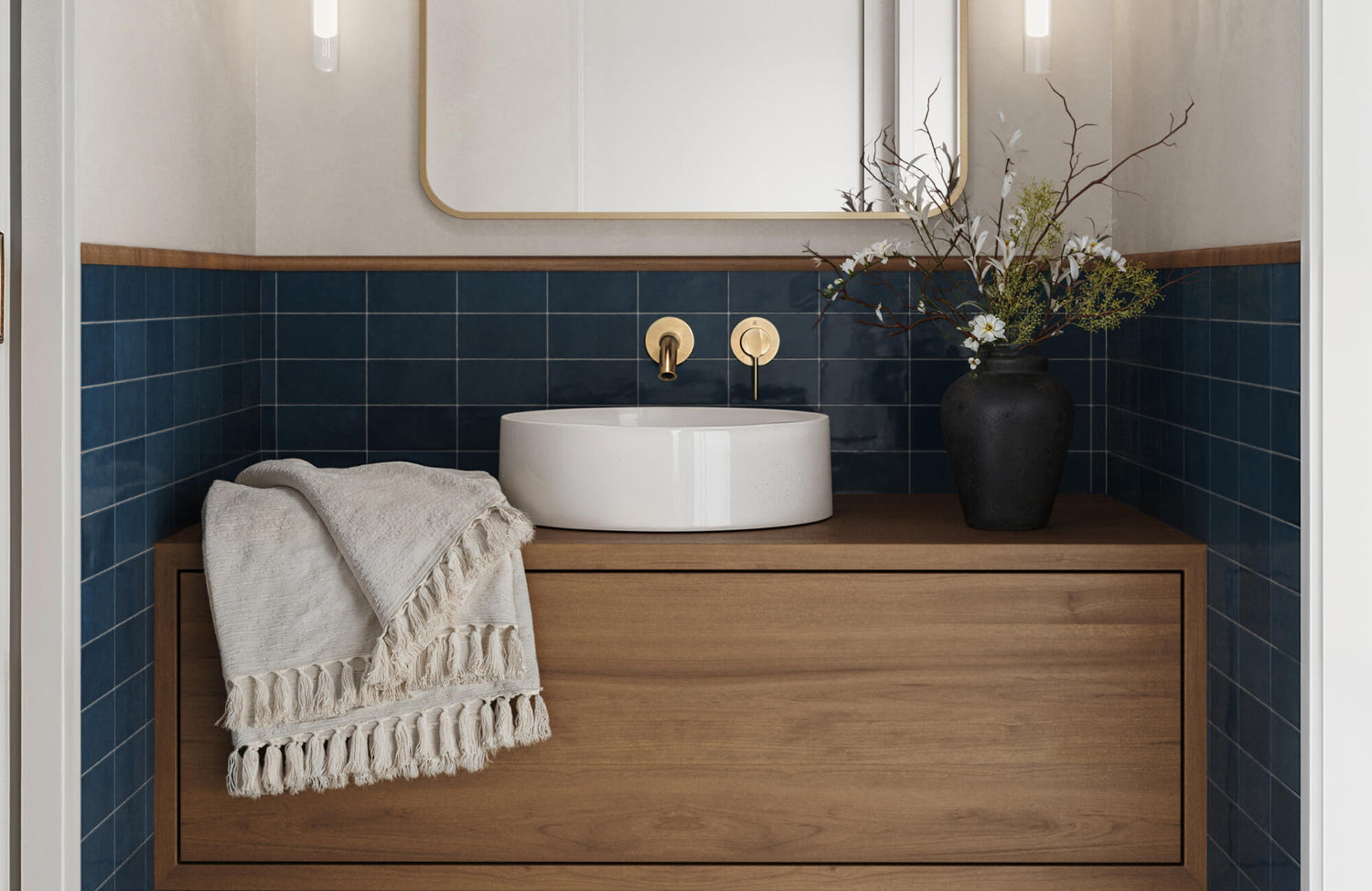
On the opposite end, darker blues like navy, ink, or indigo convey stability, depth, and quiet strength. These colors bring a sense of grounding to a room, adding emotional weight without overwhelming the senses. In the kitchen image shown above, the backsplash uses a deep, denim-toned matte tile to anchor the space while maintaining a soft, sophisticated presence. If you're drawn to this look, the Natasha 2x6 Matte Porcelain Tile in Denim captures the same rich tone commonly associated with classic denim blue, offering a versatile and timeless option for interiors that value both elegance and emotional depth.
Designing With Mood as a Priority
Design that prioritizes how a space feels, not just how it looks, tends to hold its value over time. Blue naturally supports this approach, drawing on powerful connections to the natural world. The calming effect of a clear sky or a still ocean is more than poetic—it’s biological. Blue tones have also been shown to reduce stress and promote a sense of stability, making them particularly effective in spaces where emotional clarity and comfort are essential. This is where blue intersects beautifully with biophilic design, a philosophy that emphasizes nature-inspired interiors to enhance well-being and foster calm.
By centering mood in your design decisions, you create a space that feels purposeful and enduring. A blue backsplash, for example, can be more than an aesthetic feature; it becomes part of the room’s emotional architecture. If you're looking to create this kind of soothing yet elevated atmosphere, the Polly 3x10 Glossy Ceramic Tile in Blue is a fitting choice. With its luminous finish and rich, oceanic tone, this tile reflects light softly while reinforcing a mood of calm sophistication. It also supports your everyday rhythm, offering a visual breath of calm whether you’re rushing through a busy morning or winding down after a long day. Unlike trend-driven colors that can lose their appeal with changing fads, blue resonates deeply and consistently. Additionally, it adapts without needing to compete, and it stays relevant by meeting a timeless human need: the desire to feel at ease in your surroundings.

Versatility Across Design Styles
Blue’s ability to harmonize with a wide range of design styles strengthens its timeless reputation. Whether used in a minimalist home or a colorful, eclectic space, blue backsplashes can adapt without losing their character.
Minimalist and Scandinavian Aesthetics
Minimalist and Scandinavian interiors thrive on simplicity, where every design element must serve a purpose visually, emotionally, or functionally. Within these calm and uncluttered spaces, blue can act as a quiet accent that gently shapes the room’s atmosphere. Soft tones like dusty slate or powder blue, for example, also offer just enough presence to create contrast, yet they do so without disrupting the overall tranquility. A matte-finished blue backsplash, in particular, blends seamlessly into a palette of white walls, pale woods, and natural light, adding subtle richness without breaking the sense of order. The result is a space that feels clean but never cold, simple but never bland.
Blue works especially well in this design language because it evokes serenity while still offering a visual character. Handmade or softly textured tiles also bring in a layer of organic imperfection that complements the Scandinavian embrace of hygge, the idea of comfort, coziness, and authenticity. Instead of overpowering the room, these blue elements act as quiet contributors to its warmth. Moreover, they give the eye a place to rest and the mind a sense of ease. When you allow blue to blend with restraint and purpose, it becomes not just a color choice but a tonal anchor that completes the aesthetic harmony of the space.
If you want to see how these tones and textures might work in your own space, our augmented reality (AR) tool now makes it easy to visualize tile choices in real time. By previewing how a blue backsplash interacts with your lighting, cabinetry, and layout, you can design with greater confidence and clarity.
Traditional and Classic Design Frameworks
In traditional interiors, where symmetry, craftsmanship, and timeless detail take center stage, blue becomes a natural complement. Rich tones like navy, royal, or cobalt introduce a sense of formality that enhances the refined elements typical in classic kitchens. As a result, features such as crown molding, raised-panel cabinetry, or a carved range hood stand out even more when paired with the right shade of blue.
Additionally, incorporating a deep blue backsplash provides just the right amount of contrast to highlight these architectural details. A beveled subway tile or glossy ceramic in a bold blue hue not only reflects light but also reinforces the structured beauty of the space. Altogether, it creates a look that feels both anchored and enduring, bringing a timeless sense of elegance to the room.
For a more tailored approach to traditional design, a geometric format in a saturated tone can add interest while remaining true to the space’s classic roots. Edward Martin’s Reagan 5x6 Matte Porcelain Hexagon Tile in Navy does exactly that, offering a rich navy blue color in a classic hex shape that subtly nods to heritage tilework. Its matte finish also softens the depth of the hue, allowing it to enhance a room without overpowering it. When paired with materials such as marble countertops, soapstone surfaces, or unlacquered brass fixtures, this color becomes an enhancer rather than a disruptor. Moreover, it speaks the same design language, which is luxurious, timeless, and considered.
Eclectic and Bohemian Spaces
Eclectic and bohemian interiors are known for their freedom, creativity, and global influences, qualities that align perfectly with the expressive nature of blue. In these spaces, blue steps confidently into the spotlight, no longer reserved for subtle accents but celebrated for its vibrancy and depth. Tiles in hues like turquoise, ocean blue, or rich indigo often appear in striking forms, such as Moroccan zellige, Talavera patterns, or hand-painted Spanish ceramics. These elements also tell stories, carry cultural roots, and add an unmistakable soul to the room. A blue backsplash in this context becomes more than just a backdrop; it transforms into a visual centerpiece that invites curiosity and emotion.
The bathroom photo shown above exemplifies how bold blue can define a space with both energy and elegance. If you're looking to create a similarly vibrant statement, the Mikayla 5x5 Glossy Ceramic Tile in Cerulean delivers that rich, ocean-inspired blue with a glossy finish that reflects light and movement. What allows these vivid blues to thrive in such layered settings is a thoughtful approach to contrast. Although the backsplash may be bold and highly detailed, the surrounding materials give it space to breathe. Flat-panel cabinetry, neutral countertops, and minimalist shelving offer a clean canvas that helps the intricate tiles stand out without causing visual chaos.

Design Trends and Innovation in Tile Technology
Modern manufacturing has made it possible for blue backsplashes to not only look beautiful but also perform well over time. These advances ensure that blue isn’t just timeless in theory, but in practice, too.
Smarter Glazes for Longer-Lasting Color
Advancements in tile technology have transformed the performance of blue backsplashes, especially in busy areas like kitchens. UV-resistant glazes now protect against fading from natural light, allowing even bold or delicate blue shades to maintain their vibrancy over time. These innovations also ensure that your backsplash remains visually striking, whether it’s installed under a sunlit window or across an entire feature wall.
A standout example of this innovation is the Maisie 2.5x16 Glossy Ceramic Tile in Ocean, which pairs a vivid ocean-blue tone with a sleek, light-reflective surface. Its non-porous glaze resists stains, scratches, and daily wear, making it ideal for busy environments. These improvements not only simplify maintenance but also allow you to choose a blue backsplash confidently, knowing it will deliver both style and long-term durability.
Shape and Pattern as Modern Design Tools
Although the color blue brings emotion and personality to a backsplash, the shape and layout of the tile are what truly give it movement and modern relevance. Gone are the days when square or basic horizontal subway tiles were the default. Today’s design landscape embraces unexpected geometry such as scallops that echo the curves of waves, chevrons that add a sense of direction, and hexagons that bring an architectural edge. These shapes also introduce rhythm and depth, allowing blue to feel lively and contemporary even when using a classic shade. For example, a steel blue hex tile can shift an otherwise traditional kitchen into a fresh, eye-catching centerpiece simply through its shape.
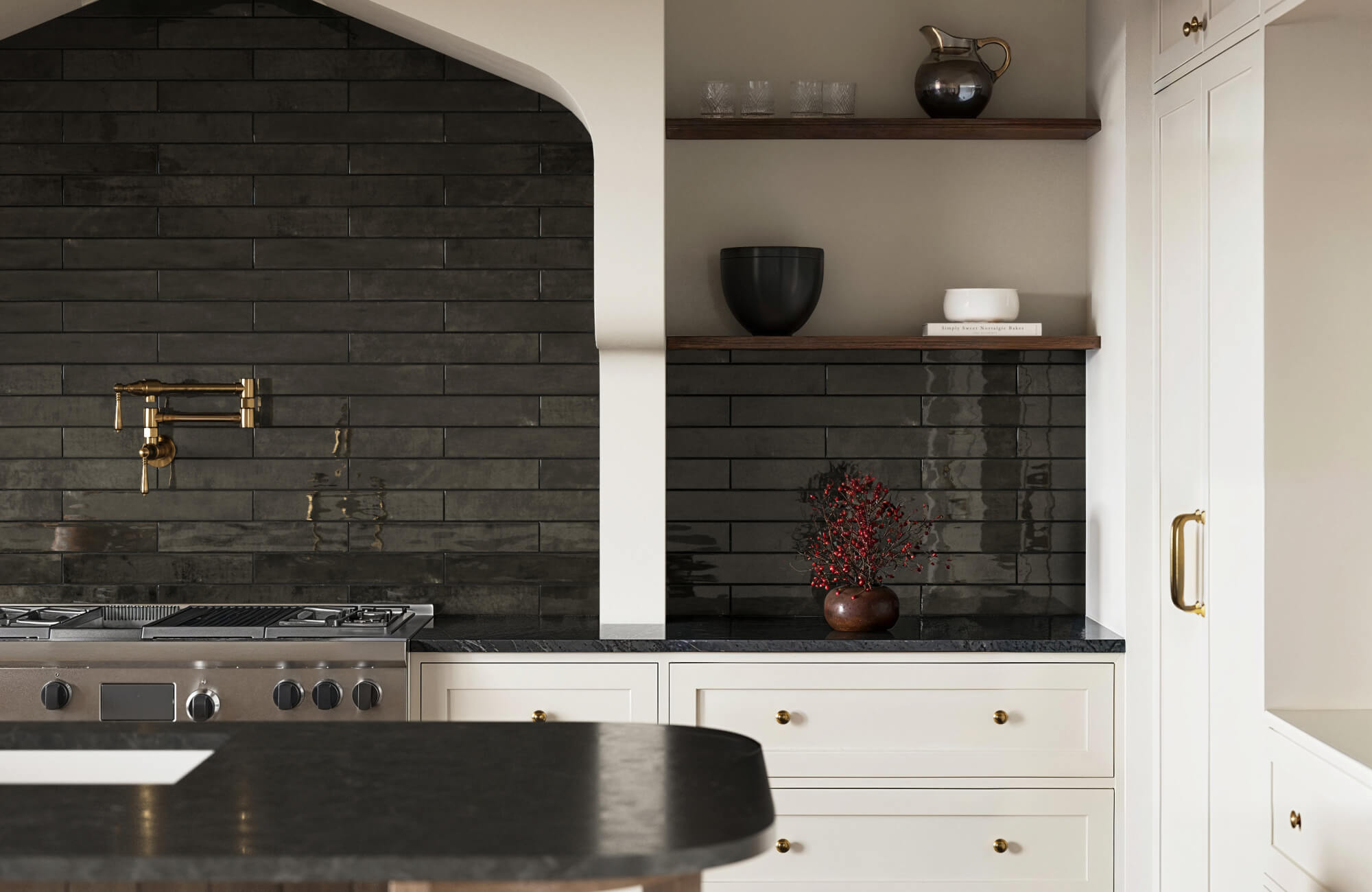
Among these innovations, the arabesque pattern stands out for its ability to bridge old-world elegance with modern expression. Edward Martin’s Jasmine 8x8 Arabesque Satin Porcelain Tile in Navy, as shown in the image above, exemplifies this blend beautifully. With its deep navy hue and curving silhouette, it creates a visual flow that feels ornate yet grounded. The satin finish also softens the overall effect, adding a quiet sophistication while enhancing the tile’s sculptural appeal.
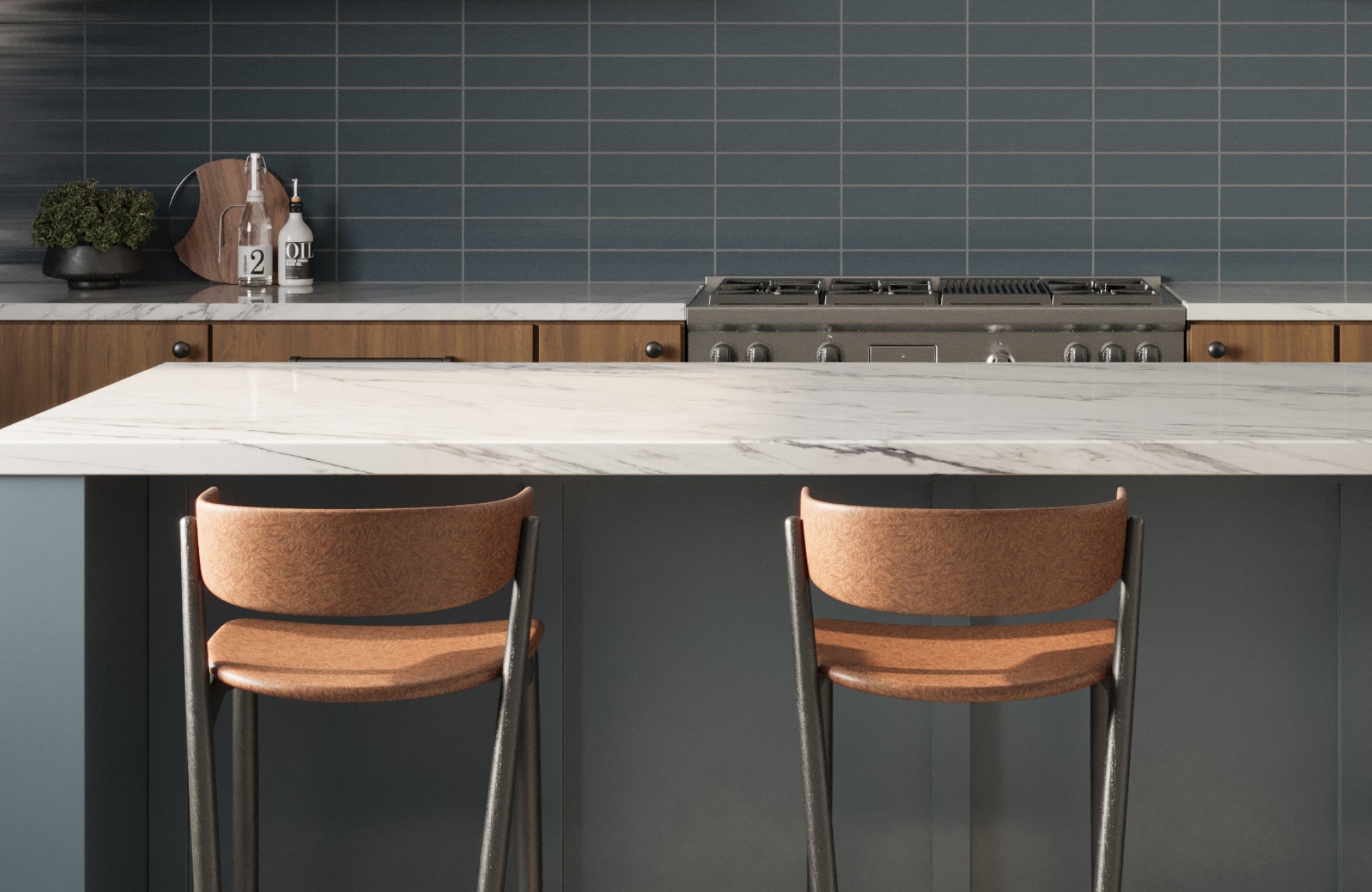
Even time-tested styles like the subway tile have found new energy through layout experimentation. Vertical stacking lends a clean, linear feel that elongates walls and adds height to the room. Meanwhile, herringbone patterns bring a sense of artistry and craftsmanship, especially when paired with a moody indigo or denim-toned tile. These layout choices allow you to play with visual flow and emphasis, all without needing to switch colors. By keeping the palette grounded in blue and shifting the form or pattern, you also achieve a balance of tradition and innovation, making your backsplash feel timeless but far from static. This adaptability is what makes shape and layout such valuable tools in keeping blue relevant across design eras.

Maintenance, Aging, and Practical Durability
Even a timeless color must perform day to day. Blue backsplashes, if thoughtfully selected, can be as practical as they are beautiful.
Managing Stains and Surface Maintenance
One of the often-overlooked strengths of darker blue tiles like navy, midnight, or cobalt is their ability to discreetly handle the realities of a busy kitchen. Grease splatters, smudges, and food stains don’t announce themselves as boldly on these hues, which means your backsplash can look presentable even on days when deep cleaning isn’t on the agenda. This built-in forgiveness also becomes especially valuable in busy areas behind stovetops or sinks. In contrast, while light blues bring a fresh, airy look, they can be less forgiving. Glossy finishes, in particular, tend to reflect light in a way that draws attention to every fingerprint or splash, which can quickly interrupt the sense of visual calm.
The tile’s finish, then, becomes a key factor in how effortlessly your backsplash maintains its appearance. Matte and satin finishes are especially helpful for camouflaging minor messes, as they diffuse light and reduce glare, softening the visual texture of the space. But just as important is your grout choice. White grout may look pristine when first installed, but in a kitchen, it can quickly darken or yellow from exposure to moisture and cooking residue. Grout that closely matches your tile or leans into a complementary tone will age more gracefully, masking discoloration and reducing the need for constant maintenance. Together, the right blue shade, finish, and grout combination allow your backsplash to hold its beauty with less effort, keeping your kitchen looking clean, composed, and well cared for.
Preserving Color and Preventing Fading
A backsplash that receives generous natural light can instantly brighten a kitchen, making the space feel more open and inviting. However, this same sunlight can take a toll on certain materials, causing colors to fade and finishes to lose their vibrancy. Fortunately, advances in tile manufacturing have made it possible to enjoy both sunlit interiors and long-lasting color. Many modern blue tiles now feature UV-resistant glazes specifically designed to protect against prolonged light exposure. Whether you're working with a deep indigo or a crisp cerulean, these innovations also ensure your chosen hue remains bold and consistent for years, even in south-facing kitchens or spaces with large windows.
Still, maintaining that original richness isn’t just about the product itself. It also hinges on how you care for it. Over time, abrasive cleaners or acidic solutions can erode protective coatings, dulling the surface and diminishing the color’s depth. To avoid this, it’s best to stick with gentle, manufacturer-approved pH-balanced products made for glazed tiles. These maintain the integrity of both the finish and the underlying pigment.

Market and Resale Considerations
Blue backsplashes offer more than just aesthetic charm—they significantly enhance a space's appeal in the real estate market. Their visual magnetism captures attention in listings, with rich shades like navy conveying elegance and lighter tones like powder blue evoking freshness and care. This subtle emotional and visual impact also helps buyers see the space as thoughtfully designed and well-maintained. In a sea of neutral interiors, the right shade of blue serves as a memorable focal point that elevates the perceived quality of the entire space.
Beyond photography, blue functions as a strategic differentiator, especially in markets saturated with safe, monochromatic palettes. Neutral-adjacent tones like denim or slate blend easily into various design styles while still adding personality. Whether your space leans modern, transitional, or traditional, a blue backsplash introduces a timeless contrast that’s both classic and current. This ability to feel curated yet approachable can also make the difference between a forgettable walkthrough and a lasting impression on potential buyers.
Why Blue Continues to Endure
Blue backsplashes have demonstrated a rare ability to withstand the test of time by balancing deep cultural heritage with practical modern-day appeal. They not only reflect centuries of symbolic significance but also evolve effortlessly alongside shifting trends, materials, and lifestyles. With emotional resonance, stylistic flexibility, and strong resale performance, blue remains both a safe and expressive option for your space. It adapts when needed, captivates when wanted, and performs when expected, making it not just timeless but truly enduring.
To explore how blue can work in your own space, seeing it firsthand is essential. Because of that, requesting samples from Edward Martin is a smart next step. Sampling allows you to experience the color’s depth, texture, and interaction with light in your actual environment, something digital images simply can’t capture. Whether you’re pairing blue with warm woods, cool metals, or natural stone, having a physical sample in hand also ensures that your design decisions feel intentional, grounded, and uniquely yours.