Dark and moody kitchens have become a defining aesthetic in contemporary home design, blending understated luxury with a sense of intimacy and character. Yet the question that matters most is whether slate is truly suited for a kitchen environment where stains, splashes, oils, and cleaning routines are part of everyday life.
Slate can be stunning, but it is not without considerations, which is why many homeowners also explore slate-look porcelain as an alternative that replicates the style with fewer maintenance responsibilities. This guide walks through slate’s visual advantages, and by the end, you will have a clear sense of whether slate’s authenticity outweighs the upkeep, or whether an engineered counterpart provides the same aesthetic with greater long-term ease.

The Undeniable Aesthetic Appeal Of Natural Slate
Slate’s visual presence is often what first draws homeowners to consider it for a dark and moody kitchen, offering a richness and depth that few materials can match. Its texture, tonal variation, and organic character create an atmosphere that feels both grounded and sophisticated. Understanding these aesthetic strengths is the key to appreciating why slate remains such a compelling choice.
The Drama of Natural Cleft Textures
One of the most captivating aspects of slate is the surface texture created by the stone’s natural clefting. This layered, slightly uneven finish interacts with light differently depending on the angle of the room, creating micro-shadows that give a dark backsplash a sculptural quality. In dimmer kitchens or those with directional lighting, the texture feels almost theatrical, allowing the backsplash to become a focal plane rather than a passive backdrop. The material’s inherent roughness signals authenticity and communicates that no two tiles are ever identical. For homeowners seeking a kitchen that looks curated rather than mass-produced, this tactile irregularity becomes a defining asset.
The clefted texture also offers a sense of depth that smooth tiles cannot imitate. Even in a pitch-black or charcoal colorway, the stone never reads as flat because the grooves give the surface a dynamic rhythm. This quality is particularly valuable in a dark and moody design where multiple shadows and layers keep the space feeling alive instead of heavy.
The "Living" Color of Natural Stone
Color variation is another reason slate earns admiration. Rather than presenting a uniform hue, slate behaves like a “living surface,” shifting subtly with natural light, artificial lighting, and even the time of day. What appears cool and blue-gray in the morning may deepen to charcoal or brown-inflected tones in the evening. This fluidity creates a sense of movement across the backsplash and keeps the palette visually engaging.
The mineral composition of slate means homeowners will encounter natural mottling, veining, or tonal shifts that feel rooted in geology rather than trend-driven design. This quality resonates with those who want a kitchen that feels grounded and connected to natural materials. While these variations enhance the moodiness of a dark palette, they also introduce complexity that makes the surface feel more nuanced than a single, static color.
The Authenticity of Organic Modern Design
Slate aligns seamlessly with the principles of organic modern design, which merges contemporary lines with raw, earthy materials. Its matte finish, irregular coloration, and unrefined texture pair beautifully with sleek cabinetry, minimalist fixtures, and modern hardware. The stone’s authenticity softens a streamlined space, creating balance between the organic and the architectural.
In a dark and moody kitchen, slate delivers an aesthetic that feels elevated without being flashy. It complements both mid-century silhouettes and rustic elements, offering the versatility that today’s homeowners appreciate. The stone’s presence signals permanence, craftsmanship, and a connection to timeless materials that have been used in homes for centuries.

The Superior Alternative: Slate-Look Porcelain Tiles
While natural slate delivers undeniable beauty, many homeowners begin to wonder whether its look can be achieved with fewer compromises. Slate-look porcelain tiles step into that conversation by capturing the same moody aesthetic with far more predictable performance. This shift from natural to engineered materials opens the door to a more practical interpretation of the same design vision.
Achieving the Look with High-Definition Technology
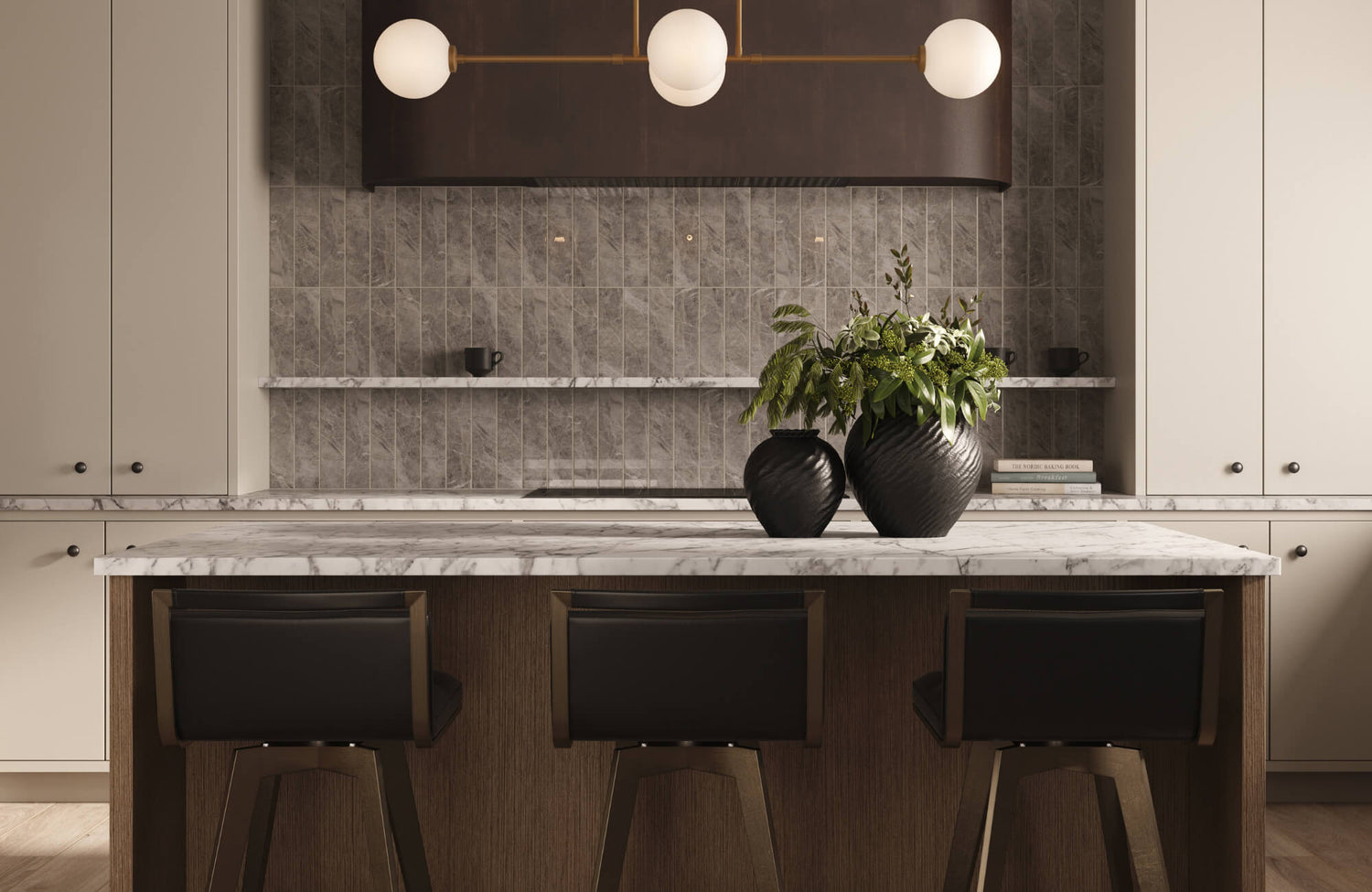
As stunning as natural slate can be, many homeowners discover that slate-look porcelain offers a nearly indistinguishable aesthetic with fewer compromises. Advances in high-definition inkjet printing now allow porcelain manufacturers to capture the intricate texture, tonal shifts, and layered variation of real stone, which is why materials like Edward Martin’s Wren 12x24 Matte Porcelain Tile in Charcoal, shown in the image above, achieve such impressive realism. The results often exceed expectations, bringing the depth and authenticity of slate into a more predictable, controlled format.
Slate-look porcelain tiles provide consistency that many homeowners find beneficial. While natural stone may arrive with unexpected color differences or thickness variations, porcelain maintains uniformity without sacrificing style. For kitchens designed with tight visual cohesion, this controlled appearance becomes a significant advantage.
The Benefit of Zero Porosity in the Kitchen
Porcelain’s non-porous composition directly addresses one of slate’s primary vulnerabilities: absorption. Natural slate is naturally porous and must be sealed to resist oils, sauces, and everyday kitchen splatters. Porcelain, by contrast, is vitrified during manufacturing, making it impervious to moisture and stains. This characteristic alone places it in a higher performance category for busy households.
In a dark backsplash, where fingerprints, grease, and water marks tend to show more readily, porcelain’s zero porosity prevents discoloration and reduces the risk of long-term etching. Homeowners who cook frequently or have children often find that porcelain allows them to maintain the moody aesthetic they love without the stress associated with stone maintenance.
Durability Against Impact and Cleaning Chemicals
A kitchen backsplash faces more wear than many people realize. Heavy cookware may bump against the wall, errant utensils can strike the tile surface, and strong cleaning agents are sometimes required to remove stubborn residue. Porcelain outperforms slate in all these conditions. It resists impact more effectively and does not chip as easily, even when installed in areas of frequent activity.
Chemical resistance is another important consideration. While slate may react poorly to acidic or harsh cleaning products, porcelain tolerates them without damage. This resilience makes porcelain ideal for homeowners who prefer straightforward cleaning routines rather than specialized stone-safe products.

Maintenance And Cleaning Protocols
Once the comparison between slate and porcelain becomes clear, the next consideration is how each material behaves in the day-to-day realities of a working kitchen. Maintenance truly shapes long-term satisfaction, and the differences between the two materials become especially noticeable here. Understanding what each surface requires helps you make a choice that aligns with your lifestyle.
The Necessity Of Sealing Natural Stone
Slate’s beauty comes with the responsibility of sealing. Without a high-quality penetrating sealer, slate can absorb oils, pigments, and water, leading to stains that are extremely difficult to remove from a dark surface. Even when properly sealed, the coating must be reapplied periodically to maintain protection, especially in high-use cooking zones.
Sealing also affects the appearance of the stone. Many sealers deepen the color, enhance veining, or add a slight sheen. While some appreciate this enriched look, others prefer a more natural matte finish and must source specialty sealers to achieve it. Regardless of preference, sealing is non-negotiable for slate in a kitchen setting.
Cleaning Textured Surfaces
Natural cleft slate has ridges and valleys that are visually stunning but can trap grease, dust, and residue. Cleaning these textured areas often requires soft brushes or microfiber cloths that can reach into the grooves without damaging the stone. Standard wiping may not be enough, especially in darker kitchens where residue tends to appear more prominently under lighting.
Porcelain tiles with a slate-look finish may also have slight texturing, but the lack of porosity makes the cleanup significantly easier. Those who prefer the feel of texture without the upkeep often gravitate toward mosaic formats like Edward Martin’s Wren 2x2 Matte Porcelain Mosaic Tile in Charcoal, which offers the same visual interest in a more maintenance-friendly design.
Avoiding Haze and Acid Damage (Natural Only)
Another point of caution with slate is the risk of acid etching. Common household substances such as lemon juice, vinegar, and certain cleaners can dull or discolor the stone upon contact. Even a light film of acidic residue may leave a noticeable haze on a dark backsplash, altering the appearance in a way that cannot easily be reversed.
Because slate is porous, any haze or damage tends to sit below the surface, making correction more difficult. This sensitivity is one reason many homeowners ultimately lean toward porcelain, its acid resistance eliminates the risk of accidental damage from routine kitchen activities.

Styling Strategies To Light Up The Dark
After exploring material performance and care, the final piece of the puzzle is how to style a dark backsplash so the kitchen feels layered, inviting, and visually balanced. Thoughtful design choices can elevate either material, ensuring the overall space feels intentional rather than overly heavy. These styling strategies bring the entire concept together, turning a moody palette into a warm and striking kitchen.
The Critical Role Of Under Cabinet Lighting
A dark and moody backsplash thrives when paired with intentional lighting. Under cabinet lighting is one of the most effective ways to highlight slate’s texture or porcelain’s high-definition detailing. The interplay between shadows and illumination brings the backsplash to life, transforming what could otherwise appear flat into a surface full of movement.
Warm LED strips are particularly effective because they counterbalance the coolness of dark stone or tile while keeping the overall palette sophisticated. The right lighting prevents the kitchen from feeling cavernous and turns the backsplash into a design feature rather than a backdrop.
Pairing With Warm Woods And Metallics
Balancing a dark backsplash with warm or reflective materials enriches the overall composition of the space. Warm wood cabinetry introduces softness and organic warmth that contrasts beautifully with slate’s ruggedness, and the tile in the image above showcases how these tones interact to create visual depth. For those who want a similar slate-inspired surface but in a larger, bolder format, Edward Martin’s Wren 12x24 Chiseled Porcelain Tile in Charcoal delivers a textured profile that pairs seamlessly with these warmer elements.
Whether the kitchen leans modern, transitional, or rustic, these materials create harmony by layering tone, texture, and temperature. This interplay prevents the darker elements from dominating the room and gives the kitchen a multidimensional feel that suits contemporary American design sensibilities.
Choosing Grout Colors To Manage Contrast
Grout selection makes a subtle but important impact on the success of a dark backsplash. A bold contrast can create sharp grid lines that overpower the stone’s natural beauty, while a tone-on-tone color choice blends the grout with the tile, giving the backsplash a seamless, continuous appearance. Homeowners aiming for a moody, elegant atmosphere often find it helpful to preview these combinations using our Augmented Reality (AR) Visualization Tool, which allows you to see grout and tile pairings directly in their own space before committing.
However, slight variations, such as choosing a grout a shade lighter, can subtly outline the individual tiles, offering definition without visual noise. This balance allows you to fine-tune the overall mood and ensure the backsplash supports the design rather than distracting from it. After narrowing down options visually, many choose to confirm their selection by ordering our tile sample, creating a smooth transition from digital visualization to real-world confidence.
The Choice Between Authenticity and Ease
The choice between natural slate and slate-look porcelain comes down to whether a homeowner values authenticity or long-term ease. Slate offers undeniable charm with its tactile texture and shifting color, appealing to those who want a backsplash rooted in natural beauty.
Porcelain, however, provides a more practical path to the same aesthetic. For those who want the richness of slate without ongoing upkeep, porcelain often becomes the more fitting solution. Ultimately, the best backsplash is the one that complements both the design vision and the rhythms of daily life, creating a kitchen that feels intentional, functional, and timeless.


