


Black and white tile has an enduring allure, effortlessly bridging the gap between timeless tradition and modern sophistication. Its bold contrast can anchor a space with graphic precision, yet, when styled with intention, it transforms into a canvas for layered textures, curated colors, and architectural detail. From grand entryways with sweeping large format patterns to intimate bathrooms adorned with subtle geometric mosaics, this classic pairing adapts beautifully to any design narrative.
By blending contemporary layout techniques, harmonious accent palettes, and refined material pairings, black and white tile can move far beyond its retro roots. The result is an interior that feels elevated, enduring, and distinctly curated—where every element works in harmony to create a space both striking and timeless.

Modernizing Layout Patterns for Visual Movement
Elevating the impact of black and white tile begins with rethinking layout strategies that prioritize flow, structure, and spatial balance. Moving beyond traditional checkerboard patterns allows the tile to feel architecturally integrated rather than decorative.
Contemporary Pattern Styles
Modern tile layouts such as herringbone, stacked bond, and basketweave offer design-forward alternatives that instantly update the look of monochrome surfaces. These patterns introduce rhythmic movement and visual direction, helping the eye travel through a space with purpose. For instance, a herringbone layout with elongated tiles creates elegant linearity in narrow spaces like hallways or galley kitchens.
In contrast, a stacked bond arrangement contributes a clean, modernist grid that works beautifully in minimalist environments. These choices also allow the tile’s high-contrast palette to serve as a backdrop to spatial geometry rather than the primary focus. With the right layout, black and white tile becomes a dynamic architectural element rather than a static surface.
Asymmetry and Zoning Techniques
Incorporating asymmetry into black and white tile layouts creates visual tension and breaks from the predictability of centered, bordered designs. This approach also supports functional zoning in open-plan layouts, helping to subtly delineate areas without structural barriers. For example, a contrasting tile “rug” under a kitchen island can define the prep area while reinforcing material hierarchy. In addition, off-center or staggered mosaics provide unexpected focal points that engage the eye and enhance spatial storytelling. These asymmetrical arrangements also make the tilework feel curated and intentional, rather than formulaic. Ultimately, zoning and asymmetry give your tile design a distinctly modern sensibility grounded in spatial logic.
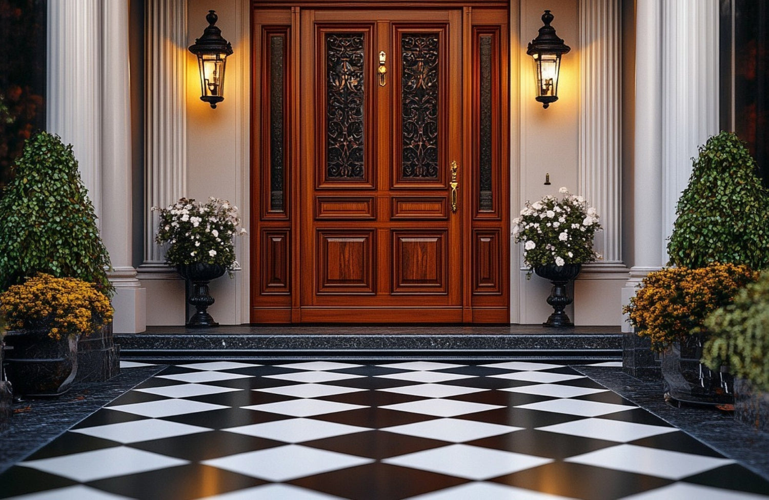
Large Format and Mixed Scale Integration
The use of large format black and white tiles can dramatically reduce visual clutter while enhancing the room’s perceived size. Formats like 24"x24" or 12"x24" support seamless transitions across floors and walls, minimizing grout lines and reinforcing visual flow. For added complexity, mixing scales, such as pairing large squares with small-scale hex or penny tiles, creates textural contrast within the same palette.
Rectified edges further support tight, clean grout joints, giving the installation a polished, refined look. This strategy works particularly well in contemporary bathrooms and kitchens where simplicity and precision are emphasized. For example, Edward Martin’s Leona 24x24 Checkerboard Polished Porcelain Tile in Calacatta and Nero Marquina, as displayed in the photo above, perfectly embodies this principle, combining a timeless checkerboard pattern with the elegance of marble-inspired finishes for a statement that is both classic and undeniably modern.

Elevating with Updated Accent Color Palettes
While black and white tile provides a strong visual foundation, it’s the supporting color palette that determines the overall tone of the space. Introducing thoughtfully selected accent hues adds depth, warmth, and balance—transforming the tile from graphic to grounded.
Neutral Accent Colors for Soft Contrast
Soft neutrals such as greige, taupe, and muted clay tones gently soften the starkness of black and white tile. These earthy hues function as transitional colors, bridging the gap between tile surfaces and other design elements like cabinetry or walls. When used effectively, they create a calming atmosphere without diminishing the tile’s bold geometry. Natural light also plays especially well with these tones, allowing the room to feel fluid throughout the day. Layering in textiles, paint, or furniture in these shades adds cohesion and livability to the overall design, resulting in a balanced, understated aesthetic that feels modern yet timeless.
Rich, Saturated Hues for Depth
If you’re seeking to introduce more drama or richness, consider accenting black and white tile with moody, saturated tones like navy blue, forest green, or oxblood. These colors create a refined contrast that enriches the monochrome palette without overwhelming it. Used on cabinetry, feature walls, or upholstery, they help ground the space while adding emotional depth. Moreover, their inherent sophistication makes them ideal for transitional interiors that blend traditional and contemporary elements. These deeper hues also allow the high-contrast tile to feel more embedded in the design narrative, rather than sitting as a surface statement. In turn, this makes the space feel more cohesive and layered.
Undertone Harmony and Coordination
Achieving a visually harmonious black and white tile space depends heavily on the coordination of undertones across all materials. For instance, black tiles with cool blue undertones should be paired with similarly cool metals like brushed chrome or stainless steel, while warm blacks work best with bronze, brass, or walnut wood finishes. The same logic also applies to white tile—warm, creamy whites coordinate better with beige or ivory walls, while crisp whites suit bright, cool-gray accents. This level of tonal precision helps ensure that materials and colors don’t visually clash. Instead, each design element feels like an extension of the others, resulting in a more fluid and cohesive interior. Undertone alignment, though subtle, can be the difference between a fragmented look and a refined, professional finish.

Creating Depth Through Material and Texture Contrast
While color contrast defines black and white tile, textural contrast brings it to life. By layering materials with varied surfaces, sheens, and temperatures, the design becomes richer and more immersive.
Matte vs. Glossy Finishes
One of the simplest ways to add depth to a monochrome space is by varying surface finishes, allowing light to interact differently across materials. In the photo shown above, the Quinn 12x12 Matte Porcelain Octagon Mosaic Tile in Black & White grounds the space with a soft, velvety finish that diffuses light and enhances the tactile quality of the floor. This matte surface contrasts beautifully with the vertical sheen of the Maisie 2.5x16 Glossy Ceramic Tile in Cobalt, whose reflective glaze captures and bounces light to create a vibrant, polished backdrop.
The interplay between the two finishes highlights how a glossy finish can bring movement and energy to a space, while matte provides stability and visual rest. Even with the introduction of a bold color like cobalt, the black and white floor maintains its timeless neutrality, ensuring harmony between all elements. This pairing also shows that when matte and glossy are balanced thoughtfully, they can elevate black and white tile into a layered, design-forward statement.
Natural Materials for Organic Balance
Incorporating natural materials alongside black and white tile introduces warmth and texture, offsetting the tile’s geometric formality. Elements like light oak, honed stone, or rattan add visual softness and tactile diversity. These materials work especially well in areas where black and white tile dominates, providing a necessary counterpoint. For instance, a white-tiled bathroom with wood vanities and linen curtains feels grounded and livable rather than stark. The contrast also helps highlight the clean lines of the tile without making the room feel cold or overly modern. In this way, natural materials bridge the gap between classic and contemporary design.
Industrial and Architectural Elements
For a more urban or modernist feel, integrate architectural materials like concrete, fluted glass, and brushed metal alongside your black and white tile. These elements introduce structural weight and visual interest that elevate the overall composition. A concrete countertop, for example, complements a white-tiled backsplash while enhancing material contrast. Fluted glass partitions or steel-framed shelving, on the other hand, echo the geometric language of the tile without being redundant. These components also lend a spatial hierarchy, reinforcing zones and transitions within open layouts. By combining tile with architectural-grade finishes, you can achieve a refined, layered interior that reads as intentional and editorial.

Harmonizing Fixtures and Furnishings with Tile Design
Once the tilework is in place, the success of the design depends on how well surrounding fixtures and furnishings complement it. Scale, proportion, and material resonance are key to ensuring a cohesive and modern final result.
Clean-Lined Fixtures and Streamlined Forms
Fixtures should reinforce the geometry and precision of black and white tile rather than distract from it. Wall-mounted faucets, minimalist vanity hardware, and slim pendant lights all maintain clean sightlines and visual clarity. These refined forms also help emphasize architectural detail and tile layout without competing for attention. In smaller spaces, especially, such restraint in design ensures that the room feels expansive rather than crowded. Avoid ornate or vintage fixtures unless they are carefully balanced with modern counterparts. The goal is to create a unified visual language that feels deliberate and well-edited.
Contemporary Finish Pairings
The finish of a fixture can dramatically influence how black and white tile is perceived. For example, brushed nickel, soft brass, matte black, and antique bronze finishes all offer warmth and tactility without overpowering the tile’s graphic quality. When finishes are consistently applied across faucets, lighting, and hardware, they help anchor the space visually. This consistency also gives weight to the tile, reinforcing its role as a cohesive design element rather than an isolated detail. Conversely, shiny chrome, though once a go-to, can feel too reflective or retro unless balanced with matte surfaces. Selecting finishes with intention ensures that every element contributes to the modernity of the design.
Furniture Scale and Material Coordination
Furniture within tiled spaces should be scaled appropriately and crafted from materials that complement the tile’s bold aesthetic. In bathrooms, floating vanities in walnut or birch help maintain floor visibility and enhance openness. Similarly, in kitchens or living areas, furniture with powder-coated steel frames or upholstered textures offers material contrast without visual heaviness. These elements should also echo the tile’s rhythm without replicating its patterns, allowing balance without redundancy. Thoughtfully layered materials like wood, metal, and fabric create a rich, cohesive narrative around the tile. Proper furniture scale and finish coordination ensure the space feels intentional and curated from floor to ceiling.
For those looking to visualize their design choices with confidence, Edward Martin’s Augmented Reality (AR) Tool makes it effortless to see black and white tile layouts, finishes, and color pairings come to life in your own space. This interactive preview allows you to experiment with combinations, such as pairing brushed brass fixtures with glossy white tile, before committing, ensuring every detail feels intentional and cohesive. With this technology, achieving a striking and timeless look becomes both precise and inspiring.

Enhancing Tile with Intentional Lighting Design
Lighting has the power to either flatten or elevate tile design, depending on how it's deployed. A strategic mix of illumination types allows black and white tile to reveal its full dimensionality and texture.
Layered Lighting Strategy
An effective layered lighting plan blends natural light, ambient fixtures, and targeted accent lighting to enhance the beauty of black and white tile. In the photo displayed above, the circular window bathes the floor in soft daylight, revealing the striking veining of the Leona 24x24 Checkerboard Matte Porcelain Tile in Calacatta and Nero Marquina and lending the space an airy elegance.
As evening falls, the wall sconce, which is our Dorian Wall Sconce in Aged Brass, adds a warm, focused glow, ensuring that the room’s textures, from the tile’s satin finish to the wood cabinetry’s grain, remain vivid and inviting. Together, these light sources create a balanced interplay of brightness and shadow, elevating the tile from a flooring choice to a defining design feature. This harmony between natural and artificial light keeps the room dynamic, functional, and timeless at every hour of the day.
Sculptural and Architectural Fixtures
Beyond function, lighting fixtures should act as visual statements that reflect the tile’s structural character. Opt for pieces with bold shapes—linear chandeliers, asymmetrical sconces, or sculptural pendants—that echo the grid or contrast it intentionally. Material finishes like matte black, aged brass, or smoked glass also integrate effortlessly into a monochrome setting. These fixtures should be positioned to highlight, not overshadow, the tilework beneath them. The right lighting becomes part of the spatial rhythm, reinforcing balance and intentionality. Used wisely, sculptural lighting enhances both the atmosphere and architectural clarity of the space.
Adjustable Color Temperature and Light Control
To maximize flexibility, install tunable LED lighting systems that allow shifts in color temperature and brightness. For example, cool lighting (4000K–5000K) emphasizes the graphic edge of black and white tile, ideal for cooking or grooming zones. On the other hand, warm light (2700K–3000K) softens the space, creating a cozy ambiance for evening relaxation. Smart dimmers and scene settings also offer easy transitions throughout the day, adapting the space to its changing functions. This kind of lighting control enhances material texture and allows the tile to respond dynamically to different conditions. With proper calibration, the tile remains visually sharp and mood-appropriate at all times.
Styling Black and White Tile with Modern Elegance That Lasts
Black and white tile, when styled with clarity and purpose, transforms from a traditional surface into a timeless architectural statement. Through intentional layout design, nuanced material layering, and cohesive color and lighting choices, this iconic pairing becomes both visually compelling and deeply modern. Every element, from subtle undertones to sculptural lighting, plays a role in elevating the space while preserving its refined simplicity. With the right design approach, black and white tile will never look dated—it will always look deliberate.
To bring your vision from concept to reality, Edward Martin makes it simple to experience the quality of their designs firsthand through our Request Samples service. Sampling allows you to see and feel each tile’s texture, finish, and tone in your own space, ensuring your final choice aligns perfectly with your design goals. This step transforms inspiration into a confident, well-informed decision—one that will keep your black and white tile looking striking and timeless for years to come.