


The color of your living room rug shapes the entire experience of the room. Whether it’s grounding your furniture, defining open zones, brightening dark corners, or adding a burst of personality, the right rug color works quietly but powerfully behind the scenes to bring your vision to life.
But choosing that perfect color takes more than matching it to your couch or following a trend. It’s about finding the hue that fits your lifestyle, adapts to changing seasons, and resonates with how you want your space to feel day after day. From mood-setting tones to practical considerations, this article walks you through everything you need to confidently pick the ideal living room rug color.

Consider the Mood You Want to Set
Before anything else, decide how you want your living room to feel. Rug color has an outsized effect on the emotional tone of a space, which can make a room feel warm and cozy, cool and calm, formal and elegant, or playful and creative.
Orchestrating Ambiance Through Chromatic Choices
Color has a direct link to how you emotionally experience a space. When you walk into a room with soft blues or muted greens underfoot, you’ll likely feel a sense of calm and tranquility. On the other hand, rich reds and golden yellows can instantly add warmth, energy, and even a sense of intimacy. These are not just aesthetic preferences; they’re emotional cues that shape your subconscious response to a room.
As you consider which rug color to go for, reflect on the overall vibe you want. Do you want your living room to serve as a peaceful retreat after long days? Lean into cool colors with gentle saturation. Prefer a space where you host vibrant gatherings? Warm tones can heighten sociability and spark interaction. Your emotional intent is also the best starting point for narrowing down your color choices.
The Subtlety of Hue Beyond Warmth and Coolness
It’s easy to classify colors as either warm or cool, but the impact of a rug goes much deeper than that simple split. Imagine how different shades within the same family can evoke entirely different emotions. A rich burgundy, for instance, may add drama and depth, while a rusty terracotta leans more earthy and relaxed. Similarly, icy blue can feel clinical or austere, whereas a dusty sage carries a gentler, more restorative quality.
This is where undertones and saturation levels come into play. Even within neutrals, an ivory rug with a pinkish undertone feels cozier than one leaning toward gray. Instead of defaulting to a color category, evaluate how specific shades interact with your lighting, furniture, and emotional goals. The right hue should also strike a chord with how you want to experience your living space every single day.
Functional Color Integration
Your rug isn’t just about atmosphere. It also needs to support the way you use your living room. A deep navy or charcoal rug can ground a busy space while hiding signs of wear, perfect for an area where family and friends gather often. In contrast, if your living room is more of a formal entertaining space or reading sanctuary, you might lean into lighter tones or bolder colors that make a design statement without needing to withstand constant use.
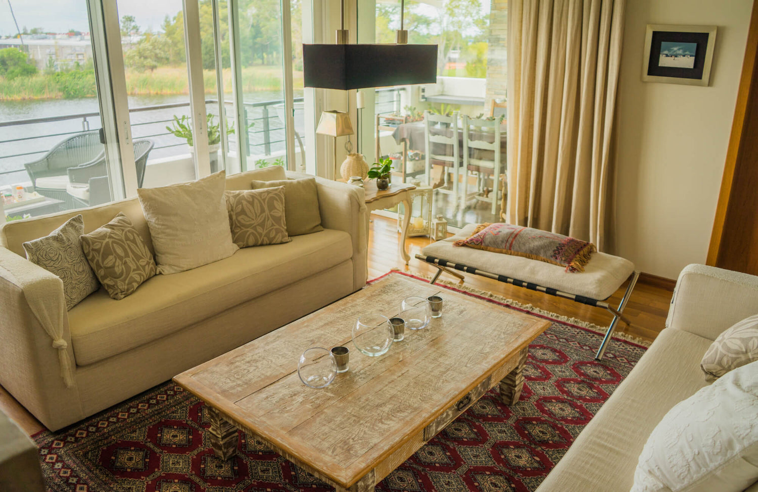
Color also enhances function when chosen thoughtfully. A rich emerald rug under a coffee table anchors a conversation area, while a soft blush in a lounge corner can create a sense of gentle retreat. For instance, our Georgette Polyester Pile Rug in Desert / Multi shown in the image above is a beautiful example of a warm-toned rug that blends muted rose, terracotta, and earthy beige. These hues not only evoke comfort and warmth but also integrate effortlessly with a variety of neutral furniture palettes, making it a versatile choice for both casual and elevated living spaces. The lived-in softness of the color palette further supports daily life while adding visual interest without overwhelming the room.

Evaluate Existing Design Elements
Your rug must coordinate with more than just your wall color. Consider furniture, artwork, flooring, and accents. The rug can either blend in to support the design or stand out as a focal piece, but it must always complement what’s already there.
The Furniture-Rug Dialogue
Your furniture sets the tone for your space, and your rug color should speak fluently with it. Start by looking at your largest upholstery pieces, such as sofas, sectionals, or armchairs. If your furniture leans neutral or understated, a richly colored rug can add energy and contrast, injecting the room with personality without overpowering it. A deep navy rug under a warm tan couch, for instance, feels both modern and grounded.
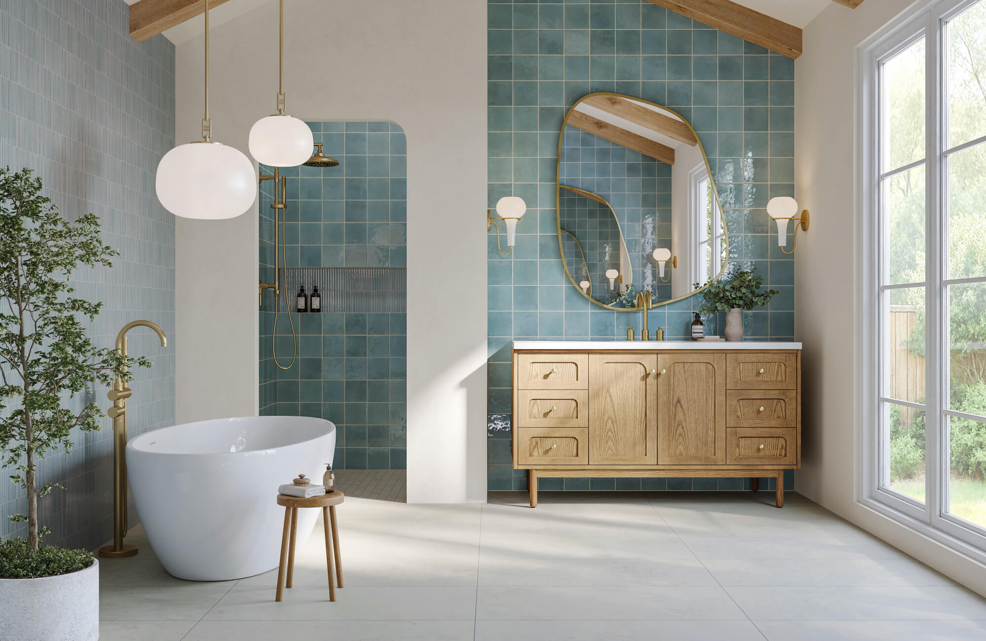
A richly toned rug like our Lafferty Wool Blend Rug in Ocean brings depth and visual contrast to rooms with neutral or minimalist furnishings. Its moody blue hue, inspired by deep coastal waters, adds just the right amount of drama without overwhelming the space. When paired with light-toned upholstery or natural wood accents, it also grounds the room with elegance and intention, allowing your furniture to feel both defined and connected within the overall design.
On the flip side, if your seating is already bold or patterned, you might find that a rug in a quieter, complementary shade offers the right visual balance. Matching tone families, like pairing a soft beige rug with oatmeal-toned chairs, creates seamless flow and subtle depth. Whether you aim to harmonize or contrast, your rug should feel intentional, helping your furnishings look anchored and cohesive rather than floating or disconnected.
Walls and Floors as Color Anchors
Walls and floors form the permanent backdrop of your living room and have a significant say in what rug colors will truly work. With neutral walls such as white, gray, or cream, you gain the freedom to bring in color through your rug. You can also play with rich greens, warm rust tones, or saturated blues without worrying about clashing. However, if your walls already carry color or a bold pattern, it's usually wiser to choose a rug that steps back slightly, perhaps in muted tones or with minimal patterns.
Your flooring matters just as much. Light wood or pale tile can make a room feel airy, so pairing it with a darker rug helps anchor the space and create contrast. Conversely, darker hardwood or stone floors can feel heavy, which you can balance with a lighter rug to brighten the overall look. A rug should never compete with these architectural elements. It should interact with them, completing the palette instead of overwhelming it.
Tying in Accents
Look around your space and identify any accent colors that appear more than once, maybe in your throw pillows, art pieces, or ceramic vases. These repeating tones can guide your rug choice, not necessarily as a dominant color but as an accent woven subtly into the pattern or border. When a rug echoes those same tones, even faintly, the room feels more pulled together and visually thoughtful.
A great example is our Quinton Wool Blend Rug in Ash, seen in the photo above. Its understated ash gray tone serves as a neutral base that grounds the space while letting the more expressive patterns in the upholstery and drapery shine. The soft, textured weave adds visual interest without overpowering the room, making it an ideal companion for bolder furniture and layered prints. It also supports the design quietly and effectively, creating cohesion while allowing your statement pieces to lead.

Use Rug Color to Define Zones in Open Layouts
In open-concept spaces, rugs do more than decorate; they define purpose. Strategic use of color in rugs can subtly separate a reading nook from a conversation area or a dining space from the living room.
Creating Boundaries Through Color Contrast
When walls aren’t available to define separate areas, color becomes your best ally. Placing a dark rug beneath a seating arrangement on light hardwood instantly grounds that area and signals it as a distinct zone. This kind of deliberate contrast also draws the eye and visually “frames” the space, giving structure without the need for physical dividers.
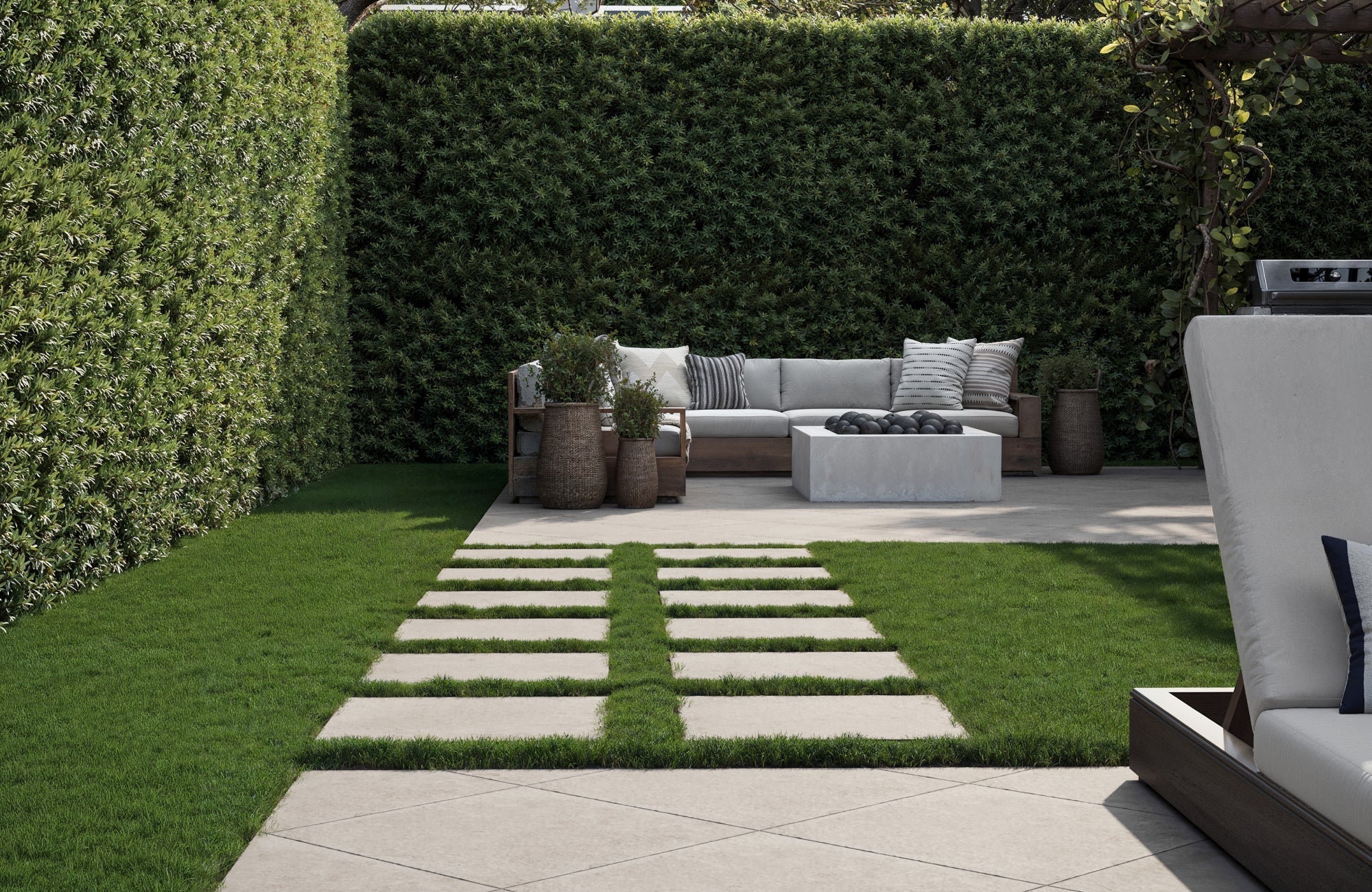
One exceptional example of this principle is our Hutchinson Polyester Face Rug in Burgundy / Denim, seen above. Its deep burgundy base with hints of denim blue creates rich visual separation between the leather sectional and the surrounding light-toned flooring. The warm, dynamic palette enhances the conversation area while subtly anchoring it within the larger open layout. This kind of contrast isn’t just practical. It also makes the space feel curated, cohesive, and intentionally defined.
On top of that, in multi-use layouts, selecting different rug colors for each function sharpens the layout even further. For example, a bold charcoal rug can mark the living area, while a warm ochre rug under the dining table signals a shift in use and mood. These contrasting zones not only create clarity but also add depth and interest to the overall design.
Activity-Inspired Color Cues
How you use each part of your open layout should influence your color choices just as much as style. A vibrant, warm-colored rug like deep rust, marigold, or burgundy can energize a dining area, encouraging interaction and liveliness around meals. These hues also activate the space and bring a welcoming warmth to gatherings.
On the other hand, quieter corners meant for reading, reflection, or even light work can benefit from cooler or earthier tones. Soft slate blue, sage green, or muted taupe, for example, helps relax the mind and reduce visual noise. Tailoring rug colors to the emotional and functional tone of each zone also adds an intentional layer to your design that goes beyond appearances.
Seamless Flow with Gradual Transitions
Not every open-concept layout needs sharp visual separations. Sometimes, especially in minimalist or modern interiors, a more fluid visual flow works better. In these cases, you can choose rugs with similar undertones or transitional patterns to create distinction without harsh contrast. For example, a living room might have a rug in soft gray with blue accents, while a neighboring workspace features a pale blue rug with subtle gray marbling.
This method also allows each area to retain its identity while still feeling like part of a unified whole. It’s an ideal approach if you want subtle zone shifts that don’t interrupt the clean lines or airy nature of your open layout. When done right, gradual transitions through color can guide movement through a space almost imperceptibly, yet effectively.

Account for Lifestyle and Maintenance Realities
The perfect rug isn’t just beautiful; it holds up to real life. Your lifestyle should directly influence your rug color choice. Children, pets, and usage all factor in.
Color for Busy Areas
When your living room doubles as a busy hub, whether it’s for hosting guests, everyday lounging, or just being the central pass-through space, you need a rug that works as hard as it looks good. In busy areas, darker shades or rugs with intricate, multi-tone patterns are the most forgiving. Colors like charcoal, espresso, or richly layered earth tones are far better at concealing everyday dust, dirt, and inevitable scuffs than lighter options.
One stylish yet practical solution for busy spaces is our Liddy Polyester Pile Rug in Graphite / Pearl, featured in the picture above. Its intricate blend of graphite and soft pearl tones creates a richly textured surface that naturally hides dirt, scuffs, and daily wear. The pattern is also subtle enough to maintain a calm, refined look, yet dynamic enough to support the demands of an active household, all while anchoring the room with understated elegance.
Pet- and Kid-Friendly Color Strategies
If you share your space with pets or young children, your rug color should help you, not stress you. Rugs in mid-tone colors such as heather gray, dusty olive, or muted navy strike a smart balance. These shades are also dark enough to mask fur and light enough to hide dust and crumbs without calling attention to every imperfection. Add a bit of texture or subtle pattern, and you have a rug that disguises life’s daily chaos while still looking intentional and stylish.
Designed with everyday life in mind, our Charlise Polypropylene & Polyester Pile Rug in Slate Dove offers a thoughtful balance of beauty and resilience. Its cool, slate-toned base is softly broken by a misty dove pattern, helping to visually conceal pet hair, stains, and crumbs with ease. This is the kind of rug that doesn’t just withstand real life; it complements it, all while keeping your living space feeling polished and pulled together.
It’s also tempting to go for a clean white or dramatic black rug, but these often highlight the very messes you’re trying to minimize. A pure white rug can make even the smallest spill feel like a disaster, while solid dark hues might show lint, pet hair, and tracked-in dust more than you'd expect. Choosing something in the middle range, with enough variation in tone, gives you a forgiving canvas that still complements your aesthetic.
Preventing Fading from Sunlight
Sunlight can be both a blessing and a design challenge. If your living room enjoys generous natural light, you’ll need to think ahead about how that light affects rug color over time. Bright, highly saturated shades, especially reds, blues, and vibrant oranges, are the most prone to fading when exposed to UV rays. Over time, what once felt vivid and bold can dull or change tone unevenly, especially in spots that receive direct sun.
To preserve the beauty of your rug, opt for more muted tones or colors that naturally age well, like slate gray, taupe, or sage. You can also look for rugs made with UV-resistant dyes or materials that are designed to resist fading. If your heart is set on a bright hue, choose a slightly deeper version at the outset. This gives you a color that looks rich now and still holds its presence even as it softens with time.

Express Your Personality Through Color
Your rug is a canvas. It reflects your aesthetic, heritage, and creativity. Make sure the rug color you choose feels true to your style.
Color and Design Philosophy
The colors you surround yourself with speak volumes about your design preferences and the kind of environment you want to live in. A carefully chosen rug color can either echo or contrast with your broader décor style, grounding the room with intentional flair. If you’re drawn to clean lines and a minimalist or Scandinavian aesthetic, neutral tones like soft beige, warm gray, or off-white also help reinforce that calm, balanced look without competing for attention.
On the other hand, if your style leans toward rich textures and expressive layers like a maximalist or vintage-inspired space, deep jewel tones such as emerald, sapphire, or amethyst make a bold statement. Earthy palettes, often found in eclectic or bohemian interiors, also pair beautifully with terracotta, ochre, or sage rugs. The goal is to let your rug color feel like an extension of your overall design philosophy, not just a separate decorative item, but an integral part of your story.
Unconventional Color Pairings
If you crave originality, don’t shy away from unexpected color combinations. Pairing hues like teal with mustard or rust with blush can produce a dynamic, eye-catching effect that sets your space apart. These bold mixes also inject energy and personality into the room and often work best when grounded by a more neutral backdrop, allowing the rug to be the hero without overwhelming the rest of the design.
To test these bold choices, start with a mood board or digital layout to visualize how the rug color will play with your furniture and accessories. Seeing the colors together before making a decision helps avoid clashes and gives you the confidence to go bold. When done well, these unconventional combinations create a room that feels daring, playful, and uniquely yours.
Infusing Cultural and Artistic Influence
Your rug color can be a tribute to your roots or your artistic influences, making the space feel more personal and grounded in meaning. Drawing inspiration from cultural motifs and palettes such as the rich reds of Persian design, the oceanic blues of Turkish textiles, or the sunbaked earth tones of Southwestern weaves adds authenticity and depth. These color choices aren’t just aesthetic; they carry a sense of identity and heritage.
A beautiful example of this approach is our Hutchinson Polyester Face Rug in Burgundy / Khaki, displayed in the photo above. With its worn-in, vintage-inspired pattern and a warm blend of burgundy and soft khaki tones, it evokes the timeless elegance of weaving with a relaxed, modern twist. This rug not only complements natural materials and organic shapes but also brings an inviting, lived-in charm to any space, perfect for those who want to reflect a story as much as a style.
You can also take cues from artwork that resonates with you. If you have a favorite painting or photograph, pull tones from that piece into your rug choice. This creates a subtle but powerful visual connection, turning your rug into an extension of your personal gallery. Whether it's a nod to your ancestry or a salute to your creative passions, weaving cultural or artistic elements into your rug color makes your living room truly your own.

Plan for Longevity and Adaptability
Style evolves. Your rug should age gracefully with your design tastes and seasonal décor. Color versatility ensures your investment remains relevant long after your next sofa change or paint refresh.
Neutral Foundations for Design Flexibility
If you're someone who enjoys refreshing your living room with new accents, artwork, or even wall colors every few years or every season, a neutral rug gives you the breathing room to do so. Shades like ivory, soft taupe, warm beige, or gentle grays act as design chameleons, effortlessly blending with both bold and subtle changes in your space. These hues don’t demand attention but provide a polished base that enhances everything around them.
A neutral rug also offers incredible versatility without feeling dull or uninspired. Depending on its texture and weave, it can either recede into the background or add tactile depth while still maintaining visual flexibility. Whether you rotate throw pillows with the seasons or switch out furniture down the line, your neutral rug remains a reliable anchor that won’t require replacement with every new design impulse.
A timeless neutral like our Pascal Polyester Face Rug in Platinum / Mist offers the kind of quiet versatility every evolving space needs. As shown in the image above, iIts soft blend of silvery grays and weathered beige tones creates a light, airy foundation that pairs effortlessly with both warm and cool palettes. The subtle, vintage-inspired pattern adds depth without distraction, making it easy to layer in new colors, textures, or accent pieces season after season while keeping your room grounded and cohesive.
Layering Rugs for Seasonal Switch-Ups
Rug layering is a clever and creative way to keep your living room feeling fresh throughout the year. Start with a larger neutral rug, something simple and versatile that covers most of the space, and layer a smaller, colorful or patterned rug on top. This top layer becomes your seasonal feature, letting you experiment with color and texture without committing to a full-room change.
During cooler months, consider layering with a rich, warm-toned rug like burgundy, rust, or forest green to create a cozy, enveloping vibe. When spring or summer rolls around, swap it for a lighter option in breezy pastels or coastal tones. This strategy not only keeps your space dynamic but also extends the life of both rugs by rotating their exposure. It's a practical way to adapt your room to shifting moods, climates, and personal style, all without straining your budget.
Find the Perfect Balance Between Style and Function
Bringing the right rug color into your living room is about aligning beauty with purpose. When you thoughtfully consider how a color supports the mood, enhances your layout, fits your daily routine, and expresses your unique style, your rug becomes more than just a backdrop. It also becomes a grounding element that unifies your entire space. With the right balance of creativity and practicality, your choice will not only complement your current décor but grow with you through every shift in season, trend, or lifestyle.
If you’re feeling unsure about where to begin or want expert guidance to fine-tune your vision, our team is here to help. Whether you're selecting a rug for a fresh redesign or layering it into an existing space, we provide personalized advice tailored to your style, needs, and space. Visit our Contact Us page to get in touch—we’re ready to answer your questions, walk you through options, and help you find the perfect rug color that brings both elegance and ease to your space.