


Wall art can influence how a room feels, but its impact goes beyond the piece itself. From what you choose to how you place it, every decision shapes whether your walls feel cohesive or disconnected. When approached thoughtfully, wall art feels integrated into the space rather than just filling an empty wall. In this article, we’ll guide you through each step clearly and practically so you can make an informed decision. You’ll learn how to choose artwork, scale it appropriately, position it intentionally, and refine its presentation so everything comes together naturally.

Selecting Wall Art with Intent and Direction
Before placing anything on the wall, it helps to understand why it belongs there. When you choose artwork with clear intention, every step that follows feels more cohesive and considered.
Define the Room’s Purpose
Start by considering how the room is used. A bedroom often benefits from wall art that feels calm and grounding, while a living room can support pieces that bring energy or encourage interaction. When the artwork aligns with the room’s purpose, it feels more natural and fitting within the space. It is also important to choose artwork that does not interfere with the room's functions. In workspaces, highly detailed or visually busy compositions can become distracting. Choosing wall art that supports focus and clarity helps maintain a more effective environment.
Align with Interior Style
It helps to consider the design language already present in your space. In modern interiors, clean lines and abstract forms tend to feel appropriate, while traditional settings often pair well with classic subjects or softer compositions. Contrast can still be introduced, but it should feel intentional. Placing contemporary art in a traditional room, for instance, can add interest as long as there is a clear visual link through color, shape, or tone.
This approach becomes especially clear in a space like the one featured above, where rich green cabinetry, classic panel detailing, and warm wood tones establish a refined, traditional foundation. Introducing Edward Martin’s Meadowline Wall Art into this setting would feel cohesive rather than contrasting, as its organic motifs and soft detailing naturally echo the room’s character. By aligning the artwork with the existing style, the overall look remains consistent while still adding visual interest.
Build a Thoughtful Color Direction
Color is not about matching everything exactly, but about establishing a clear direction. You can choose artwork that reflects tones already present in your furniture, or introduce a new color that complements the existing palette. What matters is intention. When color choices feel deliberate, the wall art blends naturally into the space rather than appearing separate or out of place.

Scaling Artwork to Fit the Wall Properly
Once you have selected the right piece, size becomes the next important consideration. When scale is handled well, the wall art feels properly anchored and proportionate within the space.
Match Art to Wall Size
Start by considering the wall itself. Large, blank walls work best with artwork that has enough visual presence, whether that’s a single oversized piece or a group of smaller works arranged to feel like one cohesive display. For smaller walls, a more restrained approach is often more effective. A single, well-proportioned piece helps maintain openness while preventing the space from feeling crowded.
This is especially evident in the photo above, where Edward Martin’s Shadow Orchard Wall Art is scaled to fit the narrow wall above the toilet. Its size feels intentional within the limited space, adding visual interest without overwhelming the surrounding elements. By keeping the artwork proportionate to the wall, the overall look remains balanced and uncluttered.
Relate Art to Furniture Width
When placing artwork above furniture, proportion becomes especially important. Keeping the artwork at about two-thirds to three-quarters of the furniture’s width helps create a clear visual connection between the two. If the piece is too small, it can feel disconnected, while an oversized one may overwhelm what sits beneath it. The goal is to achieve a balanced relationship that feels natural within the space.
Combine Pieces to Achieve Scale
At times, a single piece may not provide enough presence for the wall. In these situations, grouping smaller artworks can help achieve the right sense of scale. The key is to treat the arrangement as one unified composition. Instead of focusing on each piece individually, consider the arrangement's overall width and height. When approached this way, the result feels cohesive and well-balanced rather than scattered.

Positioning Artwork for Natural Viewing
Even a well-chosen piece at the right size can feel out of place if it is not positioned properly. Thoughtful placement helps the artwork feel comfortable to view and is naturally integrated into the space.
Use Eye Level as a Baseline
Wall art is typically positioned so its center sits around eye level, creating a comfortable and natural viewing experience. This helps prevent the piece from feeling too high or too low within the space. That said, this guideline can be adjusted. In rooms with higher ceilings or unique layouts, slight changes may be needed to maintain visual balance and comfort.
Place Art Where It’s Seen Easily
It also helps to consider how you move through the room. Artwork is most effective when placed where your eye naturally lands, such as above a sofa or along a main wall. Avoid positioning key pieces in areas where they may be partially hidden or easily overlooked. Clear visibility plays an important role in how impactful the artwork feels.
Anchor Art to Architectural Features
To create a sense of stability, align artwork with existing elements such as furniture, windows, or moldings. This gives the piece a stronger connection to the room and makes it feel more grounded. When wall art lacks these reference points, it can appear disconnected. Anchoring it visually helps the entire space feel more intentional and well-organized.
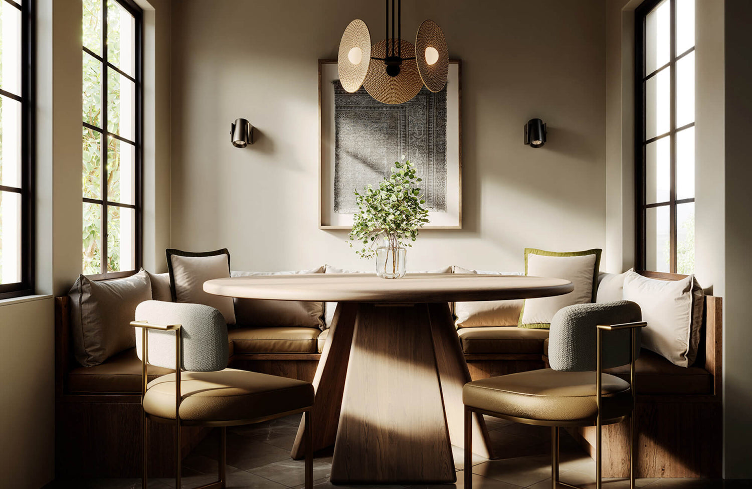
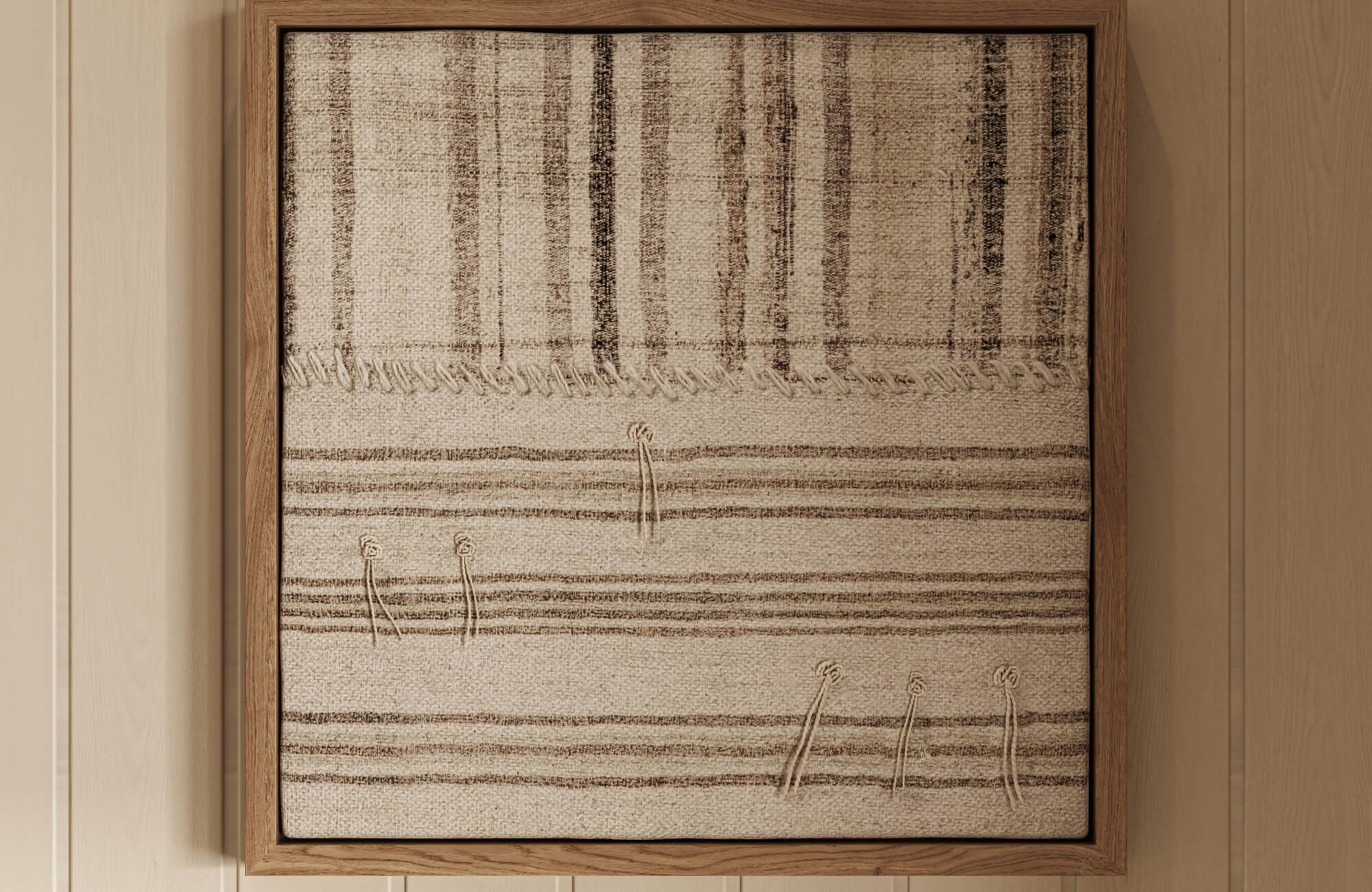
This is clearly demonstrated in the photo featured above, where Edward Martin’s Dusk Fold Wall Art is centered along the dining table and aligned with the surrounding architectural features. Its placement echoes the symmetry of the arched openings and ceiling beams, reinforcing the room’s structure. By tying the artwork to these elements, the overall composition feels balanced, cohesive, and visually anchored.

Designing Structured and Cohesive Art Groupings
When working with multiple pieces, structure becomes essential. Without a clear approach, even well-chosen artwork can feel disorganized rather than intentional.
Choose a Clear Layout Approach
Start by selecting a layout that suits your space. A grid layout offers order and symmetry, while a more organic arrangement creates a relaxed, collected feel. The choice depends on the room’s style and the impression you want to create. What matters is committing to one approach rather than mixing too many ideas.
Control Spacing and Alignment
Spacing plays a key role in holding a grouping together. Keeping the gaps between frames consistent helps the arrangement feel deliberate and well-structured. Alignment is equally important. Whether you line up edges or centers, it helps create visual order and keeps the arrangement from appearing uneven.
Unify the Collection Visually
It is important to ensure that the pieces relate to one another. This connection can come through subject matter, tone, or overall style. Even subtle similarities can help tie the grouping together. When the pieces share a common thread, the arrangement reads as a single composition rather than separate items placed side by side.

Refining Presentation Through Frames and Finishes
Framing is more than just a final step. It plays a key role in shaping how the artwork is perceived within the space.
Choose Frames That Support the Art
Choose frames that enhance the artwork rather than compete with it. Simple frames often work well for modern pieces, while more detailed styles can complement traditional works. The goal is to support the wall art, not draw attention away from it. A well-chosen frame should feel appropriate and unobtrusive.
Use Matting to Create Focus
Matting adds space around the artwork within the frame, creating a subtle separation from its surroundings. This added space draws the viewer’s attention inward and allows the piece to stand out more clearly. It also provides visual balance, especially for smaller artworks. Neutral mats are often the most effective, as they keep the focus on the artwork itself.
Coordinate Finishes with the Interior
It also helps to consider the materials already present in your space. Matching or complementing these finishes creates a sense of continuity throughout the room. When too many finishes compete, the space can feel unsettled or disjointed. A more consistent approach helps everything feel visually connected and well considered.

Enhancing Visual Impact with Lighting and Spatial Balance
After placement and framing, the surrounding environment plays a key role in how the artwork is experienced. Lighting and spatial balance help ensure the piece stands out while still feeling connected to the room.
Use Lighting to Highlight Artwork
Lighting can significantly influence how an artwork is perceived within a space. Using soft, focused lighting helps reveal details and surface texture, making the artwork more visually engaging. Positioning the light at an angle can further enhance depth without creating harsh reflections. Avoid strong glare or uneven lighting, as it can distract from the artwork rather than enhance it.
This is clearly illustrated in the photo featured above, where Edward Martin’s Golden Drift Wall Art is gently illuminated by the Alena Wall Sconce in Aged Brass on either side. The warm, diffused light enhances the artwork’s texture while maintaining a soft and balanced atmosphere. By using lighting that complements rather than overpowers, the artwork becomes a subtle focal point within the space.
Manage Surrounding Visual Space
Artwork needs adequate space around it to stand out effectively. When too many elements compete nearby, their impact becomes diminished. Allowing for open space helps direct attention toward the piece. This creates a more focused and visually balanced presentation.
Integrate Art into the Room’s Visual Flow
It is important to consider how the artwork fits within the overall room. The piece should feel connected to its surroundings rather than standing apart from them. Elements such as furniture placement, color continuity, and layout all contribute to this sense of cohesion. When everything flows together, the artwork becomes part of a unified and well-balanced environment.
Bringing Cohesion to Your Walls
To make wall art look good, it comes down to making intentional choices at every step. This means selecting pieces that suit the room’s purpose and style, scaling them to fit the wall, positioning them for comfortable viewing, and arranging them with structure when working with multiple pieces. It also involves refining how the artwork is presented through frames and finishes, while enhancing it with proper lighting and sufficient surrounding space to help it stand out.
When all these elements work together, wall art feels balanced, connected, and naturally integrated into the room. Instead of appearing as an afterthought, it becomes part of a cohesive and well-designed space. If you need guidance in bringing these elements together, reach out to our team for personalized support. Our design service can help you select, arrange, and style wall art that suits your space while maintaining a cohesive and well-considered look.
