Mosaic tile has a way of turning ordinary walls into statement pieces full of rhythm, contrast, and texture that immediately draws the eye. Whether you’re designing a sleek kitchen or a cozy bathroom, a mosaic backsplash offers endless creative potential. But with so many patterns, materials, and placement options available, how do you make your design feel intentional instead of overwhelming? In this guide, we’ll explore the key choices that help your backsplash stand out in the right way, from shape and scale to finish and flow so every detail feels connected, purposeful, and visually impactful.

Why Mosaic Tile Makes a Strong Design Statement
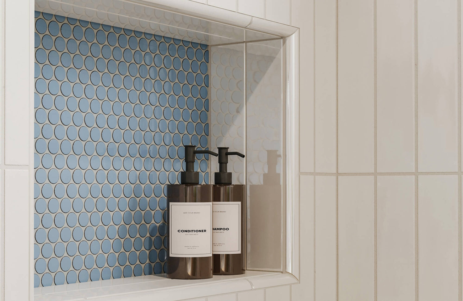
Mosaic tile isn’t just a surface—it’s a visual language. With its small-scale format and endless layout options, it adds a sense of rhythm and texture that larger tiles simply can’t replicate. Whether you’re using it to frame a stove, wrap around a vanity wall, or create an accent niche, mosaic tile draws the eye in and encourages a closer look. It invites movement, contrast, and even a bit of playfulness, something especially useful in rooms where the rest of the palette is subtle or uniform.
Part of what makes mosaic tile so effective is how well it adapts to your design goals. It can create bold contrast with geometric shapes and strong colors, or bring softness through organic curves and natural materials like marble or travertine. The tiny scale also gives you more control: you can blend patterns, shift directions, or introduce detail in a very precise way. And unlike larger format tiles, mosaics naturally echo the handcrafted feel of older, more storied interiors while still working beautifully in modern homes. When done right, they turn a blank backsplash into something memorable.
As seen above, our Shea 12.5x15 Matte Porcelain Leaf Mosaic Tile in Cool Blend is a perfect example of how mosaic can introduce both movement and subtle detail. Its soft tonal shifts and leaf-like geometry bring texture and elegance to even the most functional spaces, turning a laundry wall into a design feature.

Choosing the Right Style for Your Space
A great mosaic backsplash should feel like it belongs not just in color, but in tone, texture, and shape. The right tile complements the surrounding materials while adding something unique to the mix. Whether you're working with bold cabinetry or a quiet, neutral palette, your choices in contrast, finish, and pattern can help the backsplash feel intentional and layered, not just decorative.
Color Contrast or Tonal Harmony?
Bold contrast can give a backsplash instant impact, especially in spaces with minimal color or flat surfaces. A deep green mosaic against a light quartz countertop or bright white tile set against dark cabinetry creates that pop that catches the eye. It can help define zones in an open kitchen or break up too much sameness in a bathroom. The contrast doesn’t have to be extreme; even a gentle warm vs. cool pairing can do the trick. It’s all about creating a definition that supports the rest of the room.
Tonal palettes, on the other hand, offer a quieter kind of depth. If your space leans neutral or layered, choosing mosaic tiles that echo nearby materials like pale stone paired with creamy cabinetry can feel more cohesive and grounded. This approach adds texture and visual interest without pulling focus. It’s particularly effective in bathrooms or serene kitchen setups where you want softness without losing detail. Tonal harmony gives the room a sense of calm while still feeling elevated.
Glossy, Matte, or Mixed Finishes
The finish of your mosaic tile can completely shift the mood and feel of your backsplash. Glossy tiles reflect light and often add energy to small or shadowed spaces, especially under task lighting or near windows. They’re great for making a backsplash feel bright and lively, particularly in kitchens with darker cabinetry. But they can also highlight every fingerprint or smudge, so they work best where visual punch matters more than perfection. For a more subtle sheen, some designers opt for a soft polish or semi-gloss that reflects without overpowering.
Matte finishes, by contrast, create a more grounded and relaxed tone as seen above with our Aniston 2x2 Matte Porcelain Hexagon Mosaic Tile in Calacatta Top. They absorb light rather than bounce it, which helps balance busier textures like veined stone or rustic wood. They’re easier to keep looking clean and tend to photograph well, making them ideal for soft, minimalist interiors or spa-like baths. Mixing finishes, like using matte field tiles with a few glossy inlays, can also add layered interest without introducing new materials. The key is making sure your lighting plan supports the surface you choose, so every detail reads the way you want it to.
Mosaic Shapes That Add Character
Shape is one of the easiest ways to give a backsplash personality. While classic squares and brick patterns work well, choosing fan shapes, hexes, or herringbone layouts can instantly make the design feel more intentional. Fan mosaics bring in movement and flow, perfect for softening modern lines or balancing rigid cabinetry. Hexagons can add a retro edge or a clean, geometric rhythm depending on the color and finish. These shapes carry just enough visual tension to stand out without overwhelming the space.
Mixed-shape mosaics, where different pieces come together in an organic or patchwork layout, offer even more dimension. They break the expected grid and invite the eye to move around, especially when paired with subtle color shifts or natural material variation. If your kitchen or bath already has strong symmetry, these mosaics can soften the look and make it feel more relaxed. They also work well in open-concept layouts where the backsplash acts as a subtle transition. Choosing shape thoughtfully ensures your mosaic doesn’t just fill space; it brings it to life.

Layout and Placement Tips That Make a Difference
Where and how you place your mosaic tile matters just as much as the tile itself. Strategic layout can turn even the simplest material into a standout feature. Here, we’ll explore creative placement ideas that move beyond the expected, helping your backsplash become a true design moment.
Full Backsplash vs. Accent Strip
A full-height mosaic backsplash makes a bold statement; it adds color, texture, and rhythm that runs from counter to ceiling. This approach works especially well behind open shelves or range hoods, where uninterrupted tile can frame the space and create a gallery-like effect. In smaller kitchens or baths, extending tile up can also make the walls feel taller and more dynamic. That visual continuity keeps the room feeling open, even when the pattern is detailed. It’s a powerful move that works best when you want your backsplash to lead the design.
Accent strips, on the other hand, offer a subtler approach. When used thoughtfully, like a narrow band under a mirror or along the length of a niche, they can highlight certain areas without taking over. Strips can also be used to break up other tile fields, offering a shift in texture or tone without adding bulk. This works particularly well in minimalist or contemporary spaces where visual restraint matters. Both approaches have an impact; it just comes down to whether you want your backsplash to speak loudly or whisper confidently.
As seen above, our Ramsey 2x2 Polished Porcelain Mosaic Tile in Smoke brings this concept to life with its reflective surface and soft gray tones. It’s used here as a full backsplash behind a double vanity, offering both a cohesive backdrop and subtle texture that responds beautifully to natural light. The tight grout joints and polished finish help frame fixtures and mirrors without overpowering the space—proof that placement and finish work hand in hand.
Designing Around Outlets and Fixtures
Outlets, switches, and plumbing can easily disrupt a mosaic pattern if not planned for in advance. One way to minimize the visual break is to align outlet boxes with grout lines or place them in less conspicuous areas like cabinet sides. Slim or color-matched outlet covers can also help reduce distraction without compromising function. For bathrooms, wall-mounted faucets or mirror lighting should be mapped before tile installation to avoid awkward cuts or uneven symmetry. Planning gives your backsplash room to shine without interruption.
Another tip is to mock up the layout before setting anything in stone—literally. Use painter’s tape or cardboard templates to visualize how the tile will interact with each fixture. This allows for smart adjustments before any adhesive is involved. In tight layouts, small mosaics are more forgiving than larger tiles, since they can flex around obstacles with less visual disruption. By prioritizing flow over rigid alignment, you can maintain a clean, intentional look even in utility-heavy zones.
Framing a Focal Point With Borders or Shape Shifts
Borders and shape transitions are subtle but effective tools for defining focal points. You might frame a stove alcove or vanity mirror with a band of mosaic in a different material or pattern to create contrast without changing color. For example, a matte mosaic backsplash could be outlined with a glossy pencil trim to add definition and polish. This technique helps guide the eye and adds a custom-feel detail without overwhelming the space. It’s especially useful in areas where cabinetry and countertops are more restrained.
You can also shift the pattern itself to signal focus switching from vertical to diagonal placement behind a cooktop, or transitioning from a neutral field to a bold fan mosaic in a recessed shelf. These subtle changes in movement or direction add just enough drama to make the space feel curated. When done well, they create a moment of pause that draws attention exactly where you want it. It’s one of the simplest ways to elevate your backsplash without changing materials.

Mixing Materials and Textures for Depth
The beauty of mosaic tile lies in how it plays with light, surface, and movement, and material choice is a big part of that. Pairing different finishes and textures can give your backsplash more dimension, helping it feel layered rather than flat. Below, we’ll explore how thoughtful combinations like stone and glass, metallics, or even porcelain blends can bring a sense of rhythm and personality to your space.
Combining Glass With Natural Stone
Pairing smooth, reflective glass tiles with matte-finish stone is one of the easiest ways to add energy and balance to your backsplash. The high-shine glass bounces light around the room, especially near windows or under-cabinet lighting, while the stone brings grounding texture and warmth. This combination works well in kitchens that blend modern and natural elements, like pairing sleek countertops with rustic woods. It’s also great for highlighting certain zones, like using glass just behind the range or in open shelving. The contrast keeps the design dynamic without feeling busy.
This material mix is especially helpful when you want something that feels both refined and lived-in. Glass alone can feel a little cold, and stone alone can sometimes feel too muted, but together, they strike a beautiful middle ground. Try keeping the palette cohesive while letting texture do the work, like pairing creamy limestone with smoky gray glass. The shift in reflectivity keeps the backsplash from fading into the background.
Layering Neutral Palettes With Metallics
If you want your backsplash to pop without introducing bright colors, consider adding metallic accents to a neutral base. Small-scale brass, copper, or stainless tiles woven into ceramic or stone mosaics can create a sense of movement without overwhelming the palette. These reflective elements catch the light just enough to add interest and rhythm, especially useful in kitchens that already lean soft or understated. It’s a subtle way to bring in sophistication without going bold.
Metals also shift with lighting, meaning they’ll look different throughout the day, adding visual texture even when the color stays the same. This is especially useful in minimalist bathrooms or modern kitchens where you want to introduce depth without disrupting the overall tone. A little goes a long way; think of it as jewelry for your backsplash: intentional, polished, and designed to draw the eye.
Porcelain With Ceramic
Combining porcelain and ceramic mosaics offers the best of both worlds: durability with a handcrafted feel. Porcelain brings strength and low maintenance, while ceramic often has more variation in glaze and surface texture, adding a sense of warmth and character. Together, they can create a subtle contrast that still feels unified. For instance, matte porcelain pieces might frame a glossy ceramic center section, giving the backsplash a layered look without adding new colors or materials.
This pairing works especially well when you're working with a monochrome or tone-on-tone palette but still want to avoid a flat appearance. Ceramic’s slight imperfections, like soft edges or variation in glaze, help soften porcelain’s more precise lines. It’s a great way to introduce movement, especially if your counters or floors are clean-lined or highly polished. The two materials complement each other in ways that feel natural, grounded, and intentionally composed.
How to Choose a Mosaic Tile Pattern That Feels Fresh
If you want your backsplash to feel custom, not cookie-cutter, the pattern you choose matters just as much as the tile itself. A thoughtful layout adds movement, energy, or softness depending on the shapes you use.
Herringbone for a Sense of Direction
Herringbone patterns bring movement and flow, making even a small backsplash feel active and intentional. The zigzag layout draws the eye upward or outward depending on orientation, which can make a narrow wall feel taller or wider. It’s a great choice in both modern and transitional spaces, especially when you want your tile to feel more dynamic than a straight stack. This layout works particularly well with glass, stone, or even mixed-material mosaics. The key is to keep grout lines clean so the directionality feels crisp, not chaotic.
Chevron for a Polished, Rhythmic Look
Unlike herringbone, which staggers the tile ends, chevron patterns meet in sharp, continuous points, creating a cleaner, more graphic rhythm. The result is bold but not overpowering, especially when done in tone-on-tone palettes or soft marble finishes. Chevron works beautifully behind cooktops or bathroom vanities where you want a sense of symmetry without going overly formal. It’s a great way to get in shape without relying on strong color. For a slightly softer effect, try a chevron mosaic made with irregular or tumbled edges.
Staggered or Broken Joint for Relaxed Texture
For a more laid-back, organic feel, consider a staggered or broken joint layout. This pattern offsets each row, creating a brick-like rhythm that feels casual and easygoing—perfect for kitchens with rustic woods, natural stone, or mixed finishes. It adds texture without trying too hard, and it’s especially forgiving when working with handmade or slightly irregular tiles. The subtle shift in alignment helps diffuse the grid-like feel of traditional mosaic layouts. It’s ideal when you want visual interest without drawing too much attention to the backsplash itself.
Fan or Scallop Patterns for Soft Movement
Fan or scallop mosaics bring a sense of fluidity and softness to any wall. With curved lines and repeated arches, they create a subtle wave that feels elegant and just a little unexpected. This style is especially well suited to bathrooms or powder rooms where a bit of charm and playfulness can go a long way. Depending on the finish, like soft matte ceramic or mother-of-pearl, it can lean romantic or coastal. The curves also contrast nicely with the hard lines of vanities, mirrors, or cabinetry, adding balance to the space.
Mixed-Shape Patterns for a Collected Feel
If you want your backsplash to feel curated rather than coordinated, a mixed-shape mosaic can do the trick. This could mean combining hexagons and squares, long strips with short rectangles, or even irregular shapes for a patchwork effect. These patterns feel more artistic and less rigid, especially in eclectic kitchens or bathrooms where the design is meant to feel layered and personal. They’re particularly effective when using a tight color palette that lets the shape variation take the lead. The result is a one-of-a-kind backdrop that feels both composed and expressive.
If you’re unsure which mosaic pattern will feel right in your space, our Augmented Reality (AR) Tool can help. It lets you preview different layouts directly on your wall, so you can explore how each pattern flows with your cabinets, counters, and lighting—before committing to installation. It’s an easy way to make confident, creative decisions that truly fit your design vision.
Common Mistakes That Flatten the Design
Even the most beautiful mosaic tile can fall flat when a few small decisions go unchecked. From grout color to scale, the details you might overlook often make the biggest impact. Below are some common design missteps and how to avoid them so your backsplash stands out for the right reasons.
Using the Wrong Grout Color
Grout may seem like a finishing detail, but it can completely shift how your mosaic reads. A high-contrast grout outlines each tile and emphasizes the pattern, which can work well for bold or geometric layouts. But when used with subtle or tonal mosaics, it can feel busy or overly graphic. On the flip side, choosing a grout that blends too closely can mute the texture and movement of the tile altogether.
The best approach is to think about the visual role grout plays in your overall design. Do you want to highlight shape and rhythm, or let the material speak more softly? Testing a few grout swatches against your tile samples under real lighting can make all the difference. Grout isn’t just functional, it’s part of the visual story.
Ignoring Scale and Proportion
Not every mosaic pattern works in every space. Using tiny tiles in a large kitchen can feel overly detailed or fussy, while oversized patterns in small bathrooms can dominate the room. It's important to match the scale of your mosaic to the wall size and nearby elements like cabinets, windows, or fixtures.
Also, consider the size of the pattern repeat too tight and it may overwhelm, or too loose and feel unfinished. Step back and look at the space as a whole before locking in your layout. When scale and proportion are right, the backsplash enhances the room instead of fighting it.
Failing to Commit to a Focal Point
A mosaic backsplash is more than just a filler; it can be the visual centerpiece of your kitchen or bathroom if you let it. One of the most common mistakes is using an intricate tile but treating it like an afterthought, with no clear beginning, end, or purpose. Without a focal point, even the most beautiful mosaic can feel lost.
Instead, think about where you want the eye to land first. Whether it’s behind the stove, around a mirror, or along a full-height wall, defining that space with pattern, shape, or layout helps the design feel intentional. A backsplash doesn’t have to be loud, but it should feel like it belongs.

Should You Go DIY or Hire a Pro for Mosaic Installation?
Installing mosaic tile might seem like a manageable DIY project, but the details can get tricky fast. Because mosaics involve smaller pieces and tighter grout lines, even slight misalignments become very noticeable once the tile is on the wall. Unlike larger format tiles that offer more forgiveness, mosaics demand consistency in spacing and level application from start to finish. If you’re not comfortable with a tile saw, trowel control, or meticulous planning, the learning curve can be steep.
Grout work is another area where mosaics challenge even experienced DIYers. Since there's more grout line per square foot, it takes more time, effort, and attention to detail to achieve a clean, uniform finish. Too much grout can overwhelm delicate tile shapes; too little can lead to weak bonds or uneven color. Drying times also need to be managed carefully to avoid haze or staining on textured or porous tile surfaces. What seems like a weekend project can quickly stretch out and become frustrating if you’re not fully prepared.
That said, DIY installation can still be worth considering for small areas like a powder room niche or a short backsplash run, especially if you’re patient and willing to practice. Just make sure to work with a high-quality mesh-backed tile and test your layout before committing with adhesive. For larger projects or more intricate layouts like herringbone or custom borders, it’s often better to hire a pro. A good installer not only ensures a polished finish but can also help minimize material waste and troubleshoot layout challenges before they happen.
Let Your Mosaic Tile Tell the Right Design Story
A standout mosaic tile backsplash doesn’t just happen—it’s the result of thoughtful choices in material, shape, scale, and placement. Whether you’re layering neutral tones with metallic shimmer, playing with bold patterns like herringbone or chevron, or framing a focal point with custom detailing, the magic lies in how all the elements come together. Even small design decisions like grout color or tile finish can shift the entire feel of your kitchen or bath. When done right, a mosaic backsplash feels personal, dynamic, and deeply connected to the space around it.
If you're unsure where to start or want help bringing your vision to life, our design consultants are here to guide you. From selecting the right tile combinations to laying out a pattern that fits your space, we’ll help you turn your backsplash into something unforgettable. Book a design consultation today and let’s design something that truly stands out.


