


Within a thoughtfully designed home, wall art quietly shapes the atmosphere, lending depth, character, and a sense of curated identity to every room it inhabits. Rather than serving as mere decoration, carefully selected artwork becomes an expressive design element that reflects personal taste while enhancing the space's architectural rhythm. From the interplay of materials and textures to the subtle harmony of color palettes and spatial composition, each choice contributes to a cohesive visual narrative.
When approached intentionally, choosing wall art that reflects your personality and style helps interiors feel both refined and deeply personal. Understanding how to select wall art for modern home décor and personalized interior styling ultimately transforms walls into meaningful canvases that reflect the lifestyle and aesthetic sensibilities of those who live within them.

Defining Personal Aesthetic Identity for Meaningful Wall Art Selection
A well-curated wall art collection begins with a clear understanding of personal aesthetic preferences and the design language that shapes a home’s overall atmosphere. When artwork resonates with individual tastes while aligning with the surrounding décor, it contributes to a cohesive environment where visual expression and interior design move naturally together.
Recognizing Core Interior Design Styles That Influence Artwork
Interior design styles often provide the first clues for identifying artwork that will feel harmonious within a space. In homes shaped by modern minimalist design, wall art frequently leans toward abstract compositions, monochromatic photography, and refined line drawings that celebrate simplicity and controlled negative space. By contrast, bohemian and eclectic interiors tend to welcome vibrant paintings, textile wall hangings, and culturally inspired prints that introduce warmth and layered visual interest.
Mid-century modern interiors often draw inspiration from retro graphic prints or abstract expressionist artwork, reflecting the creative energy of mid-twentieth-century design movements. Traditional interiors, on the other hand, naturally accommodate landscape paintings, classical portraiture, or ornate framed works that highlight craftsmanship and historical depth. When wall art reflects the architectural and stylistic language of the home, the entire environment feels more unified and visually intentional.
Integrating Personal Interests Into Wall Art Themes
Artwork becomes particularly meaningful when it echoes the interests, memories, and passions that shape daily life. A collection of travel photography or vintage maps may subtly reveal a love for exploration, while botanical illustrations or nature-inspired paintings can mirror a deep appreciation for organic beauty. Music enthusiasts also often gravitate toward framed album covers, stylized lyrics, or abstract soundwave art that reflects their connection to sound and culture.
Over time, these choices begin to form a visual narrative that extends beyond decoration and instead tells a story about the people who inhabit the space. Because such pieces carry personal associations, they introduce emotional depth while enriching the atmosphere of the room. In this way, wall art evolves into a meaningful extension of lifestyle and identity rather than a purely decorative feature.
Developing a Consistent Visual Narrative Through Art
As individual pieces accumulate, the most compelling interiors often reveal a subtle narrative thread connecting the artwork displayed throughout the home. This narrative might emerge through a shared color palette, a recurring subject matter, or a consistent artistic style that links one piece to another. A photography-focused gallery wall, for instance, might combine architectural imagery, urban landscapes, and black-and-white portraits to create a cohesive metropolitan aesthetic.
Similarly, interiors inspired by nature may weave together botanical illustrations, forest landscapes, and organic abstract paintings that echo the textures of the natural world. Maintaining this thematic continuity also helps ensure that each piece contributes to a broader visual composition rather than appearing randomly selected. Over time, this thoughtful approach allows the wall art collection to mature into a cohesive reflection of personal style.

Choosing the Right Artistic Medium and Material for Design Impact
Beyond subject matter and style, the medium and material of wall art significantly influence how a piece interacts with light, texture, and surrounding décor. By thoughtfully selecting artistic mediums, homeowners can enhance the visual depth of a space while reinforcing the atmosphere they wish to create.
Canvas Art for Versatile and Gallery-Inspired Interiors
Among the many materials available, canvas remains one of the most versatile options for residential wall art. Stretched canvas prints, for example, present artwork without reflective glass surfaces, allowing viewers to appreciate color and texture from multiple angles without distracting glare. The subtle weave of the canvas also adds gentle surface depth, which enhances both photographic reproductions and expressive abstract paintings.
Because of its balanced proportions and gallery-style presentation, large canvas artwork often serves as a focal point above sofas, beds, or console tables. Designers frequently rely on oversized canvas pieces to anchor open-plan living areas and create visual continuity across expansive walls. This adaptability allows canvas artwork to blend naturally into contemporary, transitional, and modern interior design styles.
Acrylic and Glass Art for Contemporary Visual Clarity
For interiors that favor sleek surfaces and modern sophistication, acrylic and glass wall art offer a refined alternative. Acrylic panels are typically produced using UV-cured printing technology that intensifies color saturation while preserving sharp visual detail. The polished surface also subtly reflects ambient light, allowing the artwork to shift gently in appearance as lighting conditions change throughout the day.
In addition, glass art panels achieve a similarly contemporary aesthetic, introducing a luminous quality that complements minimalist interiors with clean architectural lines. Because both materials emphasize clarity and precision, they are often used in urban apartments and contemporary homes where simplicity and modern craftsmanship define the design language. As a result, acrylic and glass wall art help create interiors that feel polished, vibrant, and visually dynamic.
Metal and Mixed-Media Artwork for Dimensional Texture
While many artworks remain flat against the wall, metal and mixed-media pieces introduce dimensional structure that adds architectural interest to interior surfaces. Laser-cut aluminum or steel panels, on the other hand, often feature intricate patterns that interact beautifully with surrounding light, casting delicate shadows that shift throughout the day. This subtle movement creates visual depth that transforms the wall into an active design element rather than a static background.
Mixed-media artwork builds on this idea by combining materials such as wood, resin, textiles, and metal within a single composition. The layering of materials also introduces tactile complexity, encouraging viewers to engage with the artwork both visually and texturally. Through these multidimensional qualities, metal and mixed-media art enrich interiors by adding movement, texture, and sculptural character.

Applying Scale, Proportion, and Spatial Balance in Wall Art Placement
Even the most beautiful artwork can lose its impact if it is not scaled or positioned appropriately within the room. Careful attention to proportion, placement, and spatial balance ensures that wall art enhances the architecture rather than competing with it.
Determining the Correct Artwork Size for Different Wall Spaces
Selecting artwork that corresponds with the scale of the surrounding furniture and architecture is essential for maintaining visual balance. Designers often apply the two-thirds rule, suggesting that artwork positioned above furniture should measure roughly two-thirds the width of the furniture beneath it. For example, a ninety-inch sofa typically pairs well with artwork ranging between fifty-five and sixty-five inches in width.
This proportional relationship also allows the piece to feel connected to the furniture without overwhelming the composition. In larger rooms, oversized artwork can successfully anchor expansive walls and establish a focal point that organizes the surrounding décor. Meanwhile, narrower spaces such as hallways or entryways often benefit from vertically oriented pieces that visually extend the height of the wall.
Establishing Proper Hanging Height for Visual Comfort
Just as important as size is the height at which the artwork is displayed. In museums and professional galleries, the center of an artwork is typically positioned approximately fifty-seven to sixty inches from the floor, a measurement that aligns comfortably with the average human eye level. This placement also allows viewers to engage with the artwork naturally without needing to adjust their gaze dramatically upward or downward.
When artwork is hung above furniture, leaving a gap of roughly six to ten inches between the frame and the furniture surface helps maintain a visual connection between the two elements. In rooms with particularly tall ceilings, designers may adjust the height slightly while still preserving overall proportional balance. These subtle placement considerations ensure that the artwork feels integrated into the room rather than floating awkwardly on the wall.
Maintaining Balance Through Strategic Artwork Spacing
When multiple pieces are displayed together, spacing becomes a crucial factor in maintaining visual harmony. Interior designers generally recommend leaving two to four inches between frames in gallery-style arrangements, allowing each piece to breathe while still appearing connected. Consistent spacing further encourages the viewer’s eye to move fluidly across the composition without distraction.
At the same time, visual weight must be carefully distributed across the display. Larger or darker artworks naturally draw more attention, so balancing them across the arrangement prevents one side from appearing heavier than the other. In more layered styling approaches, a single framed piece may also be leaned against a wall or placed on a shelf to soften the structure of the display. A textural piece such as Edward Martin’s Silent Orchard Wall Art, as displayed in the photo above, works particularly well in these compositions, where its woven patterns and neutral tones introduce quiet visual interest while maintaining balance among surrounding decorative elements.
When paired with carefully spaced objects and subtle lighting, it reinforces the overall harmony of the arrangement without overwhelming the space. Through thoughtful spacing and balance, even complex wall displays can achieve a calm and cohesive presence.

Using Color Psychology and Palette Coordination in Wall Art
Color has the power to influence not only the visual harmony of a room but also the emotional atmosphere it creates. By thoughtfully coordinating artwork with interior palettes, homeowners can ensure that wall art enhances both the aesthetic and mood of the space.
Coordinating Artwork With Existing Interior Color Schemes
Integrating wall art successfully often begins with observing the dominant colors already present within the room. Designers frequently apply the 60-30-10 color principle, where sixty percent of the room features a dominant tone, thirty percent introduces a secondary color, and ten percent functions as an accent. Wall art often fulfills this accent role, subtly weaving additional colors into the design without overwhelming the palette.
For instance, artwork featuring soft neutrals, sepia tones, or muted landscapes can beautifully complement interiors with warm wood finishes, cream upholstery, and earthy decorative accents. A piece such as the Quiet Study Wall Art, as shown in the picture above, illustrates how subdued tones and classic imagery can echo the warmth of surrounding materials while adding depth to the wall. When placed within a gallery arrangement or near architectural elements like a fireplace or shelving, its layered tonal palette helps unify the space without disrupting the overall color balance.
Alternatively, artwork may repeat subtle variations of the dominant color to reinforce a calm monochromatic scheme. This thoughtful coordination ensures that the artwork feels intentionally woven into the visual structure of the room.
Applying Color Psychology to Shape Interior Mood
Color choices also influence how a space feels on an emotional level. Cool tones such as soft blues and muted greens are widely associated with calmness and clarity, making them particularly suitable for bedrooms, reading areas, or quiet corners designed for relaxation. On the other hand, warmer tones like amber, rust, and deep red tend to evoke energy and sociability, which is why they frequently appear in living rooms and dining spaces. These subtle psychological responses help designers use wall art strategically to support the intended mood of a room. Even small shifts in color intensity can dramatically alter how a space is experienced. By understanding color psychology, homeowners can select artwork that reinforces both comfort and atmosphere.
Using Contrast and Accent Colors for Visual Interest
While harmonious palettes create stability, contrast introduces a sense of energy that keeps interiors visually engaging. For instance, bold artwork can act as a focal point within neutral spaces dominated by whites, grays, or natural materials. An abstract piece featuring deep navy or charcoal tones, for example, can dramatically elevate a minimalist living room. Accent colors within artwork also provide opportunities to echo smaller decorative details such as cushions, rugs, or ceramics. These visual connections help unify the entire room without relying on identical color repetition. When carefully balanced, contrast adds sophistication and visual depth without disrupting the overall harmony of the interior.

Curating Gallery Walls and Layered Art Displays for Personal Expression
For many homeowners, the most expressive form of wall décor emerges through thoughtfully curated gallery walls. By combining multiple artworks within a single arrangement, these displays transform blank walls into layered compositions that reflect personality, memories, and artistic curiosity.
Selecting a Cohesive Gallery Wall Layout Structure
The structure of a gallery wall strongly influences how the entire arrangement is perceived. For example, grid layouts, which rely on identical frames and consistent spacing, create a clean and orderly presentation that suits contemporary interiors. Salon-style layouts also adopt a more relaxed and organic composition, combining frames of different sizes in a densely layered arrangement inspired by historical art exhibitions. In addition, symmetrical layouts balance irregular shapes while maintaining a sense of visual equilibrium across the wall. Each configuration introduces a different rhythm, allowing homeowners to select a layout that complements their interior style. When the arrangement is thoughtfully planned, the gallery wall feels curated rather than chaotic.
Creating Consistency Through Framing and Materials
Even when the artwork itself varies widely, consistency in framing can unify the entire display. Frames crafted from similar materials, such as matte black metal, warm natural wood, or classic white gallery frames, establish visual continuity across different pieces. Matting further enhances this cohesion by providing consistent breathing space between the artwork and its frame. Neutral mat colors also allow the artwork to remain the focal point while maintaining a polished appearance. This technique mirrors the approach used in professional galleries and museum exhibitions. When applied within residential interiors, it creates a refined and thoughtfully organized display.
Combining Artwork Types for Dynamic Visual Storytelling
A truly engaging gallery wall often emerges from the interplay of different artistic forms. Photography, abstract paintings, typography prints, and hand-drawn illustrations can coexist within a carefully balanced arrangement. Personal photographs and travel mementos also introduce emotional depth, grounding the display in real experiences and memories. Meanwhile, professional art prints bring visual sophistication and artistic diversity to the composition.
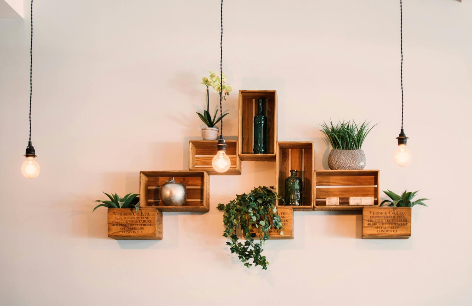
Layered styling can further expand beyond traditional gallery walls by incorporating artwork into shelves, countertops, or open cabinetry. A piece like the Meadowline Wall Art, as featured in the photo above, illustrates how textured textile artwork can be leaned or displayed within styled shelving to introduce warmth and dimension alongside ceramics, glassware, and other decorative objects. Its woven surface and soft neutral tones add tactile contrast while still blending naturally with surrounding materials.
The combination encourages viewers to explore each piece while appreciating the broader narrative they create together. As new experiences accumulate, additional artworks can be introduced, allowing the gallery wall to evolve alongside the homeowner’s personal story.
Where Personality and Interior Design Gracefully Meet
When thoughtfully chosen, wall art becomes far more than a decorative accent; it becomes a quiet reflection of the personality and experiences that shape a home. By balancing aesthetic identity, artistic materials, spatial proportion, and color harmony, homeowners can create interiors where every artwork contributes meaningfully to the overall design. The result is a living environment that feels intentional, expressive, and visually cohesive.
Edward Martin’s design services can further refine this process, offering thoughtful guidance in selecting wall art and décor that complement both personal style and architectural space. For tailored assistance in curating a cohesive interior aesthetic, you can also contact us to connect with a design specialist!
