


A blank wall can either feel unfinished or like an opportunity waiting to be defined. The difference usually comes down to how thoughtfully the art is chosen. The right piece can anchor a sofa, soften a bedroom, or bring depth to a minimalist space, while the wrong one can feel disconnected, no matter how beautiful it is on its own. Size, placement, material, and color all play a role in that outcome. In this blog, we’ll break down how to choose wall art that feels intentional, balanced, and naturally aligned with your interior design.

Start With the Room’s Purpose and Design Direction
Wall art rarely works when it’s chosen on impulse. It tends to feel most natural when it grows out of how the room is actually used and how you want it to feel day to day. A space meant for slow evenings should not carry the same visual energy as one designed for entertaining or creative work. When art supports the room’s purpose, everything feels more settled and intentional.
Defining the Mood You Want the Space to Convey
Before you think about size or color, take a moment to consider the feeling you want the room to hold. Some spaces are meant to feel calm and restorative, while others lean expressive, layered, or even a little dramatic. That emotional direction quietly shapes what kind of artwork will feel right. If you’re aiming for serenity, softer compositions and gentler palettes usually feel more natural than bold, high-contrast pieces. In a lively or creative space, however, stronger movement and expressive forms can feel energizing rather than overwhelming. Once the mood is clear, it becomes much easier to filter out pieces that might look beautiful on their own but feel out of place in context.
Choosing a Visual Anchor Before Selecting Art
Most well-designed rooms already have something that leads the eye, even if it’s subtle. It might be a fireplace, a sculptural sofa, a striking headboard, or detailed millwork that naturally draws attention. Artwork should respond to that hierarchy, not compete with it. When you ignore the existing focal point, the space can start to feel visually split, as if two elements are fighting for center stage. Instead, identify what deserves to stand out first, then choose art that supports that priority. This keeps the eye moving comfortably through the room, allowing the artwork to feel integrated rather than inserted.
Aligning Artwork With Existing Finishes and Furniture
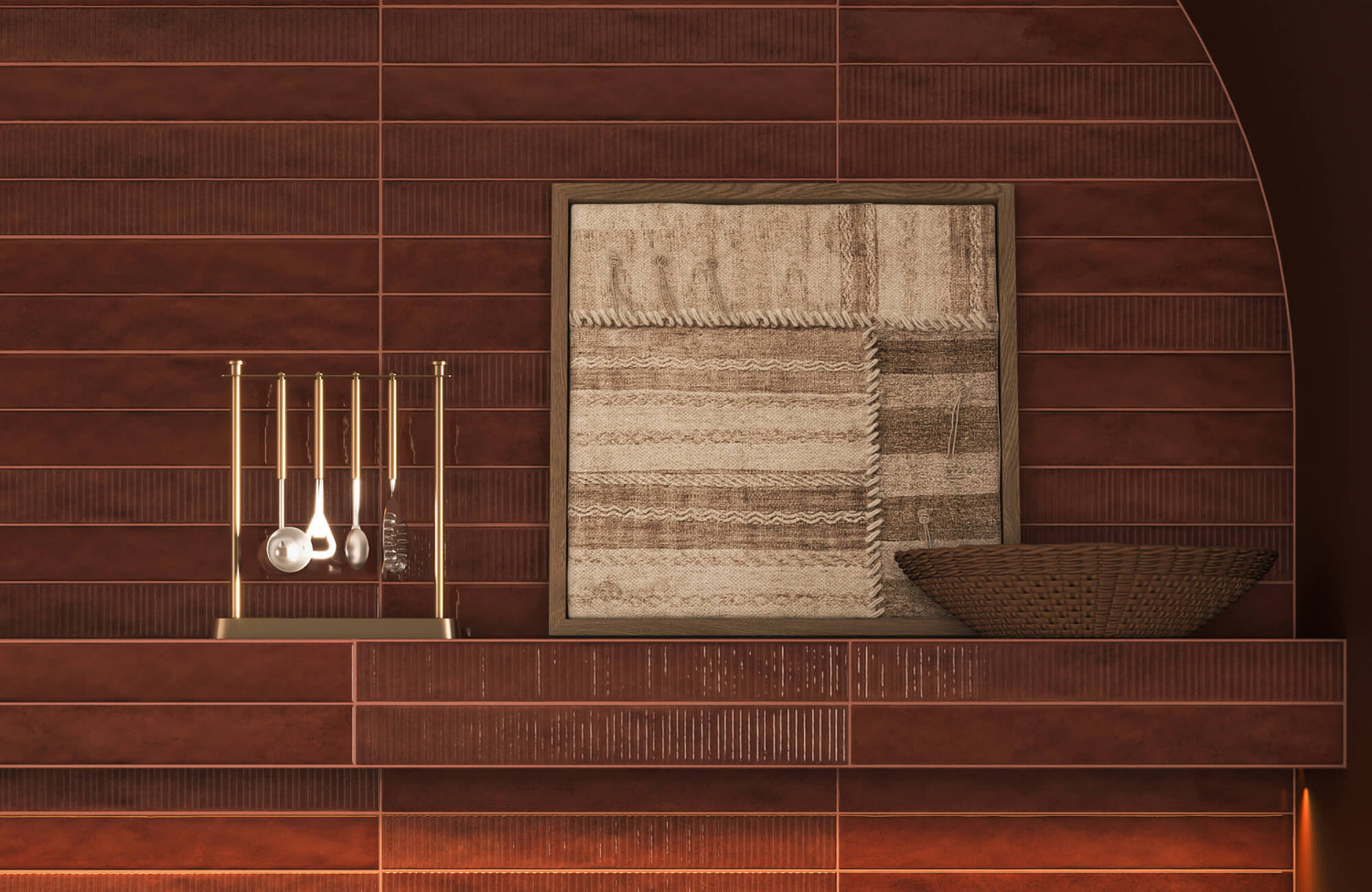
Wall art doesn’t live in a vacuum. It sits alongside flooring, upholstery, cabinetry, lighting, and all the subtle textures already shaping the room. Warm oak floors, cool marble surfaces, or richly toned fabrics will all influence how a piece reads once it’s hung. Even slight undertones can shift how certain colors feel, so it helps to step back and look at the space as a whole instead of isolating the artwork. Rather than pushing contrast just to make a statement, consider whether the piece quietly echoes a tone, material, or texture that’s already present. That subtle repetition often makes the art feel naturally integrated. When the finishes and artwork speak the same visual language, the room feels layered and connected instead of pieced together.
In a space like the one pictured above, where deep green cabinetry, glossy tile, and warm wood flooring already carry strong character, artwork needs to respond thoughtfully rather than compete. Our Meadowline Wall Art, as shown above, is a serene yet expressive display of textile artistry that would complement this kind of layered interior beautifully. Its tightly wound rows of plush white wool yarn and soft cascading fringes echo the room’s tactile richness, while the subtle band of warm beige and light brown tones reinforces an earthy, organic palette. Instead of introducing a jarring contrast, it builds on what’s already present, allowing texture and tone to feel connected.
Why Random Trend Pieces Rarely Feel Cohesive
It’s completely understandable to be drawn to something that looks striking online or beautifully styled in a showroom. The tricky part is that trends don’t automatically translate into your home’s architecture or furniture. A bold graphic or viral print might feel exciting at first glance, yet slightly out of place once it’s positioned above your sofa or beside existing finishes. Without a clear design direction behind it, the space can start to feel fragmented rather than composed. Taking a pause to ask whether the piece supports your overall vision makes a real difference. Art chosen with intention tends to settle into the room more naturally and hold its appeal far longer than something picked in the moment.

Choosing the Right Wall Art Size for Proportion and Impact
The size of your wall art can completely shift how a room feels, even when the subject and color are perfect. Scale influences whether a piece feels grounded above a sofa or slightly lost on a tall wall. In this part, we’ll look at how common art dimensions interact with furniture width, ceiling height, and overall layout so your selection feels balanced instead of undersized or overwhelming.
16" x 20" and 18" x 24" for Smaller Walls and Layered Arrangements
Sizes like 16" x 20" and 18" x 24" are often underestimated, yet they’re incredibly versatile. On narrower walls, above desks, or in compact entryways, they introduce personality without overwhelming the surface. They also work beautifully in layered setups, whether leaned casually on shelves or styled as a balanced pair. Because they carry lighter visual weight, it’s easier to group them into thoughtful clusters that feel curated instead of crowded. That said, placing just one of these above a long sofa can make it feel slightly undersized unless it’s part of a larger composition. When used with intention, these dimensions add charm and flexibility while keeping the space visually open.
24" x 36" as a Versatile Mid-Scale Statement
A 24" x 36" piece often feels like the natural middle ground. It’s large enough to stand confidently on its own, yet not so dominant that it overwhelms the wall. Above a console table or a modestly sized sofa, it tends to strike a comfortable balance. In bedrooms, it can anchor a dresser or even be repeated as a symmetrical pair for a more structured look. The added height also helps draw the eye upward, especially in rooms with average ceiling heights. As long as it spans a generous portion of the furniture beneath it, this size usually feels deliberate and well-proportioned rather than incidental.
A fireplace wall like the one in the above picture naturally calls for a piece that feels balanced rather than overpowering. Our Hollow Morning Wall Art fits beautifully in a 24" x 36" format, offering enough presence to anchor the tiled surround without competing with the built-in shelving or warm wood tones. Its antique textile–inspired detailing and muted beige and dark gray palette echo the room’s layered neutrals, creating depth without visual heaviness. Scaled this way, the artwork feels integrated into the architecture instead of simply filling the space above the mantel.
30" x 40" and 36" x 48" for Larger Feature Walls
As the wall grows, the artwork needs to grow with it. Sizes like 30" x 40" and 36" x 48" naturally feel more at home above longer sofas, king-sized beds, or wide sideboards. Instead of filling the space with multiple smaller frames, one well-scaled piece can establish a clear focal point right away. In rooms with higher ceilings, these dimensions help the wall feel intentional rather than slightly bare or top-heavy. Even so, a bit of breathing room around the edges keeps the composition from feeling cramped against nearby trim or windows. When the scale is thoughtfully considered, larger artwork feels architectural and grounded rather than simply big for the sake of impact.
Oversized Art (40" x 60" and Beyond) for Open Living Areas
Open-concept layouts and expansive walls often call for a stronger visual presence. A 40" x 60" piece, or something even larger, can match the scale of tall ceilings and wide furniture arrangements in a way smaller works simply can’t. From across the room, oversized art holds its own, whereas modest pieces may start to disappear. Choosing one commanding statement can also simplify the wall, replacing a cluster of smaller frames with a single cohesive moment. That clarity often reduces visual clutter and gives the space a more confident feel. As long as the surrounding wall area isn’t overcrowded, oversized art can feel bold, balanced, and entirely appropriate.
Gallery Walls vs Single Large-Scale Pieces
Choosing between a gallery wall and one large statement piece often comes down to rhythm and personality. Gallery walls allow for storytelling, mixing sizes and subjects to create movement across the wall. However, they require careful spacing and alignment so the composition feels cohesive rather than scattered. A single large-scale piece, by contrast, introduces clarity and calm because the eye has one focal point. In smaller rooms, a unified statement can sometimes feel less busy than multiple frames. The best choice depends on whether you want layered energy or a strong, simplified impact.

Construction and Material Quality
Once size and subject feel right, construction becomes the quiet factor that determines how the piece holds up over time. Materials influence weight, durability, and even how light interacts with the surface. Below, we’ll break down common art constructions so you can understand what truly separates a decorative print from something that feels substantial and lasting.
Stretched Canvas vs Framed Art Prints
Stretched canvas offers a relaxed, gallery-style presence that works well in both contemporary and transitional interiors. Because the artwork wraps around the frame, it doesn’t always require additional framing, which keeps the silhouette clean and modern. Framed art prints, on the other hand, feel more defined and structured, especially when paired with a mat that adds breathing room around the image. Glass or acrylic coverings also provide protection, though they can introduce glare depending on placement. Over time, high-quality canvas maintains tension across the stretcher bars, while well-built frames prevent warping and shifting. The right choice often depends on whether you prefer a softer, seamless look or a more tailored finish.
Solid Wood, Metal, and Mixed-Media Construction
Art created on solid wood panels, metal sheets, or mixed-media bases carries a different kind of presence. Wood-backed pieces feel grounded and organic, especially when the grain subtly shows through lighter designs. Metal surfaces introduce a sleek, contemporary edge and tend to resist moisture and warping more effectively. Mixed-media constructions, which combine layered materials, can add dimension and tactile depth that flat prints simply don’t offer. These materials also influence the overall weight of the piece, which affects installation and long-term stability. When thoughtfully crafted, solid constructions elevate wall art from decorative to architectural.
When artwork is built with layered materials rather than just printed on paper, you can immediately feel the difference. Our Earthbound Trace Wall Art, pictured above, is a serene yet expressive display of textile artistry, combining tightly wound beige and brown wool yarn with soft cascading fringes for added depth. Its wood frame reinforces the organic character of the woven surface, giving the piece both structure and warmth. The subtle white band grounds the composition, while the handcrafted construction elevates it from decorative to architectural. Pieces made this way don’t just sit on the wall; they bring material richness and tactile presence into the room.
Backing, Mounting Hardware, and Structural Integrity
What sits behind the artwork matters just as much as the surface you see. A sturdy backing board helps prevent bending and keeps the piece flat against the wall over time. Quality mounting hardware ensures the artwork hangs securely and stays level, especially for heavier materials like wood or metal. Poorly installed brackets or thin backing can lead to sagging or misalignment. It’s also worth checking how the frame corners are joined, since reinforced joints increase longevity. Strong structural details may not be immediately visible, but they make a noticeable difference in how the art performs over the years.
Surface Finishes: Matte, Gloss, and Textured Layers
Finish quietly shapes how a piece interacts with its surroundings. Matte surfaces reduce glare and offer a softer, more understated look that works well in rooms with strong natural light. Gloss finishes amplify color depth and can make artwork feel more vibrant, though they reflect more light. Textured layers, whether through brushstrokes or raised elements, introduce dimension that shifts throughout the day. These finishes affect not only appearance but also how the art feels within the room’s lighting conditions. Choosing the right surface ensures the artwork complements the environment rather than competing with it.

Selecting Color and Composition With Intention
Color and composition are what make wall art feel integrated rather than randomly placed. Instead of trying to match every tone in the room, it helps to think about how the artwork can echo or gently contrast what’s already there. In here, we’ll look at how thoughtful color relationships and balanced composition guide the eye and strengthen the overall design story.
Pulling Colors From Upholstery and Rugs
One of the easiest ways to create cohesion is by borrowing colors already present in the room. A painting that reflects subtle tones from a rug or upholstery fabric immediately feels connected, even if the subject matter is completely different. The key isn’t exact matching but gentle repetition, so the palette feels layered rather than forced. Even small accents, such as a muted blue in a throw pillow or a warm brown in wood furniture, can become anchors within the artwork. This approach allows the art to feel intentional without blending into the background. When color relationships are subtle yet deliberate, the room starts to read as composed rather than accidental.
Using Contrast to Create Depth
Repetition brings a sense of calm, but contrast is what keeps a room interesting. A bold artwork placed against a neutral wall can instantly add dimension and prevent the space from feeling flat or predictable. Likewise, introducing a darker piece in a light-filled room, or a lighter composition in a moodier setting, helps define focal points and sharpen the overall structure. The key is balance, not shock value. If contrast feels too abrupt, it can distract rather than enhance. When handled with intention, however, contrast adds energy and depth while still allowing the room to feel composed.
Abstract vs Representational Art in Modern Interiors
Choosing between abstract and representational art can subtly shift the tone of a space. Abstract pieces lean into movement, color, and feeling, which often complements modern or minimalist interiors beautifully. Representational art, whether a landscape, portrait, or still life, brings narrative and familiarity that can soften more structured rooms. Neither direction is inherently stronger; it really depends on the atmosphere you’re shaping. Abstract work leaves more room for interpretation, while representational pieces ground the space with a clearer visual story. When the style aligns with your overall design direction, the art feels integrated rather than randomly selected.

Placement, Height, and Arrangement Strategy
Even the most beautiful artwork can feel off if it’s hung without intention. Placement determines whether a piece feels grounded and connected to the room or awkwardly floating on the wall. Below, we’ll look at how height, alignment, and spacing create visual rhythm so your artwork feels balanced and naturally integrated.
Centering Art at Eye Level
One of the simplest ways to make artwork feel right is to hang it at eye level. In most homes, that means placing the center of the piece around 57 to 60 inches from the floor, though this can shift slightly depending on ceiling height. When art sits too high, it starts to feel disconnected from the furniture below and slightly out of reach visually. If it’s hung too low, the wall can feel compressed and the composition a bit heavy. Keeping the center aligned with a natural viewing height helps the piece feel approachable and grounded. That small adjustment alone can completely change how balanced the wall feels.
Proportion Above Sofas, Beds, and Consoles
Artwork should feel anchored to the furniture beneath it, not floating above it. A helpful guideline is to choose a piece that spans roughly two-thirds to three-quarters of the width of the sofa, bed, or console below. If the artwork is too narrow, it may look like an afterthought rather than a focal point. If it extends far beyond the furniture’s edges, the arrangement can start to feel unbalanced. Matching the artwork’s width more closely to the furniture creates a visual link that feels steady and intentional. When proportion is handled thoughtfully, the art and furniture work together as a single, cohesive unit rather than separate elements.
Spacing Between Multiple Frames
Once you start grouping more than one piece, spacing quietly becomes the glue that holds everything together. Keeping the gaps consistent, usually around two to four inches, helps the arrangement feel intentional instead of scattered. If one frame sits closer than the others, the eye immediately notices the imbalance. At the same time, spacing them too far apart can make each piece feel isolated rather than connected. It helps to think of the negative space as part of the composition, not leftover wall. When spacing is even and measured, multiple works begin to read as one cohesive, curated display.
Symmetrical vs Asymmetrical Arrangements
The way you arrange artwork can shift the mood of the entire room. Symmetrical layouts tend to feel structured and composed, especially when frames mirror each other around a central point. This approach works beautifully in more traditional or refined interiors where order feels comforting. Asymmetrical groupings, by contrast, introduce movement and a slightly more relaxed energy, which suits modern or eclectic spaces. Even without perfect mirroring, visual weight still needs to feel balanced across the wall. Choosing between symmetry and asymmetry ultimately comes down to how formal or free-flowing you want the space to feel.
Creating Impact Through Purposeful Wall Art
Wall art has the power to completely shift how a space feels, but only when it’s chosen and placed with intention. From clarifying the mood of the room to selecting the right size, construction, and placement, each decision builds on the next. When scale feels balanced, colors relate naturally, and the artwork aligns with your overall design direction, the entire room begins to feel more cohesive and elevated. Thoughtful choices almost always create more impact than simply filling empty wall space.
If you’d like guidance narrowing down the right piece, refining placement, or deciding between a single statement and a layered arrangement, our Personalized Design Consultation Service is here to help. We work with you to evaluate proportion, color relationships, and overall composition so your artwork feels purposeful rather than uncertain. A second perspective can often bring clarity and confidence to the process. With the right direction, your wall art can become the element that truly ties the room together.