


High ceilings instantly open up a room, but they can make wall art feel undersized or disconnected if the scale isn’t handled well. You might hang a piece that works in another space, yet here it leaves too much empty wall above or around it. The challenge goes beyond choosing larger artwork; it’s about proportion, placement, and how each piece relates to the room as a whole. In this blog, we’ll break down practical ways to scale wall art for high ceilings so your space feels intentional, balanced, and ready to come together with confidence.

Why Scaling Wall Art Matters in High-Ceiling Spaces
High ceilings can make a room feel open and impressive, but they also change how wall art looks and feels in the space. If the scale is not considered carefully, artwork that would normally work can suddenly feel too small or disconnected. This is where understanding proportion becomes the first step before thinking about exact sizes or layouts.
How High Ceilings Change Visual Proportion
When you have high ceilings, the vertical space naturally becomes a much bigger part of what you see in the room. Your eye is drawn upward, which means the walls carry more visual weight than they would in a standard-height space. Because of this, artwork that might look balanced in a lower room can start to feel undersized or out of place. It is not that the art itself is wrong, but rather that the surrounding space has changed the way it is perceived. The extra height creates more room that needs to be visually addressed. Without adjusting for that, the art can feel disconnected from the rest of the room. This is why proportion becomes more important than simply choosing a piece you like.
To work with this, it helps to think of your wall as a larger canvas that needs to be filled with intention. Instead of focusing only on the artwork, consider how much of the wall it occupies and how it relates to nearby furniture. Taller spaces often benefit from either larger pieces or arrangements that extend upward in a more deliberate way. This helps create a sense of balance between the wall and everything around it. Even slight adjustments in placement or grouping can make a noticeable difference. Taking a step back and viewing the wall as a whole can guide you toward better decisions. It allows you to match the scale of your art to the scale of the room more naturally.
The Risk of Leaving Too Much Empty Wall
One of the most common challenges with high ceilings is leaving too much empty wall space without realizing it. While some openness is important, too much can make the room feel unfinished or lacking direction. The upper portion of the wall can start to feel disconnected from the rest of the space, especially if all the visual elements are concentrated lower down. This creates an imbalance where the room feels heavier at the bottom and emptier at the top. Even well-chosen furniture and decor can feel incomplete when the walls are not fully considered. The space may still look clean, but it can lack that sense of cohesion that ties everything together.
A useful way to approach this is by gradually building upward rather than trying to fill everything at once. You might start with artwork above furniture and then consider how to extend the visual presence higher if needed. This could mean adding a second layer of art, choosing taller pieces, or adjusting placement to better use the vertical space. The goal is not to eliminate all empty areas, but to make sure they feel intentional rather than overlooked. Paying attention to how your eye moves across the wall can help guide these decisions. When the space feels balanced from top to bottom, the entire room starts to feel more complete. Small changes in height and arrangement can go a long way.
Why “Bigger” Isn’t Always Enough
It is easy to assume that choosing a larger piece of art will solve the issue of scale, but size alone does not always create balance. A single oversized piece can still feel out of place if it is not positioned well or if it does not relate to the rest of the room. Scale is not just about how big something is, but how it fits within the surrounding space. Placement, spacing, and composition all play a role in how the artwork is experienced. Without considering these factors, even large pieces can feel awkward or disconnected. This is why simply going bigger is not always the right solution. It needs to work as part of a larger visual arrangement.
A more effective approach is to think about how the artwork interacts with other elements in the room. For example, aligning it with furniture or grouping multiple pieces can create a stronger sense of structure. You can also use spacing to control how the eye moves across the wall, which helps the composition feel more intentional. In some cases, a combination of medium-sized pieces arranged thoughtfully can work better than one oversized item. This gives you more flexibility in shaping the overall look. The key is focusing on proportion and relationship rather than just size. When everything works together, the wall feels balanced without relying on a single solution.

How to Determine the Right Size for Wall Art
Choosing the right size for wall art becomes much easier when you focus on how it relates to your space rather than relying on fixed rules. Here, we’ll walk through practical ways to size your artwork so it feels balanced and intentional in real-life setups.
Using Furniture as a Reference Point
A reliable way to guide your wall art size is by using the furniture directly below it as your starting point. Whether it’s a sofa, bed, or console table, the artwork should feel connected to that piece rather than floating independently. In most cases, art that spans a noticeable portion of the furniture’s width will feel more balanced than something too narrow. If the artwork is too small, it can look disconnected and fail to anchor the space properly. On the other hand, going too wide can overwhelm the furniture and make the arrangement feel heavy. The goal is to create a visual relationship where the art and furniture support each other. When they feel aligned in scale, the entire setup looks more intentional.
Scaling Art Based on Wall Height
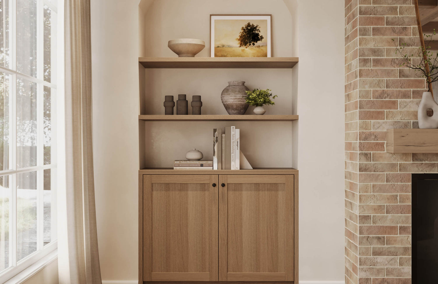
Wall height plays a major role in how artwork is perceived, especially in rooms with taller ceilings. If the piece does not take up enough vertical space, it can appear undersized even if its width feels correct. This often leads to walls that feel incomplete or top-heavy with too much empty space above. Choosing taller artwork or arrangements that extend upward helps create a better sense of balance. It allows the art to engage more of the wall instead of sitting too low and isolated. You do not need to fill the entire height, but there should be a clear presence that matches the scale of the room. Paying attention to vertical proportion helps the artwork feel more integrated.
That idea comes through clearly in the artwork shown above, where structure does most of the work instead of sheer scale. Our Borrowed Dawn Wall Art builds upward from a dense base of loose fibers into tightly arranged vertical coils, creating a quiet sense of lift that draws your eye higher on the wall. Even at a moderate size, that progression gives it more visual reach than a flat composition would offer. It feels grounded and expansive at the same time, which helps it sit comfortably within taller wall spaces. This is where proportion becomes less about measurements and more about how the piece carries itself within the room.
When to Go Oversized vs Multi-Piece Layouts
Deciding between a single large piece and a grouped arrangement often depends on both your wall size and the look you want to achieve. Oversized art works well when you want a clean, bold focal point that fills space without adding complexity. It keeps the wall simple while still making a strong visual statement. On the other hand, multi-piece layouts offer more flexibility, especially on wider or taller walls that need more coverage. Grouping smaller pieces can help you build upward and outward at the same time. This approach also allows for more variation in style and composition. Choosing between the two comes down to whether you prefer a streamlined look or a more layered arrangement.
Spacing and Margins That Keep It Balanced
Even when the artwork itself is well-sized, spacing plays a big role in how balanced it feels on the wall. Leaving too little space around the piece can make the area feel cramped, while too much space can cause it to look disconnected. The goal is to give the artwork enough room to stand on its own while still feeling anchored within the wall. Consistent margins help create a cleaner and more organized look. This is especially important when working with multiple pieces, where uneven spacing can quickly make the arrangement feel off. Taking a step back to check how the spacing looks from a distance can help you adjust more accurately. Small refinements here can make a noticeable difference in the final result.

Wall Art Styles That Work Best for High Ceilings
Not all wall art styles translate the same way in taller spaces, so choosing the right format can make a big difference in how your walls feel. Here, we’ll look at styles that naturally work with height so your space feels complete rather than empty or disconnected.
Large Single Statement Pieces
A large single statement piece works well when you want a clean and confident focal point without adding too many elements to the wall. In high-ceiling spaces, this approach helps anchor the room by giving your eye one clear place to land. It also keeps the overall look simple, which can be helpful if your furniture or layout already has a lot going on. The key is choosing a piece with enough visual weight, whether through color, subject, or composition, so it does not feel lost against the wall. This style works especially well in living rooms or entryways where you want an immediate impact. It creates a strong presence without needing additional layers. When placed thoughtfully, it can define the space in a very direct way.
Vertical Art Panels or Triptychs
Vertical panels or triptychs are a natural fit for high ceilings because they follow the upward direction of the wall. Instead of trying to fill space horizontally, these formats draw the eye upward in a more structured way. This helps the wall feel intentionally designed rather than partially filled. Triptychs also offer a sense of rhythm, as the repetition of panels creates a balanced and organized look. They work well in modern or contemporary interiors where clean lines are already part of the design. At the same time, they can soften large walls by breaking them into smaller visual sections. This keeps the space from feeling overwhelming while still using the full height effectively.
Gallery Walls That Extend Upward
Gallery walls offer a more flexible and layered approach, especially when you want to cover a larger area without relying on one single piece. By extending the arrangement upward, you can make full use of the wall height while still keeping things visually interesting. Mixing different sizes and orientations allows the layout to feel more dynamic. The key is maintaining a sense of flow so the arrangement does not feel scattered. When done well, a gallery wall can guide your eye across the entire space in a natural way. It also gives you room to incorporate different styles or personal pieces. This makes it a great option for spaces that benefit from a more lived-in and curated look.
Oversized Photography or Abstract Art
Oversized photography or abstract art works well when you want to fill space without making the wall feel busy. These styles often rely on strong composition or color rather than intricate detail, which helps them read clearly even at a larger scale. In high-ceiling spaces, this keeps the wall from feeling cluttered while still providing enough visual presence. Abstract pieces, in particular, can add movement and depth without competing with other elements in the room. Photography can create a more grounded or atmospheric feel depending on the subject. Both options work especially well in modern interiors where simplicity and clarity are important. They allow you to make an impact while keeping the space refined.
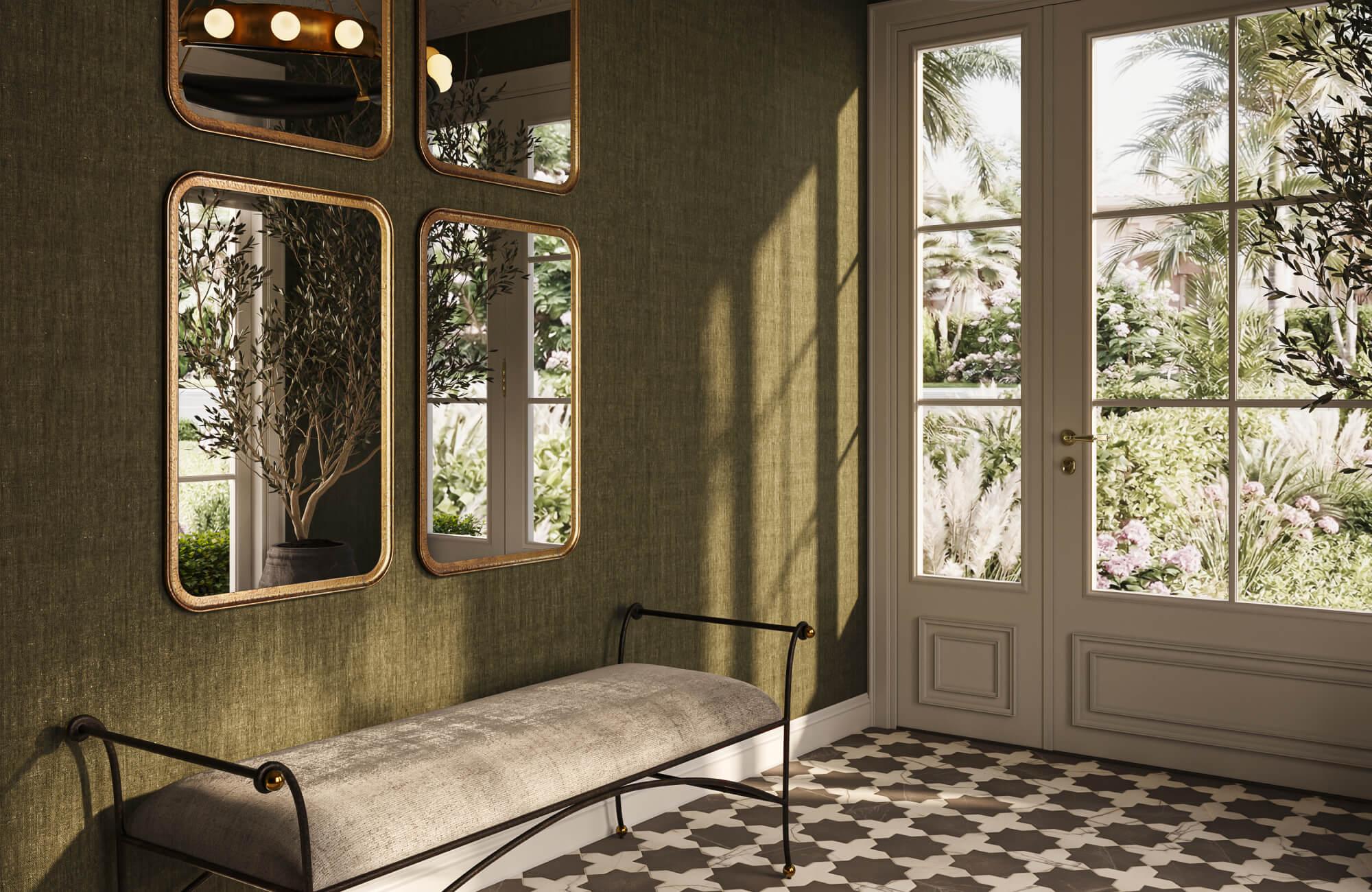
Textured or Dimensional Wall Art
Textured or dimensional wall art adds another layer of interest that flat pieces sometimes cannot achieve on their own. In tall spaces, this helps prevent the wall from feeling too flat or one-dimensional. Materials like wood, metal, or woven elements create subtle shadows that shift throughout the day, adding depth without relying on bold color changes. This can make the space feel more dynamic while still keeping the overall look balanced. It works well in rooms where you want a softer or more tactile feel. At the same time, it adds variety without needing multiple pieces. This approach is especially useful when you want the wall to feel complete without introducing too many visual elements.
The artwork shown above leans into that idea through restraint rather than scale. Our Quiet Orchard Wall Art builds its presence through overlapping textile panels, where tightly woven fields meet softer fringed edges and fine stitched lines that feel almost pieced together over time. Set within the deep green shelving, the muted tones stay grounded while the textures quietly come forward as light passes across them. Nothing feels loud, yet the surface never falls flat. It’s the kind of piece that holds attention the longer you look at it, giving the wall a sense of depth without ever needing to compete for it.

Placement Strategies That Make High Walls Feel Balanced
Once you’ve chosen the right artwork, placement is what ultimately determines whether the wall feels complete or slightly off. In taller spaces, where you position your art, you can either connect everything or leave it feeling disconnected. Below, we’ll look at placement strategies that help your walls feel more balanced without relying on rigid rules.
Centering Around Eye Level vs Architectural Height
In most rooms, artwork is centered around eye level, but high ceilings often require a more flexible approach. If you stick too strictly to eye level, the art can feel too low, leaving a large portion of the wall empty above it. At the same time, placing it too high can disconnect it from the rest of the space. The goal is to find a middle ground where the artwork still feels comfortable to view while acknowledging the height of the room. This often means slightly raising the center point or adjusting the arrangement upward. It allows the piece to engage more of the wall without feeling out of reach. In taller spaces, visual balance matters more than following a fixed rule.
Aligning Art With Furniture Below
One of the easiest ways to make wall art feel grounded is by aligning it with the furniture beneath it. When artwork sits too far above a sofa or console, it can appear like it is floating rather than being part of a cohesive setup. Keeping the spacing relatively close helps create a visual connection between the two elements. This makes the arrangement feel more intentional and easier to read. It also helps anchor the seating area so it does not feel disconnected from the wall. Even in high-ceiling rooms, this relationship still matters. A well-aligned setup creates a stronger sense of structure across the space.
Using Vertical Grouping to Fill Height
Vertical grouping is a useful way to make better use of tall walls without relying on a single oversized piece. By stacking or layering artwork upward, you create a natural flow that follows the height of the room. This approach allows your eye to move gradually from bottom to top instead of stopping at one point. It also helps fill the wall more evenly, reducing the sense of empty space above. Grouping can be done with matching pieces or a mix of styles, as long as the arrangement feels connected. The key is keeping the spacing consistent so the layout does not feel scattered. When done thoughtfully, vertical grouping creates a sense of movement that suits taller spaces.
Working With Features Like Windows or Fireplaces
Architectural features like windows or fireplaces can influence how wall art should be placed, especially in rooms with high ceilings. Instead of competing with these elements, it helps to work alongside them so everything feels integrated. For example, aligning artwork with the height or width of a fireplace can create a more cohesive focal point. Windows can also guide placement by setting natural boundaries for where art should begin or end. Ignoring these features can make the wall feel disjointed, even if the artwork itself is well chosen. Taking a moment to consider how everything interacts can lead to a more balanced result. When art and architecture work together, the entire space feels more complete.

Alternative Ways to Fill Tall Walls Beyond Traditional Art
Wall art is often the go-to solution, but tall walls can benefit from a mix of approaches depending on your space and how you use it. These options are not replacements, but complementary ways to add structure, depth, and flexibility. Below are a few ideas that work well alongside or in place of traditional artwork when the wall needs more presence.
Wall Panels or Architectural Molding
Wall panels or architectural molding can give tall walls a more structured and finished look without relying on artwork alone. Instead of filling the space with decor, you’re shaping the wall itself, which creates a strong visual foundation. This approach works well in rooms that already lean toward a classic or refined style, where added detail feels natural. Panels can break up large empty surfaces into more manageable sections, making the wall feel less overwhelming. They also add subtle texture, which helps the space feel more complete even without bold color or pattern. Over time, this kind of structure holds up well because it becomes part of the room rather than something added onto it. It’s a more permanent way to give tall walls purpose.
Murals for Full-Height Impact
Murals are a great option when you want to use the full height of a wall in a more seamless and continuous way. Instead of working with separate pieces, a mural creates one cohesive visual that stretches across the entire surface. This makes it especially effective in tall spaces where smaller elements might feel disconnected. It also reduces the need to think about spacing between pieces, since the design flows as one. Murals can range from subtle textures to bold scenes, depending on the look you’re going for. They work well when you want to make a strong statement without adding multiple layers. In the right setting, they can define the entire room.
Layering Art With Shelving or Decor
Combining wall art with shelving or decor adds both visual interest and functionality to tall walls. Instead of relying on artwork alone, you’re creating a layered setup that feels more lived-in and flexible. Shelves can hold smaller art pieces, books, or decorative objects, which allows you to change the look over time. This approach helps fill vertical space more gradually, rather than all at once. It also gives you the freedom to adjust and refine the arrangement as your style evolves. The mix of elements keeps the wall from feeling flat or overly formal. It’s a practical way to make tall walls feel more approachable and personal.
Mixing Wall Art With Lighting Elements
Adding lighting elements like sconces or picture lights can enhance how wall art interacts with the space. Instead of treating art as a standalone feature, lighting helps highlight it and adds another layer of depth. In tall rooms, this can make the wall feel more intentional and complete. The light draws attention to specific areas, which helps guide the eye across the wall. It also creates subtle contrast through shadows and highlights, making the space feel more dynamic. This approach works especially well in the evening when lighting becomes more noticeable. Combining art and lighting allows the wall to feel active rather than static.
Get the Scale Right With a Layout That Actually Works
Bringing wall art into a high-ceiling room is less about filling space and more about making everything feel connected from top to bottom. The right size, placement, and composition work together to create a wall that feels intentional instead of unfinished. When these elements align, your space starts to feel more grounded without losing that open, airy quality that high ceilings bring. Even small adjustments in height, spacing, or grouping can shift the entire look. What matters most is how the wall relates to the rest of the room, not just the artwork itself.
If you want a more tailored approach, our personalized design consultation can help you map out wall art placement that fits your exact layout and ceiling height. We look at your furniture, wall proportions, and overall style to recommend setups that feel balanced and easy to build on. This takes the guesswork out of scaling and helps you avoid trial-and-error decisions. Whether you’re starting from scratch or refining an existing wall, having a clear plan makes the process smoother. It’s a practical way to make sure your space comes together with confidence and clarity.