


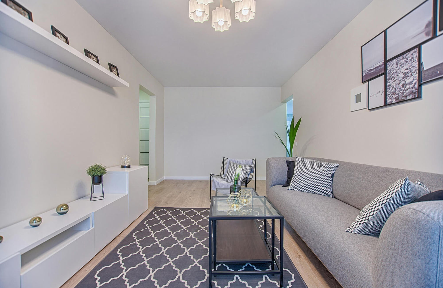
A room can look almost right and still feel slightly off, and more often than not, the disconnect shows up between the wall art and the pillows. You might match colors perfectly or pick pieces you like individually, yet something still doesn’t fully come together. That’s usually because the relationship between scale, tone, texture, and overall mood hasn’t been considered as a whole. In this blog, we’ll break down how to make those elements work together so your space feels intentional, balanced, and fully put together.

Start With What the Wall Art Is Already Doing
Before you pick any pillows, it helps to look at the wall art as if it’s already setting the rules for the room. Some pieces naturally take over the space, while others sit more quietly in the background, and that difference changes what the pillows should do. Once you notice that, it becomes easier to decide whether the pillows should stay restrained or step in and do a bit more.
When the Artwork Already Carries the Room
You’ll usually notice this right away when the wall art feels like the thing your eyes go to first without trying. It could be oversized, high-contrast, or just packed with detail that keeps pulling your attention back. In that kind of setup, the pillows don’t need to prove anything because the wall already has a clear presence. What often happens, though, is that people try to “match the energy” and end up adding pillows that are just as bold, which makes everything feel a bit crowded. Instead of one strong focal point, you end up with multiple elements competing, and the room starts to feel visually noisy. Even if each piece looks good on its own, together it can feel slightly overwhelming.
A better approach here is to let the pillows take a step back without making them feel like an afterthought. Think of them more as something that supports the setup rather than something that needs to stand out on its own. You can still introduce interest through texture or slight variation in tone, just without pushing too far into contrast or pattern. This keeps the seating area from looking flat, but it doesn’t interrupt the role the artwork is already playing. When the pillows stay in that supporting role, the whole space feels calmer and more intentional. It’s less about holding back and more about knowing the room doesn’t need another focal point.
When the Artwork Feels Too Quiet on Its Own
On the other hand, there are setups where the wall art doesn’t quite hold the space by itself. You might have a smaller piece, something minimal, or artwork that uses softer tones that don’t immediately stand out. When that happens, the wall can feel a bit disconnected from the rest of the room, especially from the sofa. It’s not that anything is wrong; it just feels like something is missing when you step back and look at it as a whole. This is usually where pillows can do more than just “decorate” and actually help pull things together. They can give the space a bit more presence without needing to change the artwork.
In this situation, it makes sense to let the pillows carry a bit more visual weight than usual. That could mean introducing slightly deeper tones, a more noticeable pattern, or even layering a couple of different textures to build some dimension. The key is that it still feels connected to the artwork, not like a separate idea placed on the sofa. When done right, the pillows start to echo or reinforce what the wall is trying to do, just in a more grounded way. This helps bridge that gap between the wall and the seating area so the room feels more complete. Instead of everything feeling spread out, it starts to feel like one cohesive setup.

Pull Colors From the Artwork Without Copying It Exactly
It’s tempting to grab the most obvious color from the artwork and repeat it on the pillows, but that usually ends up looking a bit forced. A better approach is to look past the main color and notice the quieter tones that sit behind it or around it. Those are often what make the space feel more natural and less like everything was picked from the same set.
Using Secondary Colors Instead of the Main One
Most artwork has one color that stands out right away, but it’s usually supported by other tones that don’t get as much attention. These secondary colors are what give the piece depth, even if you don’t notice them at first glance. When pillows pull from those tones instead of the main one, the connection still feels clear, just not overly obvious. It creates a more layered look where everything relates without feeling too on-the-nose. This also keeps the space from feeling repetitive, especially when the dominant color is already doing a lot of the visual work. The result feels more balanced because you’re not doubling down on the same color everywhere.
A simple way to apply this is to step back from the artwork and look at it from a distance or even slightly blur your eyes to see what other tones show up. You’ll usually notice subtle colors in the background, edges, or transitions that are easy to miss up close. Try choosing pillows that reflect one or two of those instead of the main shade. This keeps the connection intact without making it feel too obvious. It also gives you more flexibility to mix pieces without everything looking identical. Over time, this approach tends to feel more natural and less staged.
Pulling from those quieter tones often works best with pieces that already carry depth in their texture, not just color. For example, if you’re working with wall art that features warm neutrals with hints of rust, clay, or soft brown in the background, going straight for the dominant tone can feel too direct. As shown above, our Merelle 22” x 22” Down Pillow in Terracotta works well in that setup because it picks up those deeper, secondary hues without repeating the main color. The textured weave and stitched edges also break up the color slightly, so it doesn’t read as flat or overly matched. It ends up supporting the artwork rather than competing with it, which is what makes the whole setup feel more natural.
Picking Up Small Details Most People Miss
Some of the best color connections come from details that aren’t immediately noticeable. Thin lines, soft shadows, or muted accents often carry tones that don’t stand out on their own but still play an important role in the artwork. These are the kinds of colors that feel more subtle when used on pillows, which makes the overall setup look more considered. Instead of matching what’s loudest, you’re responding to what’s quietly holding the piece together. That shift alone makes the space feel less predictable and more personal. It also avoids the common problem where everything looks too coordinated.
A useful tip here is to look closely at the edges or transitions within the artwork, especially where colors blend or overlap. You’ll often find tones that aren’t obvious at first but repeat in small ways throughout the piece. Pulling from those details allows the pillows to connect back without stealing attention. It also helps when you’re working with artwork that doesn’t have a strong dominant color to begin with. By focusing on these smaller elements, the overall look feels more layered and intentional. It’s a quieter way of tying things together, but it works better in the long run.
Letting Neutrals Bridge the Gap
Neutrals tend to do more behind the scenes, but they’re often what keeps everything from feeling scattered. When the artwork has a mix of colors that don’t easily translate onto pillows, trying to match all of them can quickly feel messy or overdone. This is where softer tones like warm beige, off-white, or muted gray help settle the space. They don’t compete with the artwork, but they make it easier for the eye to move between the wall and the sofa without feeling interrupted. Without that kind of balance, even well-chosen colors can start to feel disconnected. Neutrals give everything a place to land, so the overall look feels more composed.
A useful way to handle this is to build your pillow setup around neutrals first, then layer in color more selectively. For example, start with one or two neutral pillows that relate to the background or undertone of the artwork, then add a smaller number of colored ones that tie back to it. This keeps the base calm while still allowing for variation. It also gives you more flexibility if you ever want to switch things up later. When neutrals are doing the groundwork, the rest don’t have to work as hard. That balance is what keeps the setup from feeling forced.
Avoiding Exact Matches That Feel Too Styled
It’s easy to think that matching the artwork exactly is the safest move, but it often ends up looking a bit too perfect. When the pillows repeat the same color too closely, the space can feel like it was put together all at once instead of built over time. That kind of precision removes some of the natural variation that makes a room feel comfortable. It also flattens the overall look, since there’s no shift in tone to create depth. Even if the colors technically “match,” the result can feel a little stiff. What usually works better is giving those colors a bit of room to breathe.
A better approach is to stay within the same color family but allow for slight differences in tone or intensity. If the artwork leans toward a deep shade, you can bring in a lighter or more muted version on the pillows so it still connects without repeating exactly. You can also let texture do part of the work, since the same color can look different depending on the fabric. This keeps the palette consistent while adding a bit more life to the setup. Over time, these small variations make the space feel more relaxed and less staged. It ends up looking more like a natural combination than a perfect match.

Creating Contrast Without Making It Feel Disconnected
Once you’ve pulled colors from the artwork, the next step is giving the setup a bit of variation so it doesn’t feel flat. That usually means adjusting tone, depth, or intensity rather than introducing completely new colors. The goal is to create contrast that still feels tied to the artwork, so nothing looks out of place or disconnected.
When Matching Colors Makes the Space Feel Flat
When pillows repeat the same colors too closely, everything can start to blend together in a way that feels a bit one-dimensional. At first, it might look clean and coordinated, but after a while, the lack of variation makes the space feel less interesting. There’s nothing for the eye to move between, so both the wall art and the pillows end up losing some of their impact. This tends to happen when every piece is pulled directly from the same exact tones without any adjustment. Even if the palette is technically correct, it can still feel like something is missing. That “missing” element is usually contrast.
A good way to fix this is to introduce small shifts within the same palette instead of reaching for completely different colors. If the artwork uses a mid-tone shade, try bringing in pillows that are slightly lighter or deeper within that same range. This keeps everything connected while adding just enough variation to create movement. You don’t need a big change to make it work, just enough difference so each element stands on its own. Over time, this kind of layering makes the space feel more dynamic without breaking the overall look. It’s a subtle adjustment, but it makes a noticeable difference.
Using Darker or Lighter Versions of the Same Tone
Working within the same color family but adjusting the tone is one of the easiest ways to add contrast without losing cohesion. For example, if the artwork leans toward a soft blue, you can bring in a deeper navy or a lighter, washed-out version of that same shade on the pillows. This creates separation between elements while still feeling clearly connected. It also helps avoid the overly matched look that can make everything feel too controlled. These tonal shifts give the setup more depth, especially when viewed from a distance. The space starts to feel more layered without needing additional colors.
A helpful tip here is to think in terms of light, medium, and dark rather than just “matching.” Try to have at least two of those levels present between the artwork and the pillows so there’s a natural range in the palette. This can be done gradually without making any one piece feel out of place. Even subtle differences become more noticeable once everything is arranged together. It also makes it easier to mix in new pieces later without starting over. Keeping that tonal range in mind helps maintain balance while still adding interest.
When most of the palette sits in softer blues or faded neutrals, the setup can start to feel a bit washed out without something to hold it together. A deeper tone helps break that without introducing a completely new direction. Our Merelle 22” x 22” Down Pillow in Navy, as pictured here, works well in that role by adding weight to the palette while still staying within the same color family. The slightly uneven weave keeps the navy from feeling too solid, and the white whipstitching picks up on lighter elements already present. Instead of standing out on its own, it gives the whole arrangement a bit more structure, so everything reads more clearly.
Adding One Contrasting Element That Still Relates
Sometimes the setup needs a small break from the main palette to keep it from feeling too predictable. This doesn’t mean introducing something completely unrelated, but rather choosing one element that contrasts while still connecting back in some way. It could be a slightly unexpected color, a stronger tone, or even a pattern that feels different from the rest. When used carefully, this kind of contrast gives the space a bit more personality without making it feel disjointed. The key is that it still relates to the artwork, even if the connection isn’t immediately obvious. That’s what keeps it from standing out in the wrong way.
A practical way to approach this is to limit that contrast to just one or two pillows so it doesn’t take over the entire arrangement. You can tie it back to the artwork through a shared undertone, a similar intensity, or even a small detail that echoes something in the piece. This keeps the contrast feeling intentional rather than random. It also gives the setup a focal point within the seating area without competing with the wall art. When done right, that single contrast adds energy while still keeping everything connected.

Use Texture to Support What the Artwork Can’t Provide
When color and scale are already working, but something still feels off, it’s usually because everything is reading the same on the surface. Wall art tends to be visually flat, especially prints or framed pieces, so if the pillows mirror that same finish, the whole setup can feel a bit one-note. Texture isn’t about adding more design; it’s about giving the space another layer that color alone can’t create.
Pairing Flat Artwork With More Tactile Fabrics
If the artwork has a smooth or printed finish, like canvas or anything behind glass, it doesn’t change much as light hits it throughout the day. That’s where pillows with more tactile fabrics start to make a difference, especially ones with a visible weave or slight irregularity. Linen with a natural slub, cotton blends with raised threads, or even slightly coarse weaves can break that flatness without adding more visual noise. The shift is subtle, but it gives the eye something else to register when looking between the wall and the sofa. This works especially well when the artwork leans minimal or uses large areas of solid color. Instead of layering more patterns, you’re adding variation through surface, which feels a lot more natural in the space.
When Both the Art and Pillows Feel Too Smooth
A setup starts to feel off when both the artwork and the pillows reflect light in the same way, especially with glossy prints and tightly woven or synthetic fabrics. Everything ends up sitting on the same visual level, so the eye moves across too quickly without settling anywhere. It can look clean at first, but after a while, it feels a bit lifeless, like there’s nothing grounding the space. This is why some rooms feel more like a display than something you actually relax in. The issue isn’t color or placement; it’s that nothing is breaking that smooth consistency. Even a small shift in texture can change how the whole setup feels.
Subtle Texture That Stays in the Background
Not all texture needs to be obvious to be effective, and in most cases, it actually works better when it isn’t. When the artwork already has strong detail or contrast, adding heavy texture to the pillows can start to compete with it. Softer textures, like fine weaves or fabrics with slight thread variation, tend to sit better because they don’t interrupt the overall look. You notice them more over time rather than all at once, which keeps the space from feeling busy. This kind of texture adds depth without pulling attention away from the wall. It’s the difference between something that supports the setup and something that tries to stand out on its own.
Letting Texture Carry the Variation Instead of Pattern
There are setups where adding a pattern to the pillows would just feel like too much, especially if the artwork already has a lot going on. In those cases, texture can do the work of adding variation without introducing more shapes or lines. Different fabrics can create enough contrast to keep things from feeling repetitive, even if the colors stay very close. This works well when you want to keep the palette controlled but still avoid that “everything looks the same” effect. Instead of layering patterns, you’re building depth through how the materials feel. It’s a quieter approach, but it usually ends up looking more intentional.
Mixing Finishes Without Making It Feel Busy
Mixing finishes can add dimension, but it only works when there’s some restraint in how it’s done. If every pillow has a strong or noticeable texture, the setup can feel just as overwhelming as using too many patterns. What tends to work better is having a clear difference between a few finishes rather than trying to include everything at once. For example, one more textured piece paired with softer, more even fabrics creates enough variation without overloading the space. The balance comes from how those surfaces relate, not how many you include. When one texture leads and the others support it, the whole arrangement feels more controlled and easier to look at.

Matching the Mood Instead of Just the Colors
Even when the colors line up, a space can still feel off if the overall mood isn’t consistent. Wall art usually sets a tone, whether it’s calm, bold, moody, or playful, and the pillows need to follow that same direction. Once you start looking at the feeling behind the pieces instead of just the palette, it becomes much easier to make everything sit right together.
Calm Artwork With Softer, Relaxed Choices
When the artwork leans calm, through soft tones, open space, or minimal detail, the pillows need to match that same ease rather than interrupt it. Pillows that feel too structured or sharply defined can break the flow and make the seating area feel slightly out of sync with the wall. Softer fabrics, slightly relaxed shapes, and finishes that don’t hold a rigid form tend to sit better in these setups. You’ll notice this more when the artwork has an airy or quiet presence, since anything too “tight” on the sofa starts to stand out in the wrong way. Keeping the pillows understated doesn’t mean making them boring; it just means they shouldn’t demand attention the same way bold pieces do. When everything carries that same relaxed tone, the space feels more natural and settled.
Bold Artwork With More Defined Pillow Styles
When the artwork has a stronger presence, whether through contrast, sharp lines, or more graphic elements, the pillows need enough structure to keep the balance. If they’re too soft or too muted, the seating area can feel like it’s falling behind the wall rather than supporting it. More defined shapes, slightly firmer fills, or cleaner edges help the pillows hold their place without competing for attention. This becomes especially important when the artwork has clear forms or directional movement, since overly relaxed pillows can feel disconnected from that energy. The goal isn’t to match intensity exactly, but to avoid that mismatch where one element feels strong, and the other feels too passive. When both sides carry a similar level of presence, the room feels more intentional.
When the Mood Feels Off, Even If Colors Match
There are setups where the colors technically work, but something still feels slightly uncomfortable when you look at the space. This usually happens when the mood of the pillows doesn’t line up with the artwork, even if the palette is consistent. For example, soft, expressive artwork paired with very structured or formal pillows can create a quiet tension that’s hard to explain at first. The same goes the other way, where bold, graphic art is paired with overly relaxed pillows that don’t support its presence. These mismatches aren’t always obvious right away, but they become more noticeable the longer you look at the space. It ends up feeling like the elements belong to different setups rather than one cohesive room. That’s why mood alignment often matters more than perfect color matching.
Using Pillows to Shift the Feel of the Artwork Slightly
Pillows can also subtly change how the artwork is experienced without replacing it or making major adjustments. If the artwork feels a bit too sharp or intense, slightly softer pillows can take the edge off and make the space feel more comfortable. On the other hand, if the artwork feels too quiet, introducing pillows with a bit more structure or presence can give the setup more direction. Because the sofa and wall are read together, these small changes can shift the overall feel more than expected. It’s not about overpowering the artwork, but about nudging the mood in a direction that feels more balanced. This approach works well when you like the artwork but want the room to feel slightly different without starting over.

Mistakes That Make Pillows and Wall Art Feel Unrelated
Even when each piece looks good on its own, small disconnects can make the whole setup feel slightly off. These aren’t always obvious mistakes, but more subtle choices that break the connection between the wall and the sofa. Once you know what to look for, it becomes much easier to spot why something doesn’t quite come together.
Matching Everything Too Exactly
At first, matching everything exactly can feel like the safest move, since it keeps the palette looking clean and controlled. However, when the pillows mirror the artwork too closely, the setup can start to feel flat and a bit predictable rather than intentional. Instead of creating depth, everything blends into a single layer, so the eye doesn’t have much to move between or settle on. Over time, this makes the space feel more staged than lived-in, especially when there’s no shift in tone, texture, or intensity to break things up. Even small variations are usually what give a room a sense of ease and realism, so removing them entirely can take that away. That’s why “perfect matching” often ends up feeling less natural, even though it seems like the most straightforward choice.
Ignoring Undertones Between Elements
Even when colors look close enough at first glance, the undertones underneath them can shift how everything reads once it’s in the room. For instance, a beige pillow that leans slightly yellow or warm can feel off next to artwork that has cooler, gray-based neutrals, even if both are technically “neutral.” At first, it might not be obvious, but over time, that subtle difference starts to create a quiet tension that’s hard to ignore. You may notice the pillows looking slightly out of place depending on the lighting, especially during the day when natural light brings out those undertones more clearly. This is usually why a setup feels a bit disconnected, even when the colors seem right on paper. Taking a moment to compare how each element leans, whether warm, cool, or somewhere in between, helps keep everything feeling more consistent and intentional.
Adding Too Many Patterns Without a Clear Anchor
Patterns can definitely bring life into a space, but when too many are layered without a clear point of focus, the whole setup can start to feel scattered. Instead of building depth, everything begins to compete, and the eye doesn’t know where to settle first. This often happens when multiple pillows introduce strong patterns that don’t clearly relate back to the wall art or to each other. As a result, the arrangement starts to feel busy rather than balanced, even if each piece looks good individually. Over time, that lack of structure makes the space feel less composed and more overwhelming to look at. Keeping one dominant element, whether it’s the artwork or a single standout pillow, gives everything else something to support, which helps the overall look feel more grounded.
Overfilling the Sofa Without a Clear Layout
Adding more pillows often feels like an easy way to make the sofa look fuller or more styled, but without a clear layout, it can quickly go in the wrong direction. When too many pillows are placed without thinking about spacing or balance, the arrangement starts to feel crowded rather than intentional. This not only makes the sofa look cluttered, but it also pulls attention away from the wall art, which should still play a role in the overall setup. Instead of guiding the eye between the two, the pillows create a heavy visual block that feels separate from the rest of the room. You may also find that the shapes and sizes start to overlap in a way that makes everything feel less defined. Keeping the arrangement more controlled, with enough space for each piece to sit properly, helps maintain a cleaner and more cohesive look.
Pulling Wall Art and Pillows Together
Most spaces don’t feel off because of one big mistake; it’s usually a few small decisions that don’t quite line up. A pillow that’s slightly too sharp for the artwork, a tone that leans just a bit warmer, or a mix that feels too “perfect” can quietly break the connection without being obvious at first. Once you start noticing how these details interact, it becomes easier to adjust without starting over. The goal isn’t to make everything match, but to make everything feel like it belongs in the same space. When that balance is right, the room feels more settled, and you stop second-guessing the setup every time you walk in.
If you’ve tried adjusting things but still can’t quite get that cohesive feel, it usually helps to step outside your own perspective. Our personalized design consultation focuses on how elements like wall art, pillows, and layout actually work together in your home, not just how they look individually. We look at your space as a whole, including lighting, proportions, and how each piece interacts, so you’re not left guessing what’s off. That way, you end up with a setup that feels natural, balanced, and easier to live with over time.
