


Wallpaper has the power to redefine a room, introducing depth, artistry, and architectural character in ways that paint alone cannot achieve. When thoughtfully curated, it becomes more than a backdrop, serving as a sophisticated design layer that enhances existing wall decor rather than competing with it. Achieving this balance requires a refined understanding of pattern scale, color harmony, material texture, and spatial proportion, all working together in visual continuity.
From coordinating wallpaper with gallery walls to integrating textured wallcoverings alongside millwork and statement furniture, every decision shapes the overall composition. With a strategic approach grounded in interior design principles, mixing wallpaper with existing wall decor transforms a space into a cohesive and elevated environment.

Establish a Cohesive Design Foundation
A cohesive interior begins with a careful reading of architectural lines and decorative intent, allowing wallpaper to support rather than disrupt the established aesthetic. When proportion, undertone, and structural context are evaluated together, the resulting design feels layered, balanced, and professionally curated.
Analyze Architectural Context and Structural Lines
Architectural elements such as crown molding, baseboards, ceiling height, and built-in cabinetry establish the spatial framework that wallpaper must respect to feel integrated rather than imposed. Traditional millwork profiles, for instance, often harmonize with classic motifs like damask or heritage florals, whereas contemporary interiors respond beautifully to structured, textural patterns that reinforce clean lines. In the dining space shown above, the subtle grid composition enhances the room’s symmetry, aligning effortlessly with the window trim, wall sconces, and streamlined furnishings.
Ceiling height and uninterrupted wall planes also allow the pattern to read clearly without visual compression, demonstrating how proportion directly affects scale perception. Window placement and architectural breaks are thoughtfully considered so the pattern maintains continuity across each wall surface. A refined option, such as Edward Martin’s Essex Wallpaper in Black II, 52" x 132" (displayed in the photo above), introduces a tailored, textural grid that complements modern architectural lines while preserving visual balance, making it an ideal choice when learning how to mix wallpaper with existing wall decor in dining rooms or transitional interiors.
Assess Visual Weight and Decorative Density
Visual weight refers to the perceived mass created by furniture scale, artwork groupings, and material finishes distributed throughout a room. Dark wood furnishings, ornate mirrors, and richly saturated textiles increase decorative density, which makes subtle textured wallpaper a strategic counterbalance. In contrast, light-filled minimalist interiors often benefit from bold botanical wallpaper or large-scale patterned wallcoverings that introduce dimension without overwhelming the space.
The distribution of decor across walls further influences wallpaper choice, as heavily accessorized surfaces require restrained motifs to prevent visual clutter. In addition, thoughtful calibration between dominant furnishings and secondary design elements preserves clarity and spatial balance. For those researching how to balance bold wallpaper with heavy furniture, understanding decorative density is essential to avoiding aesthetic congestion.
Identify Undertones and Existing Color Temperature
Color temperature consistency is fundamental when coordinating wallpaper with painted walls, flooring, and decorative accents. Warm undertones such as beige, cream, terracotta, or brass finishes should complement wallpaper with similarly warm base pigments. On the other hand, cool undertones found in gray paint, blue textiles, or chrome hardware require wallpaper with compatible cool inflections to maintain chromatic harmony.
Flooring materials, including hardwood, porcelain tile, or natural stone, subtly influence the overall warmth or coolness of the interior envelope. Upholstery fabrics and metallic finishes also introduce tonal cues that can either unify or disrupt the palette if overlooked. Testing large wallpaper samples adjacent to trim, cabinetry, and furnishings further ensures cohesive integration before full installation, especially when refining how to match wallpaper with existing furniture and wall art.

Coordinate Pattern Scale and Proportion
Pattern scale determines how wallpaper interacts with artwork, mirrors, and shelving, shaping the room’s visual rhythm. When proportion is thoughtfully managed, wallpaper enhances focal points while preserving compositional balance.
Balance Large-Scale and Small-Scale Patterns
Scale contrast creates layered depth while preventing visual competition between wallpaper and existing wall decor. For example, large-scale botanical wallpaper pairs effectively with small framed artwork, allowing the art to read as curated detail against a cohesive and immersive backdrop. In contrast, oversized statement art benefits from wallpaper featuring subtle micro-patterns or low-contrast textures that avoid distraction.
The size of the pattern repeat should also correspond to the wall dimensions, as expansive motifs can overwhelm compact rooms if not proportioned correctly. In addition, introducing variation in scale maintains visual movement while reinforcing a structured design hierarchy. When combining patterned wallpaper with gallery walls, thoughtful scale differentiation remains essential to achieving balanced, harmonious interiors.
Understand Pattern Repeat and Alignment Mechanics
Pattern repeat classification—straight match, drop match, or random match—directly influences both installation precision and the overall aesthetic flow of a space. While drop-match wallpaper introduces diagonal movement and a sense of dynamic rhythm, it also requires meticulous alignment to maintain visual continuity across seams. Straight-match patterns, on the other hand, follow a more predictable sequence, making them particularly well-suited for areas behind shelving, consoles, or partially interrupted walls where alignment must remain consistent.
Moreover, random-match wallpaper offers greater flexibility in rooms with multiple architectural breaks, reducing the risk of noticeable misalignment. Precise measurement of repeat length not only ensures accurate material estimation but also minimizes excess waste during installation. A clear understanding of pattern repeat and alignment mechanics is essential for achieving cohesive results when installing wallpaper behind existing wall decor.
Maintain a Clear Focal Hierarchy
Focal hierarchy determines which design element captures attention first and guides the eye's movement throughout the space. When wallpaper serves as the primary statement feature, surrounding decor should be kept edited and selectively styled to avoid visual competition. Conversely, if large-scale artwork or sculptural installations take precedence, wallpaper should act as a refined backdrop with controlled contrast.
Establishing this hierarchy also prevents competing focal points that can fragment visual flow and dilute impact. Layered lighting, including accent fixtures or picture lights, can subtly reinforce the intended centerpiece without overpowering adjacent elements. Clear visual prioritization further ensures that mixing wallpaper with existing wall decor feels curated, balanced, and architecturally intentional.

Integrate Texture and Surface Materiality
Texture introduces depth and tactile richness, influencing how wallpaper interacts with surrounding materials. Coordinated surface finishes create dimensional layering without visual redundancy.
Contrast Matte, Satin, and Reflective Finishes
Sheen variation significantly affects how light interacts with wall surfaces, influencing both mood and perceived dimension. Matte wallpaper, for example, absorbs light, helping to soften rooms that already feature glossy cabinetry, polished stone, or metallic decor. Satin or silk-finish wallpaper, on the other hand, subtly reflects light and introduces a refined luminosity to interiors dominated by flat paint finishes.
High-sheen wallcoverings should also be applied selectively, as excessive reflectivity can highlight surface irregularities or drywall imperfections. When layered thoughtfully, the contrast between matte and reflective finishes enhances depth without creating glare or visual imbalance. Selecting the best wallpaper finishes for modern interiors, therefore, requires deliberate sheen coordination aligned with existing materials and lighting conditions.
Layer Organic and Engineered Materials
Material contrast plays a pivotal role in achieving a refined and balanced interior composition. For example, grasscloth wallpaper introduces organic warmth and tactile richness that pairs beautifully with stone fireplaces, plaster walls, or concrete accents. In contrast, smooth non-woven wallpaper delivers crisp definition that complements reclaimed wood shelving or rustic beams.
Combining organic and engineered materials also prevents visual monotony while reinforcing structural coherence throughout the space. As natural and synthetic textures respond differently to shifting daylight, this layered approach enhances subtle movement across the walls. Blending textured wallpaper with existing wall decor in contemporary spaces becomes more compelling when material diversity is curated with intention.
Select Substrates Based on Performance Needs
Wallpaper substrate directly influences longevity, installation precision, and long-term maintenance. Non-woven wallpaper, for instance, offers dimensional stability, resists expansion during adhesive application, and simplifies removal when updates are needed. Conversely, vinyl-coated wallpaper provides enhanced durability and washability, making it ideal for busy areas such as hallways, dining rooms, or family spaces.
Natural fiber wallcoverings, while visually rich, require controlled humidity levels to prevent expansion or contraction over time. Evaluating environmental conditions and daily wear patterns also ensures that aesthetic choices align with functional demands. Technical substrate selection ultimately reinforces cohesive, long-lasting interior design while supporting practical performance.

Position Wallpaper Strategically Within the Space
Strategic placement refines how wallpaper interacts with furniture, architectural features, and decorative installations. Selective application often produces a more elegant outcome than full-wall coverage.
Define Accent Walls With Architectural Awareness
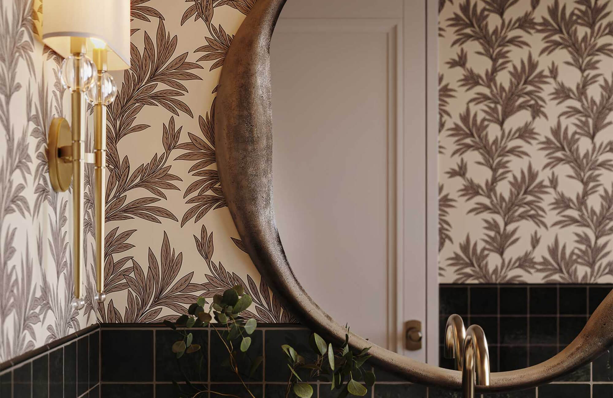
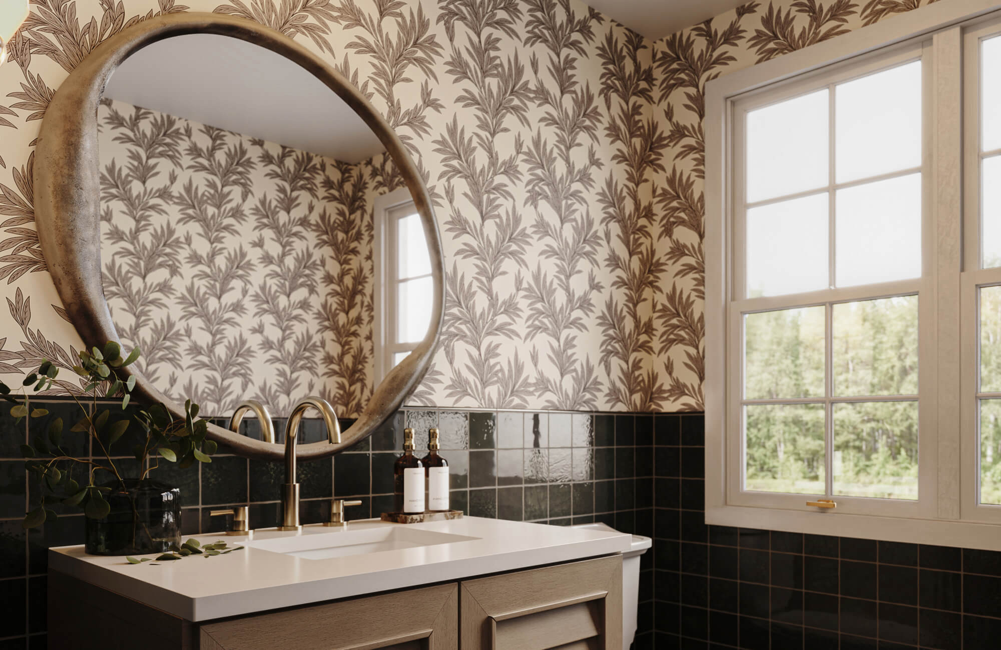
Accent walls function best when aligned with symmetry and primary sightlines, ensuring the wallpaper feels architectural rather than decorative. In the bathroom shown above, the vertically oriented backdrop reinforces the centered mirror, brass vanity lighting, and dual-sink configuration, creating a cohesive focal point. Positioning wallpaper directly behind a key element such as a vanity, fireplace, or headboard also strengthens visual hierarchy while preserving balance throughout the room.
Vertical linear patterns are particularly effective in spaces with standard ceiling heights, as they subtly elongate the wall plane and enhance perceived height. A refined option, such as the Windsor Wallpaper in Black II, 52" x 132" (shown in the photo above), introduces tailored vertical definition that complements structured millwork, warm wood cabinetry, and polished brass fixtures. When installing wallpaper behind statement architectural features, aligning the pattern with lighting and hardware also ensures the final result feels intentional, sophisticated, and seamlessly integrated with existing wall decor.
Integrate Wallpaper Within Wall Paneling or Wainscoting
Wallpaper framed within panel molding or installed above wainscoting introduces layered sophistication while maintaining architectural discipline. This segmentation technique allows bold patterns to coexist with traditional trim detailing without overwhelming the space. Painted millwork also acts as a visual buffer, providing structural contrast that defines the wallpaper as a curated insert rather than full coverage.
Precise measuring, leveling, and trimming ensure crisp transitions along molding edges and prevent pattern distortion. Balanced segmentation is particularly effective in smaller rooms where full-height wallpaper might feel excessive. As a result, integrating wallpaper into paneling or wainscoting creates a refined way to mix decorative wallcoverings with classic architectural features.
Adapt Around Functional Wall Installations
Mounted televisions, floating shelving systems, and built-in cabinetry naturally disrupt pattern continuity, making pre-installation planning essential. Selecting smaller-scale or random-match wallpaper helps minimize noticeable disruptions when portions of the design are concealed behind fixtures. Strategic centering of dominant motifs also ensures that key elements remain visible rather than awkwardly truncated at the edges of a screen or cabinet.
Additionally, seam placement should align with architectural breaks, such as vertical millwork lines or shelving divisions, to maintain visual fluidity. Careful measurement around brackets, outlets, and media ports further preserves pattern alignment and professional finish quality. Successfully integrating wallpaper around functional wall installations requires both aesthetic sensitivity and technical precision to achieve a cohesive, design-forward result.

Harmonize Color Theory With Lighting Conditions
Color harmony and lighting evaluation ultimately determine whether wallpaper integrates seamlessly with existing decor. Advanced color theory, combined with lighting analysis, ensures lasting visual cohesion and a refined ambiance.
Apply Complementary and Analogous Color Schemes
Complementary color schemes introduce controlled contrast that energizes a space without overpowering it, especially when one hue is allowed to dominate while the other functions as a refined accent. Analogous palettes, by contrast, create soft transitions that feel cohesive and calming because neighboring hues naturally blend along the color wheel. Pulling accent tones from rugs, upholstery, or framed artwork into the wallpaper pattern also reinforces chromatic continuity and prevents the wall from feeling visually detached.
This method is particularly effective when mixing wallpaper with existing wall decor in open-concept spaces where color flow must remain uninterrupted. Neutral base tones such as ivory, greige, or soft taupe help anchor saturated decor elements while maintaining balance. When determining how to match wallpaper to existing furniture and wall art, subtle echoes of hues foster seamless integration without resorting to exact color matching.
Evaluate Natural and Artificial Lighting Impact
Lighting conditions significantly influence how wallpaper color, contrast, and pattern depth are perceived throughout the day. In the dining room shown above, warm ambient lighting from the sculptural pendant and wall sconces enriches the dark botanical motif, allowing the pattern to appear dimensional rather than flat. North-facing natural light would emphasize cooler undertones in the black elements, while warmer artificial lighting would enhance the tan base, creating a more intimate atmosphere.
This interplay demonstrates how layered lighting—ambient, accent, and decorative—can dramatically shift the visual weight of patterned wallpaper. A design such as our Greensward Wallpaper in Black/Tan II, 52" x 132" (pictured above), responds beautifully to these variations, as its contrast and organic detailing gain depth under warm illumination while maintaining clarity in natural light. Evaluating wallpaper samples under both daytime and evening lighting is also essential when learning to harmonize color theory with lighting in dining rooms and formal entertaining spaces.
Use Neutral Foundations to Bridge Bold Decor
Neutral-based wallpaper offers flexibility when existing decor features bold or contrasting hues, helping the space feel curated rather than chaotic. With a restrained backdrop in place, vibrant artwork, sculptural lighting, and statement furniture can command attention without competing for visual focus.
Layered neutrals—such as warm beige with soft gray undertones—also add subtle tonal variation, elevating the overall sense of sophistication. This approach works especially well for homeowners looking for lasting solutions, particularly when blending bold wallpaper with colorful furniture while maintaining balance. Because thoughtfully chosen neutrals adapt easily as accessories or textiles change, the wallpaper continues to function as a cohesive design layer that supports evolving decor without overpowering it.
Designing With Intent and Cohesion
Blending wallpaper with existing wall decor succeeds when architectural awareness, scale coordination, and color harmony are deliberately aligned. When pattern selection and material contrast are handled thoughtfully, wallcoverings enhance curated furnishings and artwork rather than overshadow them. Strategic placement within accent walls, paneling, or segmented zones also preserves visual breathing room while still maintaining impact. At the same time, careful evaluation of lighting conditions and undertone compatibility helps ensure chromatic consistency across surfaces. Guided by professional interior design principles and strategies such as seamlessly mixing wallpaper with existing wall decor, the result is a layered, elegant space that feels intentional, balanced, and enduring.
For a more tailored approach, Edward Martin’s design services offer expert guidance to refine every detail. Contact us to transform your vision into a cohesive, beautifully curated interior!